
If I asked you to picture the homepage for a university website, what would it look like? You might come up with something similar to SUNY Cortland’s homepage: images of students on a lawn, navigation at the top with sections for Academics, Admissions, Prospective Students, Alumni, and so on. There would probably also be sections for News and Events. Indeed, university websites tend to follow a certain set of conventions, many of which haven’t changed much over the years.

Playing it safe has usability benefits, but some site designers may argue that websites must go beyond the status quo to differentiate themselves from the competition and communicate a more progressive brand.
Bucknell University’s Controversial Redesign
When Bucknell University redesigned its website and broke away from some long-established conventions, it generated a lot of buzz in the higher-education web community. Applauded by some and condemned by others, the design has been hotly debated on Twitter and on blogs. And sure enough, attendees in my University Websites course wondered about it.

Before reading any further, try this mini user test for yourself:
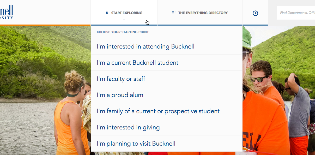
- In the top line, what does the round icon between The Everything Directory and the search box symbolize? What will you get if you click it?
- Also on that top line, what will you get when clicking Start Exploring?
- In the left margin, what will you get if you click one of the dates?
- What information is on the other side of the link “Bucknell is under the sea” within the big photo? (Did you recognize this as a link and not just a caption?) Would you click this if you were considering applying to this university?
Among the design changes that received the most attention are the following:
-
Minimalist and hidden navigation. Instead of the traditional global navigation bar with several categories, the Bucknell site has an extremely narrow and deep hierarchy, with just 2 menu items: Start Exploring, (which has a drop-down for audience-based navigation) and The Everything Directory (which leads to an A-Z index). On internal pages, the local navigation is located under drop-down menus and thus not immediately visible.
-
Tools to customize the homepage and view browsing history. Users can select which content they want displayed on the homepage, by turning certain categories “on” or “off.” The clock icon in the top navigation opens a drawer that shows users the most recent pages that they’ve viewed.
-
Glossy visual-design trends. The site uses several visual-design trends that are popular now, such as minimal content and a full-width image that fills the page above the fold. Long-scrolling, image-heavy pages feature vertically stacked containers, card, and grid layouts, and mimic horizontal swipe on desktop. While these styles aren’t unique to this university, they do impact the user experience in ways conventional sites don’t.
Bucknell’s redesign is responsive, and some of the changes (specifically, the first and the last ones) reflect practices that are ubiquitous on the responsive web nowadays. In this article I will focus on how these trends impact desktop user experience.
Where There Is Controversy, There Must Be Data
When innovative products or interfaces excite or upset people, we at Nielsen Norman Group love to add data to the conversation, however brutal the results may be (you can read examples in our archives, for example, Windows 8, Flash, PDFs).
Following this tradition, I conducted a simple usability study of Bucknell’s redesigned website to help answer some of the questions that designers had about the controversial design. The goal of the study focused on how the desktop design impacted visitors’ ability to find the information that they needed and to gauge the usability of the site.
We ran an unmoderated remote usability study with 5 participants: 3 prospective students and 2 parents of prospective students. (Even with just a few users, it’s possible to identify most of the main usability issues in a design.) We asked participants to explore the site to see if the university is a good match for their needs. Then we asked participants to find answers to questions that are typical for users of such sites (e.g., the cost of tuition, the application deadline).
The Results
Key facts and information effectively caught users’ attention and created a positive impression of the academic quality of the university.
Users love relevant facts, so it’s great that the site effectively surfaced key facts and figures with concise, eye-catching, and informative content, which users stopped to read. After the test was over, we asked participants what their impressions of the university were, and their comments about the academic quality were positive:
- “I would say Bucknell is an excellent school. I like how they teach better ways of thinking. It sounds like a really hard school.”
- "It seems like it would be an interesting place to attend, being very focused on student-faculty interactions, which are always a good thing.”

Unfortunately, these useful key facts were hard to find, because insufficient and hidden navigation prevented users from discovering the pages that showcased this information. Your website may have great content and a nice visual design, but none of that matters if users cannot actually find your content. As one of our users put it:
“It looks nice but there's not that much information about anything.”
As we’ve said before, the first law of e-commerce is that if the user can’t find the product, the user can’t buy the product. There’s a similar law for information-oriented sites: if the user can’t find the content, the user can’t read the content.
Don’t make global navigation hard to find. Everything else on your site will suffer, including your business goals.
Controversy #1: Minimalist and hidden navigation
Our finding: Minimalist and hidden navigation unanimously frustrated users and prevented them from finding information.
“I'm a college grad, and I had a hard time with this site. It would be so much easier if things would be where you think they would be. You have to hunt for everything.”
To give an idea of some of the trouble that users encountered when completing tasks, here were a few pain points:
-
Many participants were not able to find the list of majors that the school offered. One user found the list once, but was unable to retrace his steps to find it again.
-
Several participants were not able to find the cost of tuition.
-
Several participants did not realize that the university offered their program of choice. (Sadly, this is consistent with our other research on university websites, which found that 48% of visitors on university websites did not realize that their program of choice was offered at that university. Every student who leaves your site mistakenly thinking that you don’t have a program for her is a missed opportunity— one with an enormous financial impact.)
These results can be mainly attributed to 3 aspects of Bucknell University’s navigation:
-
Deep hierarchy and vague categories. Sites with deep hierarchies are usually more difficult for users than sites with moderately broad structures, as we know from research in Human-Computer Interaction. A deep hierarchy usually ends up with more generic labels at the top. By reducing the top-level navigation to only two categories, the Bucknell site forces users to choose between two vague labels (Start Exploring and The Everything Directory), which have no information scent: users cannot predict what they will get when they click on either of these.
-
(A note about audience-based navigation: Bucknell’s audiences in the Start Exploring menu are distinct, which is good. But role-based navigation like this poses the same problems it does on other university sites. Users don’t necessarily self-identify, and they often don’t understand which audience category contains the content that they want. For example, many parents view the page for prospective students well before they view the page for parents. Evaluate whether topic-based organization might be more efficient for your users. And if you are using audience-based organization, be sure that each audience is specific and distinct, and include the information that is most relevant to that audience.)
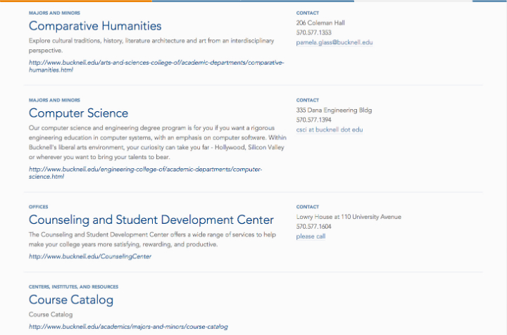
Regarding “The Everything Directory” (the 2nd category in the global navigation) this alphabetical listing of the university’s online content was not helpful for users. Alphabetical listings can work well when there is a well-known, common vocabulary for the terms used. At a university, however, most visitors don’t know the correct vocabulary or official names for things. When visitors don’t know your terminology, or when your site uses a lot of jargon, an alphabetical listing is not helpful.
-
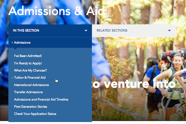
Hidden navigation. Unfortunately, Bucknell hides their main navigation under a vague label, Start Exploring; the local navigation and related content are hidden under equally unenticing labels: In this section and Related Sections. Although hiding navigation can be a reasonable compromise for mobile, it does not work well for desktop: it makes content less discoverable, requires additional interaction cost for the users to view their menu options, and it increases cognitive load because users must recall what will become available if they call up the navigation options.
In our test, users consistently could not find content because they either did not notice the local navigation, or they scanned the drop-down options quickly and missed the key links. Once they hovered the mouse off the menus, they were back to guessing where to go next and how to get there.
-
Reliance on search as primary navigation. With the trend of minimalist and clutter-free design, sometimes it is assumed that users prefer to search above all else. But often that’s not the case. Typically, people use search if they know exactly what they’re looking for, or if they cannot find something through browsing.
After using the site for a while, one prospective student explained,
"I would much prefer to click two or three things rather than having to always go to search and hope desperately that what I need comes up in the results.”
Search should only be the primary navigation for a website if the site’s main function is to be a search engine. For example, Google, Bing, and job search boards can all use this approach. But in the context of an information-heavy site like a university, browsing is essential for increasing discoverability of content.
Unfortunately, Bucknell’s search engine was not even very helpful for those participants that tried it. A parent typed “tution” instead of “tuition” and the search returned zero results. A different user searched for the phrase “Cost of going Bucknell,” and again, received no results related to tuition.
After they finished the activities that we gave them, people told us what they would improve about the site.Everybody complained about the navigation; they all wanted to see more categories. The comments below are just a sample from different users:
- "I think it’s cool, it’s very modern looking. But I really wish that it was like a conventional college site that has at the top Academics, Financial Aid, everything like that. This was much harder to navigate.”
- “They should have more tabs, rather than put everything in here [Start Exploring]”
- "It seems like it’s trying too hard to be different, and different is simply making me confused. It needs to be easier to navigate."
Recommendations:
- Design navigation that is always visible, with a level of depth and breadth that is appropriate for your content. Navigation helps users understand where they can move on the site, so make sure users can see it. In this way, you will increase findability and discoverability, so that visitors can glance at their choices without having to physically act or guess where the content is located.
- Choose clear labels to represent your content. In Bucknell’s case, The Everything Directory should have been labeled to represent exactly what it is: an A–Z Index.
- Search should be able to recognize common keywords, queries, synonyms, and misspellings. Use your analytics data to identify what people search for on your site and make sure your search engine is optimized to help them answer those queries.
Controversy #2: Customization
Our finding: Tools to customize homepage content and view browsing history are underutilized.
In our testing, the 2 customization tools were largely ignored.
-
Most users never commented on or interacted with the Customize the Homepage feature. Of the few users that did, only one user tried to understand the feature (another user clicked a category, but did not see anything happen and quickly moved on to another area). This is consistent with other research that found that users typically don’t use customization tools; they leave the default setting as is. Users don’t like to spend their time figuring out how part of a website works or what the benefit to them is. They very rarely interact with fancy widgets or elaborate tools, because they want to get their information or complete their task as quickly and possible, and be done.
Even though most users did not engage with this feature, the one that did had a very negative experience:
“I find the navigation on the homepage to be cumbersome, and it really didn’t give me a good impression when I first arrived on the site.”

-
None of the users noticed or interacted with the Recently viewed pages tool. This tool is represented by the clock icon in the global navigation. The icon didn’t harm or get in the way of any of the users’ experience, but it didn’t enhance it either. Users likely were not drawn to click the icon, because the image of a clock isn’t familiar on websites, it doesn’t look actionable, and there is no label indicating its purpose.

Recommendation: Before investing in creating fancy tools like these, consider how necessary they are for your users, how likely they are to be utilized, and whether the resources that will be spent on developing the tools would be better spent on improving content. (And design better icons.)
Controversy #3: Glossy visual-design trends
Our finding: Glossy visual design made the site look nice, but they hurt usability.
Users appreciated the aesthetics of the website, but overall, the costs of this design (measured in usability issues encountered) outweighed the benefits.
“It's not user friendly, even though it would appear to be, just by having the friendly faces and happy-looking people.”
-
Minimal content above the fold left users wanting more information, sooner. This low information density wastes the capacity of the human–desktop communication channel. Presented with a background image, one headline, and sparse navigation on the homepage, users commented that they wanted more information up front. As one student put it,
“I feel like they should put more on the starting page, rather than making the page longer.” -
Use of large images slowed down page-load time. Part of our study included a 5-second test where users looked at the website for 5 seconds and then commented on what they remembered. In one case, the main hero image never loaded, so there wasn’t much for the user to see. A different user tried scrolling down the homepage but gave up:
“It’s slow to load because of all the pictures.” -
Horizontal scrolling was rarely utilized. We know that users don’t like horizontal scrolling. Here, users were not forced to scroll sideways to view the content (fortunately), and most users did not click the arrows to view the rest of the content. A parent commented,
"Either the site should move up or down or right or left, but not both. It was a very confusing sense of navigation on the site.”
Recommendations: As with any site going through a redesign and evaluating which trends to adopt or not, it’s important to consider how each trend will impact users. Will it enhance your visitors’ ability to accomplish their goals? Usability testing will help you learn what works and what is causing more trouble than it’s worth.
Conclusion
Bucknell University isn’t alone in its desire to stand out and create a modern look and feel. Many websites in all kinds of industries do this, hoping to stick out among the crowd and impress their users. Moreover, when designing a responsive site that works for multiple devices, it’s easy to ignore the different demands of those individual devices and produce a design that works poorly on some.
Unfortunately, the reality is that too often, resources are spent on making the site look great or creating an innovative widget, and usability is neglected until the very end of development (if it’s even ever looked at). Ideally, you’ll be doing testing throughout the project, be it testing your information architecture, creating and testing wireframes and paper prototypes, and conducting usability tests with real users on all the devices that you’re targeting with your design, all with enough time before the launch so that you can iterate your designs and test them again.
Any budget that has room for an expensive glossy redesign should also have room for usability testing. As demonstrated in this article, a single day of user research easily identifies the worst design flaws. This tiny investment protects you from wasted investments in trendy design that will damage your business goals and lose hundreds of times more than the cost of user testing. Instead of guessing what customers want, find out. Then design for your users, not for glitz.
Learn how to embrace new design trends without hurting your business in the full-day course on Emerging Patterns for Web Design.
Full Report
The full University Websites report with actionable guidelines on how to improve higher education websites is available for download.


