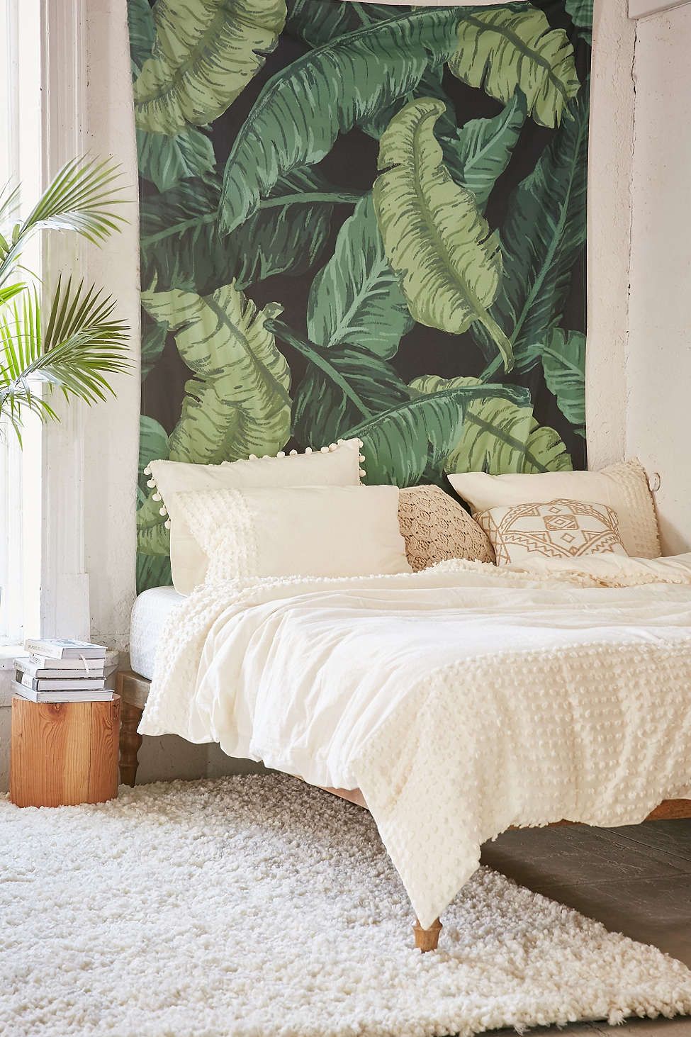
It's hard to see a beloved decor idea go from "under-the-radar" to "overexposed." For us, it was seeing the enthusiastic embrace of fabulous palm leaf prints — the kind that usually line the walls of gorgeous vintage destinations (The Beverly Hills Hotel, The Greenbrier, etc.). At first, it was nice to see the cheery, bold wall covering adding a splash of fun to the parade of all-white or all-gray walls that usually flood the Instagram feeds of the interior-minded. Then, it happened: We started getting weary of seeing that print over and over again. What was once refreshing was starting to feel a little boring, occasionally a little cheap-looking, and, even worse, a "trend." And like any trend, there's a moment when it'll look tired.
And that moment will be 2017.
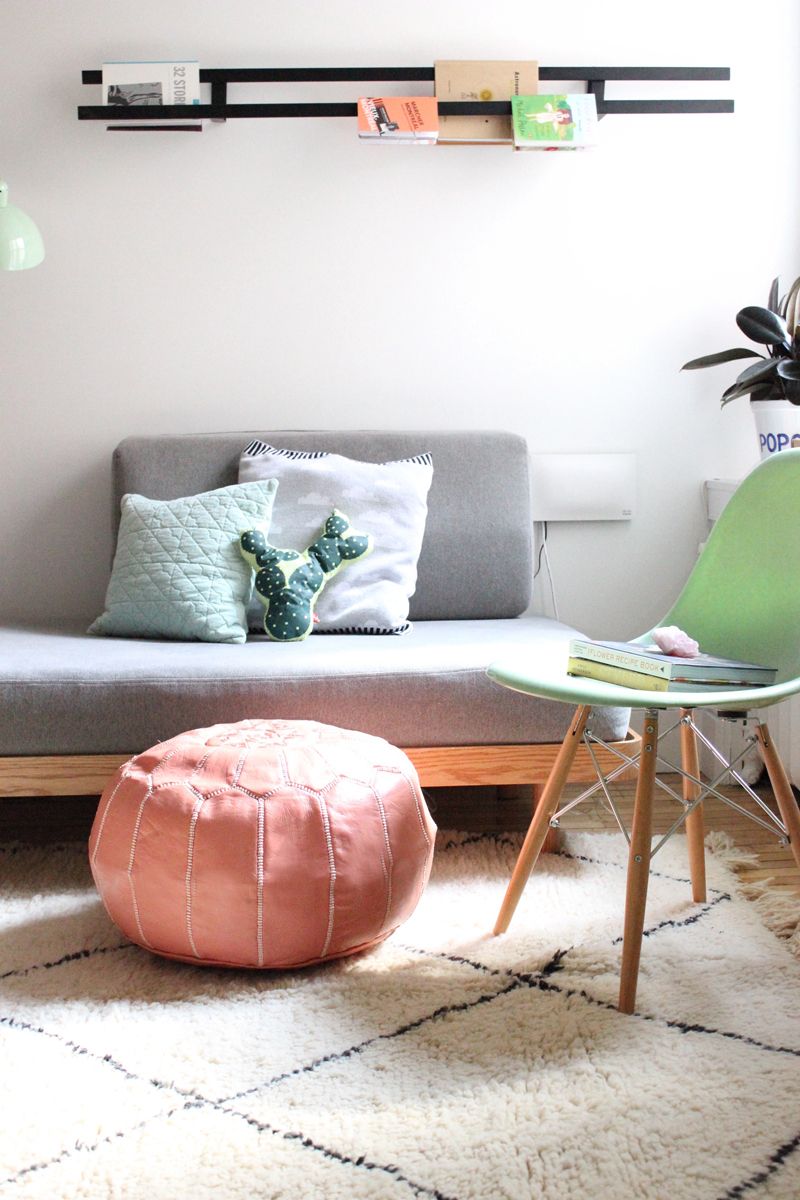
Palm leaf prints (like this tapestry, above) were one of the many looks that suffered such a fate in 2016. There was also a very specific rug that nearly every design blogger and Instagram feed had:
We have so many questions about how this rug (which, for the record, is made by the Beni Ourain tribe) came to be THE rug. Was there a giveaway for all decor bloggers? How could everyone keep this white rug so pristine? And why did everyone suddenly decide to have a diamond print on their floor?
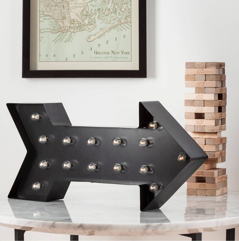
Another trend that went from cute to way, way overdone was marquee letters, decorative signage and punctuation. We didn't think it would be possible to get sick of a common symbol like an arrow, but here we are.
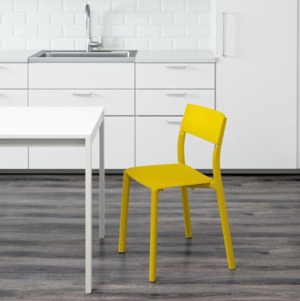
There is also a category of colors that just screams "2016," despite us loving them so much. We're talking about neons (and other super-bright hues). It's not so much that we're tired of brights, it's more how they're used as a surprising pop of color that has quickly become not-so-surprising. Instead, why not just commit to using a bright color in a bigger way, instead of with a single chair? Let's eschew timidity in 2017.
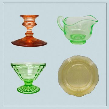
Not all trends were ready-to-buy. There was one DIY technique that became ubiquitous to an almost-maddening level: Chalk painting vintage furniture. We know that not every piece of vintage furniture can be saved, and that paint can bring new life to an old design in a very stylish way. However, we've seen many people take it too far in 2016, covering really good wood pieces (like classic mid-century bureaus, tables and shelves) with thick layers of paint. Accessories aren't safe either. Thrift stores are now chock full of great vintage glasses made a bit useless thanks to a coat of paint in an effort to make them look ... more vintage? We're not sure. Part of us dies a little inside when we see this happen to a good glass.
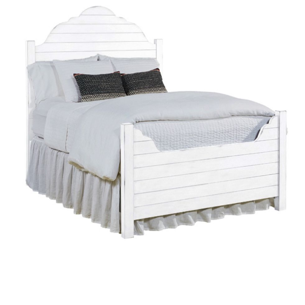
Of course, no list would be complete without the innocent wall covering that became a catchphrase for Joanna Gaines, and then a Pinterest-fueled fever dream of a thousand bloggers. And then, somehow, a bed. That would be: Shiplap.
You know how that whole "put a bird on it" design trend really feels so dated? That's what shiplap will be. You'll just say the word and you'll think of 2016, and how you tried to turn your apartment into a farmhouse.
