
An intranet implemented with the responsive design technique enables employees to access all intranet content on any mobile device or computer. A responsive-design intranet (or public-facing website) has only one codebase but typically has different user experiences for desktop and smaller-screen mobile displays, perhaps a third UX for tablets, and possibly even more user experiences for other devices and screen sizes. Since designers are able to choose how and where the content and features should appear on each device, a responsive intranet can create the best possible UX for employees no matter which device they are using.
This responsive-design approach means that intranet designers should:
- research the relative importance of particular features and content to users and the organization
- present and position that content to reflect the determined priorities.
- Advice from Great Designers
- Determine How Your Employees Will Benefit from Accessing Your Intranet on Mobile Devices
- Represent Your Organization’s Goals and Culture on the Intranet Homepage, for Mobile and Desktop
- Learn About Your Employees’ Tasks and Device Usage
- Place Key Applications and Features in the Global Navigation Where They Can be Quickly Accessed
- Don’t Downgrade the Design for One Device Just to Achieve Consistency Between Devices
- Boldly Arrange Content Based on the Device
- Conclusion
Advice from Great Designers
I revisited content prioritization choices with members of two of our winning intranet design teams from our Intranet Design Annual 2014—Abt Associates and triptic. The intranets for these organizations are very different: The first supports thousands of users from around the world, while the second supports about 20 employees all located in one office. What they do have in common is they are both excellent examples of using responsive design on intranets.
This article discusses some of choices that these teams made when prioritizing features and content for different devices for their responsive-design intranets. A few guidelines surfaced; they will help you prioritize your own content in a responsive-intranet design.
Determine How Your Employees Will Benefit from Accessing Your Intranet on Mobile Devices
Abt Associates is a global research firm with its headquarters in Cambridge, MA, but employees are stationed all around the world with many in the field. Before Abt switched to a responsive-design intranet (named "AGI", which stands for "Abt Global Intranet,") more than half of the company’s employees (working in developing countries without reliable internet access) could not access the intranet. The organization resolved to redesign it to enable global collaboration for staff everywhere. And since deploying their responsive-design intranet, the Abt Associates intranet team recommends responsive design to other organizations that have staff around the world. They also recommend that rendering on mobile devices be a “first thought” not an “after thought.”
Represent Your Organization’s Goals and Culture on the Intranet Homepage, for Mobile and Desktop
The homepage is a high-priority page on the majority of intranets because:
-
Most employees are exposed to it when they launch their browser.
-
It provides content important to everyone.
-
It acts as a gateway to the rest of the resources on the intranet.
-
It can also direct employees to content that embodies the organization’s goals and culture.
Abt Associates’ cultural values include the ideas of learning and that all employees around the world are important to the organization. The team wanted AGI to become a regular part of work life at Abt, not just a standalone resource, so the homepage had to offer staff the kind of content and functionality that would change how they work. Toward that goal, designers carefully prioritized and allocated space on the homepage to accommodate the categories of information sharing and learning, tools, and corporate information.
On the mobile homepage, designers highlighted the Today I Learned section in which employees share their insights, innovations, and success stories with fellow staff around the globe. Designers made this priority content when viewed on mobile by doing the following:
- positioning it on the first screen (“above the fold”)
- displaying all content in the section by default without any scrolling
- allocating it a large proportion of the homepage.
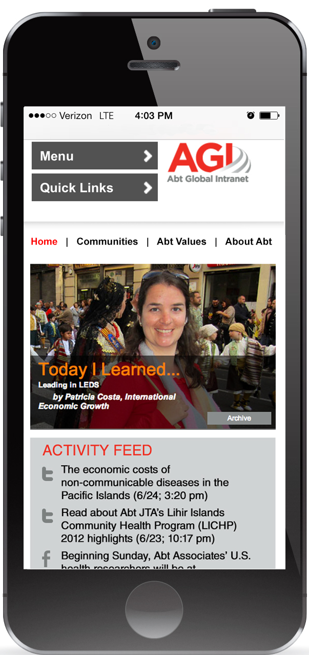
The entire Today I Learned section appears on mobile above the fold without any scrolling necessary.
Immediately below the Today I Learned section, designers placed the Activity Feed section. This placement also supports the One Global Abt learning culture on the homepage. The content in the Activity Feed is personalized for the logged-in employee and is based on his particular role and location. The section encompasses a customized news feed of Abt social-media posts and activities on the intranet, activities by staff across AGI, and activities in the AGI Workspaces (where experts can share methods and create instant discussions) that the user is a member of.
As important as it is for employees to share information and learn directly from each other, company messaging and news are equally key. Designers positioned the News section below the Activity Feed. This visible news section also reinforces Abt’s learning and information sharing culture.
A curated feed of need-to-know events—such as conferences and happenings—are sorted by date and link to a larger list. High-level events are featured in the Abt Events area below the News section.
Next appears the CEO Corner section where the President and CEO, Kathleen Flanagan, shares her personal perspectives about business, innovation and culture with staff. Stories in this section link to Flanagan’s blog and other pages.
Learn About Your Employees’ Tasks and Device Usage
Intranet designers at Abt Associates prioritized the mobile homepage to reflect the common needs of their diverse users. Designers noted that taking the time to develop a thorough understanding of their users paid off throughout the project, and their prioritization of information in the mobile display was greatly helped by this understanding.

The AGI homepage in the mobile view is a one-stop shop of productivity, learning, and information about the company. With a little scrolling, employees can access what they need, learn from each other, understand what activities are taking place, get the latest company news, and benefit from guidance and perspective as provided by the CEO.
Comparing the homepage wireframes for phone and desktop shows that more is visible above the fold on desktop, but that the key features mentioned above are in prominent, visible positions when accessed on either device.

The wireframe of the homepage on a phone demonstrates the team’s knack for prioritizing content.

The wireframe of the homepage on desktop demonstrates good use of the ample screen real estate.
Place Key Applications and Features in the Global Navigation Where They Can be Quickly Accessed
Abt Associates practiced a “mobile-first” mentality, with the specific goal of servicing staff stationed around the world that access AGI via mobile devices. The mobile presentation of AGI is optimized and selective to allow for a faster page load on devices. Although the mobile implementation is lighter, employees can still access everything they want via the homepage and menus.
The AGI menus make it easy for staff to conduct business transactions anytime, anywhere. For example, two menus Menu and Quick Links appear at the very top of the mobile homepage; Menu takes users to key sections of the site, including News, Projects, Proposals, and Tools & Resources; while Quick Links lead to timesheets, the staff directory, forms, and search. Enabling staff to easily and quickly execute employee searches or transactions like timesheets from any device is a significant business benefit provided by the mobile AGI.
Both menus needed to be easily accessible to allow staff the flexibility to get to where they need to go across the site, immediately.
Don’t Downgrade the Design for One Device Just to Achieve Consistency Between Devices
The topic of designing menus for a responsive intranet is a good time to segue into an example from another winning organization: triptic, a tech-savvy agency for online communications from Eindhoven, The Netherlands. The triptic intranet designers wanted to ensure that employees could communicate and retrieve information on its intranet (named "Iris") from anywhere, anytime.
Triptic’s responsive intranet displays its mobile navigation in a drop-down menu, accessible via a “hamburger” icon (an icon depicting three horizontal lines.) The menu is always available but takes little space on the small viewport on smartphones. A red rectangle overlaying the menu icon displays the employee’s number of notifications (updates, reactions, posts, and mentions;) because of this helpful status display, users can get information without clicking at all.
The drop-down menu content is divided into sections organized by topic. These topics are distinguished with icons and a darker grey background.

The menu is collapsed in a “hamburger” icon, so takes up little space on the phone.
Desktops afford much more horizontal space than mobile phones, so the desktop menu is not collapsed under one icon. Rather, the topics are spread horizontally in a global-navigation bar. This flatter hierarchy displays more menu choices by default, which is why we recommend reserving a hamburger-style menu icon for mobile versions and retaining full global navigation in the desktop version of a responsive design.
Rather than offering the same menu on both phones and desktops, designers at triptic exploited the available space on desktop to depict a flatter menu hierarchy that displays more options by default than the mobile device affords.
Boldly Arrange Content Based on the Device
Not only does the triptic intranet use device-appropriate navigation patterns, but it also adjusts content to accommodate the different devices. An example is how triptic employees communicate their Agile process information for their clients’ design projects. Designers determined that when using a scrum burndown chart, mobile users are mostly looking for an update at a glance. As a result, Iris offers a very modest chart. The minimalism not only makes it easy to distinguish the chart’s content on a small view port, but the “lightness” (less detail) means there is less data to serve so it downloads faster for employees.
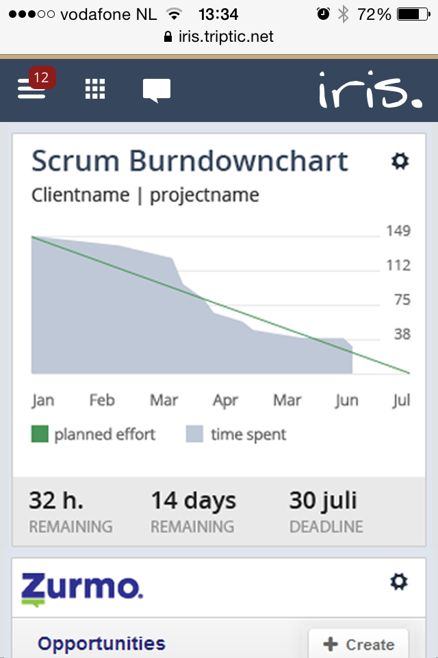
Minimal information displays on mobile so users can get a quick update at a glance, in this example, of the scrum burndown chart for a client project.
On a tablet, employees can view a more detailed version of the chart, which includes categorizations of the hours. Menus are also expanded on tablet, and available on the right side of pages. (In general, usability is enhanced by using a third design for tablets because this platform is different than mobile phones and desktop computers.)
Viewing on a tablet displays the chart, a project menu above it (circled in red in this image,) and navigation on the top and right.
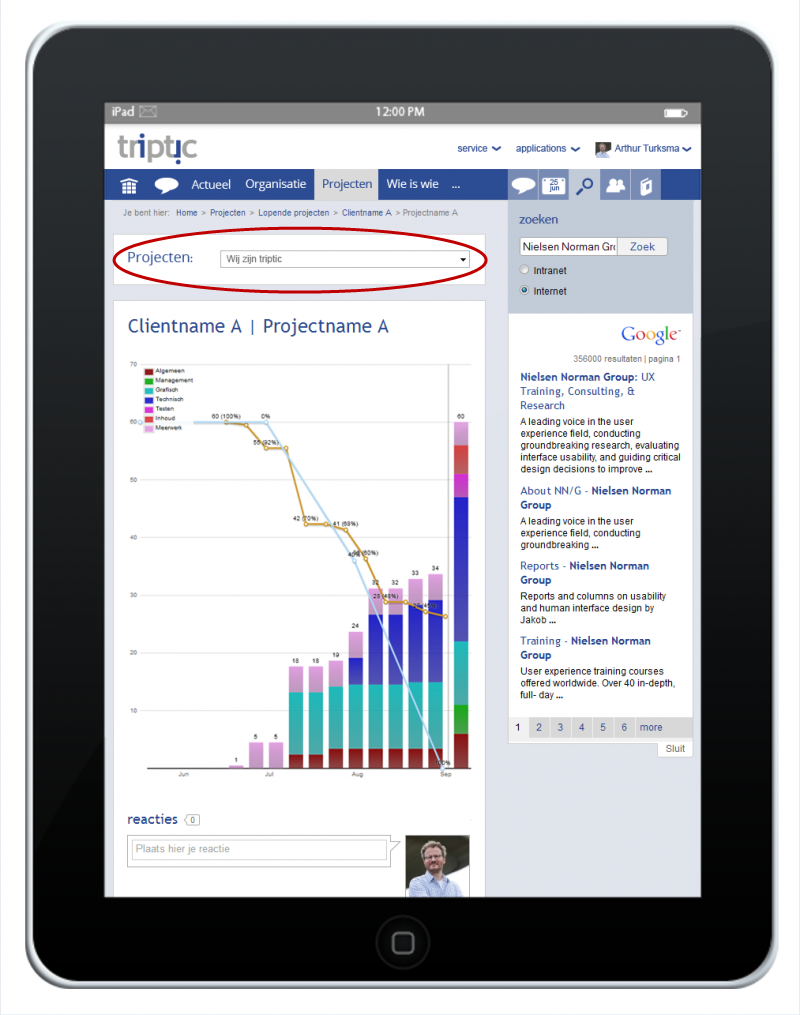
The chart view on desktop is similar to the tablet one, except that the project-selection menu is expanded and visible as a list in the left rail, as opposed to a collapsed drop-down list above the chart.
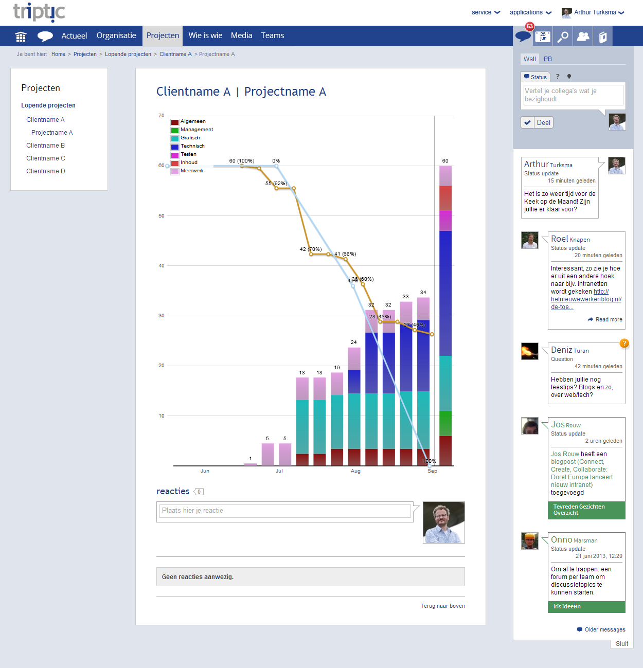
The desktop view displays the chart, project links on the left, and navigation on the top and right.
Another example of prioritizing content and features differently for different devices appears with the personal profile page. The information that employees see on mobile is: the person’s name, telephone number, job title, and availability.

Designers chose to skip displaying additional background information about a person in the mobile view. Instead, this design version simply directs attention to the details that most employees are looking for in the moment: whether the person is available, and what his phone number is.
On the desktop employees also get basic contact information plus they can glean a better sense of their colleagues via features like their photo, a large quote, introductory text, and social updates.
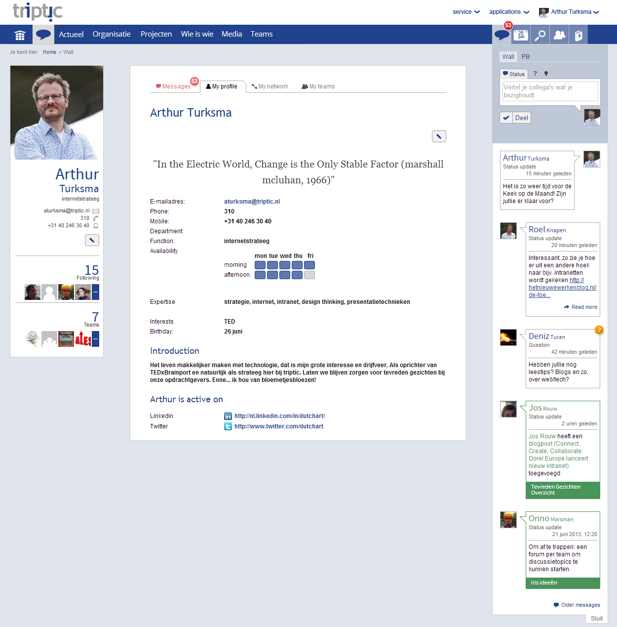
The desktop version of the profile page gives basic information plus a better sense of the individual by using the additional screen space for background information.
Conclusion
Intranets don’t have to lag behind in the responsive-design arena. Take cues from great responsive intranets like those at triptic and Abt Associates, and follow these guidelines:
- Determine how your employees will benefit from accessing your intranet on mobile devices.
- Represent your organization’s goals and culture on the intranet homepage, in both mobile and desktop versions.
- Learn about your employees’ tasks and device usage and use this information to prioritize features.
- Place key applications and features in the global navigation where they can be quickly accessed.
- Don’t downgrade the design for one device just to achieve uniformity between devices. (While cross-device consistency is important, this doesn’t mean that the user experience should be identical everywhere.)
- Boldly arrange content based on the device.
Longer case studies about these impressive responsive design intranets are in our 2014 Intranet Design Annual.
For more information about the UX decisions for responsive design attend our Scaling User Interfaces full-day training course.
Acknowledgements
I would like to extend my sincere gratitude to Arthur Turksma, Jos Rouw, and Willem van Berlo at triptic; Rob Grimmett and Mary Maguire at Abt Associates; and Glen Chambers at BrightStarr for sharing their insights and additional examples of their winning intranets for this article.


