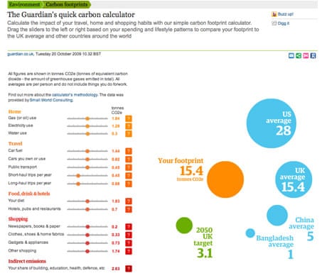
We want to help our users understand the carbon impact of their lifestyle, and suggest how they can live more sustainably. Our new carbon calculator is the first in a series of tools we're producing to illustrate the issues around carbon emissions and climate change.
I'm a product manager at guardian.co.uk and I work with the environment editorial team to use technology to support our journalism. I've been working with Duncan Clark, one of our editorial consultants, and the team at Guardian Professional's Digital Agency to develop a Flash-based tool which aims to show your carbon footprint, based upon typical figures for the average UK citizen. Carbon stats were provided by Small World Consulting.
Duncan has written about the data and methodology, but I wanted to give a bit insight into how we built the tool itself.
Our starting point was a spreadsheet with the breakdown of the average UK citizen's carbon footprint into home, travel, food and drink, shopping and indirect emissions. This aimed to cover all of the activities that we do in our personal lives, including things like your use of public services, which often aren't covered in carbon footprint calculations.
We then split each of these out into categories, and broke them down into a range of responses. This was quite difficult - is it realistic that someone might use absolutely no electricity? We decided that for nearly everyone there is some electricity use. How high should the ranges go? What about people who eat out for every meal, every day? They would go off the scale. Again, we felt that this was a minority of people.
For indirect emissions, we considered making this a range based upon whether you used a lot of public services a lot, but ultimately we decided to make everyone use the average UK figure. This is because it's very hard to know how you compare to the average and there's not much you can do to change it.
While we argued over the data and the labelling, we were working with designers and flash developers to come up with the tool itself. We knew we wanted to allow you to compare your footprint against the UK average and other people around the world. We also wanted to give you a long term goal for cutting your footprint. We went for a goal of 3.1 tonnes CO2e by 2050 in line with the UK government's statement to cut emissions by 80% by that time. We showed these as colour-coded bubbles.
The sliders for the categories were more difficult. There was a lot to fit into a small space, and some quite contentious topics! Our compromise for space was to put information about the scale as tooltips on your mouse pointer when you drag a slider, and to put the in-depth information in help bubbles to the side of each slider.
The great thing about how the developers built the tool was that all of the text and data was held in XML, rather than being baked into the Flash file itself. That meant we were able to change the labels, the help text, the values, etc. We did some user testing with an early version and were given a lot of suggestions for improvement, which we were able to implement very easily. So, if you have any suggestions, leave a comment and I'll see what I can do!
I hope we've inspired you to try to reduce your footprint. Environmentguardian.co.uk has advice and guidance on how to reduce your footprint, plus the latest news and features on climate change, greener living and all the hot environmental topics of the day.


Comments (…)
Sign in or create your Guardian account to join the discussion