The man who wants to fix Comic Sans
It’s a punchline and an unsightly relic. Why did one man decide he could redeem Comic Sans?
Share
In the world of typography, there are few fonts more maligned than Comic Sans. It’s a typeface that looks like no other; it was initially designed by Microsoft employee Vincent Connare in 1994 for a cartoon dog’s speech bubbles as part of a small program aimed at teaching children how to use computers. Good intentions, but horrible luck: a product manager took that font and added it as a standard typeface in Microsoft Windows, and it’s been hated viciously ever since (making that his legacy, rather than his other creations, Trebuchet and Magpie).
Today, with clean lines and minimalism increasingly the norm, Comic Sans is an ugly artifact of a time when dial-up screeched and hissed and Netscape was king. It has become an easy punchline (even the stone-faced no-nonsense scientists at CERN, creators of the large hadron collider, joked on April Fool’s Day that they would write memos in Comic Sans) inspired cutting satire (this piece by McSweeney’s remains one of its most popular reads) and has even found itself the target of an eradication campaign. (“By banding together to eradicate this font from the face of the earth we strive to ensure that future generations will be liberated from this epidemic and never suffer this scourge that is the plague of our time,” says the Ban Comic Sans campaign.)
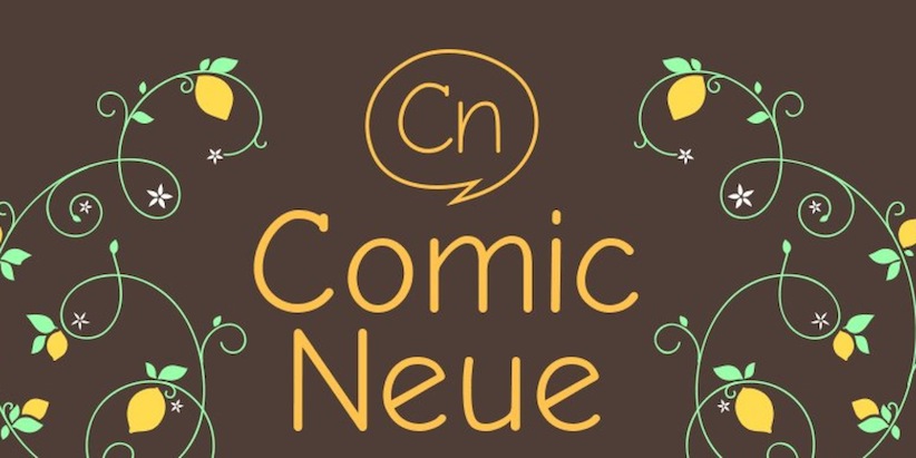
But none of that stopped Australian-born graphic designer Craig Rozynski from deciding to rescue the irredeemable font, creating Comic Neue, described as a more sophisticated fix to Comic Sans–a decision so daring that it found itself trending on Twitter this week.
We spoke to the 35-year-old Rozynski in Kobe, Japan, where he’s been living with his wife since 2010.
How familiar were you with Comic Sans’s horrible reputation?
That was how the idea came about. It was an opportunity, I guess. I think most graphic designers toy with the idea of creating a typeface in their career, but it’s not something you take on lightly because it’s a hell of a lot of work. I thought, I’ll spend a month or two on it, and maybe get a retweet at two out of it. But I just started taking it more seriously the more I worked on it, and three years later, it turned into this (laughing).
What kind of work goes into creating a font?
It’s a lot of detailed, monotonous work. Comic Neue doesn’t support a lot of European languages at the moment, it doesn’t have the extra characters to do that. Comic Neue has about 100 characters. But Helvetica has 300 or 400 characters. And then there’s different types—bold, italics. So you can imagine the thousands of thousands of individual characters that teams of people have to work on. So I don’t think I’ll be redesigning Papyrus any time soon. (Laughs.)
What is it about Comic Sans MS that strikes a nerve?
One of the most surprising things over this week has been that 99 per cent of the feedback has been totally positive, especially on the Internet, where you don’t really expect that. There’s just some anomaly with Comic Sans, isn’t there? It’s part of the pop culture vernacular, and it has been for the last 20 years. There’s just a little bit of a magic there that makes it something we talk about. It’s the font that people love to hate. That’s why I set out to save it.
What were the specific problems with Comic Sans that you sought to fix?
When you’re critiquing anything, you can be subjective or objective about it. So subjectively, personally, I don’t like Comic Sans because it just doesn’t suit my style. But objectively, with Comic Sans, there are actually just some fundamentally bad things about it. Things look squashed. It just wasn’t well done. And I think Vincent Connare himself (the creator of Comic Sans) has said that he drew it up quickly, for a certain purpose at Windows, for speech bubbles for a throwaway little application that was going to be part of Windows 3.1. I think all designers can relate to that when you look back at the work you made at the beginning of your careers. You cringe, because it’s terrible in comparison, but you’re glad no one can see that. Whereas in the case of poor Vincent Connare, his little throwaway creation is still being paraded about 20 years later and you’ve got to feel for the guy, really.
Did you reach out to Vincent Connare after you released the font?
I sent a link to Vincent on Twitter and I said, “could you look at it, could give me any feedback, whether it’s good or bad,” and he said, “it should be more casual.” The criticism has come full-circle now; he’s returning the criticism to me.
Were you worried you’d offend Connare when you reached out?
It certainly wasn’t the intention, and I’ve noticed on Twitter–I mean, he probably gets it all the time–but I might’ve fanned the flames there, and I got a few more @ replies in negative tone. I have no animosity toward Vincent, I certainly sympathize with him. I can’t speak for Vincent, but he seems to take in stride. I would’ve actually been happier if he had been more harsh toward Comic Neue because it would look good on the website, you know? (Laughs.)
It’s shite “@HuffPostTech: Someone created a slightly less horrible version of Comic Sans (http://t.co/1jkPe4UGVC) pic.twitter.com/bRp7eaVkj1”
— Vincent Connare (@VincentConnare) April 7, 2014
And now that you’ve got a Comic Sans-inspired font out, you open yourself up to similar criticism, don’t you?
The main criticism has been from actual type designers. I’m not a type designer. I’m a graphic designer, and it’s a very different and specialized game. I’ve gotten some really nice feedback that as it stands in its free version it’s perfectly fine, but right now I’d like to be picked up by a type foundry or an online library like Adobe TypeKit, so that people can easily add the font to their websites or projects. I’m considering crowd-funding it, perhaps over the next week something will go up on Kickstarter. But there’s been 400,000 unique hits on the website over the last week, so this could take the font to something a bit more serious. The overwhelming feedback from non-type designers has been, “we want this.” The French have been tweeting at me, “we want European characters,” the Greeks and the Spanish have been doing the same, people around the world are saying, “please, please, please include the fonts so we can use it in our language.” It’s bizarre, really.
Are you worried you yourself will cringe at your old work?
I’m sure I will. In fact, to tell the truth, I cringe at it already, because it’s fine as a free font, but most graphic designers are perfectionists by nature, and I look at it now thinking that it could’ve been better. That said, I would’ve been working on it for another three years, so sometimes it’s better to let it go.
As long as it’s not a millstone around your neck for the rest of your career, right?
That’s exactly right. And to tell the truth, this probably will be the thing I’m known for. Will I ever be able to match this? I don’t really think so. But hopefully I’m known for a few more.
This interview has been condensed and edited.