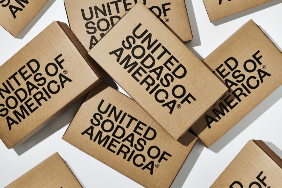
Center Design looks to 'completely reinvent' soft drinks with minimalist United Soda branding
Center Design has created a bold, dynamic look for drinks brand United Sodas which aims to "completely reinvent soda into a high-quality, fun, better-for-you beverage with modern flavours delivered right to your door".
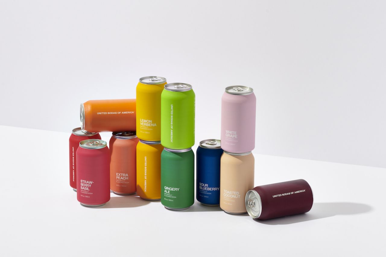
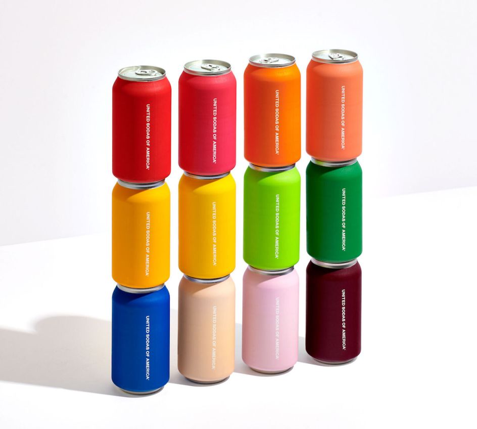
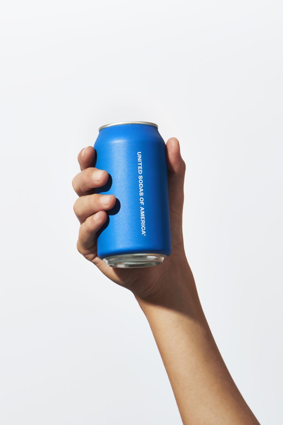
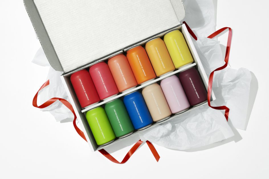
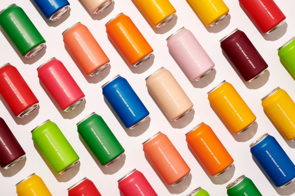
The product development was led by the colour palettes, according to Center Design, which selected a range of single colours for cans to differentiate the flavour variants. The cans use a matte finish and bold typography set in Klim Foundry font, Founders Grotesk.
"United Sodas are enjoyed by a range of Americans including families, millennials, design-obsessed creatives, sober curious, mixologists, and more," says the brand, which adds that it "prides itself on the presentation as much as it does on the taste."
Led by CEO Marisa Zupan, the founding team behind the brand come from an advertising and e-commerce background. Inspired by design-led companies such as Apple, the United Sodas designs were informed by leanings from sectors inkling beauty and fashion, and seemingly unrelated products such as razors and meal-kits.
"The overall aesthetic goals were to be the exact opposite of the shiny, uninspired, bold graphics seen on the majority of soda brands," says United Sodas. The website uses what the team term "soda scapes" to further show off the design of the cans and "enable users to listen to a variety of vibes throughout the day."
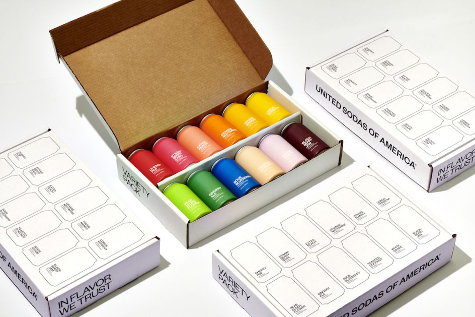
Center Design founder Alex Center has previously worked on big-name beverage brands including VitaminWater, SmartWater and Powerade. United Sodas first launched in the US in mid-2020 and comprises a range of 12 flavours including Strawberry Basil, Extra Peach, Toasted Coconut, all of which use only organic sweeteners, all-natural ingredients and contain 30 calories.
Editor's Picks


Trending


](https://www.creativeboom.com/upload/articles/86/862919952c0ad18439004228895a431dc6e45ffc_732.jpg)
Podcasts


Editor's Picks
Further Reading