

Traditionally, global navigation appears on every page of a website, and serves 2 functions:
- Allows users to switch between top-level categories easily, no matter their current location
- Ensures that even users who don't enter through the homepage can quickly get a sense of what is available on the website
Recently, some websites have begun putting global navigation categories in a drop-down menu. For example, WHSmith, a large British retailer, lists its product categories in a Shop by Department drop-down menu instead of a visible navigation bar.

Using a drop-down menu for the global navigation definitely makes the header easier to design — no need to worry about how to fit all those links in a single row. But at what cost? This approach creates an extra step that users must take before they can accomplish main functions of the global navigation.
It’s easier to understand why some designers would adopt this radical departure from the standard global navigation if you consider two other recent trends: mega-menus and mobile-optimized navigation.
Drop-Down Mega-Menus Expose Deep Content to Desktop Users
Many large websites began using mega-menus within the past 5 years. Mega-menus are large drop-down menus that include several levels of links to help users preview lower-level content in context. In many cases, they replaced the awkward cascading menus, known to challenge users’ fine-motor skills. For the most part, well-organized mega-menus with clear section headings are quite helpful for both users and designers: users can quickly browse a large number of links, and designers can more easily accommodate content changes. (Since drop-down menus can be resized without affecting the underlying page design, organizations have much more flexibility to rearrange their classifications without overhauling the entire website.)
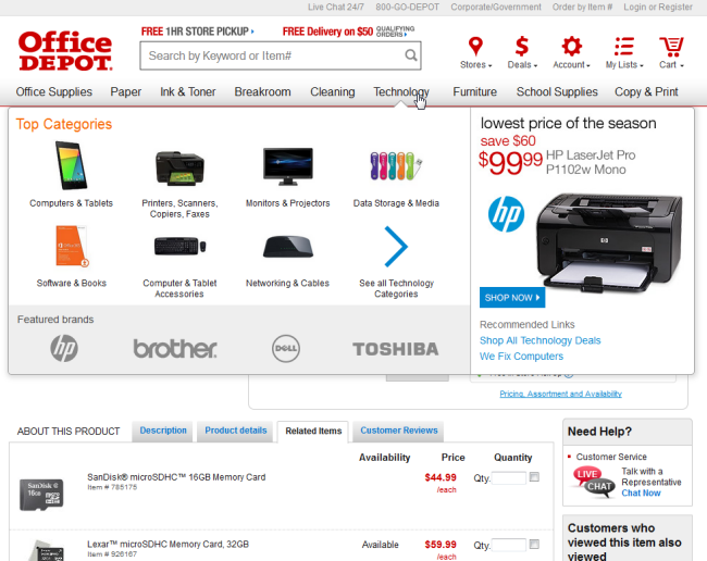
For example, users may arrive at this page about a tablet computer on the Office Depot website after clicking on a Google search result or on an ad. They may never visit the homepage at all, but can easily see from the global navigation that this company also sells paper, furniture, and school supplies.
Mobile-Optimized Navigation Conserves Screen Space
Mega-menus are now common on desktop designs, but designing for mobile users has also become increasingly important, as this traffic segment continues to grow. Mobile displays introduce major design constraints, because it’s often simply impossible to display all the top-level categories in a horizontal bar; also, large mega-menus are very frustrating for users on small touch screens. To avoid these problems, many designers use responsive design techniques to minimize the global navigation when a site is accessed from a mobile device, showing only a button that launches the global navigation menu.
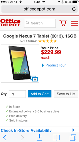
For example, Office Depot mobile site reserves the majority of the page for product-specific content, and shows only a small icon to launch the global navigation. Although design standards for mobile icons are still evolving, experienced mobile users now recognize the hamburger icon as a way to launch a menu.
Mobile Design Impacts Desktop Design
Independently, these 2 design trends make perfect sense and perform very well in their original contexts of use: mega-menus for desktop users, and minimized global navigation for mobile users.
But recently some sites — particularly ecommerce retailers, and even some intranet designers — have combined these 2 trends into a new and potentially risky navigation design. This new approach displays the primary categories of site content in a drop-down menu instead of a visible navigation bar.
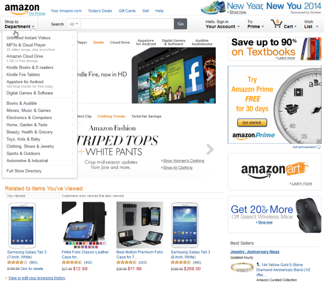
Amazon was one of the first sites to try this technique: after years of continually adjusting their global navigation to accommodate an ever-increasing range of products, they finally put the entire product list in a massive drop-down menu. The global navigation bar, which used to list major product categories, now only includes a link to the drop-down menu.
Amazon is well-known for testing new designs to ensure that they don't negatively impact sales, but just because this model works for Amazon doesn't mean it will work for other sites. Few organizations have the overwhelming brand penetration that Amazon enjoys, and even brands that are household names can't necessarily assume that their entire audience is familiar with the full scope of their offerings. In the case of Amazon, it's simple — they sell pretty much everything (which is why they have such a hard time fitting all their product categories into a navigation bar). But most organizations have a smaller range of offerings and a greater need to inform visitors about the scope of their content.
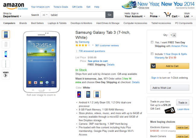
Another factor that makes this approach workable for Amazon is that they have many other navigation elements that help users discover content. For example, immediately below the global drop-down, product description pages include a horizontal navigation menu, which lists related categories within the current department.
For sites that have only a small number of global categories, hiding them in a drop-down menu doesn’t make sense. T-Mobile, for example, has placed all of their service offerings and devices within a drop-down menu labeled Shop. But the Shop menu has only 5 links, which could easily fit in a horizontal navigation bar. Because these categories aren’t listed in the global navigation, users on lower-level pages of the site may have a hard time figuring out where to look for service plans.

On the WHSmith website, fitting all 12 product categories in a global navigation menu would be difficult, but pushing them all down into a drop-down menu is not the answer. For most sites, explaining the brand offerings is simply too important to be relegated to a secondary menu; even if visitors have a general idea that this company sells books, many could be unaware of the fact that they also sell electronics and toys.
The true cost of hiding global navigation categories becomes apparent when we look at lower-level pages such as product description pages. Quite often users arrive directly at these lower-level pages, rather than coming in through the homepage. The exact page content may not be quite what the user had in mind, but a navigation bar can give users an attractive starting point to browse the hierarchy and discover what else is available. When that hierarchy is hidden, it suddenly feels like it's going to be a lot more work to navigate this site.

Is It Safe to Hide Your Global Navigation?
The temptation to put navigation menus into a drop-down is understandable: it allows much more flexibility to adjust categories in the future, and also means you don't have to clutter up your design with a menu bar. Plus, it’s an easy solution if you want to use the same design across multiple devices. But even if the global navigation is difficult to design and hard to maintain, most sites will still be better off showing top-level categories to users right away. It's simply one of the most effective ways of helping users quickly understand what the site is about.
Of course, there are exceptions to every rule. In rare cases the advantages of more flexibility to adjust the global navigation may outweigh the risks of alienating users. This is more likely to be true for organizations that have less need to help visitors get oriented, because
- The audience consists mostly of logged in users or frequent users
- Visitors rely almost exclusively rely on search or related links to get around the site
To determine if demoting the global navigation is safe for the desktop view of your site, we recommend collecting and analyzing analytics data to better inform your understanding of how users interact with your global navigation. Use an approach like the one we recommend for integrating site analytics with user experience.
1) Click tracking
You can use a click-tracking tool (e.g., CrazyEgg, Clicktale or even In-page Analytics via Google Analytics) to measure how many clicks occur on the global navigation from key points in your site such as the homepage, landing pages, destination pages. (Depending on the purpose of your site, a destination page could be a page containing a product description, a service description, an article, and so on.)
It’s important to measure global navigation clicks on destination pages for those users who enter the site on these pages (that is, they deep-link into your site). Users who deep-link into your site do not have the benefit of context presented via your homepage, so these users need assistance to understand the site scope. The risk is that if they don’t understand what else you offer, they could just bounce off the site.
2) Session Observation
Using a tool like Clicktale, observe recorded sessions to see how real visitors navigate. Do they use the global navigation? Or do they rely heavily on local navigation, related links, or other navigation components?
Does Your Hidden Global Navigation Negatively Impact Results?
If your global navigation has already been minimized, there is some data you can look at to determine whether it is problematic:
1) Bounce rate on destination pages
Compare before and after bounce rates for destination pages to determine if the lack of the global navigation is making people less likely to stick around and browse the site.
2) Click tracking
Click rate on the new menu link: How many users actually click on the new menu link or icon and, thereby, expose the tier-1 sections of the site? A low click rate on the menu could indicate a problem, but only when also accompanied by high overall bounce rate across the site (see above), indicating that people are not browsing beyond the pages they enter and exit on. This is a clue that the lack of exposed global navigation could be decreasing discoverability.
3) Order size (for ecommerce sites)
Does a minimized global navigation reduce the average order size? For ecommerce sites, this is critical information. If the lack of awareness of other product offerings results in smaller order sizes, then a hidden global navigation could be disastrous.
4) Qualitative feedback
Using a survey feedback tool (e.g., Usabilla Live, Qualaroo) placed on destination pages, determine if people specifically complain about a lack of choice. Complaints that there are few options within a category or that there is too little content about a particular topic may indicate that content findability has been compromised.
Conclusion
As with any popular web-design trend, it’s important to determine if a minimized global navigation is appropriate for your site, given your users, their usage patterns, and your goals. Mimicking mobile design on the desktop is not appropriate for all sites. Approaching this design pattern with specific goals and performance measures in mind can help you determine if it actually offers benefits for both users and your organization.


