3 Tips for Creating Effective Calls to Action
 Businesses spend a significant amount of money getting people to their websites. After all, customers can’t learn more about products or make a purchase if they can’t find the site! However, once they reach the website, the real challenge begins.
When you try to sell something to a customer, you are trying to convince them that they need your offer. This is where a call to action (CTA) comes in. With a call to action, you can tell the visitor what you want them to do in the form of text or a button (click here, call now, download) as well as what they get out of it (find out more, get a consultation, get a free trial). The more information, the better.
If you’re looking to improve your website’s conversions, keep these 3 points in mind to help make the most of your CTAs.
- Make the Important Elements Pop
When a visitor loads the webpage for the first time, their eye will instantly be drawn to something. Is it the header, the logo, or maybe a call to action?
One of the best ways to direct visitors to a call to action is to make it clearly visible and stand out on the page. To make your CTA the focal point of the page, do the following:
Keep It Above the Fold:
When you load a webpage and don’t scroll down, you are seeing above the fold of the page. This is the most viewed part of any page, and some visitors won’t even go below the fold if you don’t convince them to.
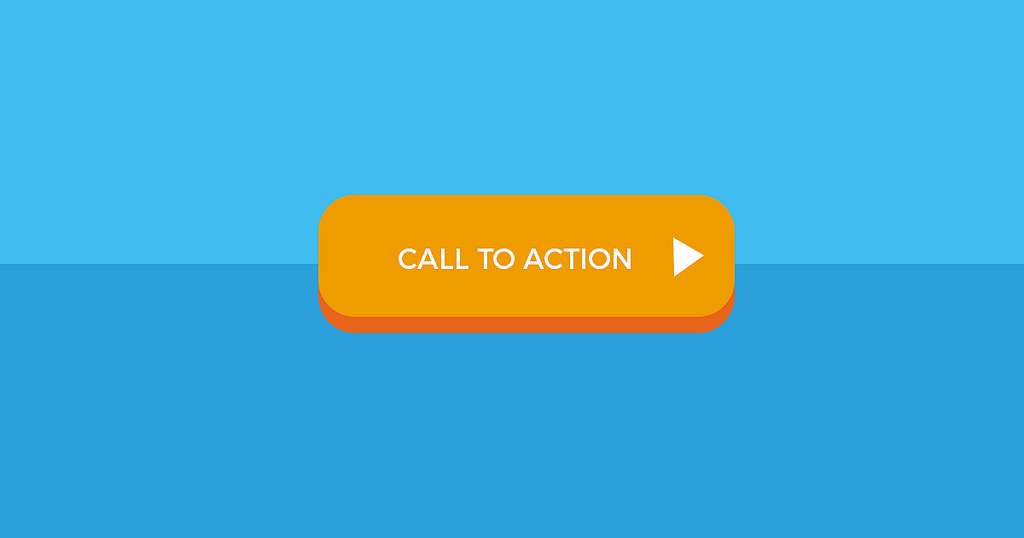
Use Eye Catching-Colors:
Calls to action are the most important part of a page because they convert the visitor to a customer or user. If your website is all gray, black, and white, consider using an orange button for the CTA so that is sticks out on the page and draws the eye.
Use a Clean Website Design:
A solid reminder for creating webpages is that every image or design element added to a page makes the others mean less. This is especially true for CTAs, as if you have tons of buttons, colored text, and images scattered throughout the page it’ll make it impossible to direct the visitor to the important parts of your site. Proper spacing and simple layouts can help to emphasize a CTA and make it more effective.
- Instill Urgency
With millions of sites available within a few seconds, convincing a visitor to click the CTA before moving on can be difficult. A great way to lower the chances of a customer leaving and coming back later is setting time limits or “limited offers”, creating a fear of missing out. If the offer isn’t available later, they can’t afford not to click it now!
- Make It Simple, Easy, and Safe
Although the action you are convincing the visitor to complete is likely not dangerous or complicated, you are still asking them to invest time, money, or effort into your offer. An effective CTA will minimize the perceived investment by using terms like “fast”, “free”, “confidential”, “secure”, and more. This way they feel like they have little to nothing to lose by clicking.
Without effective CTAs and other customer-converting elements on your site, you risk an elevated bounce rate, wasted advertising money, and lower profits. However, by implementing solid and effective CTAs, you can be sure that if you are able to get a visitor to your site, there is a good chance they’ll be converted!