
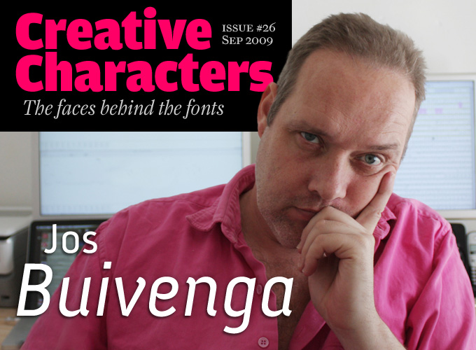
The way Dutchman Jos Buivenga rose to prominence on the type scene is quite remarkable. For years, his online friends and fans could follow the development of his typefaces via his website, and download the results at no cost. When his one-man foundry exljbris began selling his first commercial typeface Museo through MyFonts last year, several weights were offered for free. The generosity paid off: Museo became a meteoric bestseller. Eighteen months, five typefaces and one bankrupt employer later, he finds himself a full time type designer — and doing very well, thank you. Meet Jos Buivenga, going with the flow on the river of life.
Jos, you joined MyFonts in early 2008. By then, you had already created quite a following on your website and blog, where people could comment on your type design process and download beta versions of your fonts. When did it all start? Was there any kind of master plan behind it?
It all started back in 1994 with the wish to make a typeface of my own. I just wanted to see what it would feel like to use a font of my own on my first Mac. Of course this isn’t the best brief to start a font. So I considered making my first typeface, Delicious, to be just a learning process. I was completely new to type design, which is the main reason why it took me two years to create a font family that I was happy with. It sounds like a long time but it was a great experience, being in a creative process, doing highly concentrated work, exploring caveats and finding solutions. It never really crossed my mind to sell it because I didn’t know if it was good enough.
My second typeface, Fontin, which I began a decade later, still felt like a typographic exploration that I preferred to share rather than sell. Another reason for preferring to give it away was probably that I still didn’t consider myself a real type designer. After I had finished Fontin, my fonts got listed on several blogs. That’s when things really took off. I realized that people really liked my work, fortunately not only because I offered it for free. Site traffic started to build up and grew steadily year after year. At that stage I still worked full-time but the thought of selling some fonts to be able to work a day less each week began to occur more and more often.
Museo
Museo is a spirited semi-serif typeface with lucid, open forms and highly original details — especially the pipe-like, bent half-serifs. Three out of the five styles were, and still are, free. Museo is great for cool-looking magazine and poster headlines but also very effective in medium-sized texts. It supports a wide range of languages and comes with several extra ligatures and alternates.
So as a type designer you’re completely self-taught. Have you missed education, once you became serious about type, or do you think that designers who are talented and interested will always be able to figure things out on their own?
You won’t hear me say that ignorance is bliss. But as a non-intellectual person, when creating things I need to find a sound balance between knowing and not knowing. I found out long ago that this is the best way for me to explore my creative capabilities, and make the design process worthwhile. With wonderful online resources like Typophile, I never really felt I missed education. My experience is that if you’re interested, the effort it takes to figure things out is reduced drastically. And that’s really a blessing for someone like me who is otherwise lazy by nature.
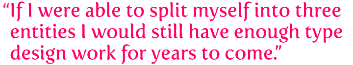
Also — and this is not out of laziness, but to have more time for type design — I am always exploring the possibilities of outsourcing technical stuff and repetitive tasks. For my latest fonts I’ve been using iKern, the kerning and spacing service of Igino Marini. That proved to be a big time saver, which is great because time really is probably my most valuable asset. I have so many ideas that I want to fulfill, that if I were able to split myself into three entities I would still have enough type design work for years to come.
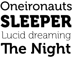
Museo Sans
Museo Sans was introduced a few months after Museo. While the original Museo’s most striking characteristics are in the unusual shapes and placement of the asymmetric serifs, Museo lacks those signature accessories. That makes it less immediately recognizable — but not bland. Its clarity and legibility are remarkable, its detailing is quite original and its wide range of numerals is both attractive and practical.
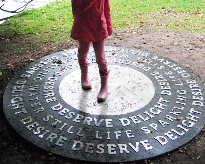
At the 10th Sonsbeek International Sculpture Exhibition, artist Ana Maria Tavares used Museo for her work Five Secrets of the Waters (For Mnemosyne). Photo by Jos van Roij.
You’re in your mid-forties, and as a type designer you were a late starter. Do you think things would have been much different if you had begun getting serious about type earlier on?
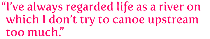
I’ve always regarded life as a river on which I don’t try to canoe upstream too much. Things have always happened to me at their own pace. The one thing I always try to do is to keep an open mind towards everything. I started my first font at 29 — which might already be regarded as late. Then for a decade I did not feel the urge to make a new one because I wasn’t inspired. It all changed with a little sketch which finally resulted in Fontin. From then on I was hooked.
Before diving head-first into type, you worked in advertising for fifteen years. Looking back — what were the things you liked most about the advertising world, and what did you hate about it?
Ever since I was a teenager I wanted to be an artist. After I graduated from high school, the right place to go seemed to be art school, but my father wanted me to learn a “proper” job. So we compromised and I got to go where I wanted, but to study graphic design, not painting. After four years — I didn’t graduate — I decided that it was time for me to become an artist. I did that for about 6 years until it became more than clear that I wasn’t able to make a living out of it. So I bought a Mac, taught myself the basics of desktop publishing and arranged an internship at an advertising agency. After a few years I got a job as an art director.
Working in the advertising business never really was my cup of tea, mainly because of the commercial attitude and the fact that all the work was based on very specific assignments. The best thing about it was the puzzle-solving aspect of commercial projects. But creating something and being in a creative process is what makes me feel alive, so I always made sure that I had something to do “on the side” that interested me. That could be painting, writing or type design.
When you joined MyFonts with Museo, you were the first designer to offer most weights of an extended family for free. On the strength of the paid fonts alone, Museo became one of the best selling fonts of 2008, and Museo Sans did even better. What made you choose this strategy? Did you expect that kind of success?
Before Museo was ready for release I often thought about what would be the best pricing strategy. I had to take into account that most people who knew me, knew me for my free fonts, so my guess was that it would be best to offer more free than paid weights. Next thing to consider was which weights should be free. I myself always hate it when free things are not complete or not as useful as they could be, so I decided to offer the three middle, most common, weights for free. And that was received better than I could have imagined. I had a bit of a hunch of Museo’s potential success because of all the positive feedback I got on my blog, but I didn’t expect it to be this big. The two fonts I released later that year – Anivers and Museo Sans – were also received very well. When the advertising agency I was working for went bankrupt in April this year it was clear that the time was right to become a full-time type designer.
Calluna
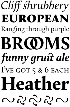
Calluna, Buivenga’s first full-fledged roman for text and display, grew out of the Museo design process. While trying out various serif shapes to create a hypothetical Museo Slab Serif, Buivenga discovered a nice way of giving his serifs a forward direction. The principle became the starting point of a totally new typeface — a robust, clean and contemporary face with interesting details and a forward flow. Calluna makes for comfortable reading even at very small text sizes; its striking details ensure that it can also be used as a display font with personality. More about Calluna’s design process here.
As for Calluna’s name: it’s simply the name of the street in Arnhem, the Netherlands, where Jos happens to live and work.
In the close-knit landscape of Dutch type design, you were completely unknown until a couple of years ago. Now you’re probably one of the country’s best-selling designers. Do you still feel like an outsider?
Yes, sometimes it feels like everything I’ve done has led up to the point where I’m at now, creating type in a world where it is not so necessary any more to relate to other type designers in order to function well. Besides, I am a person who really likes to do things his own way. On the other hand, I do feel connected to everyone who loves type and type design. Also, I immensely enjoy working together with Martin Majoor on a project at the moment.
That project is Questa, a new “modern face”. Could you tell us a bit more about the typeface and about the way you collaborate?
Early April this year I was asked to give a lecture at the 33pt symposium in Dortmund, as was Martin Majoor. We knew each other way back from art school in Arnhem, with the difference that I wasn’t into type design then. It was great meeting each other again and we both felt that the time in Dortmund was too short for all the things we wanted to share. Back in Arnhem after a few meetings we decided to do a type design project together. Going through the options we stumbled on Questa, a squarish Didot-like font that I originally had planned in one display style only. Martin saw enough possibilities to use that as a basis to create a text version too, as well as a sans-serif, all with true italics. We both have busy schedules and Martin spends a lot of time in Poland, but when he’s in Arnhem we try to team up twice a week to work on Questa in harmonious collaboration — although fortunately there is also some healthy discussion going on. Because I’m self-taught it’s great to witness closely how another type designer handles the whole process of making a large font family.
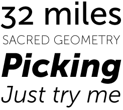
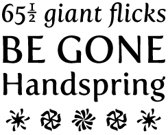
ANIVERS
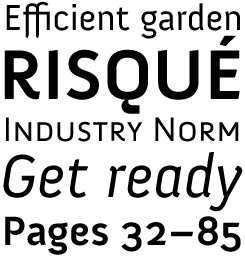
Buivenga describes his Anivers as “robust and rigid, forgiving, flexible and elegant...”. We especially like “forgiving”. As a graphic designer, you can’t ask much more from a typeface. Anivers’ whimsical shapes evolved out of an earlier free font, Diavlo, although it took major tweaking and redrawing for one font to become the other. A usable, readable sans-serif with an unmistakable personality, Anivers is suitable for a broad range of uses: from stationery to posters, from pull-quotes and intros to logos and corporate identity.
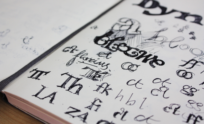
A page from Jos’ sketchbook.
During the past few years, you’ve made exemplary use of online communication and networking tools to get your fonts out there: a blog, a free fonts website, a Flickr pool, Twitter, contributions to ilovetypography.com… What’s more, it doesn’t feel like a calculated strategy. You seem to thoroughly enjoy this kind of communication.
In the early days people had to e-mail me to get my free fonts. Soon I started to receive more than 20 requests per day, so I decided to offer the fonts as a direct download. The e-mails still kept coming in, but now from people who just wanted to comment on my work. A blog is of course the better place for that, plus it also offers me the opportunity to have a direct response to type designs in progress. That’s also the reason why I embrace Flickr, Twitter and the like. To be able to interact like this is a thing I value tremendously. Later — with the release of Museo — I discovered that it also works very well to help market my fonts.
A detail for type geeks: Your latest typeface, Calluna, has a sloped crossbar on the ‘e’ — one of the primary characteristics of early Venetian or “Humanist” typefaces, as the history books never tire of teaching us. Did you actually look at Jenson’s type as a model for Calluna? Do historical models play a role in your work at all?
One day when I was playing around with Museo to see if I could make a slab serif out of it, the bent serifs with the newly attached slabs resulted in a serifed roman letterform that had a nice forward direction. I used that little accident as a base for Calluna. Not only did this determine the shape of the regular serifs, it also shaped lots of other details like for example the bottom serif of ‘p’ and the crossbar of ‘e’. I wanted the proportions of the capitals to be classical, therefore I had a glimpse at Garamond capitals. I don’t really look at other typefaces as a model; I only look at what other type designers’ solutions are for specific things I’m struggling with at that moment.
You’ve been working with MyFonts for a year and a half now. What are the main things this collaboration has brought you?
When I was ready to release Museo I was still working four days a week so I needed a partner that would relieve me from the hassle of setting up and maintaining a shop. MyFonts looked ideal to me because of the fact that I was able to do my own marketing and because MyFonts gives a fair commission on sales. MyFonts offers good possibilities for people to try out type before buying — which has gotten even better with the new site — and also the opportunity to set up one’s own foundry page. Because of that I could keep my own site fairly simple and that saved me time… precious time to design more type.
Dankjewel, Jos! As you are obviously one of the hardest working type designers in the Low Countries, we are looking forward to seeing something new from exljbris soon!
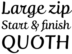
Fertigo Pro
The calligraphic roman Fertigo Pro has been one of Buivenga’s most popular fonts for years. It has the flow and humanist touch of italic handwriting, and the roundness and regularity of a roman book face. It is almost too good to be a free font and yet, that’s what it is — you can show your gratitude by adding the lovely and very affordable new Italic to your collection.
Fertigo Pro Script
While working on Fertigo Pro Italic, Buivenga suddenly saw possibilities for yet another Fertigo variety — a connected script. The resulting Fertigo Pro Script is charming yet vigorous, and great for packaging or branding. Released only weeks ago, Fertigo Pro script is steadily climbing the Hot New Fonts list at the moment of this writing.

Who would you interview?
Creative Characters is the MyFonts newsletter dedicated to people behind the fonts. Each month, we interview a notable personality from the type world. And we would like you, the reader, to have your say.
Which creative character would you interview if you had the chance? And what would you ask them? Let us know, and your choice may end up in a future edition of this newsletter! Just send an email with your ideas to [email protected].
In the past, we’ve interviewed the likes of Alejandro Paul, Dino dos Santos, David Berlow, Ray Larabie, and Underware. If you’re curious to know which other type designers we’ve already interviewed as part of past Creative Characters newsletters, have a look at the archive.
Colophon
This interview was conducted & edited by Jan Middendorp, and designed by Nick Sherman.
The Creative Characters nameplate is set in Amplitude and Farnham; the intro image features Anivers; the pull-quotes are set in Fertigo; and the large question mark is in Farnham.
Comments?
We’d love to hear from you! Please send any questions or comments about this newsletter to [email protected]
Subscription info
Want to get future issues of Creative Characters sent to your inbox? Subscribe at www.myfonts.com/MailingList
Newsletter archives
Know someone who would be interested in this? Want to see past issues? All MyFonts newsletters (including this one) are available to view online here.