How Many Shades of Grey Are There, Really?
Roy G. Biv: An Exceedingly Surprising Book About Color offers trivia, insights, and opinions about hues.
Businesses can rise and fall on their color choices. Imagine Gap betting its fall line on bistre brown when the world was really waiting for amaranth purple. Design critic Jude Stewart knows the importance of hue well. Her new book, Roy G. Biv: An Exceedingly Surprising Book About Color (Bloomsbury), takes a deep, sometimes feisty look at all the things that color can do and mean.
“I’ve always been strongly swayed by color,” she tells me. “I can recall as a kid poring over a 1980s self-help book, Color Me Beautiful, which shows you how to wear the ‘right’ colors for your skin tone. The before and after shots were incredible: drape her in the right shade of pink, and suddenly she’s dewy and glowing. Drape her in the wrong shade, though, and she turns sallow and shrunken, as if her soul had been sucked out.” Her book’s chapters loosely follow the order of the rainbow-referencing mnemonic in its title—red, orange, yellow, green, blue, indigo, violet. She also added in white, pink, and brown, colors “that don’t appear in the rainbow but allowed me to tell some great stories,” she says.
That mnemonic, it turns out, isn’t strictly accurate: “Technically speaking, there aren’t seven distinct colors in the rainbow. But Isaac Newton felt pressured to name seven colors to match the seven tones in Descartes’s musical scale–so he shoe-horned indigo in.” In fact, different languages splinter the rainbow into different color terms; “not everyone sees and names the colors as we English-speakers do,” Stewart points out. For instance, in England people don’t use “Roy G. Biv” but instead say, “Richard of York Gave Battle in Vain.” “Unless,” she says, “you’re a Yorkie and still touchy about Richard losing the Battle of Wakefield in 1460. A popular variant for those folks praises a local sweet, Rowntree’s Fruit Gums and Pastilles: ‘Rowntree’s of York Gave Best In Value.’”
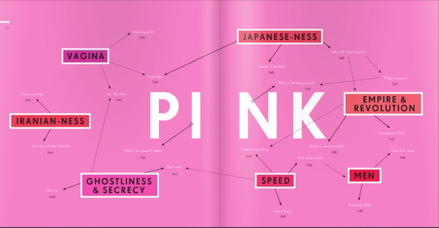
Throughout Roy G. Biv, Stewart sprinkled in quotes that expressed strongly felt beliefs about color, "ideas you could roll around in your head for a while like a caramel melting on your tongue,” she says. So I ask her to explain one of these confections: Why is pink the navy of India? “Fashion icon Diana Vreeland said this–I’m such a fan of her pronouncements, which manage to be both insightful and slightly mad,” Stewarts says. “I take Vreeland’s quote to mean that pink in India operates as a default color, a basic shade around which many different color-palettes grow. Strictly speaking I couldn’t tell you if she’s right or wrong about that observation, if India is really that awash in pink, but don’t you devoutly wish it to be true?”
To her assertion that brown is the color of death, she responds: “Not to put too fine a point on it, but: brown is the color of feces, which puts that color at the end of the life cycle. But the browns of feces, mulch, fertilizer also feed new shoots of life.” One entry in the brown chapter is about bole, a very old English word for brown that describes either a soft reddish-brown clay, a tree trunk, or the color of either of these. She writes: “Picture it: a late winter afternoon, bare of all leaves, one bole sprouts quietly out of another. Brown comes from brown and returns to it.”
Orange, she asserts, is a violent color. Why? “As queer as a clockwork orange,’” Stewart notes, is the Cockney expression that inspired the title of Anthony Burgess’s 1962 novel A Clockwork Orange. “It’s roughly the equivalent of our ‘three-dollar bill,’ something so odd that it can’t be trusted. I like how Burgess describes his intent in his book’s introduction: a person programmed only to perform good or evil ‘has the appearance of an organism lovely with color and juice, but in fact only a clockwork toy to be wound up by God or the Devil … or the almighty state.’”
While Stewart says she likes orange, she notes that it has a rich history of signaling cheapness and vulgarity, and, “it doesn’t require much of a leap to taint a lower-class color with associations of violence.”
And what about prisoners’ orange jumpsuits, I ask? Wouldn’t wearing a symbol for violence breed more violence? Stewart argues that orange prisonwear is for visibility, “especially during perp walks, and as a strong visual signifier separating those in the cage from those who aren’t.” As she describes in the book, “correctional facilities in Cleveland County garb their prisoners in pink shirts and yellow-and-white-striped pants. Dressing like a gaudy Easter egg is apparently part of their punishment.”
I always wanted to know why green was considered lucky and unlucky. How can the color that dominates the natural world symbolize such extremes of fortune?
“It’s unanswerable in a sense, but let’s consider some of the evidence,” she says. “In China, men hesitate to wear green hats, because the phrase ‘to wear a green hat’ in Chinese sounds exactly like the one that means ‘to be cuckolded.’ Green cars and magazine covers are both stigmatized as unlucky for murky reasons. I relate in the book a controversy over whether or not Napoleon was killed by his own green wallpaper. On the lucky side of things, we have green as the auspicious color of Islam and Muhammad, Confucius’s praise of the 10 virtues of jade, theater’s green room and all the explanatory lore about how it earned its name. It’s hard to say what about green prompts so many conflicting responses, but nonetheless the through-line is there.”
Stewart says she is not running for America's color czar, issuing decrees about the practical uses of color or proselytizing “tasteful” choices. Her goal is “simply to open your eyes again to all the meanings colors can contain.”
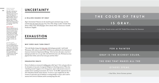
Which means answering common queries. Like, pressingly: Are there literally 50 shades of gray? “The gray chapter of Roy G. Biv opens with an entry titled 'A Million Shades of Gray,'” she says. “Here’s that entry in its entirety: ‘Roget’s International Thesaurus sets the mood for gray’s emotional range, one that stretches from the mud to the stars: Iron. Dun. Drab. Dingy. Leaden. Grizzled. Slate. Mousy. Ashen. Limy. Salt-and-pepper. Dove-colored. Silvery. Chiaroscuro. Grisaille. Pearlescent. Dappled.’ In a more pragmatic vein, I just checked Benjamin Moore’s website to find out how many shades of gray paint they offer: a solid 150-plus.”