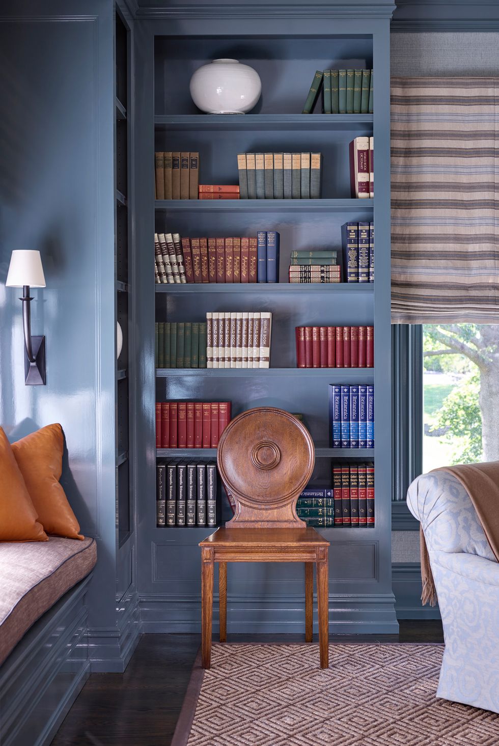
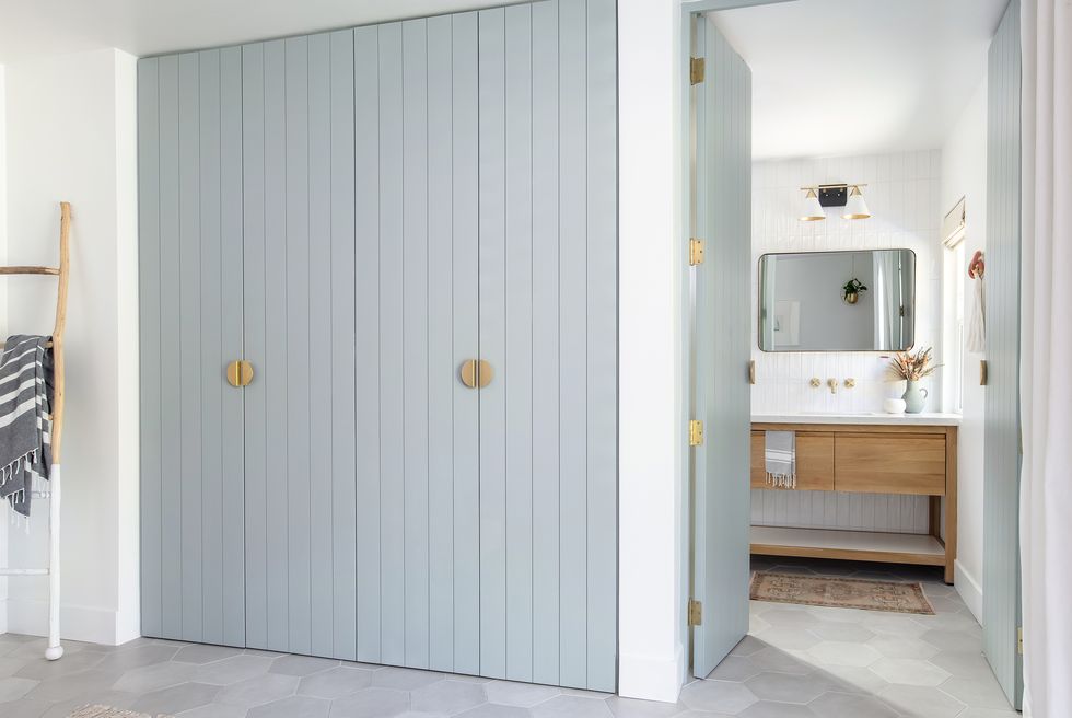
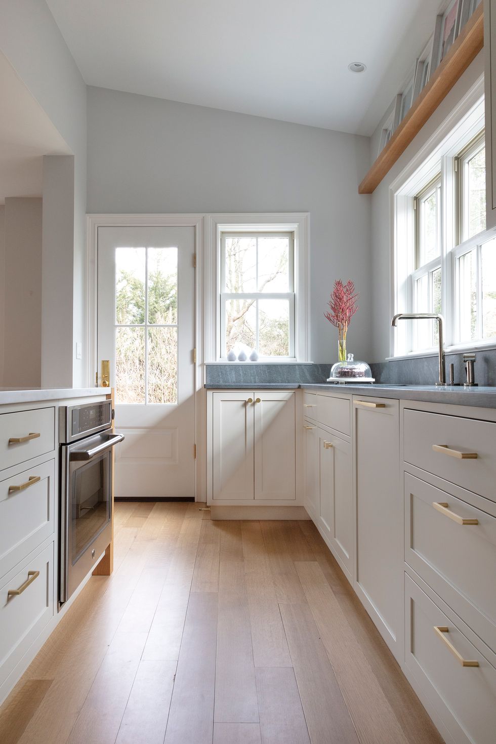
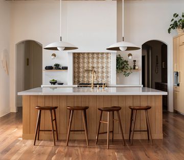
1Templeton Gray, Benjamin Moore
 Adam Macchia
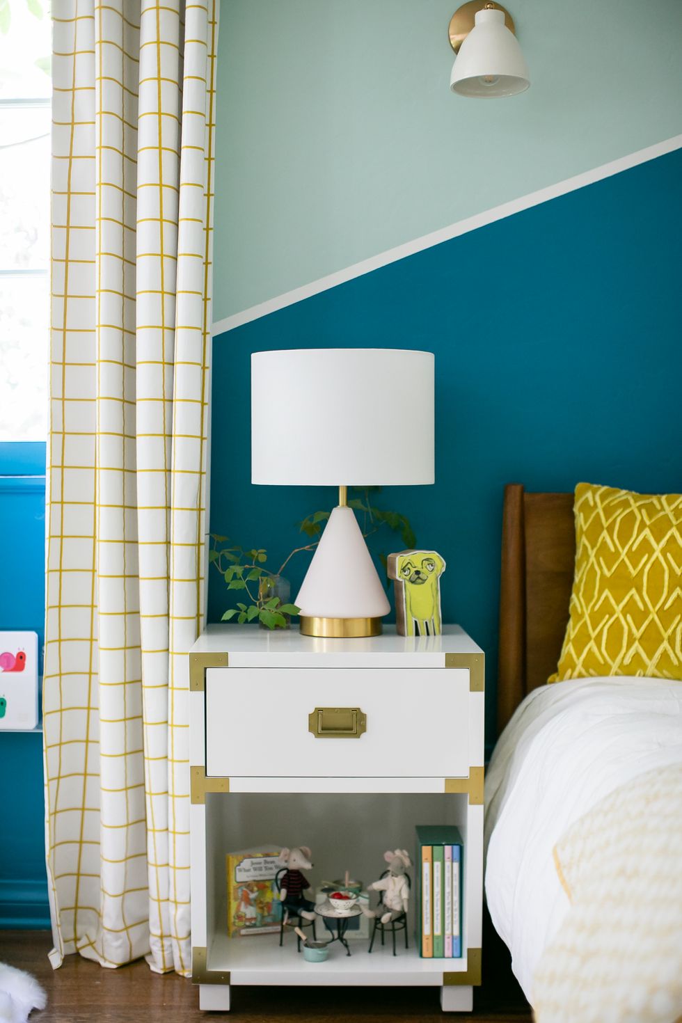
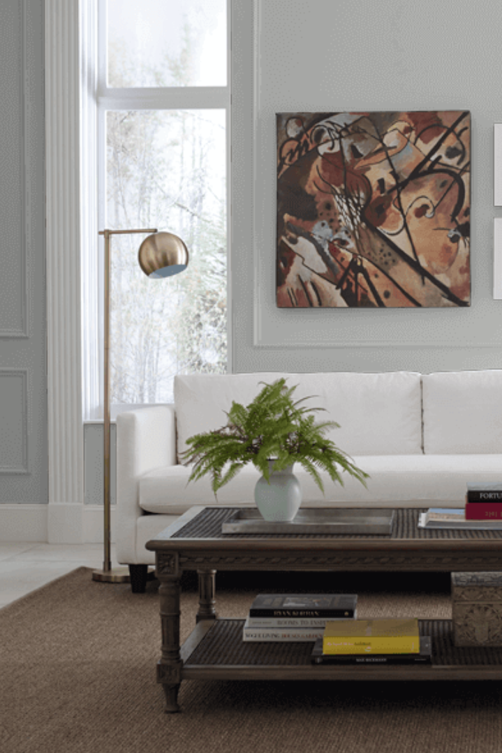
"Templeton Gray from Benjamin Moore’s Historical Colors collection is one of our most requested paint colors on the 'gram," says Dan Mazzarini, creative director of BHDM Design and ARCHIVE by Dan Mazzarini.
"It sounds like it will be a true gray, but it's actually blue with gray and green in it — a fabulous 'chameleon color,' as I like to call them. It takes on the character of the other decor in the room. It has become a great go-to for millwork — I love it on doors, to distinguish kitchen islands and as entire libraries for depth and bold interest."
SHOP NOW
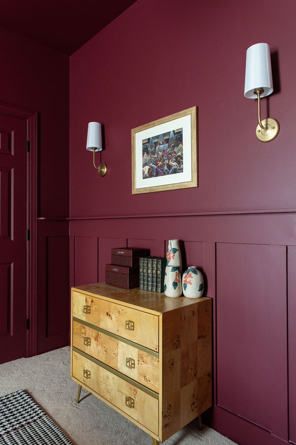
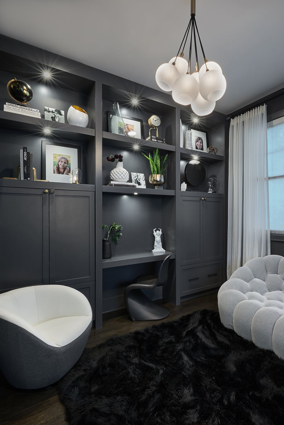
2Burgundy, Sherwin-Williams
 Amanda Anderson Photography
"One of my favorite saturated colors to add flavor and interest to a room is Sherwin-Williams' Burgundy," says interior designer Marie Cloud of Indigo Pruitt. "The deep, warm color can make a space feel cozy and inviting. It is a great choice for guest rooms, bedrooms or dining areas."
SHOP NOW
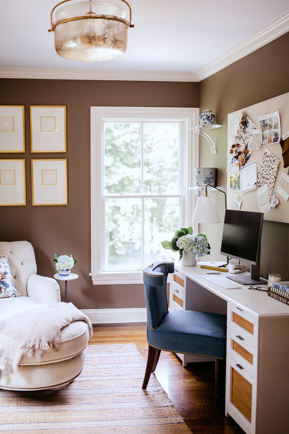
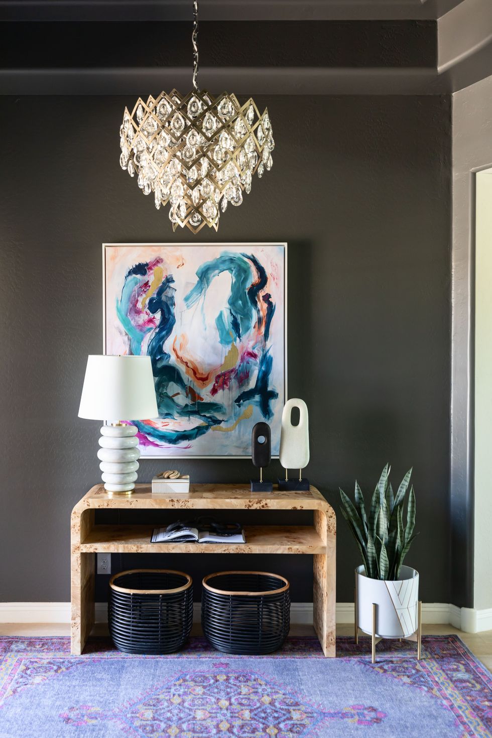
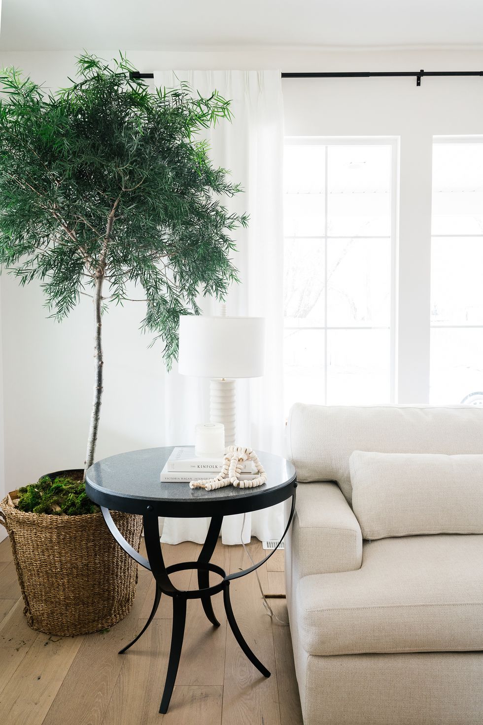
3Fairview Taupe, Benjamin Moore
 Sara Grayson
"I love this cozy brown shade because it has a gray, chalky hint to it," says interior designer Erin Gates. "It's great paired with blues or blush/faded russet tones."
SHOP NOW
Advertisement - Continue Reading Below
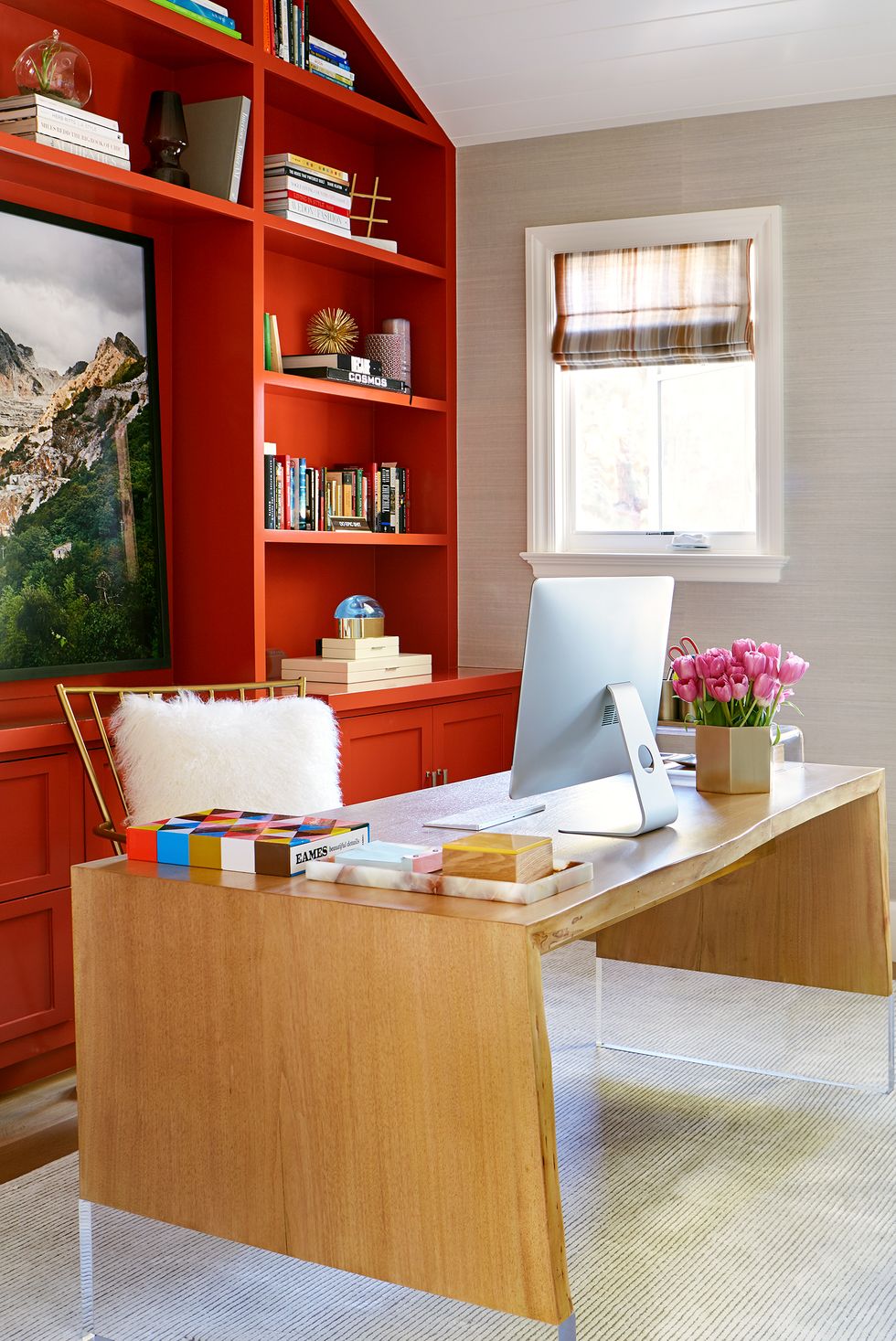
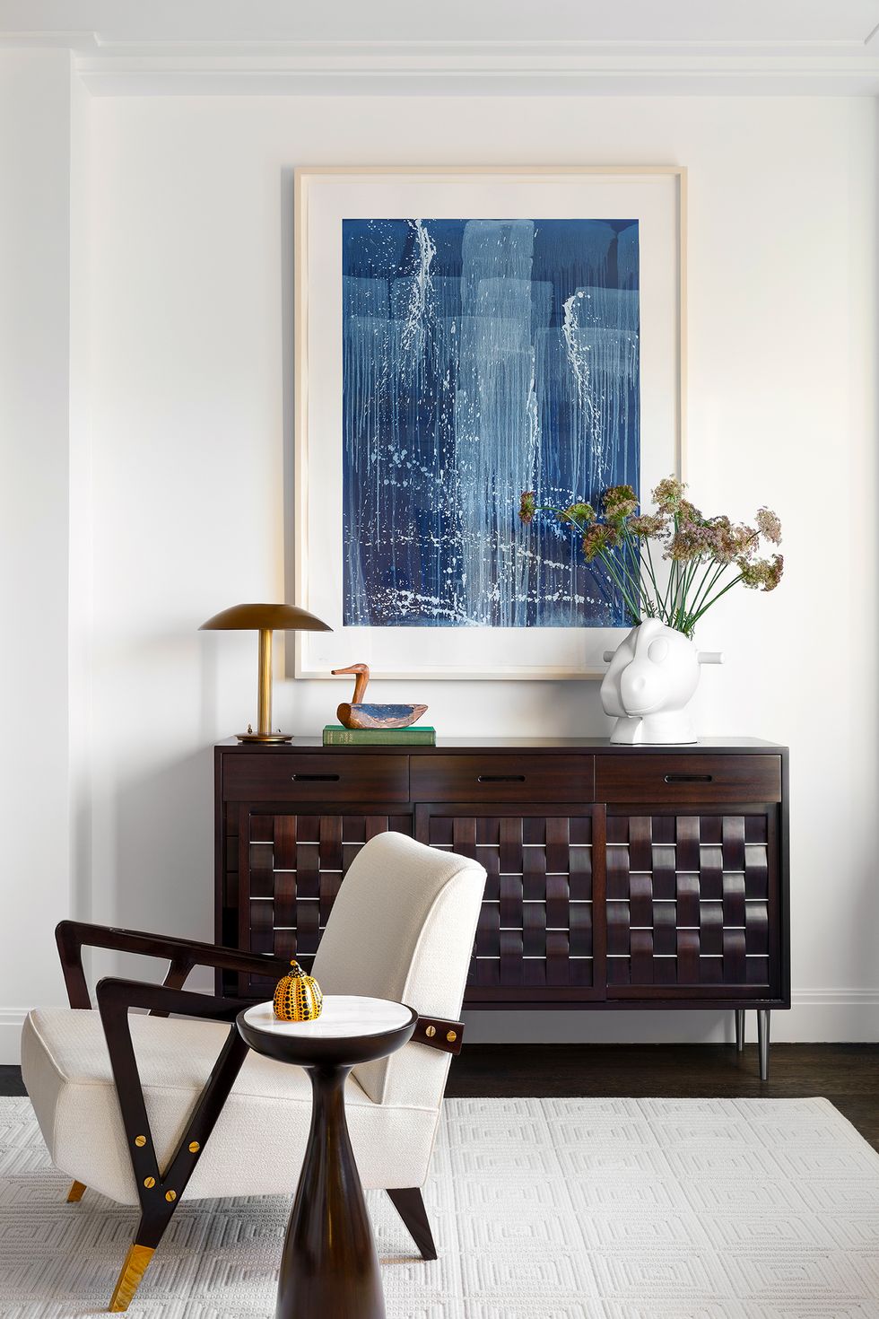
4Hearty Orange, Sherwin-Williams
 TREVOR TONDRO PHOTOGRAPHY
Designer Adam Hunter is a fan of this energetic orange shade from Sherwin-Williams. "It radiates energy, creativity and positivity, making it an ideal choice for a workspace where you need to stay motivated and inspired. Additionally, it brings a sense of warmth and coziness," Hunter says. Plus, it pairs well with neutrals and wood tones of all kinds.
SHOP NOW
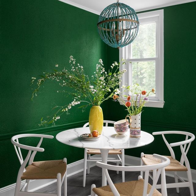
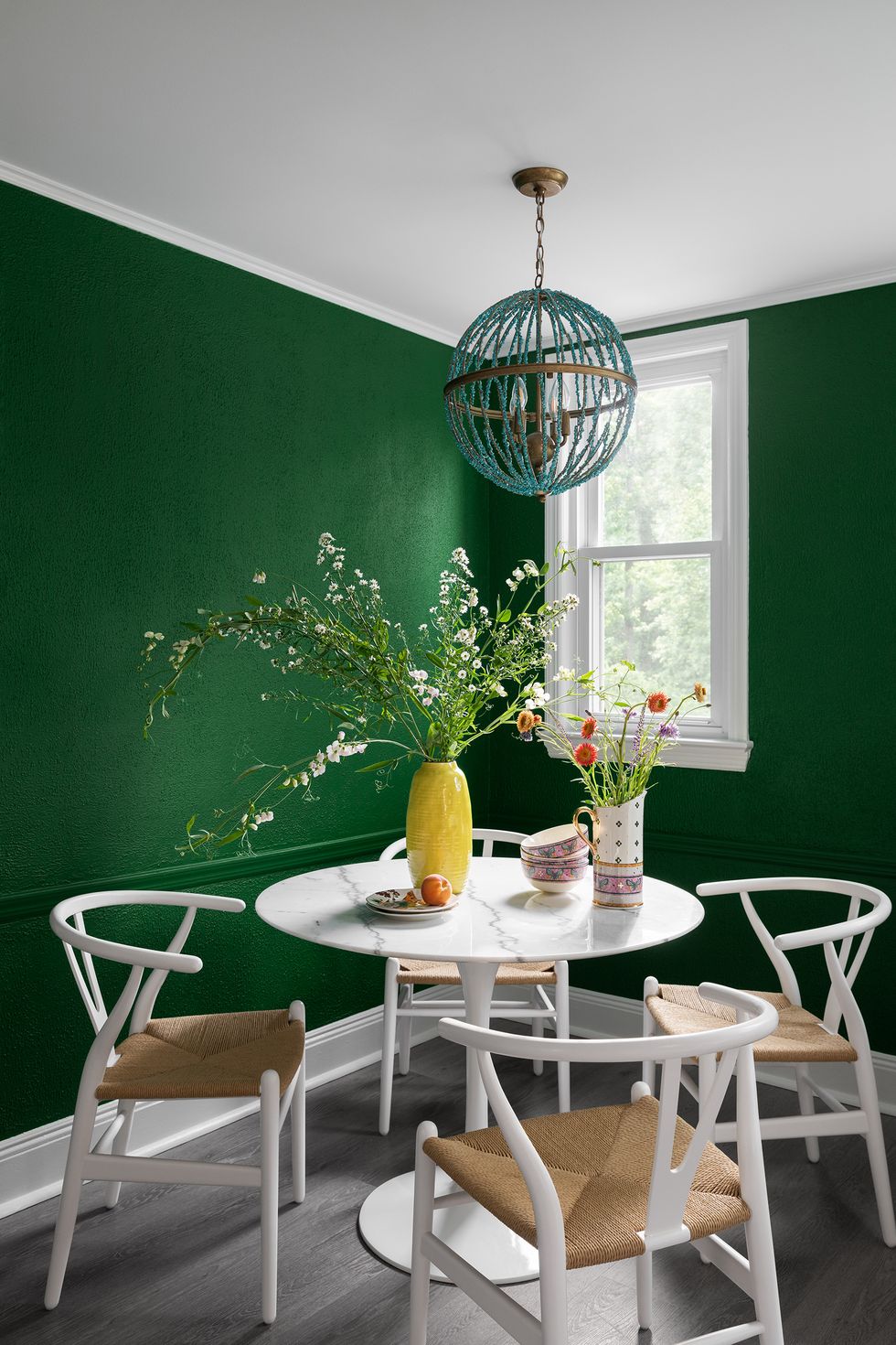
5Buffett Green, Benjamin Moore
 Brittany Ambridge
Designer Sarah Storms didn't think twice about going bold in this eating area, noting that the unexpected hue blends with the kitchen's existing flooring, cabinetry and backsplash.
"What I love about this color is the rich saturation level without being dark and without feeling too bright. It actually brings life and light into the kitchen that the previous light gray was dampening. When in doubt, look to a jewel tone. They are nature’s shining stars or perfectly balanced color."
SHOP NOW
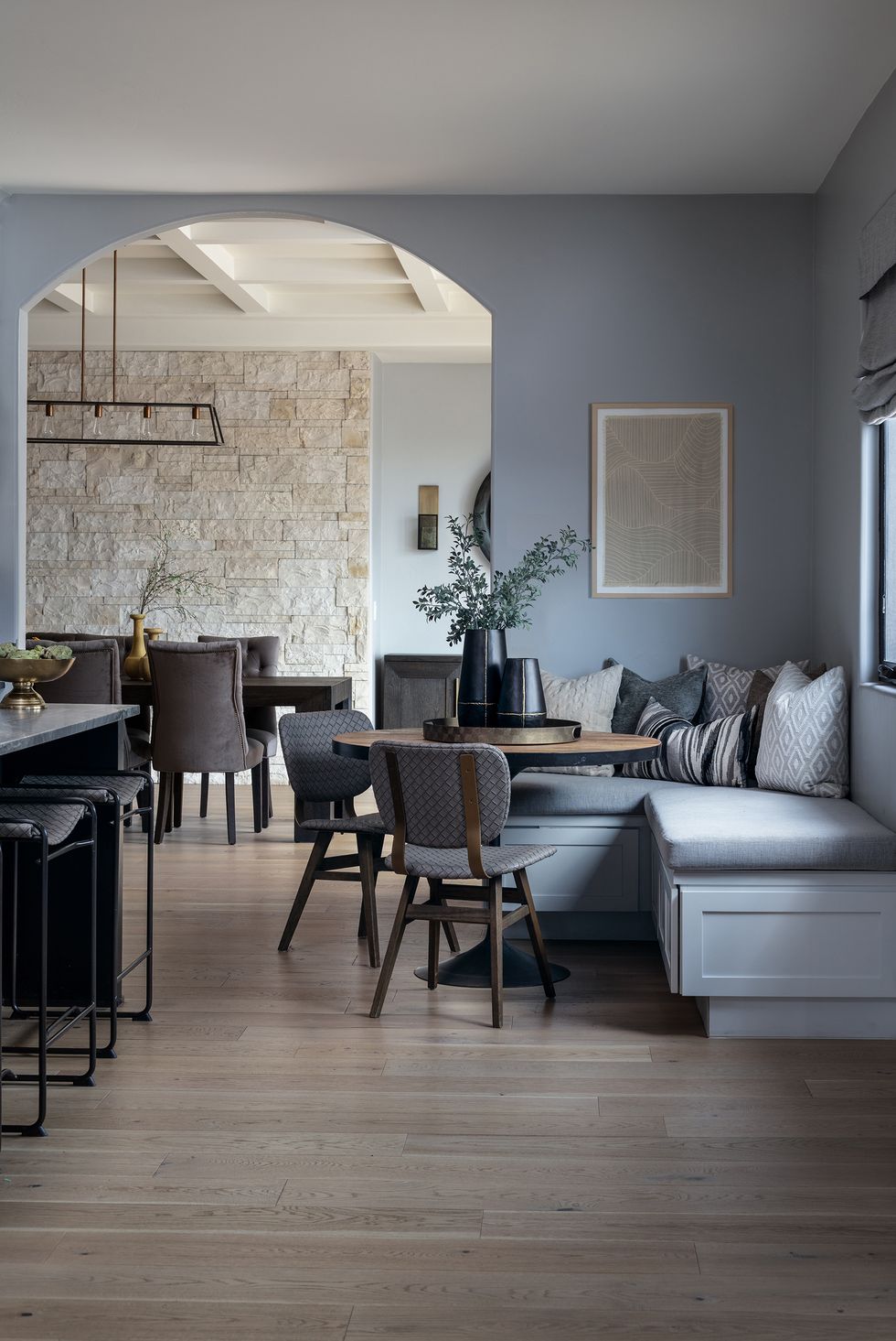
6Steely Gray, Sherwin-Williams
 Natalia Robert
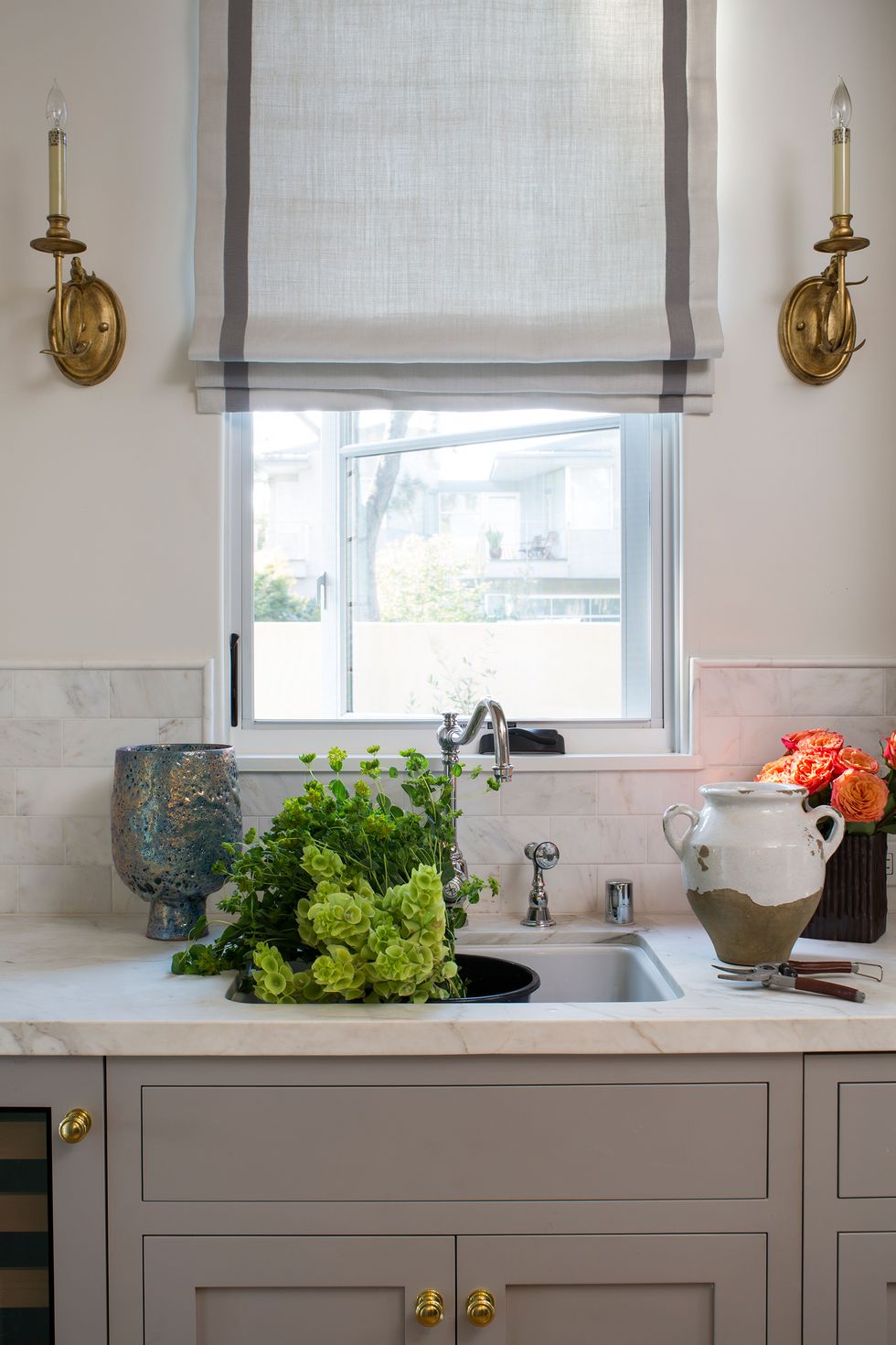
For designer Jennifer Verruto, gray paint colors don't have to be boring. "Don’t let the name fool you, this color has a rich, yet subtle blue undertone," says Verruto, founder and CEO of Blythe Interiors.
"We love using it in living spaces because it creates a calming feeling and is a great color foundation to build upon. It’s a great choice for traditional and transitional design aesthetics and it looks beautiful paired with deep charcoals and natural stone tones."
SHOP NOW
Advertisement - Continue Reading Below
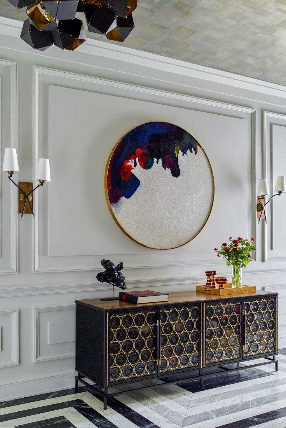
7Moonshine, Benjamin Moore
 Eric Piasecki
"This shade is an off-white color used on the foyer paneling in this West Village apartment," says Gideon Mendelson, founder and creative director of Mendelson Group. "The color has a beautiful, understated muted blue-gray undertone that gives the room depth and interest."
SHOP NOW
8Oyster Bay, Sherwin-Williams
 Natalia Robert
Jennifer Verruto, founder and CEO of Blythe Interiors, says Sherwin-Williams' Oyster Bay is a versatile blue that can complement a range of aesthetics.
"This green with slate-blue undertones is a favorite because it works great in spaces where you’re trying to achieve a balance of warm and cool tones. For example, it beautifully complements gray floors but also looks gorgeous paired against natural wood and brass hardware. It’s also a great choice if you’re trying to achieve a crisp, cool vibe with coastal influences."
SHOP NOW
9Forged Steel, Sherwin-Williams
 Life Created
Sherwin-Williams' Forged Steel is a go-to choice for Lauren Lerner of Living with Lolo. "I love that this color changes depending on the lighting and nearby hues," she says. "It is a warm gray with some brown tones and a great neutral to be used as a dramatic backdrop."
SHOP NOW
Advertisement - Continue Reading Below
10Classic Gray, Benjamin Moore
 Photo: Meghan Beierle-O’Brien; Stylist: Char Hatch Langos
When it comes to gray paint colors, Benjamin Moore's Classic Gray is the top pick for Kitchen Design Group's Caren Rideau. “It brings soft warmth to a room and does not distract from artwork or any bright colors in furniture. It is a nice backdrop in a room."
SHOP NOW
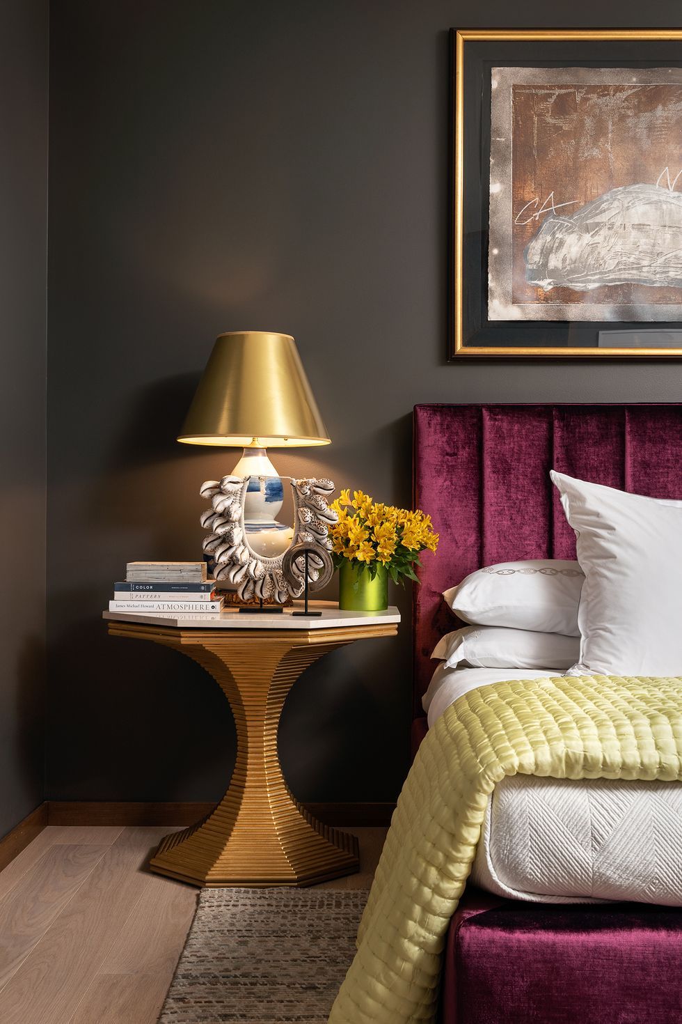
11Century Darjeeling, Benjamin Moore
 Mike Van Tassell
Dark hues can make a big impact, and this project from interior designer Gail Davis is proof. "I had the opportunity to use this expressive color in a guest bedroom for a private residence in Princeton, New Jersey. This color did not disappoint, being the perfect backdrop for the headboard and artwork. It takes your breath away."
SHOP NOW
12Dimpse, Farrow & Ball
 Melinda Kelson O'Connor Design
Gray paint colors, like Farrow & Ball's Dimpse, are beyond versatile, according to architect and designer Mindy O'Connor.
"Dimpse is a cool pale gray that works as a terrific neutral in lieu of white in a modern space. It is a perfect backdrop for kitchen cabinetry or against other natural wood and stone elements without overwhelming the design. While setting a more cool tone, it is not stark."
SHOP NOW
Advertisement - Continue Reading Below
13Gray, Benjamin Moore
 Brianne Bishop Design
"We love using a deep, moody color to give depth to a space and this color achieves that with the perfect balance of warm and cool," says designer Brianne Bishop.
SHOP NOW
14Snowbound, Sherwin-Williams
 Travis Richardson
"When it comes to white paint, we like to use the same shades throughout for the walls, trim, cabinets and ceilings," says House of Jade Interiors' Kirsten Krason, noting that Sherwin-Williams' Snowbound is the perfect hue.
SHOP NOW
15Chantilly Lace, Benjamin Moore
 Donna Dotan
Designer Ariel Okin likes this cool, crisp white from Benjamin Moore. "It automatically opens up a room and makes it feel airy and clean," she says. "We also love pairing it as a trim color with Simply White by Benjamin Moore on the walls for a nice warm-cool contrast."
SHOP NOW
Advertisement - Continue Reading Below
16Aegean Teal, Benjamin Moore
 Ryan Garvin
Teal is a no-fail choice for a bedroom, library, office or even cabinetry, according to designer and HGTV star Breegan Jane. Her favorite? Benjamin Moore's Aegean Teal. "Teal is reminiscent of the shimmering waters of Ibiza on a warm, sunny day," says Jane. "It's synonymous with serenity, and who couldn’t use a little more of that?"
SHOP NOW
17Green Smoke, Farrow & Ball
 Sarah Winchester
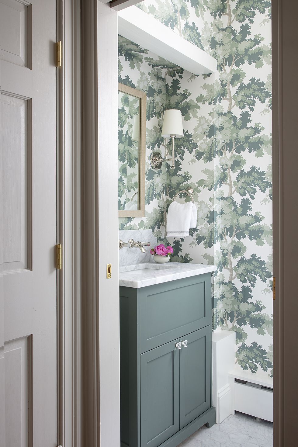
"I love this deep rich green color in powder rooms (I used it in my own!) and on millwork," says interior designer Erin Gates. "We've been using it a lot lately in libraries and dens. It has a nice amount of gray in it, which makes it subdued yet dramatic."
SHOP NOW
18Cavernous, Dunn-Edwards
 Amy Bartlam
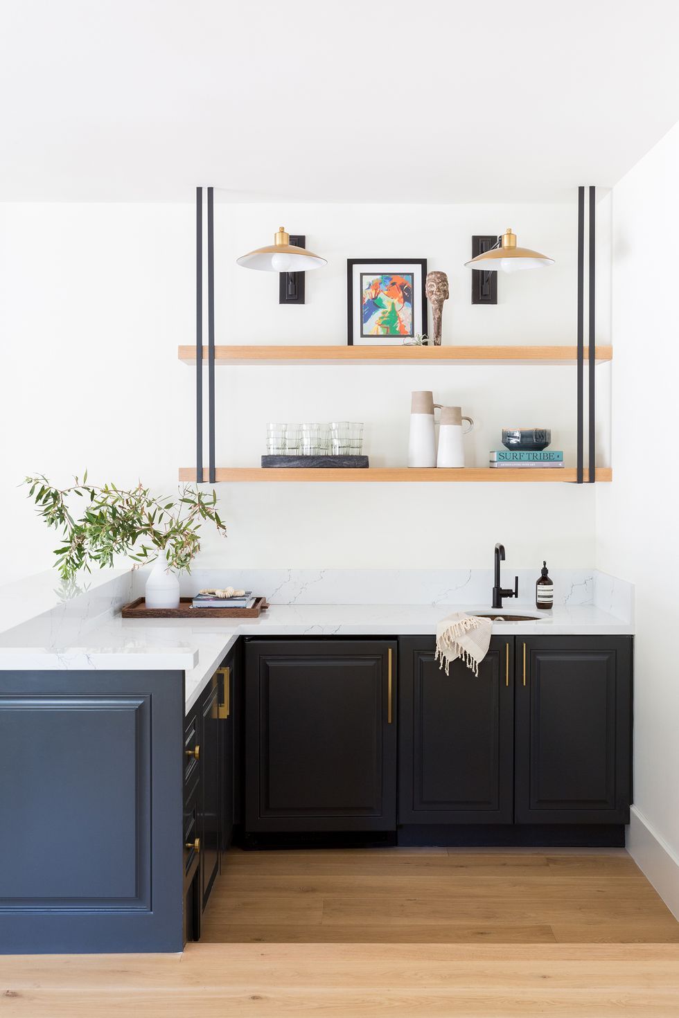
Look no further than Dunn-Edwards' Cavernous if you have an affinity for dark paint colors. "The contrast is amazing with a crisp white, but also has this ability that allows it to pair perfectly with the warmer neutrals that we are using more and more of these days as well," says Los Angeles-based interior designer Kate Lester.
SHOP NOW
Advertisement - Continue Reading Below
19Palladian Blue, Benjamin Moore
 Benjamin Moore
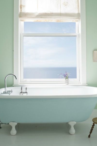
"My go-to paint colors are classic and easy to live with," says interior designer Lauri Ward. "This blue-gray-green shade can be used in almost any room. It's an especially good choice for cooling a very sunny room, or creating a tranquil bedroom."
SHOP NOW
20Garden Stone, Clark+Kensington
 Ace Hardware
"I try to stay away from colors with heavy blue undertones, and I direct my clients toward warm grays that will stand the test of time," say Ace design expert Katie Reynolds. "This shade is a favorite."
SHOP NOW

Overseeing all things home for GoodHousekeeping.com and HouseBeautiful.com, Lauren swoons over midcentury design and employs tough-love approach to decluttering (just throw it away, ladies). She loves anything neon coral, puts bacon on her veggie burgers, and would follow Tina Fey and Amy Poehler to the end of the earth.

Monique Valeris is the home design director for Good Housekeeping, where she oversees the brand's home decorating coverage across print and digital. Prior to joining GH in 2020, she was the digital editor at Elle Decor. In her current role, she explores everything from design trends and home tours to lifestyle product recommendations, including writing her monthly column, "What's in My Cart."
Advertisement - Continue Reading Below
Advertisement - Continue Reading Below
Advertisement - Continue Reading Below


