:format(webp)/cdn.vox-cdn.com/uploads/chorus_asset/file/14431420/The-Evil-Dead-Poster.1419979835.jpg)
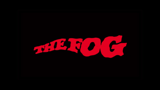
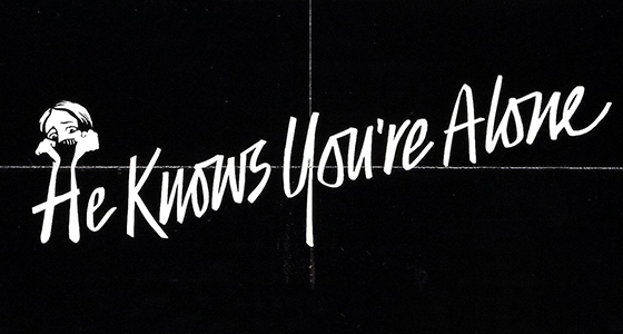
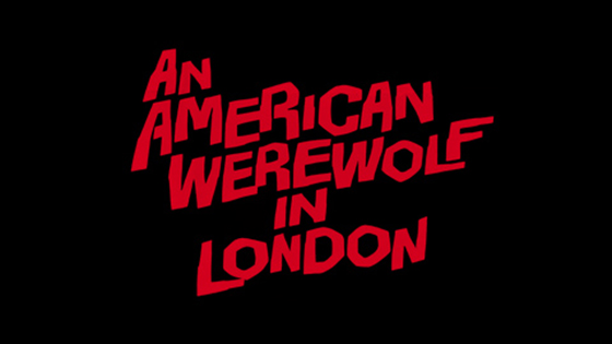
The early eighties saw a flood of horror movies hit movie theaters, as studios looked to repeat the success of John Carpenter's genre-defining slasher movie Halloween. Some were good, and some were bad, but, as graphic designer Christian Annyas points out, the vast majority had fantastically well-designed logos. In a blog post, Annyas highlights some of the custom typography that helped horror movie posters stand out in an increasingly crowded market. From the angular typography of The Evil Dead, to the skeuomorphic The Fog logo, movies were branded with strong, unique identities — especially when compared to modern posters that rely on plain type and tired clichés.
:format(webp)/cdn.vox-cdn.com/uploads/chorus_asset/file/24365737/Wyze_Cam_OG_Telephoto_8.jpg)
:format(webp)/cdn.vox-cdn.com/uploads/chorus_asset/file/19336098/cwelch_191031_3763_0002.jpg)
:format(webp)/cdn.vox-cdn.com/uploads/chorus_asset/file/25289286/Wyze_Cam_v3_Pro_4.jpeg)
:format(webp)/cdn.vox-cdn.com/uploads/chorus_asset/file/24444824/era100black.jpg)