In February, Data Clinic introduced our latest tool, TREC (Transit Resilience for Essential Commuting), at The Opportunity Project Summit, hosted by the US Census Bureau. On March 13, 2023, the team hosted a deep dive at NYC’s Open Data Week to expose the key decisions and methodologies that resulted in an accessible suite of insights on the climate risk and importance of transit stations that could lead to more informed infrastructure improvements. Read on to learn how the Data Clinic team developed TREC, and how you can get involved.
The Motivation
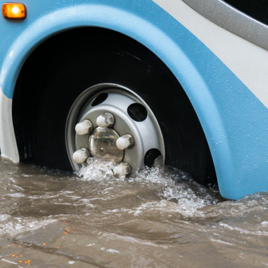
Climate change has the potential to severely disrupt public transit operations as seen in the aftermath of Hurricane Sandy in 2012, and more recently during the record-breaking rainfall from Tropical Storm Ida in 2021 in New York City. Across the country, storms are likely to get more frequent and severe. Coupled with the fact that over 40% of transit infrastructure is already beyond its designed life, we can expect an increasing strain on all transit operations.
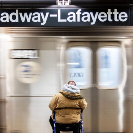
Building resilience in our transit infrastructure is critical not only as a response to climate change, as buses and subways emit 30-70% less greenhouse gases compared to cars, but also from an environmental justice perspective as low-income workers are 2-3 times more likely than high-income workers to rely on public transit.
The TREC Theory of Change
To ensure we would build something valuable and novel that could progress the conversation and action around transit resilience, we spoke with several transit agencies across the country (such as the NYC MTA and Southwestern PA Commission), researchers working in this space, and community organizations involved in advocacy. Based on these conversations, we narrowed down the scope of our solution to:
- Focus on more frequent, but minor climate disruptions as cities typically have studied the potential impact from severe events (e.g., hurricanes) and have a response plan in place, while research on the impact of localized events, such as flooding from heavier storms, is less common across the country.
- Keep core transit users’ needs front and center as daily life doesn’t stop during localized events, and users still rely on public transit to get where they need to go. Therefore, we identified key locations/services that transit users need to reach even during heavy storms (emergency healthcare, jobs, schools, etc.) and studied the importance of a transit location in accessing these.
- Aid in prioritizing locations for infrastructure improvements as funding is limited and agencies often grapple with distributing resources to maximize impact.
Our approach with TREC is to provide our priority users (transit planners and community organizations) with easily interpretable data that can be used to prioritize infrastructure improvements and inform advocacy:
- Transit locations at risk from climate change
- Importance of a transit location to riders
As we heard from user advocates, we were confident that this intersectional approach would add new perspectives to the transit climate resilience sector. “Joining information on public infrastructure, demographics, and climate risks has the potential to help planners address issues proactively and is an example of how the TREC tool differs from other resiliency tools I am familiar with,” shared David Schneider, Data Scientist at the FTA Office of Research Demonstration, and Innovation, and the lead of the Opportunity Project sprint.
Introducing TREC
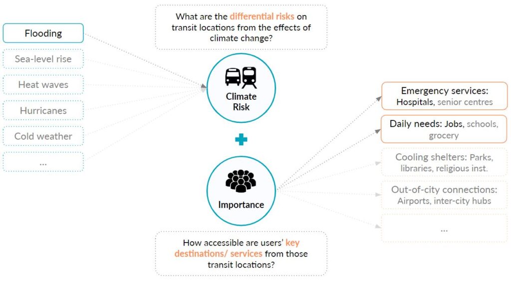
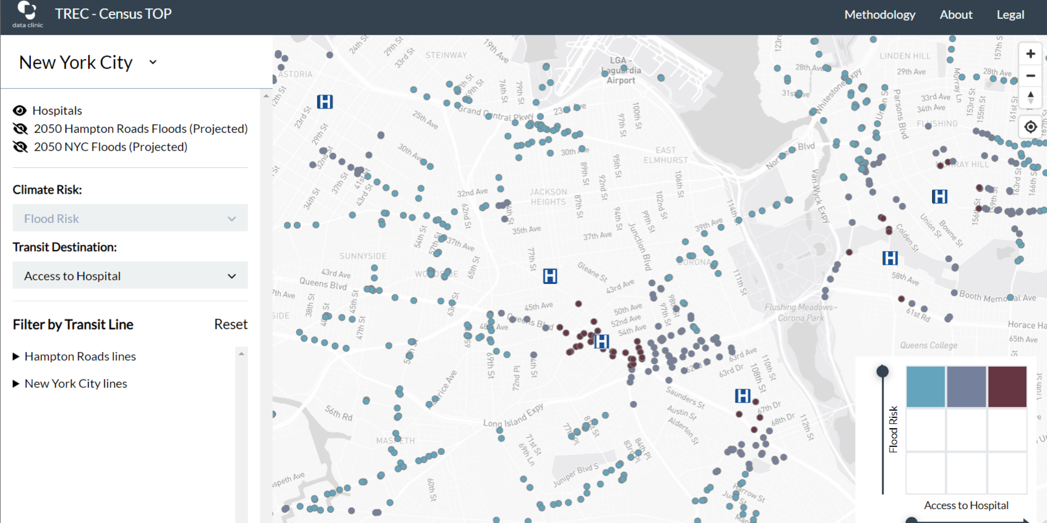
For our first iteration of TREC, we looked at risk from flooding at different locations and how much access a transit location provides to hospitals and jobs (particularly jobs held by vulnerable workers). We developed this concept in such a way that allows for future expansion. As shown in the diagram above, additional weather event risks, and relevant destinations for transit users can be incorporated seamlessly within the TREC framework.
TREC categorizes the above metrics–risk and access–as high/medium/low for each individual transit station and is available for the New York City and Hampton Roads, VA regions to demonstrate the concept across one larger and one smaller transit system. Each transit location is color-coded based on one climate risk metric (flooding, in this case) and one access metric (access to hospitals, in the below example) to easily identify and filter locations that are both at high risk and provide easy access. Keeping in mind the long-term goal of resiliency planning, we have also included projected flood maps for 2050 for these cities.
Through TREC’s intersectional filter, route-level summaries, and visualization, we hope to make it easier for users to identify individual stops and regions within a city to study in more detail and prioritize for action.
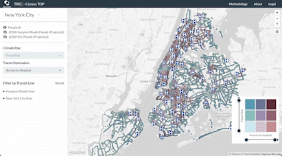
You’ll notice that this beta version only includes bus stops and routes. There are two primary reasons for this. First, our stakeholder research revealed that buses are the most prevalent form of public transit across the country regardless of transit system size, so ensuring our approach worked for buses would be crucial to making this a scalable and inclusive tool. Second, flooding on a subway line can have significantly larger network effects, either shutting down entire lines and/or requiring rerouting via other tracks’ lines, which strays from our single-stop metric focus. Buses, on the other hand, have the ability to maintain a route when a station is flooded as it can reroute via nearby streets in real time. If we receive interest to expand TREC to additional climate risks, our team is prepared to bring in subways where relevant.
Building the TREC Risk and Access Metrics
To actually develop the high/medium/low climate risk and access metrics visualized in TREC, we needed to define underlying calculations that would be scalable across the country and would have real-world relevance. We settled on four stop-level metrics:
- Flood risk in the area around the stop
- Walking distance to nearest hospital
- Number of people working within a 15-minute walk of the stop
- Social vulnerability of workers within a 15-minute walk of the stop (intended as a proxy for essential workers employed near the stop)
Creating each of these metrics required careful thinking about how best to capture the underlying idea. Finding appropriate open data sources was the first major challenge. Our transit stop data comes from each city’s General Transit Feed Specification (GTFS) data–the standard resource for this type of project. But when it came to our data about climate risk, jobs, and essential workers, we needed to do some research.
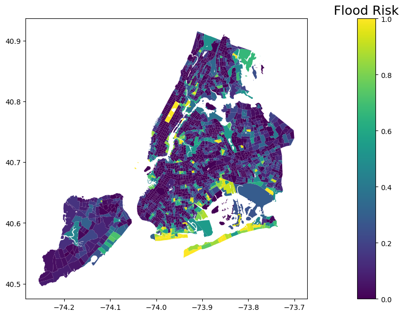
For our flood risk metric, we wanted data that was nationally available, sufficiently granular (so that we can differentiate between the flood risks of stops near each other), and inclusive of multiple types of flooding. We first considered using data from FEMA’s National Risk Index (NRI). The NRI provides census tract level estimates of expected annual damage due to climate change. At first, this seemed granular enough for our uses. Digging a bit deeper into the underlying data revealed that weather event data was at the county level, which was much too high level to be useful in this use case. On the opposite end, we thought about using regional floodplain data (like New York City’s stormwater flood estimates) to derive our metric. This kind of data is extremely granular, but we decided against it because it lacks national availability and is often specific to a certain kind of flooding. Fortunately, we were able to find what we were looking for. First Street Foundation is a Brooklyn-based nonprofit organization that seeks to ‘make climate risk accessible, easy to understand, and actionable for individuals, governments, and industry.’ As part of this mission, they create property-level flood risk estimates and provide an aggregated version of this data for public noncommercial use. The aggregated data is nationally available at the census tract level and accounts for all major forms of flooding – exactly the kind of information that would be helpful for our intended users, transit planners and community organizations.
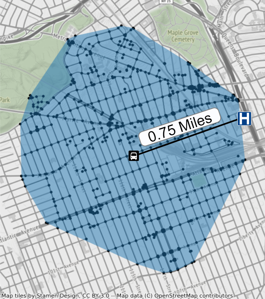
We treat stops as destinations, so it’s important to have a rigorous definition of what each stop gives transit users access to. One way to do this is to define a radius (say, 1 mile) and draw a circle of that radius around each stop. This is straightforward to implement, but it ignores the natural and built environment around each stop. Consider the example below. The figure displays a bus stop and a hospital in Jamaica, Queens. The bus stop is only 0.75 miles from the hospital, which would normally be about a 15-minute walk. However, a ground-level train line runs between the bus stop and the hospital, making it impossible to walk directly from the stop to the hospital. In order to account for this type of barrier, we need to consider the underlying “walk network”–all the streets and paths that can be traversed on foot. In the figure below, we are plotting the subset of NYC’s full walk network that can be reached within a 20-minute walk of the bus stop. The blue polygon is called the “walkshed” around the stop. In our example, we see that the hospital is not reachable within a 20-minute walk from the stop, despite being well under a mile away.
Our two jobs metrics also make use of the walkshed around each stop. Treating the stops as destinations means we want to understand people who work in the area of the stop rather than those who live near the stop. A special census product turned out to be perfect for our needs: the LEHD Origin-Destination Employment Statistics (LODES). This dataset contains a census block-level mapping between where people work and where they live. We used the LODES data to identify the total number of people employed in each walkshed, which we then broke into thirds within each city- the walksheds with high/medium/low density of commuter jobs. We exclude people who both live and work inside a particular walkshed from the count because these people are unlikely to rely on transit to get to work.
We adapt this process and bring in one more dataset for our vulnerable workers metric. The dataset is the CDC’s Social Vulnerability Index (SVI)–a composite measure that scores census tracts based on factors related to socioeconomics, race and ethnicity, transportation, and household characteristics. We combine the SVI and LODES data to match the workers in each walkshed to the census tracts that they live in and use a set of weights to calculate the average vulnerability of workers within the walkshed. Like the jobs score, we then bin the walksheds into thirds within each city–the walksheds with high/medium/low density of vulnerable commuter jobs.
With the metrics in hand, our team was prepared to begin building out a tool that facilitated access to our insights.
Building the TREC Web App
To visualize all this data, we decided that making a tool for the web was the best approach, for accessibility and usability reasons. Users wouldn’t need to download and install software, and any updates we made to TREC would be immediately available once we pushed them live. We chose to build a single-page web app using React and Mapbox. The data is all loaded in as GeoJSON, with the exception of the projected flood data, which has been converted to a vector tileset.
Our goal was to keep our target users, transit agency planners and community organizations, in mind as we designed and built the tool. While some of these users might have a lot of experience working with data, others might not–so it was important to design something that had a low barrier to entry and would feel comfortable and familiar to users. Transit planners make use of desktop GIS tools like QGIS, so we wanted to incorporate some of those features, while also keeping things as simple as the web, which all users will expect.
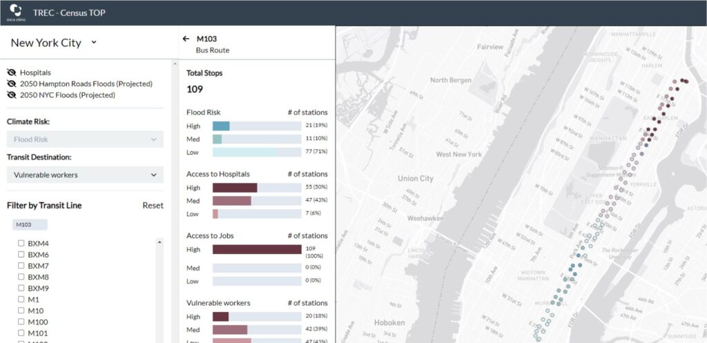
For users with transit network analysis needs, we realized a map view wouldn’t be enough, but we also needed to balance that with not reinventing GIS. We settled on a sidebar with a summary view, allowing those familiar with the network to view it with a route-level granularity.
For users to do specific stop-level analysis, we made our map legend into an interactive filter that allows for a dynamic way to view stations based on their climate risk and transit accessibility. “The visualization aspects […] that help make complex, multi-criteria decisions [are interesting]. The demonstration on how to identify stations critical for essential services of transit at a system-wide level, such as job and hospital accessibility, but which are at a higher flood risk, is an example of that […].” said Dr. Vonu Thakuriah, a Distinguished Professor at Rutgers University and Director of the Rutgers Urban and Civic Informatics Lab.
Get involved
The code and data for the tool are available on Github, and the current version of TREC can be accessed at trec.tsdataclinic.com. What comes next depends on you–TREC’s users. We want to make sure that any future expansions (more cities, climate events, access metrics) or features (exporting filtered data, bookmarking stations, etc.) are informed by what’s most useful to those seeking to apply this in their climate resilience efforts.
Email us at dataclinic@twosigma.com to share your thoughts, or submit an issue on GitHub with your request. We’d love to hear from you and explore how TREC can better respond to your use case.