How to Create a Responsive Navigation For Your Site
One of the trickiest parts to be responsified on a website is “the Navigation”, this part is really important for the website accessibility, as this is one of the ways visitors jump over the web pages.
There are actually many ways to create responsive web site navigation and even some jQuery plugins are available to do it in a second.
However, rather than applying an instant solution, in this post, we are going to walk you through on how to build a simple navigation from the ground and using the CSS3 media queries and a little jQuery to display it in a small screen size like the smartphones properly.
So, let’s just get started.
HTML
First of all, let’s add the meta viewport inside the head tag. This meta viewport tag is required for our page to scale properly inside any screen size, particularly in the mobile viewport.
<meta name="viewport" content="width=device-width, initial-scale=1, maximum-scale=1">
…and then add the following snippet as the navigation markup inside the body tag.
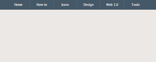
<nav class="clearfix">
	<ul class="clearfix">
		<li><a href="#">Home</a></li>
		<li><a href="#">How-to</a></li>
		<li><a href="#">Icons</a></li>
		<li><a href="#">Design</a></li>
		<li><a href="#">Web 2.0</a></li>
		<li><a href="#">Tools</a></li>
	</ul>
	<a href="#" id="pull">Menu</a>
</nav>
As you can see above, we have six primary menu links and added one more link after them. This extra link will be used to pull the menu navigation when it is hidden in a small screen.
Further reading: Don’t forget the viewport meta tag.
Styles
In this section, we start styling the navigation. The style here is only decorative, you can pick any colors as you desire. But in this case, we (I personally) want the body to have a soft and creamy color.
body {
	background-color: #ece8e5;
}
The nav tag that define the navigation will have 100% full width of the browser window, while the ul where it contains our primary menu links will have 600px for the width.
nav {
	height: 40px;
	width: 100%;
	background: #455868;
	font-size: 11pt;
	font-family: 'PT Sans', Arial, sans-serif;
	font-weight: bold;
	position: relative;
	border-bottom: 2px solid #283744;
}
nav ul {
	padding: 0;
	margin: 0 auto;
	width: 600px;
	height: 40px;
}
Then, we will float the menu links to the left, so they will be displayed horizontally side by side, but floating an element will also cause their parent collapse.
nav li {
	display: inline;
	float: left;
}
If you notice from the HTML markup above, we’ve already added clearfix in the class attribute for both the nav and ul to clear things around when we float the elements inside it using this CSS clearfix hack. So, let’s add the following style rules in the style sheet.
.clearfix:before,
.clearfix:after {
    content: " ";
    display: table;
}
.clearfix:after {
    clear: both;
}
.clearfix {
    *zoom: 1;
}
Since we have six menu links and we also have specified the container for 600px, each menu links will have 100px for the width.
nav a {
	color: #fff;
	display: inline-block;
	width: 100px;
	text-align: center;
	text-decoration: none;
	line-height: 40px;
	text-shadow: 1px 1px 0px #283744;
}
The menu links will be separated with 1px right border, except for the last one. Remember our previous post on box model, the menu’s width will be expanded for 1px making it 101px as the border addition, so here we change the box-sizing model to border-box in order to keep the menu remains 100px.
nav li a {
	border-right: 1px solid #576979;
	box-sizing:border-box;
	-moz-box-sizing:border-box;
	-webkit-box-sizing:border-box;
}
nav li:last-child a {
	border-right: 0;
}
Next, the menu will have brighter color when it is in :hover or :active state.
nav a:hover, nav a:active {
	background-color: #8c99a4;
}
…and lastly, the extra link will be hidden (for the desktop screen).
nav a#pull {
	display: none;
}
At this point, we only styling the navigation and nothing will happen when we resize the browser window. So, let’s jump to the next step.
Further reading: CSS3 Box-sizing (Hongkiat.com)
Media Queries
The CSS3 media queries is used to define how the styles will shift in some certain breakpoints or specifically the device screen sizes.
Since our navigation is initially 600px fix-width, we will first define the styles when it is viewed in 600px or lower screen size, so practically speaking, this is our first breakpoint.
In this screen size, each of two menu links will be displayed side by side, so the ul‘s width here will be 100% of the browser window while the menu links will have 50% for the width.

@media screen and (max-width: 600px) {
	nav {
  		height: auto;
  	}
  	nav ul {
  		width: 100%;
  		display: block;
  		height: auto;
  	}
  	nav li {
  		width: 50%;
  		float: left;
  		position: relative;
  	}
  	nav li a {
		border-bottom: 1px solid #576979;
		border-right: 1px solid #576979;
	}
  	nav a {
	  	text-align: left;
	  	width: 100%;
	  	text-indent: 25px;
  	}
}
…and then, we also define how the navigation is displayed when the screen get smaller by 480px or lower (so this is our second breakpoint).
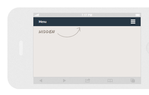
In this screen size, the extra link that we’ve added before will start visible and we also give the link a “Menu” icon on its right-side using the :after pseudo-element, while the primary menu links will be hidden to save more vertical spaces on the screen.
@media only screen and (max-width : 480px) {
	nav {
		border-bottom: 0;
	}
	nav ul {
		display: none;
		height: auto;
	}
	nav a#pull {
		display: block;
		background-color: #283744;
		width: 100%;
		position: relative;
	}
	nav a#pull:after {
		content:"";
		background: url('nav-icon.png') no-repeat;
		width: 30px;
		height: 30px;
		display: inline-block;
		position: absolute;
		right: 15px;
		top: 10px;
	}
}
Lastly, when the screen gets smaller by 320px and lower the menu will be displayed vertically top to bottom.
@media only screen and (max-width : 320px) {
	nav li {
		display: block;
		float: none;
		width: 100%;
	}
	nav li a {
		border-bottom: 1px solid #576979;
	}
}
Now, you can try resizing the browser window. It should now be able to adapt the screen size.
Further reading: Media Queries for Standard Devices.
Showing the Menu
At this point, the menu will still be hidden and will only be visible when it is needed by tapping or clicking on the “Menu” link and we can achieve the effect using the jQuery slideToggle().
$(function() {
	var pull 		= $('#pull');
		menu 		= $('nav ul');
		menuHeight	= menu.height();

	$(pull).on('click', function(e) {
		e.preventDefault();
		menu.slideToggle();
	});
});
However, when you resize the browser window right after you’ve just viewed and hid the menu in a small screen, the menu will remain hidden, as the display: none style generated by the jQuery is still attached in the element.
So, we need to remove this style upon the window resizing, as follows:
$(window).resize(function(){
	var w = $(window).width();
	if(w > 320 && menu.is(':hidden')) {
		menu.removeAttr('style');
	}
});
Alright, that’s all the codes we need, we can now view the navigation from the following links, and we recommend you to test it in a responsive design test tool, such as the Responsinator, so that you can view it in various width at once.
Bonus: An Alternative Way
As we have mentioned earlier in this post, there some other ways of doing it, and using a JavaScript library called SelectNav.js is one of the easiest way. This is a pure JavaScript that is not relying on another third party library like jQuery.
Basically, it will duplicate your list menu and transform it into a <select> dropdown menu, then you are able to choose which one is hidden or shown depending on the screen size through media queries.
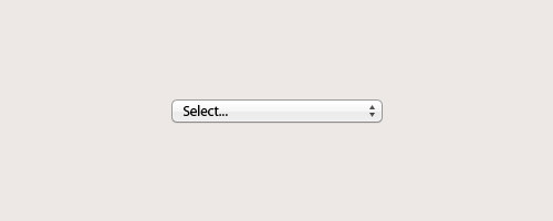
One of an advantage I like on this practice is that we don’t have to worry on the navigation style as the <select> menu will make use of the native user interface from the device itself.
Please, refer to the official documentation for further implementation.
Conclusion
We have come through all the way to create responsive navigation from scratch. This one we have created here is just one of examples, and as we stated earlier in this post and shown above, there are many other solutions you can implment. So, it is now leave to your decision to pick which practice that best fit to cater requirement and your web site navigation structure.