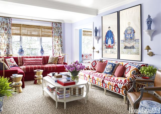
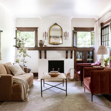
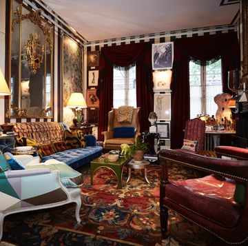
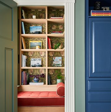
The best antidote to the all-day gray of Manhattan's concrete and steel: A playful Park Avenue apartment that Los Angeles designer Mark D. Sikes decked out in a not-so-quiet riot of rollicking colors, patterns and textures.
ALEXANDRIA ABRAMIAN: Wow! No shortage of visual stimulation going on here!
MARK D. SIKES: The client wanted an apartment with old-world elegance and great style. I'm based in California, and a lot of my work is more casual than this. Here we were going for a glamorous statement. It's Park Avenue, after all.
Glamorous, yes, but not formal, despite the address.
In New York, people are often surrounded by buildings, so color is especially important here — even more so than in other places. This client and her husband have school-age children and wanted their apartment to feel cheerful and alive, as well as chic. Even though it doesn't get a lot of light, this home is bursting with details and color.
Yellow and green are the classic uplifting tones, but I don't see either here.
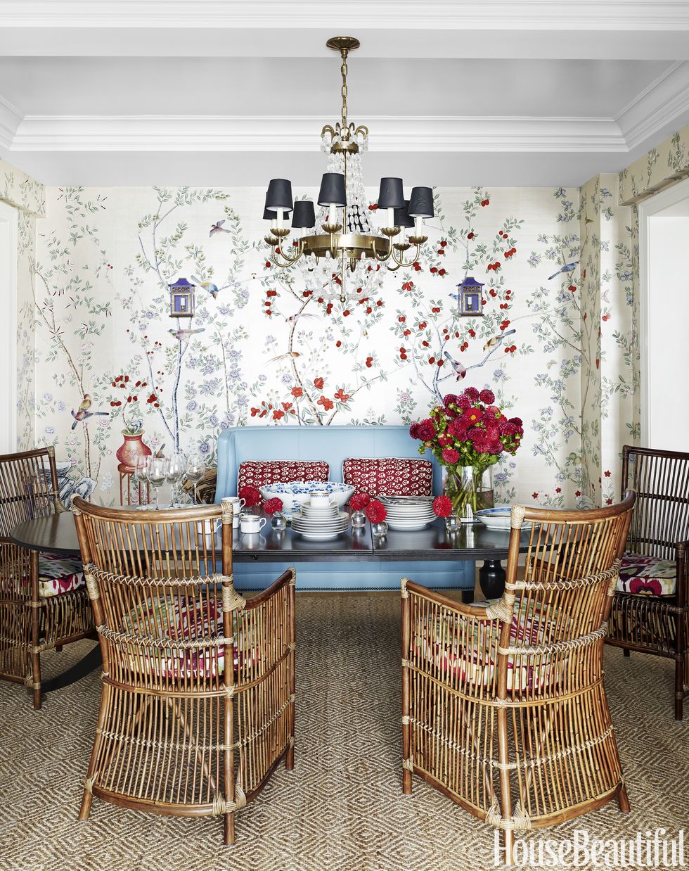
It's the way in which color is used, more than the specific hues, that can make a place feel happy. She fell for a de Gournay hand-painted floral wallpaper with a beautiful palette of robin's-egg blue, red, lapis and lilac. We used it in the dining room. It became the catalyst and set the tone for how we worked with color throughout the apartment.
How does so much of everything not feel like too much?
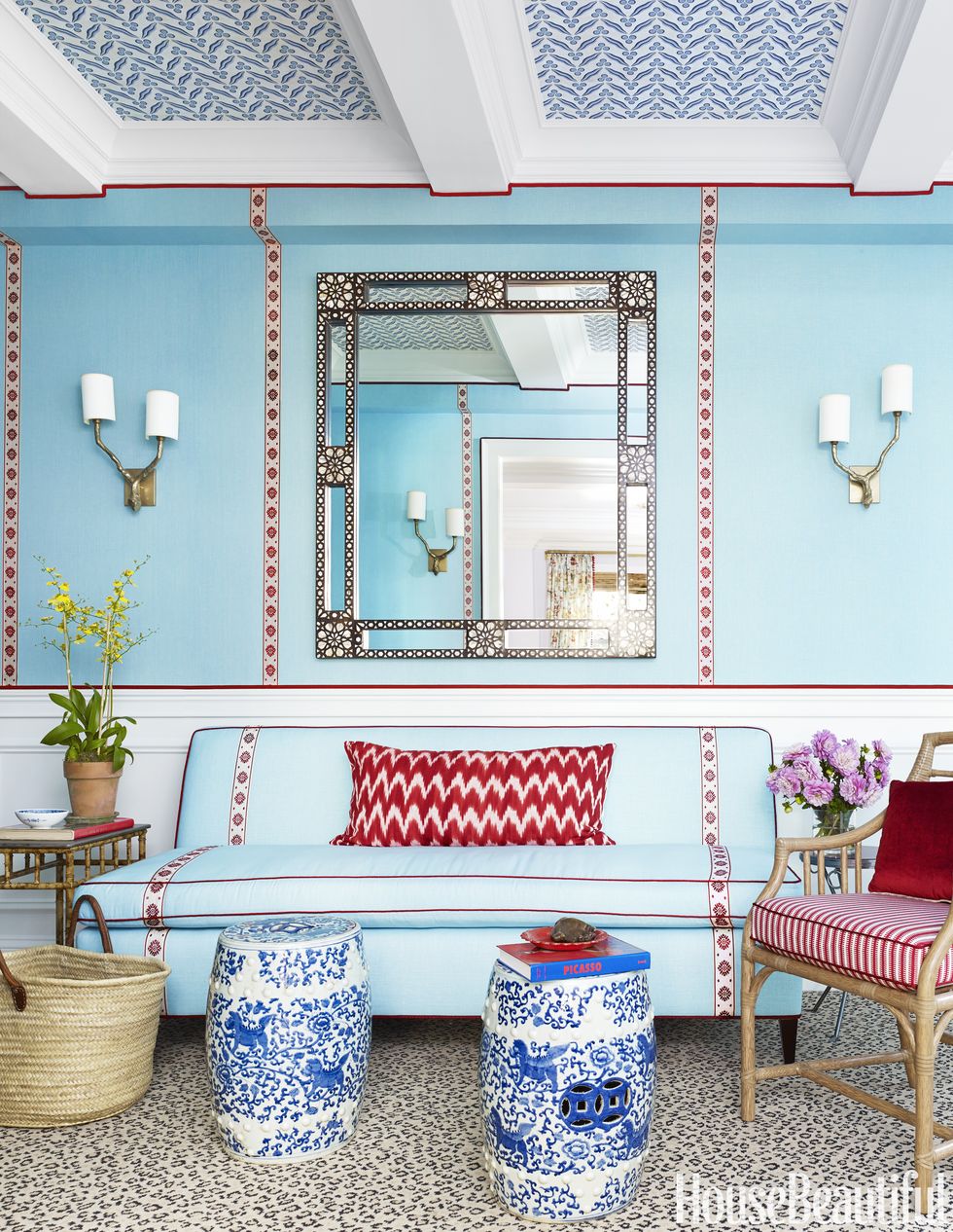
In the living room, you get the full color punch, with reds, blues and lilac on the walls. But it would have felt overwhelming to give every color that much play in every room. Because of this, transitions became important. For example, the foyer is pale blue with just a hint of red in the trim and a dab of lilac in the wallpaper on the ceiling. The powder room is blue and white with red accents. When you get to the master bedroom, lilac reappears in a more important way to help soften the space. I also used a variety of tones and a wide range of textures in these spaces, including silk, linen, leather and cotton.
You're a master at combining patterns. What's your strategy?
The apartment seems to have countless patterns throughout, but really, there are only three: ikat, chintz and suzani. The key is to play around with scale. Some patterns are small and delicate, while others are larger and more emphatic. Combining them gives a room depth. And, just as with color, there's a rhythm to the way pattern is applied from room to room. The foyer has solid blue walls and patterned wallpaper on the ceiling. The dining room has that fabulous chinoiserie wallpaper, which looks like a garden, but this is balanced by quieter rooms with solid walls and subtler pattern.
Overall it's a bravura performance of mixing and matching. Does that take courage?
I was in fashion for so many years. I was the senior director for visual merchandising at Banana Republic for 15 years, where I helped to create the store and window displays. I think that's why I'm so comfortable using a mixture of colors, patterns and textures. In some ways, creating a store display to show off the latest fashions is not unlike designing a room.
The client never requested a retreat from it all? A solid white bathroom, for example?
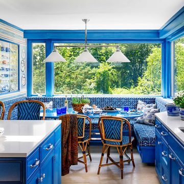
She didn't. There is color and pattern in every room, including the kids' bedrooms and even the kitchen, which has bright cornflower-blue walls. I tone it down with natural elements like bamboo furniture and fiber rugs. If you look closely, it all makes sense — but even if you don't, it's still delightful.
Bamboo dining chairs with a leather banquette? That's inspired.
Since this apartment isn't huge, the couple wanted a good variety of seating. I love the mix, and it's also functional. Her kids use the dining table for homework. The house is fancy, but they also feel comfortable here. When the decorating was finished, there were many "Wow, Mommy!" moments as the children explored their new home.
Given your background in fashion, what kind of outfit is this home?
I am drawn to timeless clothing — white-and-blue shirts and stripes. But there is also a part of me that loves glamour, and to me, this apartment is like a Valentino dress. This home feels like a swanky cocktail party — dazzling, but not so precious that you can't have kids running around.
See more photos of this gorgeous home »
Mark D. Sikes on Color
Your color philosophy: Blue and white forever!
Colorful accessory you always wear: I'm never without a French blue pocket square. It adds so much chic. I did a version for women — I call it a mini scarf — as part of my clothing line, MDS Stripes. ($28, mdsstripes.com)
Favorite curveball hue: This might surprise people, but it's red. Whether the palette's green and yellow, neutral or blue, nothing's better for bringing some glamour and elegance than a pop of red.
Color that makes everyone look amazing: Red! It works for rooms, it works for people.
Iconic landmark you'd recolor: I live in L.A., and the Hollywood sign is looking a little dingy. I'd paint it blue, of course!
Colors you'd bring home from a trip: The blues of the Greek islands, India's pinks, the neutrals in Africa, Parisian reds and the bright green lawns of the American South.
Accent walls are: Okay in the right place. It depends on the architecture and the location. Maybe Palm Springs?
Flower of choice: To me, green viburnum is the perfect shade of pale green.
The color that changed your mind: I love blue. But I never imagined cobalt-blue crosshatched walls could work in a Manhattan townhouse until I saw Bunny Mellon's dining room from the '60s. There's the cobalt, and it 150% works.
This story originally appeared in the September 2016 issue of House Beautiful.
