So you’ve decided to re-do your website. Maybe you have you have settled on a logo and have a few ideas on what you want to convey to your existing and potential customers. That is an excellent start, but sometimes this is where things get a bit overwhelming. Whether you’re a writer, an illustrator, a musician, an improv actor or a designer sometimes we benefit from constraints.
That is where style tiles can help you and your designer build a solid foundation for your website.
So what is a style tile exactly?
Merriam-Webster defines I’m just kidding, I wouldn’t do that to you. A style tile is a tool that you can develop along with your designer to help craft the feel of your project or website from the early stages without getting bogged down in the fine details.
It’s simple to do, easy to understand, and the final product will be rewarding. Let’s break it down into the main parts:
Logo:
We’ve talked about a logo, and that’s a fantastic start. I won’t get into the nitty gritty of logo design but if you don’t have one, that can be added later.
Colours:
This can be straightforward; for example, if you already picked a colour from years gone by and you and your customers are already familiar with it go right ahead. If you want to delve deeper, you see patterns emerge when using certain colors. Red evokes imagery of heat, passion, and many believe stimulates appetite. Blue on the other hand is cool, stable and increases productivity. Of course personal taste also goes a long way. A style tile will contain a pallet of roughly five colours, including primary, secondary and branding colours.
Font:
What does your font say about your company, your products and your services? Would you take someone else seriously if they chose a font that looked like this? Work by yourself or with a designer to select the fonts that will have an impact. Comic Sans will communicate something entirely different from Helvetica or Times New Roman. Easy readability is also a factor with font selection. Print media and online media are read differently by the audience taking into consideration whether or not to use serifs.
Buttons and textures:
Although not critical at this stage, you can also start to think what some of the elements you will be re-using look like. Since we’re developing a consistent and on-brand design, elements will be used which are consistent, without becoming repetitive.
Iteration:
Design is an iterative process, and the process of designing style tiles is a tool to help move in the right direction. Remember to maintain versions of each style tile and save them. There might be a moment in the design process where you want to revisit something you liked previously.
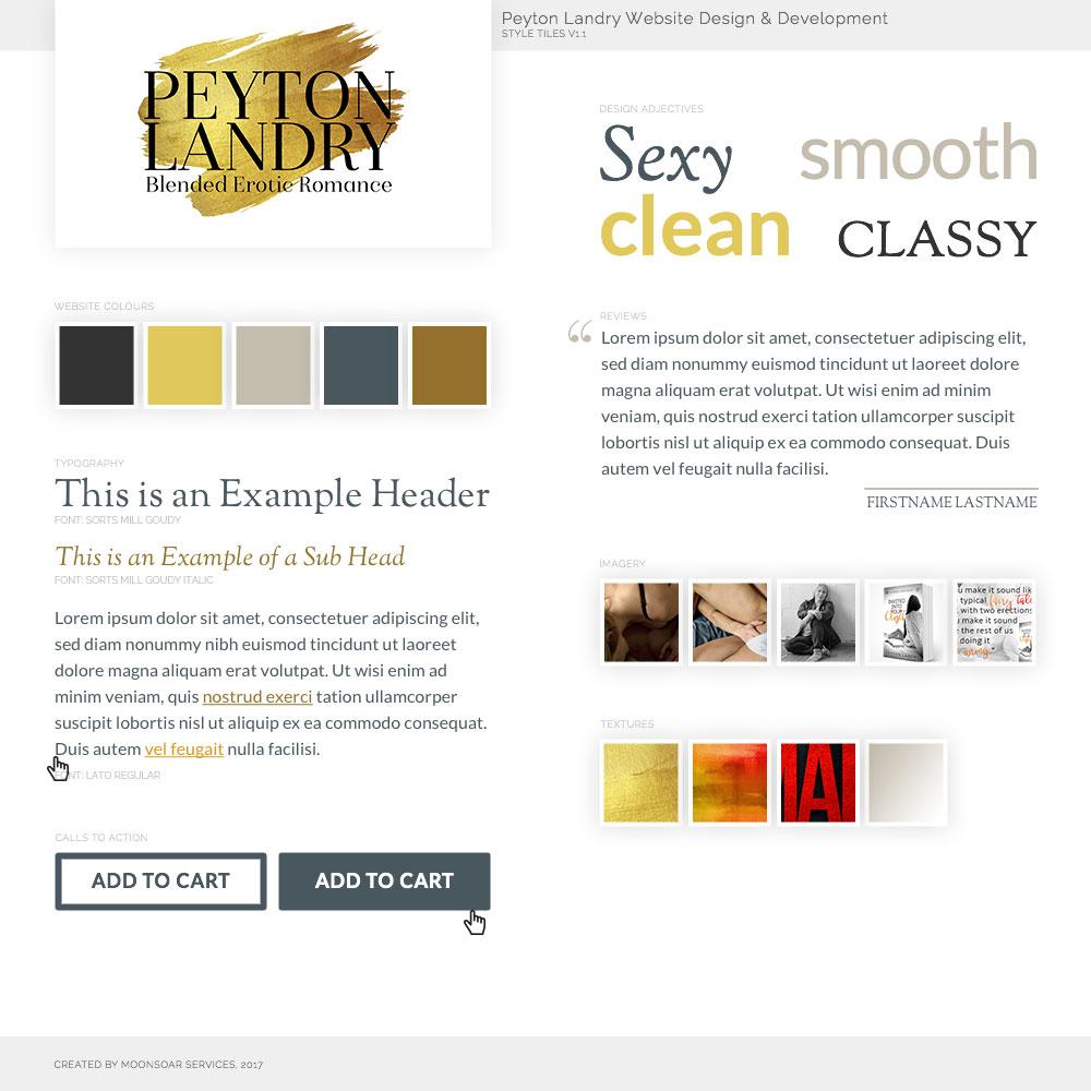
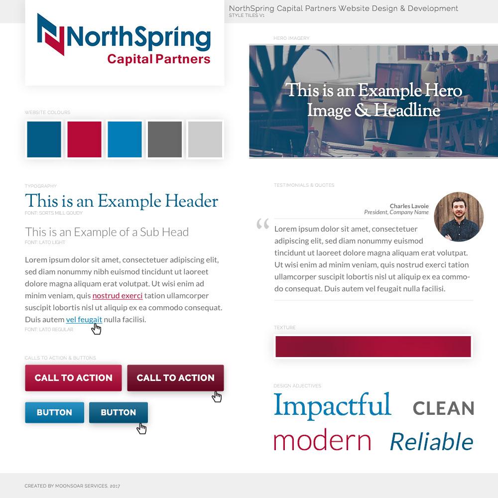
Here are a couple of examples of style tiles we’ve used to help our clients move forward in the design process. Have fun getting started on developing your ideal project.


