 Adam Nieman, Science Photo LibraryAn illustration shows the volume of all the world’s liquid water if put in the form of a sphere (green) and the volume of the atmosphere (pink) if the air were all at sea-level pressure.
I recently became aware of fascinating efforts by Adam Nieman to help society appreciate environmental challenges in fresh ways by visualizing volumes that are otherwise abstractions. In 2003 he created the image above, illustrating the volume of the world’s oceans and atmosphere (if the air were all at sea-level density) by rendering them as spheres sitting next to the Earth instead of spread out over its surface. To my eye, this helps powerfully convey the finite nature of these shared global assets. In general, I think there’s great merit in conceiving and testing new ways to communicate visually on the keystone issues of this blog (energy and climate, population and consumption, the relationship between humans and other life). Click here for his globe showing all the world’s land types as “islands” (and note how tiny the urban islet is).
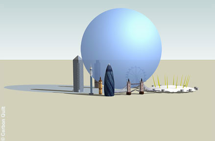
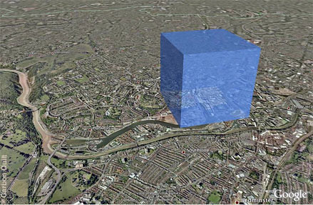
Lately, he’s focused closely on carbon dioxide, developing a variety of ways to visualize the roughly 80 million tons of the greenhouse gas emitted daily by human activities. Here’s London’s daily output:
This work relates to my musing a while back on whether we’d be more engaged in limiting emissions “if CO2 were pink.” But he’s gone further, building interactive images that mesh data and graphics in novel ways, including the figure below, which compares the cumulative emissions of the world’s nations, large and small. Click it to explore.
This graphic is part of an initiative by a unit at I.B.M. focused on “collaborative visualization.” A central point of debate in climate negotiations has been the extent to which established industrialized powers are obliged to act given their outsize contribution to the atmosphere’s buildup of greenhouse gases so far.
I sent Dr. Nieman some questions and he replied with the answers you can read below. I’ve periodically highlighted other innovative efforts to build understanding with imagery, including a dynamic map of United States carbon dioxide emissions and a mesmerizing portrait of 24 hours of aviation in North America. What else is out there?
What’s your education and work background?
I have a degree in physics from Edinburgh University, where I also studied philosophy. After graduating I worked as a picture researcher ending up at the Science Photo Library in London. I then moved to Bristol to do a PhD in the philosophy and visual culture of science and worked as a lecturer (professor) teaching science studies and new media theory. In 2003 I moved away from academia to concentrate on art-based projects including Space Signpost. Since then I have mostly been working in science communication focusing on visual stuff. I am the creative director of carbon visuals and of GovEd communications and I am trying to find the time to finish a book on photography and astronomy.
How did you come to this mix of the quantitative, environmental and visual?
It started with an idea called “Scale Explorer” back in the early noughties. I realized that my training as a physicist had given me a wonderful relationship with the universe and that my friends were missing out. In particular, nonphysicists are restricted to the “human scale” whilst physicists can mentally inhabit spaces the size of the universe and spaces many orders of magnitude smaller than atoms just as easily. Physicists are also at home with phenomena that take billions of years or take the tiniest fraction of a second.
The universe is a richer and more beautiful place than we realize. Being human is a bit like owning a mansion in which we are locked in a cupboard. Physics is the key to the door; it lets us roam about our own home. The idea of Scale Explorer was to help non-mathematical people to relate to the rest of the universe and make it meaningful for themselves. Space Signpost was part of that program. The project’s original name was “Welcome to the Neighborhood” because the idea was that it should expand the volume of space that viewers/users inhabit.
In making the image reproduced at the top of this post, did you focus on water or air volume first and were there any unexpected difficulties or is that a straightforward calculation?
The air and water images were the first of my “volume representations.” Pleasingly, they won an “Images of Science” award in 2003. The only hard bit (apart from modeling the Earth using U.S.G.S. data) was finding reliable estimates for the volume of the world’s water and the mass of the atmosphere, which wasn’t all that hard. Because I was busy with other things, it was a long time before I got round to doing something similar for carbon dioxide.
Have you done any animated imagery?
I’ve done animations of carbon dioxide emissions. I like these a lot – especially the ones that show per-capita emissions in real-time. //carbonquilt.org/gallery/videos#video-FkS0-AukOBo. These provide a sense of our impact on the atmosphere that I haven’t seen in other representations.
Your efforts recently seem focused on CO2 nearly entirely. Are there other applications for this visualization approach you plan on trying soon?
Scale Explorer (which is an ongoing project) led to the development of graphical techniques that help viewers relate to quantitative data physically as well as numerically and we have been developing these infographic techniques at Carbon Visuals. The graphical techniques we have been developing can provide insight into many otherwise abstract global issues including biodiversity, population and land-use change, but currently we are focusing on carbon dioxide. Biodiversity is one issue I’d like to deal with in particular, because it’s not an easy subject to get a “feel” for unless you are an ecologist.
I have also been taking the Scale Explorer project in more artistic directions. I had a show called “Numbers” in London last year which included slightly more arty stuff including a map of the atmosphere and portraits of some local stars. My favorite piece in the show is called “Allotment” and shows the area of land and sea we’d each have if the world were divided equally amongst 6.5 billion people. Details of the pictures in that show can be found here.
I am now working on a time-based piece called “Jacob’s Ladder.” It’s about epidemiology: it shows people dying (statistically) in real time. I am trying to make a 20-kilometer-long sculpture
called “Tangent” that will reveal the curvature of the Earth to someone driving along a straight road. And I have plans to make a portrait of everyone on Earth.
Here’s a visualization of “Tangent”:
Are you aware of other efforts along these lines that you particularly like? I’m reminded, for example, of the manipulated photography of Chris Jordan.
There is some good infographic work out there, but nobody as far as I know is trying to make it “real” the way we are at Carbon Visuals. I like Chris Jordan’s work a lot. He’s the only other person I know exploring some of the same quantitative themes that I have been. When I first came across his work, part of me thought, “Great – I’m not all on my own,” and another part of me thought, “Oy! That’s my turf – get off.” (In fact there’s plenty of room for all of us :-).
Here’s a closing image, showing one person’s “quota” of the atmosphere if all of the air were divvied up among the world’s human inhabitants:


