Markets
5 Lessons About Volatility to Learn From the History of Markets
In 2018, the re-emergence of volatility took many market participants by surprise.
After all, aside from a few smaller, intermittent spikes over the course of the current bull market, volatility has largely been in a long-term downtrend since the aftermath of the 2008 Financial Crisis.
Whether there is more volatility lurking ahead this year or whether the markets continue to calm, it’s worth looking at the last century of market history to put these recent bouts of volatility into context.
Learning From the History of Markets
Today’s infographic comes to us from New York Life Investments and it goes back in time to show us that the volatility experienced in 2018 was neither exceptional or unusual.
Here are five important lessons to learn from it all:

With volatility back on the table again, investors are re-learning what it’s like to cope with a sometimes tumultuous market.
Higher volatility can be a source of uncertainty for even the most seasoned investors, but a look at historical data over the last century helps to ease these concerns.
5 Lessons About Volatility
Here are five lessons about volatility that we can learn from the history of markets:
Lesson #1: Volatility isn’t new
Volatility isn’t a new phenomenon – and it’s actually as old as the stock market itself. In fact, if you look at historical swings in the Dow Jones Industrial Average, you’ll see that many of the biggest ones were more than 80 years ago.
Lesson #2: Volatility is actually the status quo
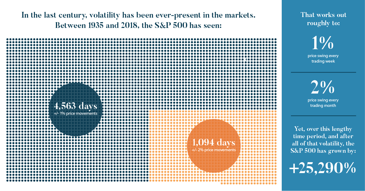
In the last century, volatility has been ever-present in the markets, and between 1935 and 2018 the S&P 500 has seen:
- 4,563 total days with +/- 1% price movements
- 1,094 total days with +/- 2% price movements
That works out roughly to a 1% price swing every trading week – and a 2% price swing every month. Yet, over this lengthy time period, and after all of that volatility, the S&P 500 has grown by 25,290%.
Lesson #3: Any short-term volatility disappears with a long-term view
Daily price swings can feel like a roller coaster. But if you take a step back and look at the big picture, this volatility is just a blip on the radar.
For example, if you look at a chart of the S&P 500 from August 1990 to February of 1991, you’ll see that daily volatility was rampant. But zoom out to a 10-year chart, and these daily or weekly swings are barely noticeable.
Lesson #4: Volatility can be easily weathered with a resilient portfolio
Given that volatility has been around forever and that it’s extremely common, that makes it fairly unavoidable. Therefore, to weather periods of volatility, it is imperative to build a resilient portfolio by diversifying between different asset classes.
Certain assets are better at weathering periods of volatility than others. Here are some traits to look for:
(a) Low correlation with the market
These assets can zig when others zag, making them a valuable hedge (Examples: Gold, alternative assets, municipal bonds)
(b) Generates cash flow
When times are uncertain, the market puts extra value on assets that are generating real cash flow (Examples: Stocks that pay dividends, or bonds that pay interest)
(c) Defensive or non-cyclical
During uncertain times, there are still companies with stocks that will thrive. They are usually bigger companies with conservative balance sheets and durable competitive advantages. (Examples: Quality stocks in healthcare, consumer staples, telecoms, REITs, and utilities sectors)
Lesson #5: Volatility reminds us that there is no reward without risk
Investing in stocks comes with risks, but it also comes with the best returns over time:
| Asset Type | Annualized real return, 1925-2014 |
|---|---|
| U.S. Equities | 6.7% |
| Government Bonds | 2.6% |
| Cash | 0.5% |
If stocks offer the best long run gains – and volatility is an unavoidable aspect of investing in stocks – then we must learn to accept volatility for what it is.
Even better, we must learn to build resilient portfolios that can weather any storm, while minimizing these effects.


Markets
U.S. Debt Interest Payments Reach $1 Trillion
U.S. debt interest payments have surged past the $1 trillion dollar mark, amid high interest rates and an ever-expanding debt burden.


U.S. Debt Interest Payments Reach $1 Trillion
This was originally posted on our Voronoi app. Download the app for free on iOS or Android and discover incredible data-driven charts from a variety of trusted sources.
The cost of paying for America’s national debt crossed the $1 trillion dollar mark in 2023, driven by high interest rates and a record $34 trillion mountain of debt.
Over the last decade, U.S. debt interest payments have more than doubled amid vast government spending during the pandemic crisis. As debt payments continue to soar, the Congressional Budget Office (CBO) reported that debt servicing costs surpassed defense spending for the first time ever this year.
This graphic shows the sharp rise in U.S. debt payments, based on data from the Federal Reserve.
A $1 Trillion Interest Bill, and Growing
Below, we show how U.S. debt interest payments have risen at a faster pace than at another time in modern history:
| Date | Interest Payments | U.S. National Debt |
|---|---|---|
| 2023 | $1.0T | $34.0T |
| 2022 | $830B | $31.4T |
| 2021 | $612B | $29.6T |
| 2020 | $518B | $27.7T |
| 2019 | $564B | $23.2T |
| 2018 | $571B | $22.0T |
| 2017 | $493B | $20.5T |
| 2016 | $460B | $20.0T |
| 2015 | $435B | $18.9T |
| 2014 | $442B | $18.1T |
| 2013 | $425B | $17.2T |
| 2012 | $417B | $16.4T |
| 2011 | $433B | $15.2T |
| 2010 | $400B | $14.0T |
| 2009 | $354B | $12.3T |
| 2008 | $380B | $10.7T |
| 2007 | $414B | $9.2T |
| 2006 | $387B | $8.7T |
| 2005 | $355B | $8.2T |
| 2004 | $318B | $7.6T |
| 2003 | $294B | $7.0T |
| 2002 | $298B | $6.4T |
| 2001 | $318B | $5.9T |
| 2000 | $353B | $5.7T |
| 1999 | $353B | $5.8T |
| 1998 | $360B | $5.6T |
| 1997 | $368B | $5.5T |
| 1996 | $362B | $5.3T |
| 1995 | $357B | $5.0T |
| 1994 | $334B | $4.8T |
| 1993 | $311B | $4.5T |
| 1992 | $306B | $4.2T |
| 1991 | $308B | $3.8T |
| 1990 | $298B | $3.4T |
| 1989 | $275B | $3.0T |
| 1988 | $254B | $2.7T |
| 1987 | $240B | $2.4T |
| 1986 | $225B | $2.2T |
| 1985 | $219B | $1.9T |
| 1984 | $205B | $1.7T |
| 1983 | $176B | $1.4T |
| 1982 | $157B | $1.2T |
| 1981 | $142B | $1.0T |
| 1980 | $113B | $930.2B |
| 1979 | $96B | $845.1B |
| 1978 | $84B | $789.2B |
| 1977 | $69B | $718.9B |
| 1976 | $61B | $653.5B |
| 1975 | $55B | $576.6B |
| 1974 | $50B | $492.7B |
| 1973 | $45B | $469.1B |
| 1972 | $39B | $448.5B |
| 1971 | $36B | $424.1B |
| 1970 | $35B | $389.2B |
| 1969 | $30B | $368.2B |
| 1968 | $25B | $358.0B |
| 1967 | $23B | $344.7B |
| 1966 | $21B | $329.3B |
Interest payments represent seasonally adjusted annual rate at the end of Q4.
At current rates, the U.S. national debt is growing by a remarkable $1 trillion about every 100 days, equal to roughly $3.6 trillion per year.
As the national debt has ballooned, debt payments even exceeded Medicaid outlays in 2023—one of the government’s largest expenditures. On average, the U.S. spent more than $2 billion per day on interest costs last year. Going further, the U.S. government is projected to spend a historic $12.4 trillion on interest payments over the next decade, averaging about $37,100 per American.
Exacerbating matters is that the U.S. is running a steep deficit, which stood at $1.1 trillion for the first six months of fiscal 2024. This has accelerated due to the 43% increase in debt servicing costs along with a $31 billion dollar increase in defense spending from a year earlier. Additionally, a $30 billion increase in funding for the Federal Deposit Insurance Corporation in light of the regional banking crisis last year was a major contributor to the deficit increase.
Overall, the CBO forecasts that roughly 75% of the federal deficit’s increase will be due to interest costs by 2034.

-

 Green1 week ago
Ranked: The Countries With the Most Air Pollution in 2023
-

 Automotive2 weeks ago
Almost Every EV Stock is Down After Q1 2024
-

 AI2 weeks ago
The Stock Performance of U.S. Chipmakers So Far in 2024
-

 Business2 weeks ago
Charted: Big Four Market Share by S&P 500 Audits
-

 Real Estate2 weeks ago
Ranked: The Most Valuable Housing Markets in America
-

 Money2 weeks ago
Which States Have the Highest Minimum Wage in America?
-

 AI2 weeks ago
Ranked: Semiconductor Companies by Industry Revenue Share
-

 Travel2 weeks ago
Ranked: The World’s Top Flight Routes, by Revenue