Couple of weeks ago the folks at WordPress released WordPress 4.4, aka “Clifford”, named after the legendary jazz musician Clifford Brown. WP4.4 came with some great new features. We are not going to get into that in this post, as those have been greatly covered all over the net.
Like many of us, you may have woken up with a forced update of your site from your hosting company. Unfortunately, this has become a standard practice for many WordPress hosts, that strive to keep their environment secure. They simply force the latest update and let you deal with the issues after the fact.
One of those issues, we noticed with some of our clients, were blurry images on mobile devices.
But why? The images were working just fine before the update!
While there are quite a few reasons why your images could look fuzzy or blurry on mobile / retina ready devices, here is the most common we have encountered so far.
One of those new WordPress 4.4 Cliford features were “Responsive Images”. Here is an excerpt from WordPress Codex on what it is:
“WordPress now takes a smarter approach to displaying appropriate image sizes on any device, ensuring a perfect fit every time. You don’t need to do anything to your theme, it just works.”
Well… not quite!
Some of our clients were already using “responsive images ready” WordPress themes. They have been around for quite some time.
Once your WordPress site was updated to 4.4, you now had your theme and WordPress competing on how to handle responsive images at the same time. And in most of the cases, this was the reason for blurry images on mobile / retina ready devices.
Now that you know what could be causing the issue, here are a couple of ways to fix it:
1. Disable Responsive (Retina) images in your theme options
If it’s available, the first thing you could try is to disable the retina images in your theme options and let WordPress handle those for you. The below screenshot was taken from the settings on one of the most popular theme in ThemeForest – The 7
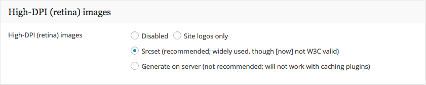
Note: Please note that in most cases your theme may be relying on it’s own responsive images settings, in order to operate properly. In that case, please see option 2 below.
2. Disable WordPress support for responsive images.
The second thing you could do is tell WordPress to let your theme handle the responsive (retina) images. In this case and what we ended up doing for most of our clients is to paste the below code into your functions.php.
/**
* Disable responsive image support
*/
// Clean the up the image from wp_get_attachment_image()
add_filter( 'wp_get_attachment_image_attributes', function( $attr )
{
if( isset( $attr['sizes'] ) )
unset( $attr['sizes'] );

if( isset( $attr['srcset'] ) )
unset( $attr['srcset'] );

return $attr;

}, PHP_INT_MAX );

// Override the calculated image sizes
add_filter( 'wp_calculate_image_sizes', '__return_false', PHP_INT_MAX );

// Override the calculated image sources
add_filter( 'wp_calculate_image_srcset', '__return_false', PHP_INT_MAX );

// Remove the reponsive stuff from the content
remove_filter( 'the_content', 'wp_make_content_images_responsive' );
Credit for solution goes to StackExchange user Birgir Erlendsson
If you are not comfortable modifying you functions.php file, Joseph Fusco has packaged this piece of code in a plugin and you can download it here: Disable Responsive Images or you can ask us to help you with it.
Was this helpful? What other issues did you notice after WordPress 4.4 update? Lets us know in the comments below.