


4 Dreamy White-and-Wood Kitchens to Learn From
White too bright in your kitchen? Introduce wood beams, countertops, furniture and more
Mitchell Parker
January 22, 2016
Houzz Editorial Staff. Home design journalist writing about cool spaces, innovative trends, breaking news, industry analysis and humor.
Houzz Editorial Staff. Home design journalist writing about cool spaces, innovative... More
While a recent Houzz kitchen survey shows that many homeowners prefer white cabinets, there is such a thing as too much white in a kitchen. To keep your fresh white kitchen from looking like a Snowmageddon highlight reel, look to natural wood accents to warm things up. These four kitchens show how natural wood beams, floors, countertops and furniture can help bring balance.
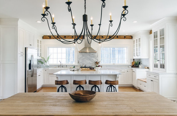
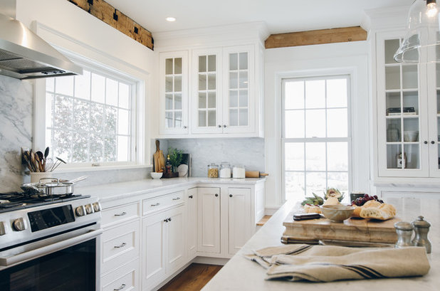
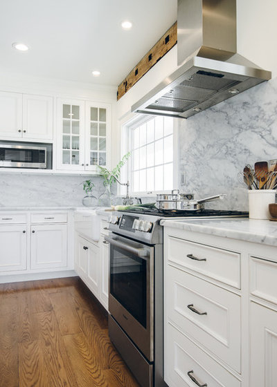
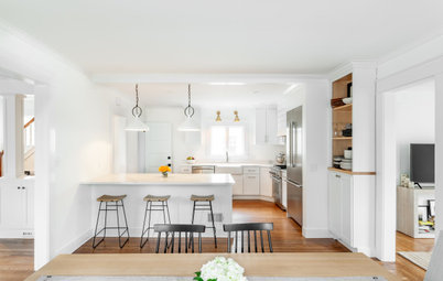
1. Beam Me Up
Designer: Stephanie Holmes of The Working Kitchen
Location: Cooperstown, New York
Size: 300 square feet (about 28 square meters); about 19 by 16 feet
Year built: 1835
Special feature: White cabinetry, white walls, white marble counters. “The natural lighting in this 1800s farmhouse is incredible, so a white kitchen just felt right,” says designer Stephanie Holmes. In contrast, natural wood elements in varying tones add texture, warmth and a sense of history to the new elements in the room. Reclaimed wood from a wing that was taken down was repurposed as a window seat, echoing the character of the original exposed beams. The flooring is oak stained to match the original wide plank flooring found throughout the rest of the house. The dining table is distressed pine and the wooden bowl and pestle are vintage.
Homeowners’ request: Keep things clean and simple, employing natural materials, finishes and textures wherever possible. “The bones of the house are amazing, so I felt a responsibility to let it speak for itself and not overdesign,” Holmes says. “It was very important that this space feel authentic, and that the kitchen transition seamlessly into the other spaces. The wall and trim color are consistent throughout the house, so the natural wood tones, the passages of gray slate flooring and the repetition of the honed white marble in the baths — they all draw you from room to room. It just flows beautifully.”
Why the design works: “A wall of windows floods the space with light, reflecting off the honed marble and glass, and amplifying the size of the room,” Holmes says. “The exposed beams and warm woods tone down the formality and make the space feel more intimate and lived-in.”
Why the design works: “A wall of windows floods the space with light, reflecting off the honed marble and glass, and amplifying the size of the room,” Holmes says. “The exposed beams and warm woods tone down the formality and make the space feel more intimate and lived-in.”
“Uh-oh” moment: “It was actually more of an ‘aha’ moment,” Holmes says. “As is common with projects of this type, you never know what you’ll find when you open up 180-year-old walls. Initially, the space was to be taken back to the studs and the walls were to be Sheetrocked right to the ceiling. As demolition progressed, the ceiling beams were exposed and their original face was removed to make room for the new Sheetrock. Once we saw the beams, however, and saw what they added to the space, we knew they had to stay. It was unfortunate that the original face had been removed, but to see them now, you’d never know. They just belong there. The kitchen would be a different place without them.”
Designer secret: “As a designer or homeowner, when tackling a project like this, it’s so important to really be present in the space, throughout the process,” Holmes says. “As with the beams, you never know what treasures you’ll find. You can add a lot of beautiful things to a space, but sometimes highlighting what is already there can be invaluable.”
Designer secret: “As a designer or homeowner, when tackling a project like this, it’s so important to really be present in the space, throughout the process,” Holmes says. “As with the beams, you never know what treasures you’ll find. You can add a lot of beautiful things to a space, but sometimes highlighting what is already there can be invaluable.”
Splurges and savings: The homeowners splurged on the sink and custom inset cabinetry, and saved on the appliances.
The nitty-gritty: Wall and trim paint: Popped Corn (W-B 200); cabinetry: Essex inset door in custom Nordic White finish with rub throughs, Wood-Mode; floors: oak; window seat: reclaimed wood; counters and full height stone backsplash: 3 centimeter Carrara marble in a honed finish; sink: Shaws Original, Rohl; faucet: Twisthaus Collection in Pewter, Whitehaus; hardware: Normandy Collection in pewter, Top Knobs; pendant lights and chandelier: Pottery Barn; counter stools: Pottery Barn; range: Bosch; range hood: Best: refrigerator and microwave, Profile, GE; dishwasher: KitchenAid; dining table: trestle style, Pottery Barn
Team: Red Point Builders (design and build); Vicki Bodine Photography
See more of this farmhouse kitchen
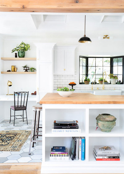
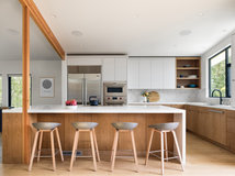
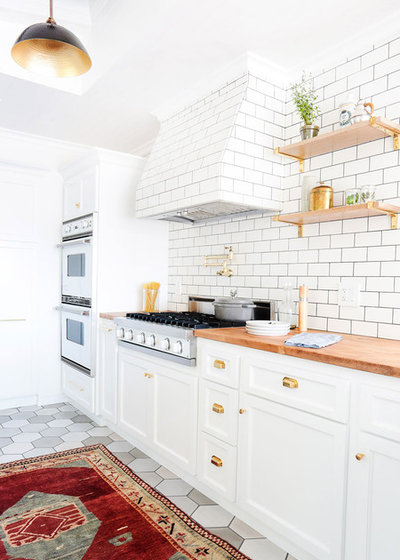
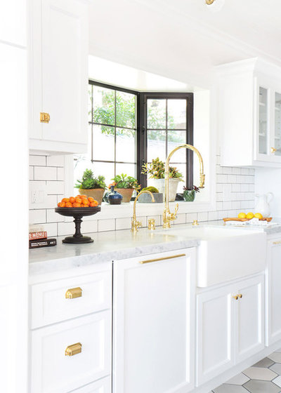
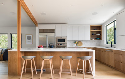
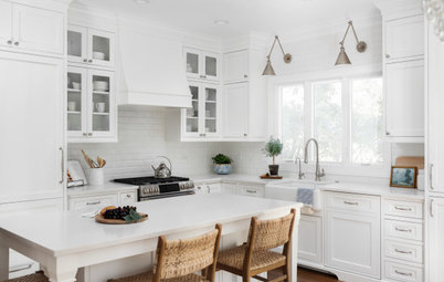
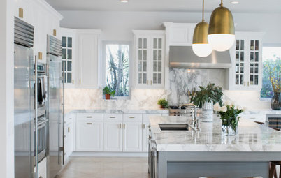
2. Counter Attack
Designer: Stefani Stein
Location: Los Angeles
Size: 190 square feet (about 18 square meters); 10 by 19 feet
Year built: 1923
Special feature: Custom white cabinetry with honed marble countertops, maple butcher block countertops and cerused white oak shelving. “It keeps things bright and airy but still warm,” says designer Stefani Stein. Limed oak floors in the living room and cement tile floors in the kitchen add additional warmth and personality while complementing the exposed pine beams between the kitchen and living room. Matte subway tiles, dark grout, brass hardware, a tile wrapped range hood, refurbished vintage Viking appliances and clean yet classic casings and mouldings reinforce the goal of a remodel that feels current and timeless.
Homeowners’ request: A fresh take on the existing traditional style of a 1920s bungalow. “Because the home had low ceilings and additions from several different eras, we wanted to make it feel brighter and more open, while simultaneously unifying the additions to feel cohesive and true to the bones of the original architecture,” Stein says.
Why the design works: “This space had low ceilings, pink carpet and a dining room that was actually larger than the living room,” Stein says. “It felt cramped and wasn’t even remotely functional. Raising the ceiling was an obvious starting point, but the addition of three large skylights in the kitchen flooded the space with light, taking the transformation to the next level.”
Designer secret: “Going with a bright white palette, the brass was an integral part of adding warmth to the space,” Stein says. “Unlacquered brass ages naturally, acquiring a lovely patina that evolves over time.”
“Uh-oh” moment: The various additions to the home had left it with various window types — wooden, aluminum and vinyl. After Stein and the homeowners agreed to replace all the windows, they realized that because of the additions, all the window sizes were different, and current sizes wouldn’t match unless they went custom, which wasn’t in the budget. “In the end, we were able to sit down with the window representative and the contractor to come up with creative framing ideas that solved the problem and looked fantastic,” Stein says.
Splurges and savings: “By going with classic subway tiles on the walls, we were able to splurge on honed Carrara countertops,” Stein says.
The nitty-gritty: Wall paint: Bit of Sugar, Behr; cabinet paint: White Cliffs, Portola Paints & Glazes; floor: limed oak; wall-mounted shelves: cerused white oak; countertops: custom-stained maple butcher block; exposed beams: pine with hand-distressed finish; cabinet hardware: unlacquered brass, Rejuvenation; lighting above sink: Schoolhouse Electric; rugs: Jamal’s Rug Collection; desk lamp: West Elm; desk chair: Martin & Brockett; fixtures: Waterstone; vintage bronze lidded bowl: Hollywood at Home; oven and range: refurbished vintage, Viking
Team: Tessa Neustadt (photographer)
See more of this home
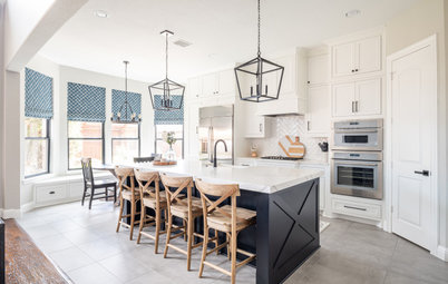
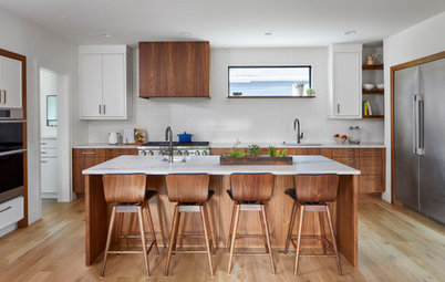
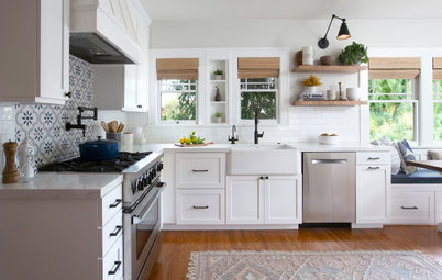
3. Farm Charm
Designer: Kate Marker of Kate Marker Interiors
Location: Barrington, Illinois
Size: 405 square feet (about 38 square meters), including breakfast nook; 27 by 15 feet
Year built: 2013
Special feature: Light wood stools, chairs and a farmhouse table layer on white cabinets (Linen White by Benjamin Moore) for a creamy, vintage look.
Homeowners’ request: This was a new construction project in which the homeowners, a couple with three young children and another on the way at the time, wanted a timeless look that incorporated traditional and modern pieces. “Timeless with a twist,” says designer Kate Marker. Because it was new construction, the space had no limiting factors to begin with.
Plan of attack: The white cabinet paint came first, followed by the light wood furniture pieces. The rest of the house is a soft blend of grays, creams and light blues, so Balboa Mist, a soft neutral by Benjamin Moore, was selected as the wall color.
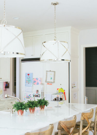
Why the design works: By mixing modern elements — wishbone chairs, light wood, Calacatta marble slab backsplash — with traditional elements — the oil painting in the gilt frame, buffalo check window treatments, pleated island light fixtures — this kitchen exudes timeless charm, Marker says.
“Because we were designing for a young family, we needed functionality that tied in with the aesthetic,” Marker says. “We needed a farmhouse table that wouldn’t splinter and would hold up to the daily use of a family of six. The table is made from durable mango wood. For the wishbone-shaped Oslo chairs, we had custom cushions made in a smoky blue fabric to add comfort that were then Scotchguarded and given Velcro fastenings for easy removal and cleaning.”
Who uses it: A young couple with four kids ages 2 to 9
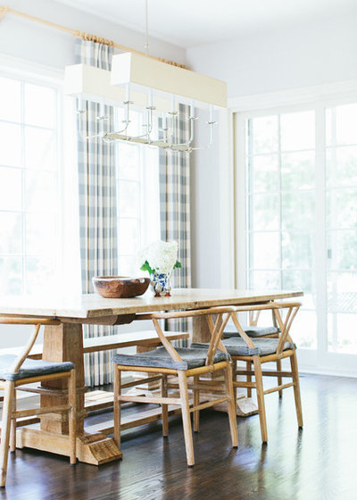
Designer secret: “Find a fresh interpretation of something tried and true,” Marker says. “We chose the buffalo check for the window treatments because it is a fresh twist on something classic. The larger scale is an update of a classic pattern and brings a freshness to the space. The light blue of the buffalo check ties in with the other blues and grays throughout the home.”
The nitty-gritty: Countertops and backsplash: Calacatta marble; stools: homeowners’ own; wall paint: Balboa Mist, Benjamin Moore; cabinet and trim paint: Linen White, Benjamin Moore; wishbone chairs: Oslo, Bungalow 5; table: farmhouse in mango wood, Sarreid; window treatments and chair cushions: custom
Team: Pinnacle Home Builders; Stoffer Photography
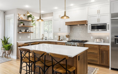
4. Get Floored
Designers: R. Michael Cross and John Barker III of R. Michael Cross Design Group
Location: Richmond, Virginia
Size: About 300 square feet (about 28 square meters); about 20 by 15 feet
Year built: 1909
Special feature: “The decision to go with an all-white color palette was very intentional,” says homeowner Margaret Anne Powers. “We had studied hundreds of photos on Houzz and identified key elements that we wanted to incorporate: dark wood floors, light walls and natural materials. Urban homes tend to be dark inside because of shared walls, limited windows and close proximity to other buildings. White was an easy choice for us. The natural elements really show off against the white backdrop.”
The floors are heart pine reclaimed from 100-year-old Navy pier pilings in Washington D.C. The dining table was hand-made from Virginia walnut grown on the farm of the homeowner’s great-grandfather. The stools were bought unfinished and then stained with the same oil and wax as the floor.
Homeowner’s request: These newly empty nesters wanted a clean, fresh start for the next phase of their lives. The existing home was in poor condition, with small, dark rooms. They reconfigured the house so that everything they need would be on the ground floor, including the master suite. Upstairs sits a media room, office, two guest bedrooms and two bathrooms. Nontoxic and sustainable materials helped earn the home LEED Gold status.
Who uses it: Margaret Anne Powers is a former schoolteacher. Her husband, Patrick, is a local physician. They designed the home to age in place, with all doors wide enough to accommodate wheelchairs and walkers if needed. The home is automated so that interior and exterior lights, security system, media components and temperature can controlled through smart phones and tablets.
Plan of attack: The floors drove the other details of the house. The cabinetry followed. Originally, the homeowners wanted stainless steel for the island countertop before spotting a beautiful slab of marble that was almost the exact size of the island in the plan. They used stainless steel for the perimeter countertops.
“Uh-oh” moment: A few months after completion, the wood grain on the cabinets began to “bleed” through the no-VOC finish. At first, the homeowners thought it was shadowing but it got worse. “With an open floor plan there was no hiding or ignoring it,” Powers says. The cabinet company shared the owners’ disappointment and began researching a solution.
The manufacturer of the cabinet paint (thinned for use in a sprayer) and the woodworking company stood behind the product and offered to pay for a replacement product. However, the replacement would not be a LEED-acceptable product. After weeks of contemplation, it was decided that all the cabinetry in the entire house would be professionally hand-painted, in place, with a no-VOC paint.
The nitty-gritty: Wall color: Seagull, Porter Paints; cabinet and trim color: Delicate White, Porter Paints; stools: smart and sleek, Wisteria; dining chairs: Skin chair, Houzz; pendant lights: recycled cardboard, Houzz; dining light: George Kovacs Twist & Shout, Houzz; appliances: Thermadore; faucet: Align, Moen; sink: stainless steel: Elkay
Team: R. Michael Cross (principal architect) and John Barker III (project designer) of R. Michael Cross; John Luck (builder); Richard Cross (LEED Homes consultant); Adam Goldsmith (photographer); Cary’s Mill Woodworking (cabinetry); Old Dominion Metal Products (stainless steel countertops); Artistic Stone Design (marble island countertop); Wendy Morton (design consultant)


Our talented staff can plan and manage projects anywhere, of any size, from interior design and space planning to... Read More
What are you working on?

Related Products
Related Stories
New This Week
7 Wonderful New White-and-Wood Kitchens
Design and remodeling pros share details on how they mixed these classic elements to create warm and inviting spaces
Full Story
Kitchen Makeovers
Kitchen of the Week: Bright and Balanced Modern Farmhouse Style
A Texas couple works with a design team to turn a dark and dated kitchen into a light and fresh family space
Full Story
Kitchen Design
Kitchen of the Week: Bright and Open in 142 Square Feet
A designer removes a wall for better flow and adds a peninsula, countertops, cabinets and natural light
Full Story
Before and Afters
Kitchen of the Week: Classic White Space With Layered Style
A designer helps an Illinois couple create a bright, fresh kitchen with subtle texture, custom details and a new layout
Full Story
Houzz TV Live
4 Pro Tips for Designing a Balanced White-and-Wood Kitchen
In this video, see design techniques that pros use to shake up the classic color palette
Full Story
Kitchen Design
New This Week: 4 Ways With White-and-Wood Kitchens
Designers share fresh ideas for bringing dynamic style to this classic kitchen palette
Full Story
Houzz TV Live
Fresh White Palette Brings Joy to Designer’s Kitchen and Bedroom
In Florida, Krista Watterworth Alterman ditches dark faux-Mediterranean style for bright, glossy whites
Full Story
Houzz TV Live
Peek Inside an Architect’s Bright Modern Home in Ireland
In this video, Denise O’Connor talks about the light-filled kitchen, dining and living areas inside her home in Dublin
Full Story
Kitchen Backsplashes
Love a White Backsplash but Not Subway Tile? Try One of These
By Erin Carlyle
If you want to go beyond the classic rectangle, consider these 11 white backsplash tile options
Full Story
Kitchen Design
Kitchen of the Week: Family-Friendly With Modern Farmhouse Style
A San Diego couple with small children work with their designer to reconfigure and brighten a Craftsman kitchen
Full Story
Amazing work! Thanks so much for sharing the information on products/colors.
f you're interested in wood styling of your home's deck, balcony and stairs, check out Mountain Laurel Handrail here :
http://awoodrailing.com