
When creating websites that work well on a range of screen sizes and devices, responsive web design is far and away the most popular approach.
Recommended by Google and embraced by many web designers and developers, it is, however, not the only solution for creating multi-device friendly websites.
While not as popular as responsive web design, an adaptive approach is another viable solution for developing multi-device-friendly sites.
In reality, creating websites that accommodate a variety of possible screen sizes is not only about responsive versus adaptive. The future of multi-device web design is rather a combination of both.
Regarding Responsive Web Design
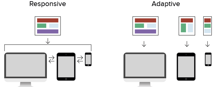
As established by Ethan Marcotte, responsive web design is the combination of a fluid grid, flexible media, and media queries. Responsive websites have fluid layouts that change and adapt regardless of the screen size being used.
The benefits of a responsive approach are well known:
- The ability to support a wide range of screen sizes and devices with a single website. This includes the “in-between” popular screen resolutions like 320, 768 and 960 pixels wide.
- Future friendliness for devices that have yet to enter the market.
- One website to maintain and market instead of several.
The primary challenges of responsive web development are:
- Difficult to retrofit an existing site, which means the project is likely a redesign/rebuild of the site. This will impact the scope of the project and its cost.
- Limited design control for many of those aforementioned “in-between” sizes. The site will fit on those sizes, but the visual presentation is often less than ideal.
- Since you are delivering a single site to all devices, optimizing what gets sent to each device in terms of resources like images can be very difficult.
Regarding Adaptive Web Design
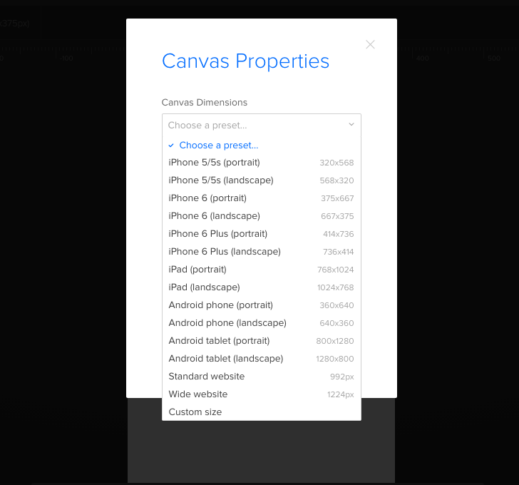
Where responsive web design struggles with layout, adaptive often excels (and vice versa). An adaptive website uses fixed sizes, based on pre-determined breakpoints, to deliver the most appropriate layout version for the screen size that browsers detect when the page first loads. You can see some of the most common fixed sizes in UXPin‘s built-in breakpoints:
The benefits of an adaptive approach are:
- Better design control since the site is set to specific breakpoints that you can design for.
- Often easier to apply to an existing site to add support for small screen devices without need to recode that site from scratch.
- The ability to deliver only the resources (images, scripts, etc.) that are necessary for a given breakpoint/version.
The drawbacks of adaptive are:
- Does not fluidly accommodate those “in-between” sizes between the breakpoints you establish.
- Requires you to design for every individual breakpoint you plan to support. This can increase the overall design and development time of a project.
- Will not automatically work well if a new resolution is introduced into the market in the future. A new breakpoint will need to be added to the site, which will add to the long term maintenance of a site.
The Best of Both Worlds
As you can see, both responsive and adaptive have their strengths and weaknesses. This is why neither approach alone represents the future of web design.
Instead, solutions that combine the best of both worlds is where multi-device web design is headed for 2016 and beyond.
We can see a simple example of combining responsive and adaptive principles in a solution like Adaptive Images from Matt Wilcox. This shows that this combination of adaptive and responsive is about more that layout. It is the spirit of creating the best overall experience possible, including layouts, downloads, and more.
This approach addresses one of the key weaknesses of responsive web design: the ability to deliver different images to different screens. As stated on their website, Adaptive Images uses JavaScript to “detect your visitor’s screen size and automatically create, cache, and deliver device appropriate re-scaled versions of your web page’s embedded HTML images.” With Adaptive Images, a site’s layout can still be responsive and fluid, but this adaptive approach to delivering different images based on detected screen size is an important step forward.
The combination of responsive and adaptive thinking does not stop with just images, however. Many web designers are taking this many steps further with what is commonly known as RESS (Responsive web design with Server Side components).
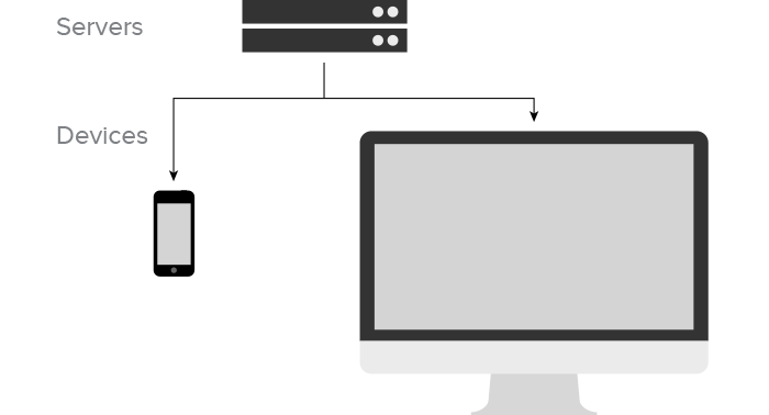
RESS combines the benefits of a responsive solution (fluid layouts, future screen support, etc.) with server-side detection that determines what a particular device or screen needs to properly display the webpage. As summarized by Luke Wrobleski, “source order, URL structure, media, and application designs can be finely optimized for a specific device class before ever reaching its browser.”
Luke goes on to add that “RESS combines adaptive layouts with server side component (not full page) optimization. So a single set of page templates define an entire Web site for all devices but key components within that site have device-class specific implementations that are rendered server side.”
This means that a multi-device website can enjoy the following benefits:
- Fluid layout that supports a variety of screen sizes and also fills in the “in-between” states between key breakpoint sizes.
- Future support for device sizes not yet released.
- Better design control for key breakpoint sizes.
- Resources like images and media can be smartly delivered only to the devices that need them.
- One website to maintain.
While RESS may not solve every challenge of multi-device web design, it is an important step in the right direction — one that heralds what the future of the industry has in store for web design professionals.
Solving Problems
Both responsive and adaptive are potential solutions to the problems you will be called upon to solve, but neither of them are as powerful on their own as when the best aspects of each are combined.
This is the kind of thinking that will define the future of multi-device design.
Instead of limiting ourselves to one solution with its strengths and its weaknesses, we will build our future work upon solutions that borrow the best aspects of multiple solutions. This is why multi-device web design is not just about responsive or adaptive, but rather responsive and adaptive and anything else that allows us as design professionals to improve the work that we do.
If you’d like to prototype responsively and adaptively, you can get started and play around in UXPin with a free trial.

