Want to learn how to double conversions on your website?
Don’t we all? Well it’s something we’ve done a few times for our clients so let’s see if one or two examples might give you a bit of inspiration…
Let’s start with a recent one: We have recently built a website for one of the UK’s leading CRB checking companies.
We also run AdWords campaigns for them and the stats show their site was converting about 2.5% of visitors, meaning roughly one in 40 people who landed were turning into paying customers.
As if by magic, here’s a screen grab from the last two months of their campaign:-
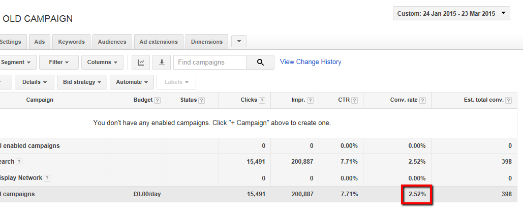
This isn’t an awful rate compared to a lot of industries but we felt a few key changes might just help.
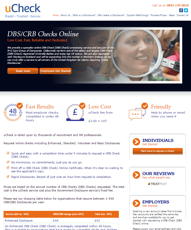
Here’s their landing page as it was back then. What would you do to improve things? Don’t scroll too far down if you want to play along:-
We put our heads together and came up with six main areas we thought we could focus on in our bid to increase conversions on their site. They were as follows:-
1 Simplicity: To a man / woman, our analysts all felt there was too much going on here, making it hard for the user to know where to look
2 Calls to action: They aren’t visible enough. It should be immediately clear to the user what they need to do if they want to progress things
3 The fold: Too many important features are too low down the page and not immediately visible (including some of the calls to action)
4 The content: It’s too wordy, meaning the message gets lost. We thought our client needed to add more value in fewer words
5 Look and feel: The whole thing arguably looks dated and could do with refreshing. A new colour scheme, font and icons were all discussed
6 Mobile optimisation: You’ll have to take our word for this one but the site didn’t translate well to mobiles and tablets, a must in this day and age
So we gave the client various options for a new look and feel, made all the usual tweaks throughout the process and this is what we came up with.
Drum roll please:-
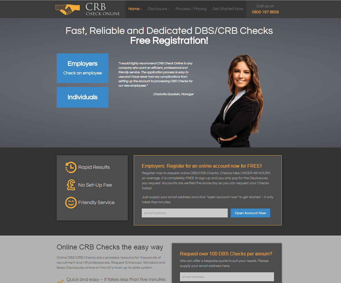
So how have things improved – what did we try to do?
Good question.
There are now fewer areas of the page competing for the user’s attention. We’ve got as much content in in fewer words and we like to think the message is clearer.
The calls to action are also clearer – nice, clear, large blue buttons that contrast well with the background colour. It’s also fully mobile optimised and nothing pivotal has been dropped below the mythical “fold”.
We also added a chat box to give potential customers the chance to ask questions.
The result?
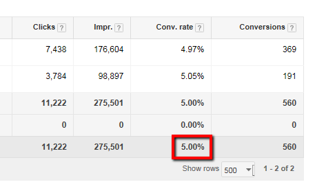
We’re now well over 500 conversions on the new site, which we think is a large enough sample size to start drawing conclusions.
So the million dollar question – what’s the conversion rate?
The all-time conversion rate, ie since we launched, is bang on 5%. In other words, one in 20 visitors to their site become paying customers – as near as makes no difference double the old rate. But don’t take my word for it:-
If you need a CRB check done you know where to go – or failing that have a play around on the site and see what you think.
How to double conversions on your website – case study No.2
OK so if a complete revamp of your entire site sounds like more than you bargained for, don’t worry – often a couple of tiny tweaks can make the difference. Let’s hit you with another example…
Another client of ours sells pashminas. Again, conversion rate was lower than they wanted but they specifically requested gentle evolution rather than revolution – and a price tag that reflected that.
Here’s their old site:-

Here’s what we did – can you spot the difference?:-

At first glance not a huge amount has changed but we like to think the changes we have made are pretty key.
Firstly, we’ve moved things around a little so the writing no longer clashes with the picture. We’ve also lightened the picture to make it a fraction less gloomy.
Crucially though, we’ve introduced 40 words or so of content focusing on a number of the products’ selling points and a “shop now” button that leaves readers in little doubt as to their next action if they are keen to explore more.
The client didn’t want us to play around with font, picture, colour scheme or make too many fundamental changes to the layout – they were merely after small tweaks on a budget of little more than £100.
The result? Once again, conversions have doubled – in this case a fraction more. Again, this has happened over several weeks, giving us a degree of confidence about the sample size.
We feel with a few more tweaks we might be able to push it up even more but it does go to show a few modest changes in layout, content or calls to action might be all it takes.
So don’t worry if your website isn’t doing enough for you. It might be a simple tweak or two that will make all the difference.
And that might set you back next to nothing and be achievable in a matter of days. Or even hours.
To sum up – tips for improving conversions on your website
To sum up, there are no magic wands you can wave that will show you how to double conversions on your website but there are a few tricks of the trade that should help.
We’d always advise a simple, uncluttered message with clear, prominent calls to action and we’d urge you to resist having too many competing features on the page.
Mobile optimisation is a no brainer – as is accurate and persuasive content and having your key features above the fold.
It goes without saying you might want your site ripped up and started again.
However, it’s also possible to make some serious improvements on anything from £100 and upwards – and it might even be possible to turn around inside a day.
We are actually just starting the process with another couple of clients as we speak so don’t be surprised if you hear about how that went in a couple of months.
And if you are still hungry for more on conversion optimisation, do not fear: here’s 25 handy tips from our friends at Siteoscope.
Either way, don’t hesitate to get in touch if you have any web design questions – if you aren’t sure about your site we’d be more than happy to talk about your options.