APPtitude: Painting An Expressive Landscape in ArtRage for iOS
Learn how to paint a simple expressive landscape using the oils and palette knife in ArtRage for iOS with Alison Jardine, the author of “Make Great Art on Your iPad”.

APPtitude
An introduction from the artist.
It’s easy to forget that the future has actually arrived. Once upon a time, we dreamed of ‘video phones’ and Star Trek-style hand-held communicators to speak to anyone, anywhere, anytime. When these astonishing inventions were delivered via Apple and other new-tech companies, we quickly assimilated these futuristic devices into our everyday.
Writing my recent book about iPad art reminded me just how exciting these tools are, and it rekindled my enthusiasm for these revolutionary devices. Apps like ArtRage give me an entire art studio on the same tool I use to email people and read the news.
My own IRL art studio is a place of toil and sweat. I rarely leave the place without cement-caked fingers and a swipe of charcoal across my face. By contrast, when I spend a few hours in blissful creation with ArtRage, I emerge as fresh as a daisy.
There are many things we can do on touch devices that we cannot do in traditional media, not least the fabulous ‘undo’ function. However, while I can’t literally feel the ArtRage media in the way I can with pigment and pencil on paper, the visualizations are so convincing that, to the eye at least, the creative experience is extremely similar.
Take for example, the impasto technique beloved of painters since the post-impressionists. ArtRage’s oil paintbrush allows you to load your paintbrush thickly with paint, and this inspired me write a project based on Vincent Van Gogh’s sumptuous Sunflower paintings.
In this tutorial, I want to show you how you can get virtually dirty with viscous, unctuous paint in ArtRage, in an original expressive landscape composition.
Time to Start Painting
Blocking In Color
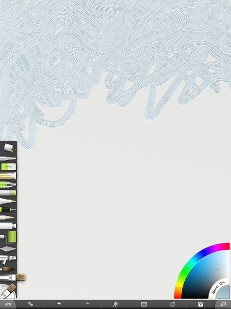
Open a new canvas with dimensions around 1600 x 2000 (so the vertical is the bigger measure). Pick the canvas paper texture, and set the scale to around 14%. This is the scale of the ‘canvas’ texture. Set the depth to around 14% – this affects the way the paint is depicted.
Select the oil paintbrush (the one with the flat brush), and set the size to around 30%, 100% pressure (this creates impasto paint) and 0% thinners. Switch off auto-clean, insta-dry and make sure that square head is not on.
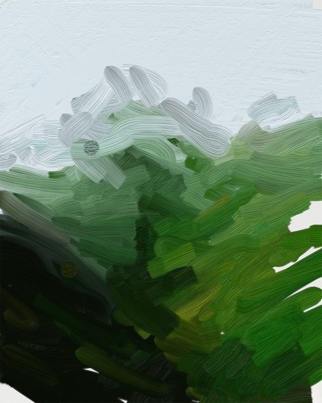
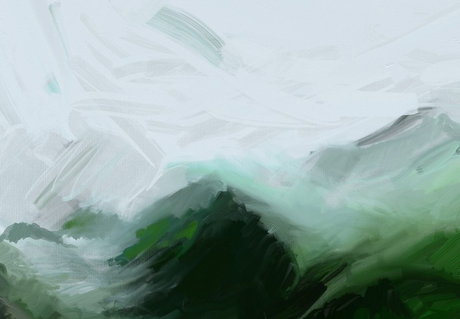
Select a grey-white color and push the paint around at the top of the canvas – don’t worry about ‘form’, just loosely cover the area that will be sky. Then, I went over it with the palette knife, to smooth it out.
Next, start adding deep greens to the mix in the middle and bottom of the canvas, keeping the colors cool and tinged with dark tones, rather than bright yellow-greens.
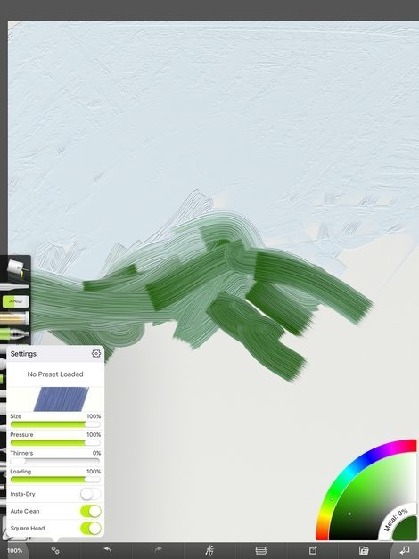
Deepen the green to almost black to show the shadow of the valley, in the center of the composition.
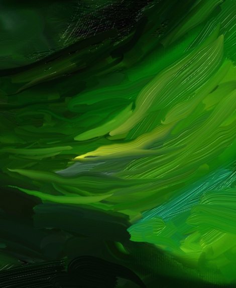
Sunlight hits the right-hand slope on this rainy day in Scotland, so add some yellow-greens in places. Notice how, because of our settings, the paint colors start to mix together, edges blur, just like real oil paints.
Shadows and Depth
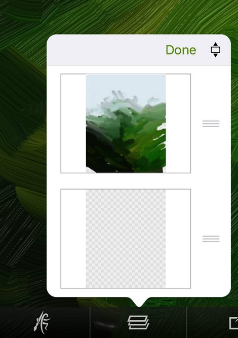
Now, I realize I forgot to add a dark grey to the background. In ArtRage, unlike traditional media, this doesn’t matter. Simply click on the layers icon, press and hold on a particular layer for a few seconds, and you will be able to drag-and-drop it into a new order. Magic! Fill this bottom layer with slate grey paint using the roller brush, set to 100% size.
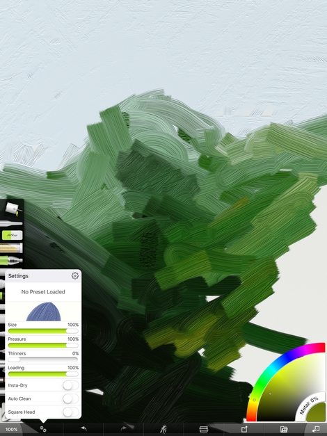
Back to the upper layer, and you’ve piled on your first layer of colors by now.
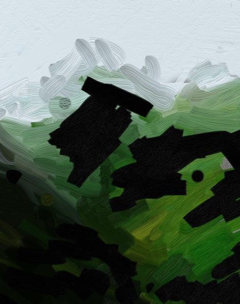
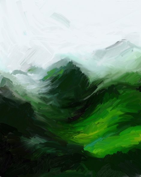
Add some dramatic darks in key shadow areas. Let’s add drama! I added this dark area towards the back to become a distant craggy mountain.
When working on a painting, always work on the whole surface at once – don’t develop one area and leave the others way behind.
Use the palette knife tool to push and blend these dramatic tones together. Add smaller brush strokes in your chosen greens, greys and yellows, over the top to literally pile more paint on top. I find this so very enjoyable! Relax into the strokes and don’t worry about what ‘realism’.
To do this, when you add paint keep your pencil or finger on the surface and jiggle it around. It will mix the new color into the old ones for you. If you lift up your brush, when you place it down again it will deposit the unmuddied color again. This, for me, is why the ArtRage app is so very much fun.
I added a grey-blue to form the craggy mountain tops in the background. Colors fade and become bluer in the distance, and this is a useful device for creating a sense of depth.
Blending and Detailing
I’m using the palette knife set to ‘edge’ to blend it all together, and also leave scrapes and scratches in the foreground, like implied foliage.
Remember, the scale of your marks matter in making great paintings. Think about how marks closer to the front of the painting, and smaller in the back, can make a sense of depth and perspective. The direction of the strokes can create a sense of contoured form, as well as, in this case, perhaps the sense of the stormy winds blowing. Add brighter tones on top of darker ones for contrast and texture.
Here is another thing I enjoy about ArtRage. If you use the Apple Pencil with the app, try pressing harder – brush stroke responds as would a real one: it becomes thicker, and more spread out with visible hair-marks. As you press more lightly, it becomes thinner and finer. Add variety to the image by mixing in thin lines among the thicker ones.
Blurring, Blending, and Finishing Up
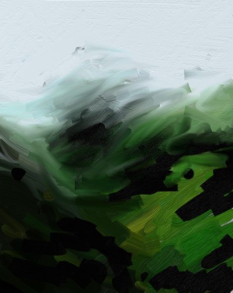
The finishing touch to my fresh, fast landscape will be a bit of blurring. In the distance, as well as becoming more blue, objects are also less distinct. This gives us a chance to play with the opposite settings to impasto.
Switch your settings to 0% loading of paint, and 100% thinners.
With your brush in this setting, you can blend the paint you’ve already put down together, as if you were adding turpentine to a oils on canvas. Use it to make your horizon less distinct, and to soften some of the edges between different paint colors.
Now, why not play around with all the different settings between 0% thinner to 100% thinner? Just in this one tool, there’s a variety of great effects at your fingertips.
Finally, I went back over the whole painting and made expressive brushstrokes to mimic the movement of the wind across the hilltops, to make it cohesive. I also intensified the moments of bright yellow-green signifying the passing sunlight on the right-hand side fields.
This image is a little abstract, a little representational, and I think this conveys how it feels to paint with an easel and oil paints on those hills.
About Alison Jardine
Alison is a professional artist from England who currently lives in Texas. You can visit her website at alisonjardine.com or follow her on Twitter at @alisonjardine.
She is the illustrator and author of the book ‘Make Great Art on Your iPad’, a more advanced artist guide to drawing with iOS. While the tutorial above is quite simple, the book provides techniques and tutorials for artists who already know how to use their art app. It covers the main iOS apps currently available, including ArtRage, Procreate, Adobe Photoshop Sketch, Tayasui Sketches and more, but focuses on fine art lessons rather than basic guides to each app.
It is available from Amazon.com, all Barnes & Nobles stores, and other online retailers, and has been very well reviewed.
A look inside the book…
no images were found