Should the hamburger icon be on your mobile menu?
It’s not the hamburger that’s the problem, it’s what designers do with it that counts.
It’s not the hamburger that’s the problem, it’s what designers do with it that counts.
The three-line “hamburger” menu icon receives a lot of vitriol. It is variously described as “controversial”, “notorious” etc. but it is rapidly becoming the de facto symbol to open a navigational menu on a mobile website.
So perhaps it is time to learn to live with it and make it better.
The hamburger was created in 1980 by Norm Cox, for the Xerox “Star” personal workstation, the world’s first graphical user interface.
Norm Cox, principal of interaction/experience design consultancy, Cox&Hall, tells ClickZ:
“Since someone “discovered”, a few years ago, that I had designed the hamburger menu, I’ve had countless questions, speaking invitations, interviews and inquiries… and read numerous articles and blogs regarding the (somewhat fabricated) controversy over its use.
In a way, I find it amusing that a simple widget like this has gotten so much attention, generated so much discussion, and gotten so many “experts” bloviating about the reasoning for its good/bad or right/wrong attributes.
I will simply say this about the hamburger widget. It is merely another widget in a designer’s arsenal of tools that s/he can use… well… or poorly. It has no inherent goodness/badness, or rightness/wrongness, except in the context of how it’s applied by the designer.”
This column will look at mobile menu best practice, including:
The subsequent column will look more closely at the design and user experience (UX) aspects, including:
The image below shows the mobile sites for top six search results for “hamburger icon” on the world’s most popular search engine. Five out of six of these headlines appear on sites that use a site-wide hamburger icon.
Three stories are negative. Two of negative stories: the BBC’s “Three lines mystify most people” and TechCrunch’s “Kill the hamburger button” sit, somewhat embarrassingly, below a hamburger.
Not only have the TechCrunch/AOL developers ignored the recommendations of its writers on the “devil” hamburger on mobile web (and app) they have also introduced a second unlabeled icon – a rocket – to denote a hidden menu of ‘most popular’ stories.

Critics of the hamburger icon report (and re-report) a number of internal studies by companies that noticed a deterioration in use of the menu when they switched the menu style used by their apps or website to a hamburger icon and vice versa when switching away.
Only one of these studies is mobile web:
The other studies commonly cited are for native apps (maybe just iOS): Zeebox (2014); Polar (2015), and Redbooth (2015). These studies suggested that menus hidden behind a hamburger icon received less engagement than visible navigational tabs.
Notably, Redbooth was an iOS app study; Zeebox and Polar may also have been, but neither app exists anymore.
So while these native app studies appear to be compelling, it does not follow that the behavior of iOS app users is applicable to mobile web. Nor does it follow that it applies to Android apps either.
As Redbooth notes: “Apple discourages [the hamburger’s] use”, and Zeebox notes: “The side menu has become fashionable on Android but not yet taken off on iPhone”.
However compelling other people’s findings about their own sites/apps appear, they should not dictate how you design/redesign you website.
As demonstrated below in the Moovweb research, engagement levels of the hamburger/menu vary massively by industry.
The key lesson to learn is not that the hamburger is good or bad, or that hidden menus are good or bad, but that it is important to run your own tests.
Learn more about mobile user testing.
Critics of the hamburger also like to cite Facebook’s 2013 decision to drop the hamburger icon in favor of a bottom tab bar as vindication.
Reality:

Despite the immense importance of navigation on the mobile/responsive web, lack of conformity and the bitter debate that the hamburger encourages among design/UX professionals, it is amazing that there haven’t been more studies of menu use across multiple sites.
While not massive, there are two studies that are essential reading:
Moovweb studied 50 sites that used its mobile/responsive commerce platform and made two interesting findings:
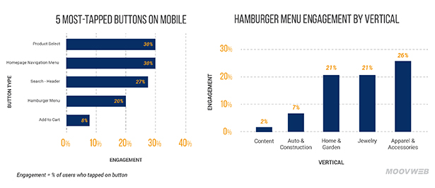
Then working with one unnamed mobile travel site, Moovweb ran a test to compare engagement rate with an unlabeled hamburger icon and one that was labeled.
The results were striking. The engagement rate for the unlabeled menu icon was 10.8%; while labeled one received 17.3%; which is a 61% improvement.
While adding a MENU is the most common label to enhance the hamburger, there are variations, as seen above the BBC uses a SECTIONS label, while Facebook (only on the iOS app) uses MORE.
The question is: if you are going to add MENU to your hamburger icon, then why bother with the hamburger at all?
Jason Grigsby, co-founder, of Portland, Oregon-based mobile web development agency, Cloud Four, tells ClickZ.
“When people criticize the hamburger, e.g.Luke Wroblewski, they’re referring to the fact that the icon itself doesn’t convey enough meaning. People get confused by it.
So the argument is to avoid using the hamburger icon and instead use the word ‘menu’ or similar so people know what the hell you’re going on about.”
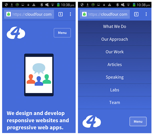
The new design of the Cloud Four site uses a MENU button, with a menu that slides down from the top.
The navigation menu, as Grigsby points out, is a whole different matter… and one we will be dealing with in detail in the next column.
To hamburger or not to hamburger… is only part of the question.
The other side of this debate concerns the whole nature of the menu, the fact that all the options are invisible unless the user taps the hamburger icon/menu button.
The clever thing that Luke Wroblewski pointed out is “out of sight, out of mind. This has become a rallying cry again the hidden menu and the poor old hamburger icon that has come to symbolize the hidden menu.
To date evidence to prove this theory is largely anecdotal, and based on apps such as Zeebox, Redbooth and Polar, (Wroblewski being one of these developers).
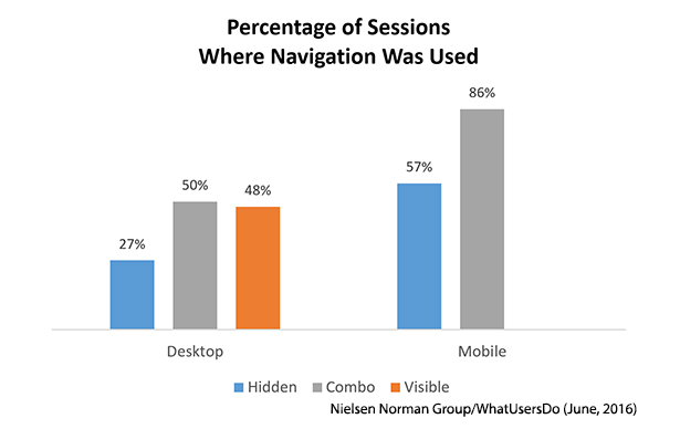
That’s what makes the recent Nielsen Norman Group/WhatUsersDo research so welcome: it’s web based, spread over six sites, with real users (179 of them), and its real research conducted by expert UX testers.
The research asked people to complete a task on the various responsive sites on desktop and mobile and studied whether people engaged better with/found it easy with:
The key findings for mobile users were:
Nielsen Norman makes the following recommendations for mobile sites:
Returning to the image above of the top six top ranking sites for “hamburger icon”. Three out of five that use a hamburger, use the unlabeled icon alone for navigation and one (TechCrunch) even uses an additional unlabeled rocket.
The BBC is the only one that adopts a combo approach to navigation. It has visible tabs for NEWS, SPORT and MORE (which is a menu) in addition to the Hamburger/Sections button.
Interestingly on older/smaller smartphone these three options are reduced to one MENU button.
A great example of the combo is Summit Metro Parks, which uses a labelled hamburger menu and four labelled buttons for key activities.
Mike D’Agruma, lead front-end developer, Evolve Creative Group, a web design agency in Akron, OH, USA, explains why he likes the Summit Metro Parks site.
“The hamburger/menu icon is at the top of the home screen. It has clear visual separation via color, size and treatment from surrounding content. Not only does it make use of iconography, but it also includes text descriptions. There is no assumption about that the user will recognize and know how to use the icon.
It stands out against additional types of navigation on the page. As well as the hamburger/MENU, there is a rotator/carousel with a clear call-to-action on each slide and a second-tier page navigation of highly visible and labelled buttons to help funnel users where the site wants them to go.”
A really useful way to think about menus and navigation is to stop worrying about them and start thinking about what users actually want to do and make it really easy for people to do it.
If people are on a certain page there is a strong probability that they will want to do a finite number of things next. If these are not on the page, put them on visible call-to-action buttons, image links, text links etc.
Things that people might want to do, but are lower down the hierarchy of probable tasks can be placed in the menu.
The expert on this is Steven Hoober, president of 4ourth Mobile, who is recognized for his work on mobile touch-screen interfaces. He explains:
“The important thing is to stop thinking about navigation and site structure and think about what the user wants to do. They have priorities, which I call primary, secondary and tertiary actions:
Hoober’s article on Why it’s totally okay to use a hamburger icon is essential reading.
The hamburger and the hamburger debate is here to stay.
Some people will continue to hate it. This from Nick Babich, editor of UX planet: https://uxplanet.org/
“To my mind, Hamburger is a bad option both for mobile and for desktop.”
And some will defend it. Phil Reay, head of insights, SessionCam, a tool for monitoring web customer behavior:
“Until a better solution to the hamburger menu is designed, our experience suggests that this catch all approach provides the best user experience for customers.”
The next column will look more closely at the design and user experience (UX) aspects of menus and navigation.
Read the report: DNA of a Great M-Commerce Site Part 1: Planning
This is Part 26 of the ClickZ ‘DNA of mobile-friendly web’ series.Here are the recent ones:


