Labeled with Love
Forms exist on pretty much every site on the web in one form or another. They are the primary mechanism by which we gather information from our users.1 Of course, before anyone can fill out a form, they need to know what it’s asking for. Labeling is key.
A few months back, I relayed a story from Facebook about how important the wording of their questions was in getting accurate responses from their users. The words we choose are incredibly important—your interface is a conversation with your users. I highly recommend reading up on that (and listening to the Radiolab episode that spurred me to write it), but I’m going to spend the remainder of this post talking about the utilitarian aspects of labels and how to use them properly in your forms.
Connecting the Dots
When you look at a basic form field, you have two bits of information: the field and the label.

You could achieve this with a minimum of markup:
Your Name
<input name="full_name">
The thing is, the text “Your Name” is not associated in any way with the input. Sure, a sighted person would likely be able to tell that that text is associated with the field, but no computer can tell that. And if a computer can’t tell the text and input are associated, your form control is inaccessible to anyone who uses assistive technology like a screen reader. It’s also going to pose a problem in the near-future of “headless UIs” like those hinted at by Cortana, Siri, and the Echo.
Thankfully, establishing a relationship between the two is quite easy using the label element. The most common (and preferable) way to do this is to wrap the labeling text in a label element. Then you create an explicit association with the field using the for attribute, which is an id reference. In other words, the value of the for attribute needs to match the value of the id attribute on the field you want to associate with that label.
<label for="full_name">Your Name</label>
<input id="full_name" name="full_name">
With that markup in place, the programmatic connection between the elements is made and the results speak for themselves: When you focus the field, the contents of the label are read out.
An Alternate Approach
Since I specifically referred to this approach as explicit association, you probably assumed that there’s another kind of association. And you were right: implicit association. Implicit association is created by wrapping a form control and its associated label text in a label element. I like to use this approach with radio and checkbox controls:
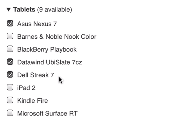
<label>
  <input type="checkbox" name="devices[]" value="Asus Nexus 7">
  Asus Nexus 7
</label>
It’s worth noting that there’s nothing wrong with explicit association in this context either.
<input type="checkbox" id="asus-nexus-7" name="devices[]" value="Asus Nexus 7">
<label for="asus-nexus-7">Asus Nexus 7</label>
You can even combine the two approaches.
<label for="asus-nexus-7">
  <input type="checkbox" name="devices[]" id="asus-nexus-7" value="Asus Nexus 7">
  Asus Nexus 7
</label>
The reason I like to use implicit association with checkbox and radio controls has to do with ensuring the greatest breadth of support when it comes to styling inputs. For instance, if I set width: 80% on all input elements using a simple type selector, that width would be applied to all input elements, including radio and checkbox controls. In order to prevent radio and checkbox controls from getting rendered at that width, I would need to assign an override value of width: auto to them them specifically. I can do that using attribute selectors:
input {
  width: 80%;
}
input[type=checkbox],
input[type=radio] {
  width: auto;
}
While completely valid, that approach leaves out any browsers that don’t support attribute selection (e.g. IE 6). That may not seem like a deal-breaker in your book, but on the off chance some poor soul happens to be stuck using an out-of-date browser (as many are on mobile), I like to show them a little love. And, thankfully, using the implicit markup pattern for checkboxes and radio controls allows for this quite easily: I just use a descendent selector instead.
input {
  width: 80%;
}
label input {
  width: auto;
}
This approach results in a greater amount of support and, incidentally, less CSS.
Added Benefit: Interactivity
Obviously, associated labels are great for folks who use screen readers, but they have another benefit: tapping on a label will focus or activate the associated form control.
 "
"
label will focus the associated form control.This isn’t a game-changer when it comes to standard text fields, but it’s an exceptional affordance when it comes to radio and checkbox controls, especially on mobile, as it vastly increases the tappable region used to activate the control.

To create incredibly generous tap targets on mobile devices, we can take things a little further. Add padding to the top and bottom of the label to make it bigger and then use negative margins to counter that enlargement and keep the layout as it was before the padding was applied.
.grouped label {
  margin: -1em 0;
  padding: 1em 0;
}
It’s worth noting that older versions of Internet Explorer only provide the focus/interaction benefit when you use explicit label association. That’s why I like the combo approach of implicit and explicit association for checkbox and radio controls.
As Dennis Lembrée mentions in the comments below, Dragon’s Naturally Speaking also doesn’t recognize implicit association, which is why it’s incredibly important to use explicit association even if it seems implicit association should suffice.
Placeholders Aren’t Labels
HTML5 ushered in a new option for working with input elements: the placeholder attribute. This declarative attribute makes it possible to offer hint as to the sort of content you were looking for in a field. In supporting browsers, it appears in the field, ghosted back a bit, and disappears when you start typing a response.2

Having this supported in the browser was a huge boon. For years we’d been using JavaScript to achieve this very effect—albeit typically for label text—in an effort to create more compact forms. Now we get the effect without having to include any additional files or libraries.
Of course, since placeholder implements an existing pattern, it came with baggage. People commonly achieved this effect by (ab)using the value attribute as a fake label. As such, its introduction didn’t do much to increase the accessibility of forms. Form controls need a label. If you want to make your form more compact, you can do that using proper markup and a little clever CSS.
<p class="form-control">
  <input id="full_name" name="full_name">
  <label for="full_name">Your Name</label>
</p>
.form-control {
position: relative;
}
label {
display: block;
position: absolute;
top: 50%;
margin-top: -.5em;
left: .25em;
transition: .25s transform;
}
input {
display: block;
border: 1px solid;
border-radius: 3px;
padding: .25em;
}
input:focus + label {
transform: translateY(-1.5em);
}Mary Lou assembled some beautiful examples of this approach in her Inspiration for Text Input Effects. I highly recommend you check those out, but here’s a teaser to whet your whistle:

We don’t have a ton of elements in HTML, which is why it’s important that we properly use the ones we do have. Hopefully this has provided a helpful overview of how to properly label form controls using HTML.
Footnotes
When we’re not, you know, tracking them with a super cookie or something. ↩︎
Browsers typically exhibit two different behaviors here. Some hide the placeholder text as soon as you focus the field, others hide it only when you start typing. Either one works although, admittedly, I favor the text disappearing when you type rather than when the field receives focus. I can see how that approach might confuse some users, I just prefer it because it ensures you see the placeholder. ↩︎
Comments
Note: These are comments exported from my old blog. Going forward, replies to my posts are only possible via webmentions.Šime Vidas
Those inline
numbers are fairly small click targets. Maybe the padding + negative margin technique could be used on them?I love that idea! Done. Pushing it now.
Hmm, but the effect in the last example will make it hard to enter a value if one is using an older browser that does not support the transition or transform properties since the initial placement without those properties will be on top of the input field, right? I like the effect and all but I'm just concerned about the UX when one visits using a browser that does not support the transform property :) - When there is no support for transforms ideally the label should be placed on top of the input field instead,..I'll see if I can wrap my head around it unless someone else beats me to it :D
You could accomplish the same thing with positioning rather than transforms, but if you wanted to use transforms, you could place the whole thing inside an @supports block (e.g. @supports(transform:translateY(0)){ /* code for the transform version */ }).
Hi Aaron aaah yes of course and then one could enhance the moving using transition, which would then only be used by browsers that understand it :)
...one could of course make use of modernizr but wondering if there is another approach too?
No need (see my response above).
Note that implicit labels don't work with Dragon.
Also, my response to examples like Mary Lou's above: if you're going to place the label above the input after focus, why not just put it there in the first place? (And ensure the text is adequately sized.) Moving labels can cause confusion for the user, and creates more code complexity. But I must admit it's a doable compromise with designers.
Brilliant article, thanks for writing this. I feel like it's dead easy to understand a topic that could be quite technical in nature. Also, really happy to see an example of an accessible form that also has wow factor - *Hazel Bolton (Content Manager)
Now, I fully understand what a label is. Thanks for sharing, Aaron.
> To create incredibly generous tap targets on mobile devices, we can take things a little further. Add padding to the top and bottom of the label to make it bigger and then use negative margins to counter that enlargement and keep the layout as it was before the padding was applied.
This doesn't make sense? Using more padding to make the targets easier to hit is always good practice, especially for small controls like checkboxes - but if you use negative margin to make those regions overlap, the top-most of two overlapping regions will simply "win", so all you've managed to do is unfairly favorize the items that end up rendered on top. The regions should be equal - all you need is some padding in the
 {{ mention.author.name }}
Webmentions
#accessibility #a11y
Likes
Shares