


Bathroom Design
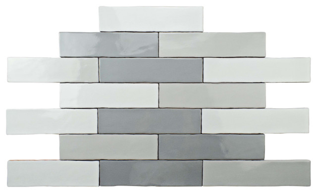
Celebrate the Rectangle With This Very Contemporary Tile Pattern
There are so many ways to work with stack bond tile. Here's how to keep the look super sleek — and how to change it up

Rectangular tiles are everywhere now and available in many colors and sizes. You can use them in several different layouts, including stack bond, where the tiles are placed on top of each other in columns to create a rectangular grid. These beautifully neat, contemporary designs can be used in so many ways, there’s bound to be something that inspires you.
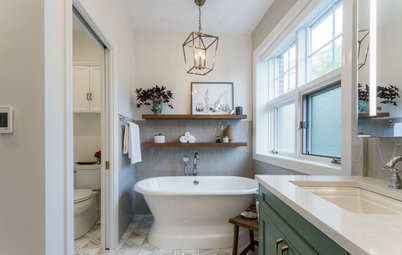
2. Line up tiles on floors and walls. By using the same tiles on walls and floors, you can create a clean, calm space. The stack bond layout here means the flow of color and grout lines run along the floor, up a step, over a raised platform then perfectly up the wall behind the bath. This gives a lovely movement across the room.
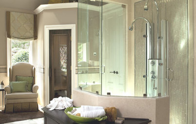
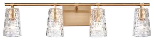
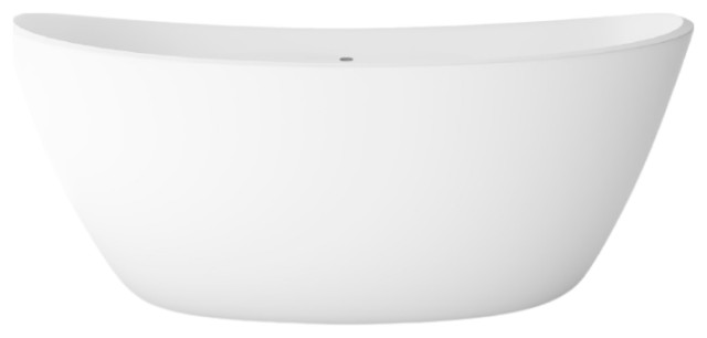
The look is strong and confident, and the finish is balanced with an unusually shaped free-standing bath. By keeping hardware smooth, uncluttered and simple, the tiles are allowed to be the feature, without becoming overpowering.
The look is strong and confident, and the finish is balanced with an unusually shaped free-standing bath. By keeping hardware smooth, uncluttered and simple, the tiles are allowed to be the feature, without becoming overpowering.
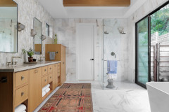
3. Mix it up. This just shows what you can do with a simple plain white tile. Stack bond tiles cover the bulk of this bath area, but some are laid vertically to add a quirky touch and make the space more unusual.
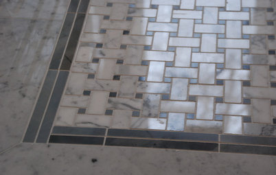
The effect is very easy to achieve, as long as you get the right tile. For this to work, check that three tiles stacked horizontally are the right width to fit with one tile laid vertically. If they don’t quite fit, you will end up having to adjust spacing, and the grout lines will not be a uniform width — this will look clumsy rather than sleek.
The effect is very easy to achieve, as long as you get the right tile. For this to work, check that three tiles stacked horizontally are the right width to fit with one tile laid vertically. If they don’t quite fit, you will end up having to adjust spacing, and the grout lines will not be a uniform width — this will look clumsy rather than sleek.
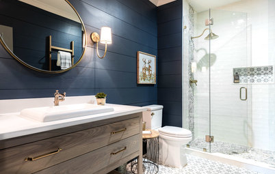
4. Give a modern twist to a traditional idea. Period properties often have paneling to hip height, and when it’s in a contrasting color, the look is warm and classic. In this bathroom, the same design concept has been used with pretty green tiles, which contrast with the neutral scheme. However, by fitting them in the modern stack formation (rather than the more obvious brick layout) the bathroom feels much more contemporary.
The idea of mixing old and new is continued with a modern roll-top bath. The end result is the perfect solution if you can’t decide between traditional and contemporary.
The idea of mixing old and new is continued with a modern roll-top bath. The end result is the perfect solution if you can’t decide between traditional and contemporary.
5. Echo other elements with the tiles. The tile layout in this bathroom is particularly effective because it echoes the lines on the cabinetry and gives a beautiful finish. Straight grid lines are clearly visible around the cabinet doors and there are no curves to be seen, so the tiles add a neat mirror effect. The design is continued onto the floor, giving a cohesive feel to a small bathroom. It looks considered, with enough contrast to be interesting.
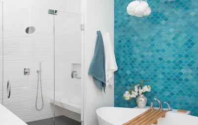
6. Use the same tile in different colors. The intense turquoise of this tiled wall is clearly the main feature in the bathroom. The stack bond layout offers simple grid grout lines that serve to outline, and therefore intensify, the color of the blue. A different layout, such as brick, might have looked too detailed and fussy.
To continue the contemporary feel, the side of the bath and shower area has also been tiled, but in a color that almost disappears. The drawers on the vanity are the same rectangular shape and are in a stack too. In a small space like this, it’s important to choose elements that have the same shape or design, so they all sit neatly together as a whole.
To continue the contemporary feel, the side of the bath and shower area has also been tiled, but in a color that almost disappears. The drawers on the vanity are the same rectangular shape and are in a stack too. In a small space like this, it’s important to choose elements that have the same shape or design, so they all sit neatly together as a whole.
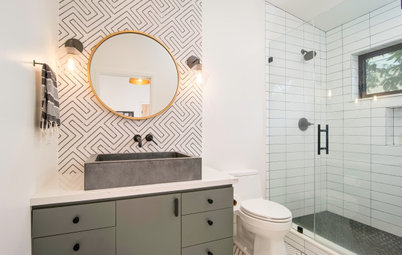
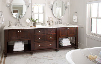
7. Get your sizes right. This sink area looks particularly neat because everything is the right size. It is also spaced perfectly, with the sides of the basins lined up with the mirror above for a squared-off design.
The tiles run floor to ceiling, making the room appear taller, and continue through to the shower enclosure on the right to give it width — a useful trick to use in a small bathroom.
The solid gray color and pale grout lines are precise and contemporary. An uncluttered style like this needs to be kept neat, so make sure there’s enough storage to stash away toiletries.
8. Choose white tiles and matching grout. This is a tiny room, so it can be tiled throughout to avoid the worry of inevitable splashes. Anything brighter or bolder might have made the walls feel closed in, so the choice of white tiles in a simple stack bond layout gives an understated elegance.
If you have a little en suite, or are even adding a downstairs powder room or shower room, this look is worth considering to combine practicality with light, bright airiness.
If you have a little en suite, or are even adding a downstairs powder room or shower room, this look is worth considering to combine practicality with light, bright airiness.
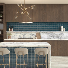
9. Tile from countertop to wall cabinet. Tiling the visible wall space between cabinets in a kitchen creates a completely practical surface. Tiles are easy to wipe down and won’t get stained by splashes as you cook spaghetti Bolognese.
These tiles echo the design of the handleless cabinet fronts, and since they are small, you can fit several in each column. This makes the space above the countertop look generous. It’s an effective way to create flow across a wall, as the tiles also form the cooker backsplash. The line is undisturbed and makes the most of a compact space.
These tiles echo the design of the handleless cabinet fronts, and since they are small, you can fit several in each column. This makes the space above the countertop look generous. It’s an effective way to create flow across a wall, as the tiles also form the cooker backsplash. The line is undisturbed and makes the most of a compact space.
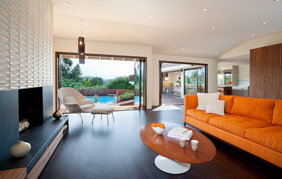
10. Fit tiles in unusual areas. Tiling walls in rooms other than bathrooms or kitchens is becoming hot interior news, as it adds drama and texture in a way that’s impossible to achieve with paint or wallpaper. Living areas such as a dining room look amazing with tiles — the texture and color introduced here makes an eye-catching feature with floating shelves drawing a viewer’s attention even further.
This is a great way to zone an area in an open-plan room too, as it anchors a dining space. It would work equally well to cozy up a living area around a sofa.
Tell us: Have you used a stack bond tile pattern in your home? Share your ideas and photos in the Comments below.
More
Porcelain vs. Ceramic Tile: A 5-Scenario Showdown
See Why Tile Is Being Used in More Rooms Than Ever
Sponsored
Central Ohio's Trusted Home Remodeler Specializing in Kitchens & Baths
The window wall is tiled with lighter tiles in the same layout to give a cohesive look. However, the matching grout allows this wall to fade into the background as a quiet contrast to the dark side. When creating this look, make sure the two different-colored tiles are the same size, or it will look untidy. Many companies produce the same tile in a variety of colors, so pick two from the same range for a pair that will definitely work together.