Takeaways From Mobile Web Behavior

Email Newsletter
Weekly tips on front-end & UX.
Trusted by 200,000+ folks.
 Flexible CMS. Headless & API 1st


 Register!
According to Ian Carrington, Google’s mobile and social advertising sales director, speaking at Mobile Marketing Live back in 2012, more people in the world have access to a smartphone than a toothbrush.
With that in mind, it’s perhaps not very surprising that there’s no shortage of information about how people interact with websites on mobile. From specific usability testing and scrutiny of Google Analytics data to more generalized but larger-scale projects, we can quite easily gain access to statistics that illustrate how users interact with our websites.
This vast array of knowledge is beneficial only if we analyze, utilize and capitalize on the information to specifically improve user experience. In particular, by looking at the ways in which users interact with websites on mobile, we will have a basis for learning that becomes mutually beneficial.
Below are six ways we can learn from this information.
Mobile Users Check Their Device Frequently
Research carried out by Salesforce for its “2014 Mobile Behavior Report” (PDF) indicates that the average mobile user checks their phone over 1,500 times a week and uses their device for 3 hours 16 minutes every day. Their main tasks, in order of occurrence, are:
- accessing email (91%),
- text messaging (90%),
- searching the internet (76%),
- social networking (75%),
- while watching TV (70%),
- keeping up to date with the news (62%),
- playing games (57%),
- listening to music (46%),
- reading (43%),
- watching videos (30%),
- getting directions (24%).
Takeaway 1: Content Length
It’s clear that “mobile” users are constantly active, and we can use the list of habits above to our advantage and really optimize our website’s content for mobile visitors.
Based on research by Medium, articles that take the user around 7 minutes to read are ideal. Although this is the peak of the trend, a great article can be of almost any length. Google will judge the value of your information with a “time to long click” metric. This means that when a visitor stays on your page for a long time, they are telling the search engine that your content has provided real value to them.
A technique you may want to consider to hold visitors on your website is “pageless” (endless) scrolling. This can be a good format to achieve a low bounce rate, but without proper implementation, it could harm search results and become counterproductive. (We highly encourage you to read our article on Infinite Scrolling: Let’s Get To The Bottom Of This first to avoid faulty implementations and annoyoing user experience when using the “infinite scrolling” pattern. —Ed.)
The key is to break up content into sections so that crawlers can better replicate user behavior. An infinitely scrolling page is made SEO-friendly when it’s converted to paginated sections, all with similar title tags and rel="next" and rel="prev" values in the template’s head section.
See the demo created by Google webmaster trends analyst John Mueller, for example. With the usual infinite scroll, content displayed after the initial page load isn’t indexed, rendering it unsearchable. With the SEO-friendly method, all content is accessible, thus maximizing search potential while maintaining the ability to hold visitors with your carefully crafted content.
Full details on paginating an infinite page can be found on the Webmaster Central Blog.
They Use Their Device As A Second Screen
According to a 2014 Statistica report, up to 71% of tablet owners use their devices as a second screen or engage in activity on their device while carrying out other tasks.
People will use their tablets when watching television, use both smartphones and tablets simultaneously, and listen to music through their device as they carry out other unrelated activities.

Takeaway 2: Visitor Involvement
Understanding that a visitor’s attention might be focused elsewhere helps us appreciate the importance of maintaining both interest and ease of use.
Your website’s structure can play a huge part in this. When a page lacks visual hierarchy or defined sections or is just plain confusing, the visitor’s brain goes into overdrive to understand what’s happening.
Injecting character and unique elements into the design will help to separate your brand from others, but do this while ensuring that users can navigate your website intuitively.
One way to capture attention the right way is with original design elements and graphics and by making sure the content you serve is presented in a manner that is out of the ordinary and that, therefore, triggers visitor involvement without being intimidating.
The layout for Eat And Think meal plans is an example of how we attempted to turn information that might be deemed difficult to digest into something that holds the visitor’s attention — in this case, for all 11,000 pixels of the page.
By breaking content down into distinct sections with the use of bold headings and graphics, we achieved a bounce rate of under 19% for the plan across mobile devices. Repeat visits were also high, with users returning to view their plan twice a week within the first month of purchase on average.

People subconsciously pay attention to individuality and switch off if anything becomes repetitive. In this way, the novelty factor needs to remain throughout the visitor’s journey on your website. A mundane and unimaginative layout could sap attention within seconds.
It is also important that first-time mobile visitors be able to complete tasks without being overwhelmed. By combining novelty elements with ease of navigation and a practical interface, you can create a fantastic experience, even if visitors are not giving 100% of their attention.
They Use Geolocation And Push Notification
An increasing number of people like the concept of geolocation, which opens a gamut of opportunities for web designers and marketers. For example, Groupon presents local offers to customers and Google tailors search results according to where you are.
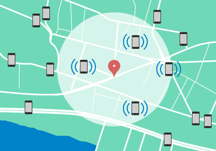
When geolocation is combined with push notification, marketing can really come into play. For example, Starbucks sends potential customers a push notification when they walk within a geofence around a branch. A geofence is a virtual fence with a geographical radius that triggers a tailored update notification, offer or coupon to any customer who passes through the area. This might be annoying if you push it over the edge, but sending an update once and again with user’s consent might be worth considering.
Takeaway 3: Brand Trust
In order for people to sign up for a geolocation-based service, they must trust the brand and the quality of the app and believe that something is in it for them.
Your website can go a long way to instilling confidence through tone, consistency and branding. As with newsletter registrations, always make clear the benefits users will get from registering with you, and help users understand that their data will be protected and that they will be able to opt out at any time.
As a developer, always bear in mind factors that could cause app abandonment. Some of the most common reasons for one- and two-star ratings in Apple’s App Store are bugs and overuse of a device’s bandwidth or power. For example, a previous version of Staples’ app continually used GPS actively and, therefore, quickly drained the battery, ultimately discouraging people from using the application.
Obvious but worth mentioning: start by going through Apple’s “App Programming Guide for iOS” (PDF) to avoid making similar mistakes and to ensure that your app delivers a fantastic experience without these common pitfalls.
They Avoid Typing
You’ve no doubt experienced the frustration of mistyping or forgetting the context of an online form due to a phone’s small screen. Because of the difficulty of submitting information, around 50% of mobile web users choose to log in via social networks in order to avoid having to type in text and remember countless passwords.
Well, it doesn’t mean that it will automatically work for every website, but you could compare the conversion rate with both and see what works best. One thing to keep in mind though is that sometimes users might not remember how they logged in or signed up last time, so they might end up with a few duplicate accounts and start wondering where their data has gone.
Takeaway 4: Orientation-Specific Formatting
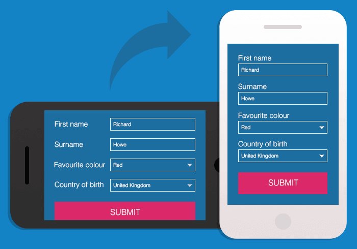
When tweaking a website for mobile, first consider the necessity of information having to be typed in. When information is absolutely necessary, prepopulate the form as much as possible.
Even the simplest things, like placeholder labels, can cause issues. Despite looking clean and saving space, the context of a field can be lost as soon as the user starts typing. With just the smallest of distractions, visitors can forget whether you have just asked for their first name or full name, their county or country.
Although this format works well when one or two fields are being completed, it becomes an issue when you’re asking for a lot of specific information. The visitor will then receive an abundance of errors upon submission due to incomplete or incorrect data, which is highly frustrating.
One solution is to left-align labels, but this leaves little space for the fields themselves on a screen in portrait orientation. The other option is to position labels above the fields, but again, this restricts users with screens in landscape orientation; iPhone 6 users would see only about one third of the screen, meaning that the form’s context would be lost again.
So, what can you do? The key is to use both variations and to dynamically change the labels’ position and the font size of inputted text according to the orientation. This will give users an optimal view in both situations, thereby improving accessibility and reducing the chance of input error.
An even better option would be to use the floating label pattern or display input fields differently altogether. Very much like Typeform does, you could let the user focus on typing alone. So instead of using the mouse, for example, the user is focusing only on one input field at a time. Virgin America Airlines follows the same pattern in their flight booking process.
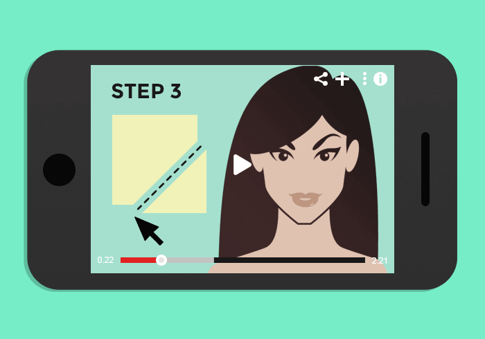
They Watch Videos
Online video is still a huge growth area, and the number of users is expected to reach 1.5 billion in 2016. YouTube’s own research indicates that 50% of its users watch videos on their smartphones, with YouTube alone accounting for approximately 18% of all mobile data traffic. According to Invodo, mobile and tablet users are also three times as likely to view a video on these devices as they are on laptop and desktop computers.
All of these statistics quite clearly indicate that including video on your website promises a good return on investment and is something you ought to be doing to increase traffic. Nevertheless, a surprising number of websites have been slow to implement this.
Takeaway 5: User Journey Videos
If you’re not already creating video content, perhaps now is the time to start. Great results can be achieved even with low-cost options, such as vlogging or a short educational series. You can then begin to build your YouTube channel and embed videos appropriately across your website.
Once your videos are in place and fully responsive, the next step is to evaluate their position in the layout. For example, marketing- or sales-related material would best be used early in the m-commerce journey to increase interest in and curiosity about your brand and products, enticing the customer to delve further and, ultimately, creating the intent to purchase. As the visitor reaches more specific category levels, videos that help them make a decision, describing what sets product A apart from product B, would be highly useful.
Finally, more specific videos should be embedded within product-level pages to close sales and increase conversions. According to Econsultancy, visitors are 64 to 85% more likely to make a purchase after watching a video, making it a very worthwhile exercise for both you and the customer.
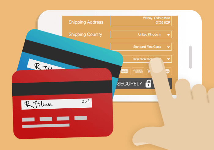
They Shop
Google Mobile Planet states that 20% of smartphone users in the US make a purchase on their device daily and 14% weekly. Tablet users spend over 50% more per purchase with online retailers than smartphone visitors and 20% more than laptop and desktop visitors. At the top of the list of product categories are items such as event tickets, gift cards, food and electronics.
Takeaway 6: Cart Streamlining
To ensure that you’re making the most of your m-commerce website, make sure the navigation and filtering are easy, the loading time quick, the methods of payment trustworthy and the checkout straightforward.
Always provide guest checkout as a default option, and set shipping address the same as an invoice address by default. Avoid email verification input fields (a vast majority of users consistently copy-pastes the email address from one input field to another) and avoid any optional fields — it might be better to display them on toggle if necessary.
Always be very clear and transparent about pricing and shipping costs, and provide both the time and the price in local currency as soon as possible. Make use of free shipping thresholds and pre-fill as many input fields as you can, e.g. the “State” and “City” by asking for a ZIP code first. Make guest customers feel secure in using your checkout and in manoeuvring easily from choosing products to selecting a delivery method, with just a few taps of the screen.
It’s worth repeating: by reducing the amount of effort that goes into buying on your site, you will automatically increase conversion rate, and make your customers more likely to return.
Summary
While such straightforward guidelines are emerging as we move forward in the mobile age, they are not the only behaviors that website visitors exhibit on mobile. Mobile users also use social media extensively, play games and download scanned coupons.
Of course, the guidelines will vary from website to website, so think about how users interact with your website on mobile and how you can translate these guidelines to your own case. When you look closely at the behavior of mobile users, it’s very surprising how much you learn.
Further Reading
- Infinite Scrolling: Let’s Get To The Bottom Of This
- Get the Scrolling Right
- Reapplying Hick’s Law of Narrowing Decision Architecture
- Advanced Navigation With Two Independent Columns
- How I Built The One Page Scroll Plugin
 (da, al, ml, mrn)

