One of the many massive disruptions caused by COVID-19 is the widespread closure of schools. If your child is one of the many students facing multiple days at home, and you’re one of the many parents wondering how to keep them from spending the entire time in front of the TV, here are some ways to keep them entertained in an educational way.
First of all, let’s talk about coronavirus.
Since appearing in Wuhan, China, in December 2019, COVID-19 has become a public health emergency. Though this virus is part of a family of coronaviruses that causes a range of familiar diseases from the common cold to SARS, COVID-19 is referred to as novel coronavirus because it is new to humans (World Health Organization). According to the CDC, the virus spreads through person-to-person contact, though it can be prevented by frequent hand washing, covering the mouth and nose when sneezing, and avoiding close contact with anyone showing symptoms of respiratory illness (Centers for Disease Control).
It’s a lot to process, especially in the wake of nonstop news headlines about travel restrictions, event cancellations, and famous people falling ill. In addition to researching public health practices and guidelines, one of the tools you and your student can use to understand the disease is GIS.
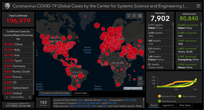
First, check out some of the dashboards that countries have created to monitor COVID-19 and learn more about the spatial distribution of cases. Governments from Germany to Israel to Thailand are combining maps and live data about the number of cases to understand where the disease is spreading most rapidly and how to best respond. Johns Hopkins University and Esri are maintaining a global dashboard, and there are many more being created to monitor national, state, and county-level cases available in the COVID-19 Hub.

*This image was captured on March 17, 2020, and might not reflect the current situation. Visit the dashboard for the most current information.
Which dashboard is most helpful to you?
Why do you think different governments and agencies need different types of data?
Notice that most data is reported at a country level. This is usually done to protect the identities of patients. But it also points to a big question—where are you in relation to reported cases? Try using the following exercise to learn how to find your absolute location, your location within a regional boundary, and your location within a global boundary. Then, compare your location to the data provided about where there are outbreaks.
Another important fact we know about the virus is that it can be more severe for older people and those with pre-existing conditions (Centers for Disease Control). To understand where there are large populations of seniors who need to be extra vigilant in following CDC guidelines to prevent the spread of the illness, try this lesson to map population by age. You can also learn more about Census data and demographics in this blog. Explore the available data to find more information about at-risk populations.
Where are there large populations of older people?
What other data is available in the Living Atlas and the U.S. Census that can give you clues about where at-risk populations are?
Finally, there are many ways that public health agencies use maps to track the movements of infected people. It is important to understand patterns of movement and who infected people may have come in contact with to monitor the spread of the virus. To see how this has been done for previous health emergencies, try this lesson on monitoring an E. Coli outbreak and use a similar workflow to map coronavirus.
Now that you understand the geographical dimensions of the COVID-19 epidemic, you know it’s especially important to continue listening to the CDC’s guidance on preventing further spread of the disease and staying healthy. Continue checking the CDC’s site and local health department bulletins for information on how to protect yourself and your family.

Article Discussion: