|
|
Photo © Adam Twardoch
|
|
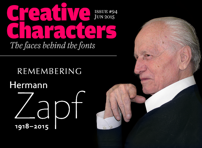
On June 4, 2015, the typographic world lost an iconic figure. Hermann Zapf died in Darmstadt, Germany, aged 96. As a type designer, calligrapher, author and teacher, Zapf was unique. His eye for harmony and detail was uncanny; his flexibility in designing for changing technologies exemplary. In a career spanning over seven decades, Zapf designed dozens of timeless classics, including the Palatino, Optima, and Zapfino typeface families — types that were modern yet true to tradition, and always elegant. He is survived by his widow, fellow type designer, calligrapher and bookbinder Gudrun Zapf-von Hesse, now 97. These past few weeks, we interviewed some of the people who knew him well — type designers who worked in close collaboration with a man they admired and loved.
|
|
|
|
Akira Kobayashi began his career as a type designer at Sha-Ken Co., Ltd. in Japan. In 1989, he traveled to London to study calligraphy and typography. On his return, he worked at Jiyu-Kobo, Ltd., and subsequently at TypeBank Co., Ltd., where he designed Latin typefaces to accompany the foundry’s digital Japanese fonts. Starting 1997 he worked as a freelance type designer, winning numerous international awards. In 2001 he moved to Germany to assume his present position at Linotype GmbH (now Monotype GmbH).
|

|
|
Hermann Zapf has been a key figure in your career as a type designer. While living and working in Japan, how did you come across him?
Back in the 1980s I was one of about two dozen designers in a Japanese phototypesetting machine manufacturer, where I was required to draw many kanji characters with a pointed brush every day. One day, feeling rather exhausted, I picked up a book from the bookshelf in the company’s design department. This was Hermann Zapf’s About Alphabets, a small book that changed my life completely.
I immersed myself completely in the beauty of his calligraphy and sketches. Since it was the first book I ever read in English, I had to use a dictionary every couple of lines. There were many things I learned from the book, but one thing which grabbed my attention is that he was a self-taught calligrapher and it took him a while to realize that he was holding his pen at the wrong angle — after all, Mr Zapf was also an ordinary man! I decided to follow in his footsteps. I left Japan for the first time in my life, and lived in London to experience the Western world first-hand. While there I studied Western calligraphy and read many books on typography and type design.
After returning to Japan in 1990, I started working as a freelance type designer. This time I was holding a mouse instead of a pointed brush, and developed original typefaces during my spare time. I was fortunate to win some awards. In 2000, at the prize-giving ceremony of the International Digital Type Design Contest in Mainz, I found myself on the stage, holding a first prize certificate. In my acceptance speech, I thanked Mr Zapf sitting in the jury’s seat and told the audience the story just mentioned above. So to me, the collaborative projects with Mr Zapf meant so much more than just redesigning typefaces.
Could you tell us a bit about your collaborations with Mr Zapf?
I joined Linotype in May 2001, and the Optima Nova project started a couple of weeks later. Following a short kickoff meeting at the office with Mr Zapf, we set to work by reviewing the digital version of the existing Linotype Optima. Our main communication method was by postal mail: we sent printed proofs to Mr Zapf and he wrote instructions on them and mailed them back to us. His instructions on them were very subtle — our printed letters were about ten centimetres high, and the differences from the old version were often less than half a millimetre.
One day, after a meeting I showed him how I work with type design software. He seemed impressed by the speed of the process. We all know that in the pre-digital era, type designers had to wait for weeks — or even months — to see the results of their work. From that moment on, Mr Zapf started to visit me almost every week, sometimes twice a week, and our collaborative work also brought significant changes to his approach to type design.
A typical collaboration day started at 8:30 am. Mr Zapf came to my office and sat next to me, looking at the computer screen and giving instructions. I made changes until he was satisfied with them. We usually worked until 5pm with no coffee break — he did not drink coffee and neither did I. Our lunch never lasted longer than twenty minutes; we simply loved working, and he was unstoppable. He was 83 at the time, but had the energy of a man in his middle age.
Any other memories that you would like to share?
During the Palatino Nova project, Linotype’s Otmar Hoefer asked Mr Zapf rather abruptly to design a new sans-serif. I remember Mr Zapf saying, without hesitation: “Warum nicht? (Why not?).” I was a bit surprised, but soon I understood his swift response. A few days later, he brought us photocopies of some sketches he had drawn in the past. The idea of Palatino Sans had been conceived in his mind several decades ago.
What were the most important things you learned from him? And did he learn from you?
One thing I learned from him was how to judge the quality of curves and letterforms. During the collaboration, Mr Zapf did not touch the computer; he gave me instructions in very subtle details — “Make this part slightly thinner,” or in a later stage‚ “Can you try to make this curve better?”. When I thought I knew how to make it better, showed him, and he nodded, that was proof that we had an understanding.
By looking at the same computer screen, we learned many things from each other. With my very basic explanation of the software, he understood quickly how to control Bézier curves, letterspacing, and even kerning. He also made drastic changes to letterforms or created spontaneously a handful of alternate glyphs and ligatures. He really enjoyed the new possibilities offered by the typographic environment in the 21st century.
Until his very last moment, he was eager to be involved in several projects, including Zapfino Arabic with Nadine Chahine. His passion for type design never stopped burning.
|
|
|
|
Nadine Chahine grew up in Lebanon and studied graphic design at the American University of Beirut. She has an MA in typeface design from the University of Reading, U.K., and obtained a Ph.D. at Leiden University in The Netherlands with a doctorate thesis on legibility, focusing on Arabic scripts. As Monotype’s Arabic specialist, she closely collaborated with Hermann Zapf on the Arabic versions of the Palatino Arabic and Palatino Sans Arabic typefaces and, these past few years, on the impressive Zapfino Arabic.
|

|
|
What did Hermann Zapf mean to you as a student of Latin and Arabic letterforms?
I was always fascinated by his Optima typeface and I always saw it as a unique typeface that cannot be improved; that is, it exists in a universe of its own and there will never be space for another typeface in that genre, because Optima is already perfect.
When you first met Mr Zapf, what was it that impressed you most? Was it difficult for you to win his trust as an Arabic specialist?
I met him in 2005 at the Linotype office. He was visiting at the time, and Linotype’s then director Bruno Steinert told him there was a new Arabic designer in the company, and that we should meet. I was very much in awe! He struck me as an old-school gentleman like the ones you see in the movies — very well-spoken and approachable. He was keen to listen to what I had to say and agreed immediately to Bruno’s idea that we do a Palatino Arabic.
In the next two years he would visit the office and we would spend the whole day working together. There is nothing more humbling than to work side by side with a legend. It was always very clear that I’m in the presence of genius and I was continuously gob-smacked by how sharp his eyes were and how clearly he saw every tiny detail.
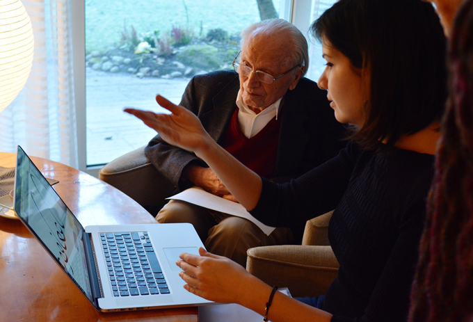
Nadine Chahine working together with Hermann Zapf. Photo courtesy of Akira Kobayashi.
You worked with Hermann Zapf on Zapfino Arabic until shortly before he passed away. What was the process like?
We collaborated on three typefaces together: Palatino Arabic, Palatino Sans Arabic, and Zapfino Arabic. By the time we got to the last two projects he trusted me fully and I was able to draw everything on my own and every once in a while we would visit him at home in Darmstadt to show him the progress of the design. Sometimes it would be months between the visits, sometimes weeks. I could not visit as often as I liked because of travel and work commitments, but we always managed to visit whenever we hit a design milestone.
What were the most important things you learned from him?
I learned to hope that I will be able to love type design all the way to the end, that this is a lifetime commitment, and something that will be a major part of my life for hopefully many years to come.
Technically speaking, I think I learned to draw curves that feel like he drew them — or at least I hope I did. Sitting with him for so many hours and after working together for ten years, I am now very familiar with his drawing style and how he looks at curves. This is probably the biggest influence on my own drawing ability. I would not have been able to design Zapfino Arabic if I had not worked with him in those early years. This is something that I will be forever grateful for, and I am keenly aware that this kind of experience is an honor and a privilege and one that will very likely not be repeated.
|
|
|
|
Jovica Veljovic studied at the Department of Applied Arts and Design of Belgrade University of Arts and taught Typography there until 1992. He then moved to Hamburg, Germany, where he lectures in Type Design and Typography at the University of Applied Sciences. He works as a type designer, typographer, calligrapher and book designer. His typefaces have been published by ITC, Adobe Systems and Linotype. His best known typeface is ITC Veljovic, which he recently redrew as ITC New Veljovic Pro.
|

|
|
Could you describe your relationship with Hermann Zapf?
I was still a student at Belgrade Art Academy, intending to study Graphics and Fine Art, when a friend of mine lent me the book Über Alphabete by Hermann Zapf (1960). This book completely changed my life, and my interests went in a new direction. The book, with its with beautiful calligraphic examples and typefaces, paper, printing, binding, typography and size, fascinated me so much that I began studying calligraphy and lettering, and dreamed of setting up a printing shop.
The first time I met Mr Zapf was in 1987, during the international typographers’ ATypI conference in Munich. That same year I sent him my small etchings of calligraphy. He liked them so much that he asked me to describe my technique, because of the fine crisp edges on it that he liked very much. From time to time Hermann sent me his published works and we kept in contact. After I came to Hamburg in 1992 we began working together. In the early nineties, when he was correcting his Palatino, I helped him with the new Cyrillic character set. On certain things he was so opinionated that I could not convince him to do otherwise.
He was a perfectionist; he worked very intensively and was very organized. He would send me a job one day, then call the next day to ask if the work had been done.
During the production of Zapfino, he was upset with the digitization of some of its ornaments, complaining that people did not understand how the broad pen works. I offered him help to correct things. Knowing how accurate Hermann’s drawings are, I insisted we start from scratch instead of correcting existing data. Looking at the digital output of a 1000 x 1000 unit glyph, he was able to see one unit difference.
We also worked together on Zapfino Cyrillic and Greek. It was a very nice experience to share our love for details and for some things that are almost invisible.
With Mr Zapf, you share an ability and a passion to translate the gestures of writing into the stable shapes of printing type. Would you say your approach is similar? Have you learned from him in this respect?
Yes, definitely — I have learned a lot from him as well as from Henri Friedlaender from Israel. Hermann was a calligraphic Mozart, his writing was elegant and fine with real delicacy. Thanks to his books I have developed a sensibility for material and a good taste in typography. He has celebrated this art, without compromising, for seventy years. His legacy is enormous.
What is the thing about him that you’ll miss most?
His warm sense of humor. And an almost childish enthusiasm for small things like “schmale Kanten” (narrow margins) in industrial book production. We often spoke about such things. From time to time he would send me an example from old times, commenting: “If you reduced today’s machine speed and took good care of it, it would be possible to get this again.”
|
|
|
|
Based in Berlin, Ferdinand Ulrich is a young typographer and researcher. He is Erik Spiekermann’s assistant at the P98a printing workshop, and teaches editorial design at Halle University of Art. He gives lectures on his research projects — including an extensive thesis on Zapf’s near forgotten Hunt Roman — and writes book and type reviews.
|

|
|
As a student of graphic design, how did you encounter Hermann Zapf and his work?
One of the best pieces of advice during my undergraduate studies came from my professor at that time, Erik Spiekermann — to study abroad at the renowned Carnegie Mellon University (CMU) in Pittsburgh, Pennsylvania. Those months at the CMU School of Design were completely dedicated to type and typography. I began to study the history of type, became acquainted with the smell of letterpress ink and it was that semester that introduced me to the œuvre of Hermann Zapf.
CMU had a long history with Zapf: In the fall of 1960, Professor Jack W. Stauffacher invited Zapf to Pittsburgh — his first teaching assignment in the United States. Zapf’s short residency left a profound impression on the faculty and students. His conversations with Stauffacher mark the beginning of Hunt Roman, his first custom typeface (and one of his very last for metal type), designed for the Hunt Botanical Library, an institute on CMU campus.
Nearly fifty years later in Pittsburgh, I discovered those Hunt Roman metal type sorts, cast in just one weight and four sizes. As it turned out, the type was available in only three other places in the world — a story of collaborations, friendships and cultural exchange — and some semesters later it became the topic of my graduate thesis. I believe this typeface is one of Zapf’s best (with Comenius — a daughter of Hunt Roman — perhaps being the best) and it was the starting point through which Zapf’s work captured my attention. When visiting Stauffacher at the Greenwood Press in San Francisco in 2012, he described Zapf as a “cultural ambassador”. I could hear his appreciation for Zapf in every moment of our conversation; their friendship became the heart of my thesis.
And then you got to meet the man himself…
At first I had been corresponding with Zapf by ‘traditional’ mail. However, during a small Hunt Roman lecture tour through the United States last year, it was my host Jerry Kelly, a close friend of the Zapfs, who contrived a meeting between them and myself. Two weeks later I received a phone call from Gudrun Zapf-von Hesse who officially invited me to their home in Darmstadt for “Kaffee und Kuchen” (coffee and cake). During that first quite magnificent and unforgettable visit, I was just as interested in her work as I was in Mr Zapf’s. Thus, on another occasion some months back, I interviewed Mrs Zapf-von Hesse about her career and her typefaces — both of them are brilliant type designers in their own right. Within a rather short time, through their warm and hospitable nature, the Zapfs took me into their confidence. Receiving Mr Zapf’s personal blessing to have some Hunt Roman cast for my own use, was understandably a special treat.
When I handed Mr Zapf one of the few copies of my rather thick unpublished thesis, he remarked in jocular fashion: “A whole book about one typeface?” While I mourn for the loss of one of the most refined and pleasant type designers, I can only confirm: a comprehensive work on all of the Zapfs’ typefaces is indeed needed and yet to be realized.
|
|
|
|
Thanks to all contributors for their insights.
During his long and multi-faceted career, Hermann Zapf had numerous working relationships with colleagues across the world. In the United States he was a consultant to Hallmark Cards, and founded a company with Aaron Burns and Herb Lubalin, the founders of the International Typeface Corporation (ITC) — among many other activities. For those interested to know more about Zapf’s life and work, Jürgen Siebert wrote a brief yet thorough overview of Hermann Zapf’s career for FontShop’s website.
|
|
|
MyFonts on Facebook, Tumblr, Twitter & Pinterest
Your opinions matter to us! Join the MyFonts community on Facebook, Tumblr, Twitter and Pinterest — feel free to share your thoughts and read other people’s comments. Plus, get tips, news, interesting links, personal favorites and more from the MyFonts staff.
|
|
|

|
Who would you interview?
Creative Characters is the MyFonts newsletter dedicated to people behind the fonts. Each month, we interview a notable personality from the type world. And we would like you, the reader, to have your say.
Which creative character would you interview if you had the chance? And what would you ask them? Let us know, and your choice may end up in a future edition of this newsletter! Just send an email with your ideas to [email protected].
In the past, we’ve interviewed the likes of Maximiliano Sproviero, Sumner Stone, Typejockeys, Charles Borges de Oliveira, Natalia Vasilyeva, Ulrike Wilhelm, and Laura Worthington. If you’re curious to know which other type designers we’ve already interviewed as part of past Creative Characters newsletters, have a look at the archive.
|
|
Colophon
This newsletter was edited by Jan Middendorp and designed by Anthony Noel.
The Creative Characters nameplate is set in Amplitude and Farnham; the intro image features Optima Nova and Palatino Sans; the quote images are set in VLNL Spaghetti; and the large question mark is in Farnham. Body text, for users of supported email clients, is set in the webfont version of Rooney Sans.
|
Comments?
We’d love to hear from you! Please send any questions or comments about this newsletter to [email protected]
|
Subscription info
Had enough? Unsubscribe immediately via this link:
www.myfonts.com/MailingList
Want to get future MyFonts newsletters sent to your inbox? Subscribe at:
MyFonts News Mailing List
|
Newsletter archives
Know someone who would be interested in this? Want to see past issues? All MyFonts newsletters (including this one) are available to view online here.
|
|
|
|
MyFonts Inc. 600 Unicorn Park Drive, Woburn, MA 01801, USA
MyFonts and MyFonts.com are trademarks of MyFonts Inc. registered in the U.S. Patent and Trademark Office and may be registered in certain other jurisdictions. MyFonts and MyFonts.com are trademarks of MyFonts Inc. registered in the U.S. Patent and Trademark Office and may be registered in certain other jurisdictions. Aldus, Virtuosa, Zapfino and Optima Nova are trademarks of Monotype GmbH registered in the U.S. Patent and Trademark Office and may be registered in certain other jurisdictions. Palatino and Optima are trademarks of Monotype Imaging Inc. registered in the U.S. Patent and Trademark Office and may be registered in certain other jurisdictions. Kompakt and Saphir are trademarks of Monotype GmbH and may be registered in certain jurisdictions. Other technologies, font names, and brand names are used for information only and remain trademarks or registered trademarks of their respective companies. Other technologies, font names, and brand names are used for information only and remain trademarks or registered trademarks of their respective companies.
© 2015 MyFonts Inc.
|
|
|