
 Microsoft Excel, or the Marketer’s binky, as I often refer to it, has become the default solution to tackling the data challenge we face in Marketing today. The process goes something like this: We download multiple reports from all the marketing systems we use, we piece together the data into Excel, we build charts, and then get crazy and copy those charts into PowerPoint. We do this every day/week/month. The same process. Over and over. With the same result, which is a fragmented look at our marketing performance all powered by an API. No, not the API used in programming but this API: Actual Person Interface.
While this is still the most popular approach in the industry, do you ever wonder why? One reason: It’s what we know. We have all been using freaking Excel and PowerPoint our entire careers and when we need answers on how marketing is performing, we crack open our analytics toolbox, which consists of duct tape and bailing wire and get to work. This option alone is responsible for why Marketers have become data gatherers, spending 80% of our time doing this extremely career rewarding exercise of building spreadsheets, sheet links, lookups, and pretty charts.
I ask you to think about this process for a moment if you find yourself here – particularly if you are an agency. In fact, one agency partner shared with us that, before partnering with Alight, it took them roughly eighty hours — EIGHTY HOURS! — a month to put together their “analytics” PowerPoint for one client! In other words, I get two weeks off before I have to climb aboard the crazy train and do the 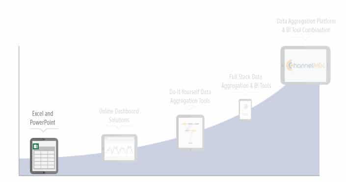 “analytics” PowerPoint all over again. This process is a never ending, mind-numbing process that often leads you to question your sanity as you download report after report, copy data into specific cells, create charts, and build presentations.
Now, think about what happens to your data. The data itself usually lives on individual desktops; it is difficult if not impossible to share the data across departments or the organization. And when it finds itself into presentations, it is sealed in a tomb of death. That is why we call this entire option of using Excel and PowerPoint the “Data Death March.”
This entire process of using Excel and an “Actual Person Interface” to gather data ultimately will never allow you to truly answer either of the two fundamental questions of “what happened” and “what do I do”. It is too cumbersome and organizations of any size must move beyond this option as quickly as possible.