Mapping User Feedback on the Met App

The Met app now features a map of the Museum. All images courtesy of the authors
«Ten months after the launch of the Met app, the most frequent feedback we receive is still more or less, "It's beautifully designed, but where is the map of the Museum?" We can now shelve this question with the recent launch of version 1.2 in the App Store, because the map is finally here!»
The map issue has become an important lesson about user-experience design, user expectations, and behavior. It goes without saying that one of the most important services smartphones offer is global positioning and wayfinding, and smartphone owners expect wayfinding solutions to be abundant and sophisticated. As Apple and Google have seemingly mapped the entire world, so, too, should The Metropolitan Museum of Art include a flawless, interactive map of its galleries in its app. With people around the world demanding such services of their local museums, malls, airports, and office parks, tech giants are racing to crack the nut of indoor positioning. Many businesses and organizations, however, have taken matters into their own hands by using technology like WiFi triangulation and beacons—to mixed results.
One useful case study is from our neighbors at the American Museum of Natural History, where a three-year effort culminated in the 2010 launch of their mobile app, Explorer. This year, the AMNH replaced the WiFi-based infrastructure with a fleet of beacons to power their app. Needless to say, this project is not simply a mobile-app development project, but a museum-wide service-design project.
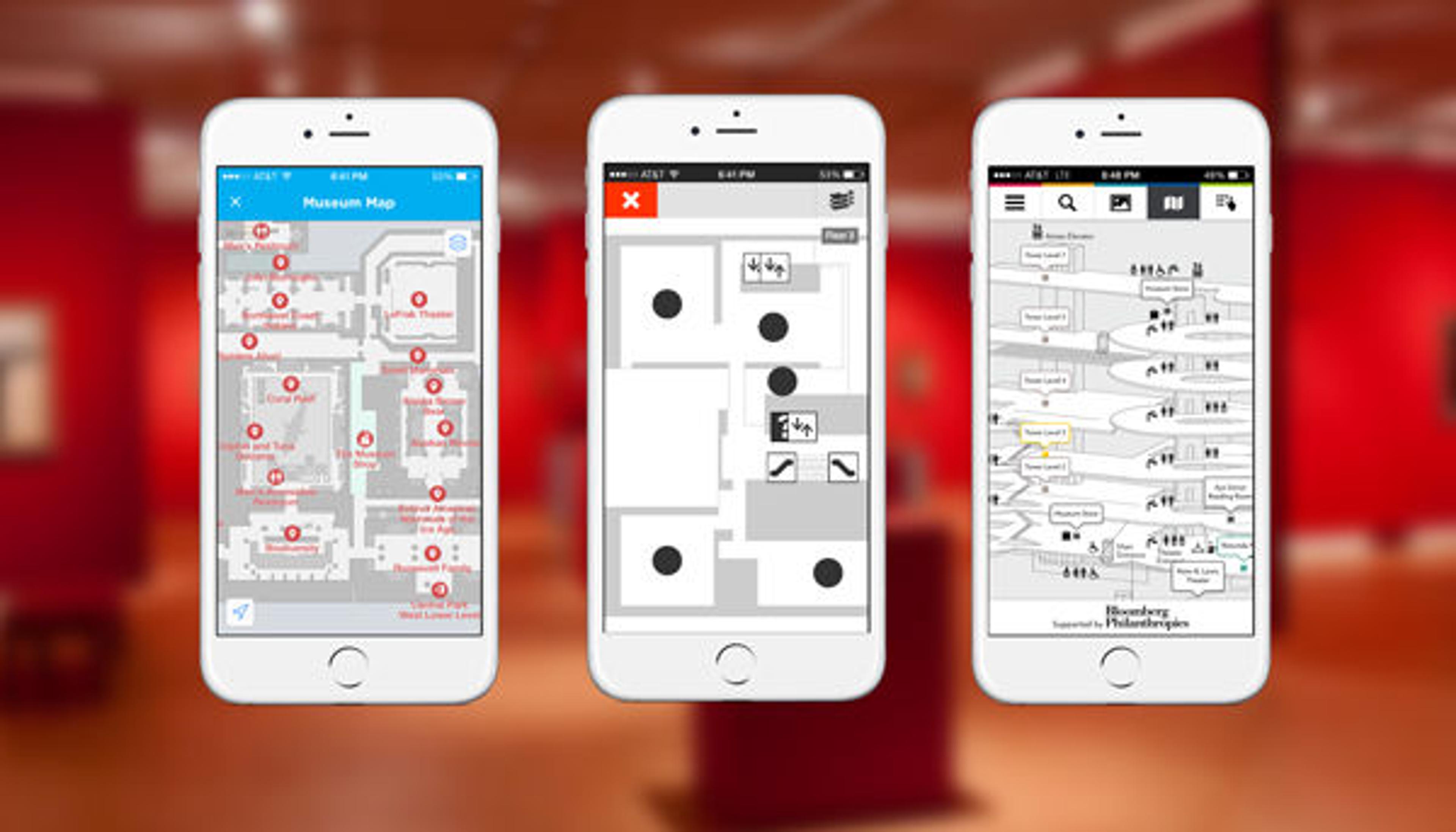
Other museums have included custom maps in their mobile apps, including, left to right: The American Museum of Natural History, the Museum of Modern Art, and the Guggenheim
In contrast, the Met was simply not ready for that level of investment when it embarked on building its flagship mobile app last year. The team considered low-hanging-fruit solutions, but we were skeptical that the custom maps adopted by our peers at museums like MoMA and the Guggenheim would suffice for our huge, complex space. (The Met, after all, is the second-largest museum in the world.) We were daunted by the level of effort we thought would be required to produce a custom map that could live up to our design principles—useful, simple, and delightful—so we opted not to include one at all. We believed that the paper map available throughout the Museum, combined with our knowledgeable security staff, would continue to be more useful resources than anything we could produce on mobile in the time that we had to complete the project.
A Change of Heart
After launch, it became clear that we had a problem on our hands. User reviews on the App Store reflected strong disappointment at the lack of a map feature. Meanwhile, when we surveyed the reviews of apps that contain custom maps, we found that very few of them were so harshly rejected, which led us to reconsider our wayfinding strategy and do a little user-experience-design soul searching.
Upon visiting a museum in lower Manhattan, we downloaded the app and opened the map. Immediately, usability challenges were evident—for one thing, the schematic geometric shapes on the screen did not resemble the gallery spaces well enough for us to be able to identify our location. Yet somehow, the map was still instantaneously useful. Within a few seconds of looking at it, we had a sense of the size of the building and the density of the attractions, plus a quick survey of the amenities.
After walking around, it was easier to feel like one had a better sense of the map and, by extension, a better sense of the space. Unlike with Google Maps, which is precise enough to guide one through confusing street layouts like those in Manhattan's West Village, the best way to engage with this map was to take a few glances at it, get one's bearings, and soldier on with device securely in pocket.
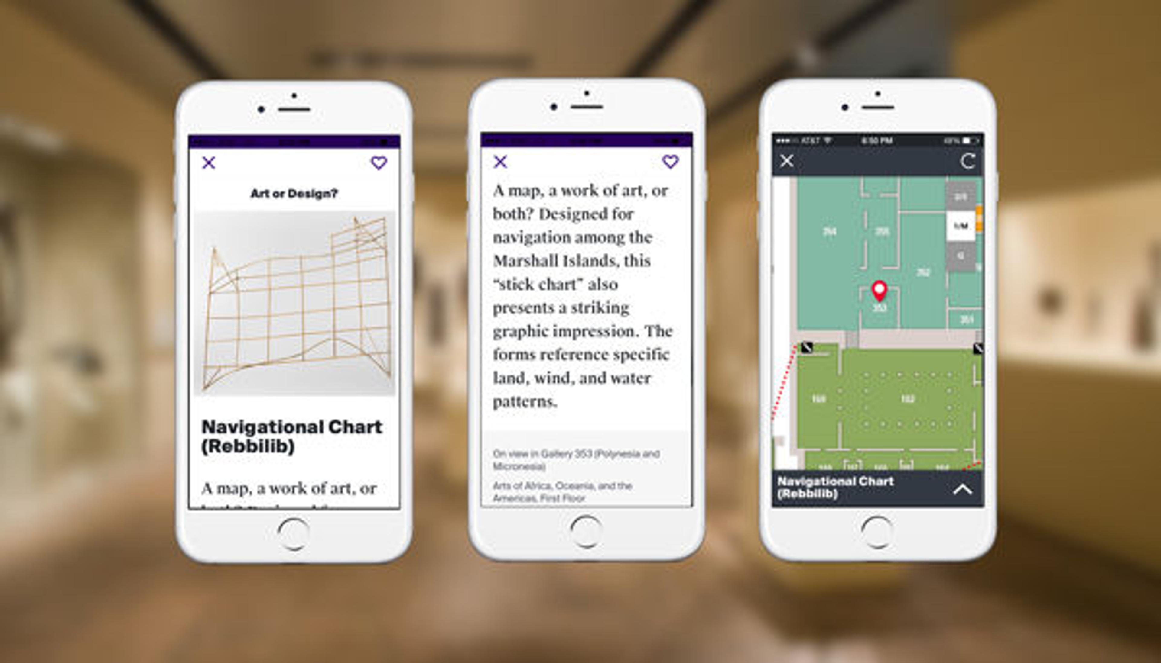
The Met app features an object from the collection, Navigation chart (Rebbilib), made by Marshallese people
Around the same time as this museum visit, we came across a useful maxim from the usability expert Steve Krug: "Focus ruthlessly on fixing the most serious problems first." It can be tempting to downplay a problem when it's not clear how to best solve it, but he explains: "You don't have to fix each problem perfectly or completely. You just have to do something—often just a tweak—that will take it out of the category of 'serious problem'" (Don't Make Me Think, Revisited, 138).
When it comes to indoor maps, at least for now, it seems that "perfect" is truly the enemy of "good." The Met will leave "perfect" to the big investors. Google has been working on street mapping for ten years and will surely improve their indoor mapping service well enough for it to become just as ubiquitous in the next few years. Meanwhile, providing a "good" wayfinding feature is something that the Met has a responsibility to deliver.
The map you see in version 1.2 is intended to address the problem of wayfinding in the Museum, but by no means is it perfect out of the gate. You will find that the map pins locations of artworks, exhibitions, and events on a zoomable, digital version of the Met's existing floor map. It does not pin the user's location or provide turn-by-turn directions. Users will not be able to tap on each gallery to learn what artworks it houses, nor can users discretely request to see the nearest bathroom. These are features that we may well tackle in future iterations, thanks to the existence of this baseline solution.
How We Built the Map Feature
Building a mobile map for the Met is a formidable challenge. The Museum is known for its encyclopedic collection and labyrinthine layout, and the Met app displays over fifty events and thirty exhibitions at any given time, as well as lists of collection objects that should all map to locations in the Museum. When we started the map project, there was already a digital map on the website, and it was only optimized for desktop web browsers. There was already a process in place to populate that map with links to objects, galleries, events, and exhibitions, so we decided to leverage the existing workflow and transform the data into something the app could use. This solution ensures that every time a new exhibition is added or the map is updated, both the mobile and desktop maps will update in coordination.
Subathra Thanabalan, a mobile developer on the Digital Media Department's Media Technology team, had experience working with Mapbox and the JavaScript library Leaflet for building web-based maps that are optimized for mobile devices, so we used TileMill to generate tiles from the existing map images and added them as a layer to a Leaflet map built in JavaScript. Mapbox serves the tiles so that we don't have to worry about the complexity of setting up a tile server, and can focus on building map features.
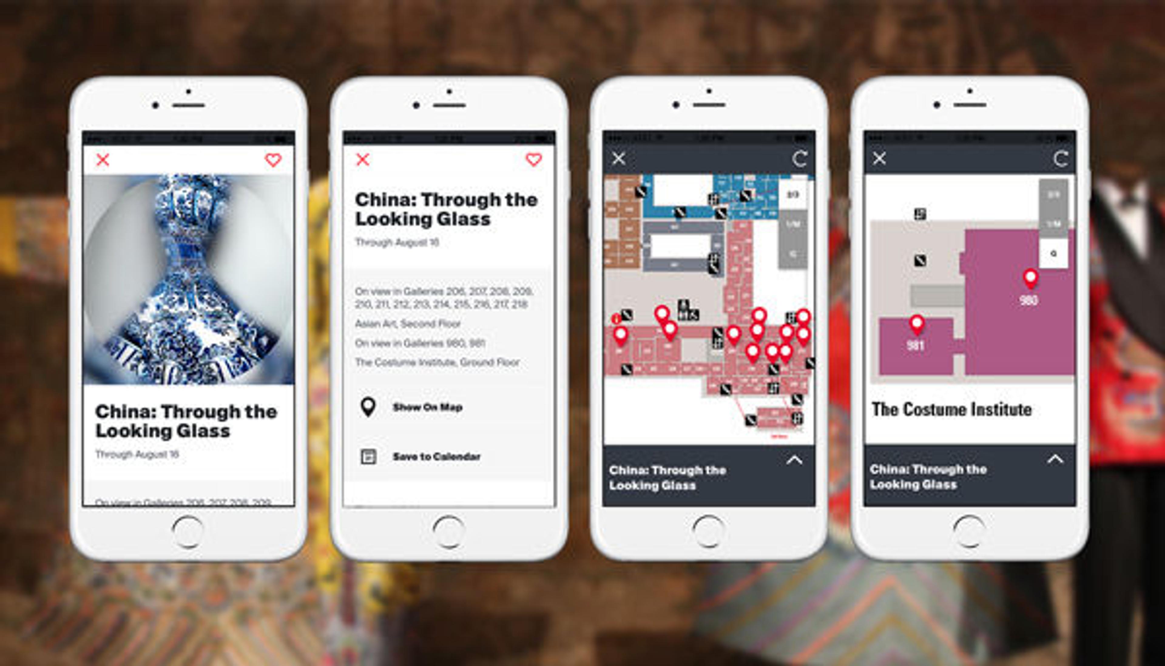
Screenshots from the Met app showing a listing for the current exhibition China: Through the Looking Glass and the map feature
The benefit of the web-based solution is that we can push out updates to the map more quickly. And because the web-based map is accessible from any web browser, it can easily be incorporated into other platforms, like Android. When we make improvements and updates, those changes will appear on both platforms immediately without requiring users to download updates.
There are some disadvantages to using a web-based map solution, however. Most notably, a natively built implementation would provide smoother performance when panning and zooming. Our map also requires an Internet connection, so we will be monitoring performance closely as it rolls out. And since the image tiles that make up the map already have features like gallery numbers and text "baked in," we don't have dynamic control over the font size of such elements. This makes the map a bit hard to read when zoomed out, but that's something we can target in future iterations, depending on user feedback.
We are also closely following developments on native maps for iOS and Android, and would consider moving to that solution in the future. In that case, the experience we have building the web-based version will help us scale any learning curves.
We hope that you find the map feature in the Met app useful on your next visit to the Museum. If so, please take a moment to rate the app! As always, we also want to hear your feedback: please email us your thoughts at mobilefeedback@metmuseum.org. Your feedback will guide further improvements to the map feature.
Related Links
Download the Met app—now available on iOS and Android.
View all blog posts related to the Met app.
Liz Filardi
Liz Filardi is the senior product manager for collections in the Digital Department.
Spencer Kiser
Spencer Kiser is the media technology manager in the Digital Department.