In this tutorial, I’ll teach you how to design a simple and sophisticated web journal application in Sketch, for both mobile and desktop. We’ll use the VSCO aesthetic as inspiration and, at the end of this tutorial, you’ll have become aware of many of the most important features of Sketch.
Besides these application-specific skills, you will also get a deeper understanding about setting typefaces and layout with the help of a modular scale. We will be using some basic and intermediate techniques in Sketch. Let’s get started!
Tutorial Assets
You will need the following assets in order to follow along:
Before we open Sketch and create a new document, I should point out that this concept is entirely theoretical. It would require a much deeper market analysis before we could turn it into a real, usable product. I’ve always been passionate about online storytelling with beautiful photos, so I created this concept to teach you how to follow web trends from a designer’s perspective.
Typography
When I start a project, I always start with typography because I strongly believe that typography is the most important tool for communication designers have at their disposal.
For the body text and larger titles, I chose Merriweather, a serif font inspired by old-style book faces, which works well for telling stories and journeys. On high resolution displays it gives the feeling of a real, printed journal.
On the other hand, for common UI elements such as buttons and labels, I wanted something modern, so I chose Montserrat, which is a clean and simple sans-serif font.
Setting Up the Artboards
First of all, I would like to write a little bit more about how I approach my layout and typography settings. Tim Brown, Type Manager for Adobe Typekit, created a fantastic tool called Modular Scale. This tool is great: after we define our ideal text size and suggest an important number, it will divide and multiply these numbers by a mathematically familiar value like the golden ratio or perfect fifth. In a moment, when we set up our typographic hierarchy and the basic elements of our layout, I’ll always refer back to these numbers.
Note: Obviously, in some cases we need to break this rule, but it will provide us with a natural balance within our layout and typography, which is pleasing to the eye.
I set the ideal text size to 18px and defined 670px as an important number, as this will be the actual, usable width of our mobile layout.
Step 1
After we open Sketch, let’s select the Artboard (A) option within the Insert menu.
For our mobile view, I recommend you choose the iPhone 6 dimensions, but if you have a different iPhone model, it’s better to choose that one. Using Sketch has a huge advantage in that it allows you to mirror your work to your iOS device in real time with Sketch Mirror, without exporting or transferring images. Mirror is an essential part of my design workflow, because with it, I can immediately see the final result of my work in my hand.
To activate this function, you will need the Sketch Mirror app from the App Store. Then click on the Mirror icon within Sketch (make sure your devices are on the same network or connected via a USB cable).
For the desktop view, I chose the Desktop HD canvas, which is 1440px wide.
Tip: later we can modify the height of our artboard by changing the numbers on the inspector panel.
Step 2
After we have the proper artboards, it’s time to set some guides so our layout has enough space and looks balanced. To turn on the rulers and the basic guides, go to View > Show Rulers (⌃R) . Then select the middle of our mobile canvas, which will be at 375px and also put a mark at the first and the last 40px, so that it will work with a horizontal 40px padding.
To create a guideline click on the ruler at 40px, at 375px and at 710px points.
In the case of the desktop view, we also set a middle guide (720px) and 100px padding.
Creating the Top Navigation Area
Note: If you would like to create a realistic mockup with an original Safari menubar, you can either create a screenshot and paste in the cropped image, or you can download the iPhone 6 GUI Template (iOS 8) created by the (former) Teehan+Lax team.
Tip: It’s good to know that Sketch has a built in iOS template as well, which you can find under File > New From Template > iOS UI Design.
Step 1
To create our top navigation bar, let’s select the Rectangle (R) tool.
Tip: I truly recommend you to learn the most important shortcuts, because they are easy to use. In most cases the shortcut key is the first letter of our tool, so in case of Rectangle it’s R, in case of Oval it’s O, in case of Line it’s L.
With the Rectangle tool create a 750px wide, 120px high rectangle, which has a #F9F9F9 background color.
Tip: In terms of colors, I always use HSBA (Hue, Saturation, Brightness, Alpha) numbers, because it’s easy to modify them and imagine the result in advance.
Step 2
Let’s select the Oval (O) tool and while pressing the Shift + Alt keys, draw a perfect 80px circle. On the right side, in the Inspector panel, click on the Fills button, and under the fourth tab upload a profile picture.
Tip: If you press the Alt key and move your cursor, you can see the distances in pixels between the selected elements.
Step 3
Select the Text Tool (T) and place a name next to the profile picture with 20px left padding. Set the font size to 22px and the font color to #9E846E. You can set uppercase letters in the Type > Uppercase menu.
Place the ‘New story’ text with the same settings at the right side of our artboard with 20px right padding.
Step 4
Now, we will create our first icon, which will be a ‘+’ icon.
Let’s create a 36x6px rectangle with our Rectangle (R) tool, which has the same color as our text. Once done, duplicate the resultant shape.
Select the second one and on the inspector panel (on the right side) rotate it by 90 degrees.
After placing the rectangles onto each other perfectly, drag the first one and drop it into the second one on the layer panel. In doing so we merge the two separate layers into one 36x36px icon.
Step 5
In the case of our desktop view, we also have the same full width navigation rectangle with 70px height and 80% opacity.
The menu button’s text size is a little bit smaller; 14px with a 40px padding and a #CCCCCC separator line.
Designing the Fixed Bottom Navigation
In the case of the mobile view, we will create a fixed bottom navigation bar, where the user can choose between the Grid, Favorite locations, Search and Profile pages.
Step 1
Just as with the top navigation, we’ll begin with a full width, 100px high, #FFFFFF rectangle with 90% opacity. Let’s place a 1px #E6E6E6 line at the top of this rectangle and divide it into four equal columns.
All of our icons are 50px tall and their color is #666666.
Tip: you can create your own ‘Grid’ icon by arranging nine 14x14px rectangles with 4px padding.
Creating the Header
Step 1
For the hero image, let's create a full width, 850px high rectangle and fill it with a photo, as in case of the profile picture. To make sure the text on it will be still readable, I put a black layer on the image with 20% opacity.
In case of the desktop hero image, I recommend 1000px for the height. Also, make sure that the image is under the navigation bar.
Step 2
For the title and the subtitle, the font sizes are 60px and 24px, respectively. The title font is Merriweather Bold and the subtitle font is Montserrat Regular.
Step 3
The last element on our hero image is the ‘Get Inspiration’ button, where the font size is 24px with 1.33px letter spacing. The button itself is 338x89px with a 3px width white border. Let’s place the button 70px from the bottom of the image.
For the desktop view, I recommend a smaller, 18px font size.
Creating Article Cards
Step 1
In this step we will create a special place for the most popular story. In order to do that, begin with a 670x480px image-filled rectangle, which has a special icon in the right top corner. With this icon everyone can flag their favorite journeys on the site.
This icon has a 80x80px white circle with 2px inside thickness. The ‘pin’ icon is 12px wide and we use a 18px Montserrat Regular number. This whole icon has 70% opacity and 15px top and right padding.
In the case of the desktop view, this image is 1240x750px and the ‘favorite location’ icon is 50x50px.
Step 2
Now we can create our first card. As a first step, make a 670x522px image-filled rectangle, then another 670x435px #FFFFFF rectangle. Place the second rectangle on the top of the first one.
Create a third, 670x744px rectangle and cover with it the previous two. Place this layer under the previous ones. Give a little shadow to this layer, which will make it pop out a bit.
Border radius is essential in our card design, so set it to 5px. In order to see this radius on every layer, click on this shadow layer and use it as a mask.
Due to the fact that on mobile we don’t have a hover state, we will use the hover view as a standard view, so all information will be visible right away.
After we select every layer connected to this card design, we can Group (⌘-G) them together, then we can duplicate them easily while pressing the Alt key and moving the original group downwards (alternatively we can duplicate with ⌘-C and ⌘-V method, too.)
Tip: Organizing our layers into groups is extremely useful in bigger projects like this one.
In the desktop view, we can use the same cards. For more sophisticated results, I suggest tweaking the ratios and font sizes a little.
Don’t forget that we have a hover view available on desktop, so we can create a simpler version of the card as a default, revealing the more complicated one when the user hovers the cursor above the card.
Designing the Map Section with Journey Collections
With the help of this map section, it’s possible to filter and search journeys by location. The results will be displayed as collections written by multiple authors.
Step 1
Create a 750x850px rectangle and fill it with a simple Google Maps screenshot. For the search bar place another rectangle at the top of this rectangle with 80% opacity.
Tip: For easier alignment, create a square in the left side of the search bar. After this we can place our search icon in the correct spot.
I chose #B3483E as the main color for my Map UI. This color was inspired by Pantone Marsala, Pantone’s color of the year 2015.
Step 2
When someone searches for a specific location, the results will be displayed as little journal notebooks. Every journal book is a 320x414px picture filled rectangle, with a hint of a shadow.
We can set the selective border radius by selecting its shape and hitting the Enter key. If we select one of the vector points, we can give them separate border radius values. Set the top and the bottom right border radius to 12px.
Step 3
In the desktop view, almost everything is identical, except that we position the journals next to the map and not under the map.
Designing Small Article Cards
Step 1
Designing small article cards will be similar to creating the larger ones, except that we delete the description and the summary part of the stories. This way we can display more information in the same space, so the user can go though more content in the same time.
In the desktop view, besides decreasing the size of the cards, we also sort them in a three column grid. I believe this will give us a convenient and fast way to discover and explore new content.
Call to Action
Before we finish our project with the footer, it’s inevitable that we provide a call-to-action section.
Step 1
As always, we need a picture-filled rectangle at 750x1000px. In order to make the text readable, we add a white gradient layer to our picture. Our gradient is from #FFFFFF opacity 30%, to #FFFFFF opacity 70%, so we only need to modify the amount of opacity.
Tip: a small, but sometimes still significant trick to improve the legibility of our text is to add shadow to it. In this case, I applied a soft light shadow on my title and paragraph text.
Creating the Footer Area
For the footer area we will use a combination of social media icons and text buttons.
Make sure that our social media icons remain touchable on small mobile screens. Let’s make them at least 44px tall or wide.
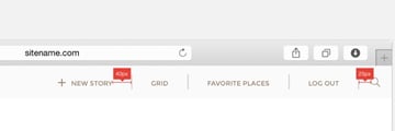
One More Idea
For the desktop view we can create one more navigation style, but we have to be careful with this and only use it above 1440px width. It’s equivalent to the fixed bottom navigation in mobile view.
Congratulations!
We’ve completed our beautiful journal web application design. Having followed this tutorial I hope that you are more confident in using Sketch for big projects. Let’s have a look at a mashup of the final products:
I’m curious to hear about how you found the process, so don’t hesitate to leave feedback and questions in the comments.


