
When seeing a new logo, how many times have you asked yourself, “Where have I seen that before?”
This year, Bill Gardner asked himself that very question 25,000 times.
Since founding the popular online logo database LogoLounge in 2002, Gardner has seen more than 200,000 logos (some approved, some rejected) contributed by graphic designers from more than 100 countries around the world. Every year, he summarizes his observations in a logo design trends report, grouping them into style taxonomies, as a kind of pulse survey of visual branding.
Unlike a trader following market trends or a clothes horse following fashion trends, Gardner, a graphic designer himself, isn’t necessarily following logo trends for inspiration—and he doesn’t advise anyone else to. As he says in the introduction to this year’s report, as he has for the last 13 years: “Be educated by this, stand on the shoulders of others to advance our industry, but please do not consider this report a suggestion of what your next project should look like.”
But the solutions arrived at by logo designers to help companies—or presidential candidates—create distinction from competitors is still plenty worthy of study. Gardner’s trend reports—the most comprehensive survey in the industry—serve as historical documents that have bearing not only in the evolution of design, but in the representation of business, technology, and culture at large. That’s an especially vital function right now, as mobile phones and smart watches have designers recalibrating the dimensions of their canvas, and the impact of their handiwork.
Here are the top 15 visual themes observed in the most recent year’s worth of emblems, excerpted from Gardner’s 2015 trends report, which was published this week:
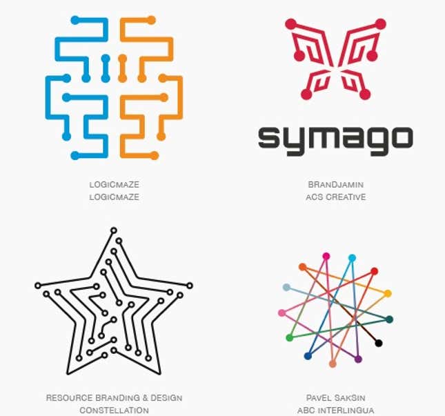
Dot Tip
There is a nod to science by referencing digital terminals with these, though that is becoming a pretty dated symbol in a world that is reliant on more advanced technology.
Contours
This is just the amount of visual eye candy necessary to lift the logo from a page and create a point of optic differentiation. Some designers might view this technique as a bit too tricky for their liking but time will prove one group or the other right in the end.
Concentrak
Played out against a dark background these logos are often packed with high-chroma color and can radiate like neon. It’s also not uncommon to see a gradation in the color to convey an additional message of shift or change as it relates to the entity it represents.
Sparkle
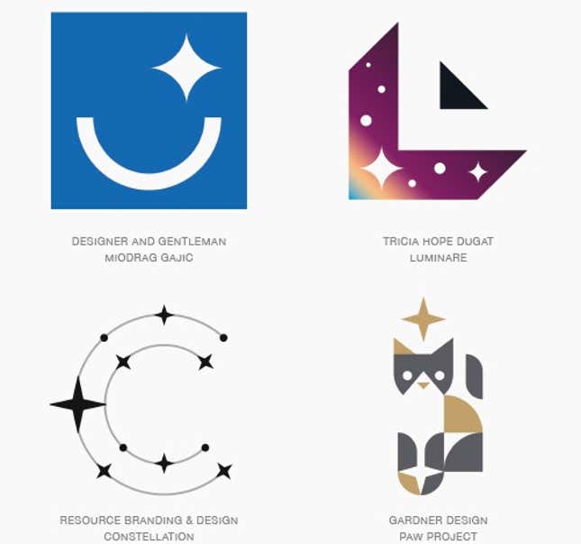
Certainly not a new icon, but one that is on a rocketing resurgence. The four-pointed star is being refitted and reintroduced with a less divisive host of symbolism.
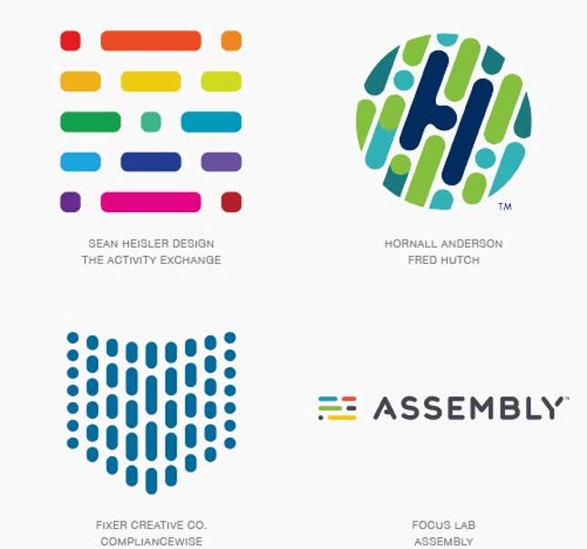
Pick-Up Sticks
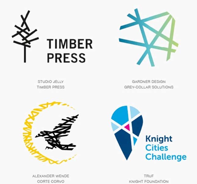
Possibly the most compelling reasons for utilizing this in a logo is its confrontational nature. Humans love order and serving up the antithesis guarantees a thoughtful encounter.
Coloring
This is a natural progression that will stunt the creative juices of designer’s children who’d previously been admonished for NOT coloring outside the lines. All that said, these are really beautiful solutions that maintain a contemporary aesthetic. They manage to hybrid a relevant technique with some nostalgic coloring book skills and a smart limited palette.
Circle Break
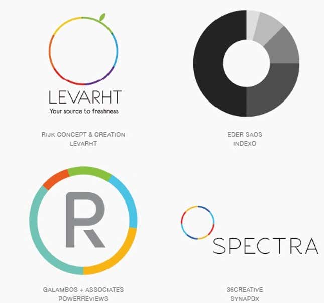
Imagine a pie chart so great that the middle has been eaten and all you’re left with is a really perfect ring of a crust with the same remnants of the colored wedges left on the perimeter. Occasionally there is a piece or two missing but the rim of a circle is always evident. The colored band areas may represent percentiles, or minutes on a clock, or some less orthodox representation, or they could just provide a decorative effect.
Trixelate
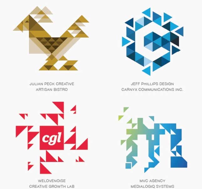
Obviously the offspring of what happens when a triangle and a pixel hook-up. But not just a solid field of homogeneously consistent triangles. Full of diverse scale and with floating pieces that portray motion and the story of process.
Photo
Those ascribing to traditional identity design tenets scrunch up their face and break into a cold sweat whenever a photographic image is interjected into a logo. You can literally see them squirm and then launch into a litany of challenges to this graphic taboo. Shake it off and embrace it.
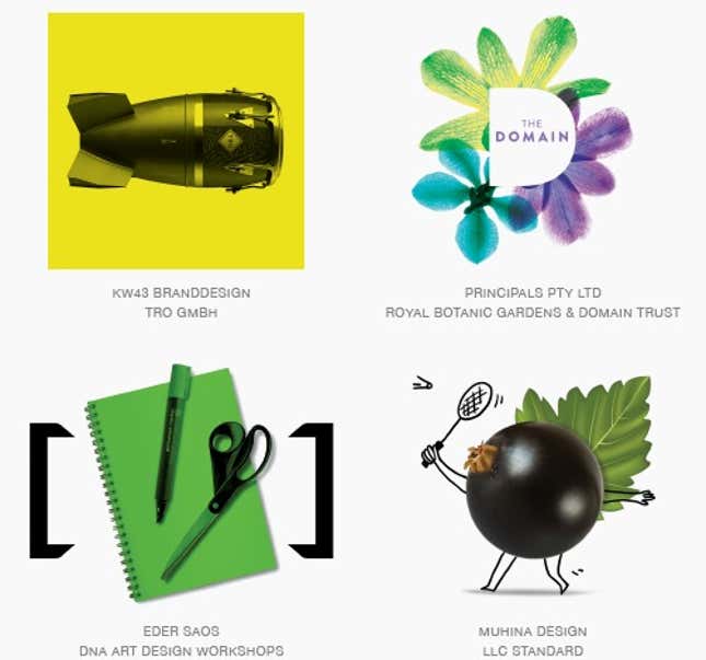
Rays
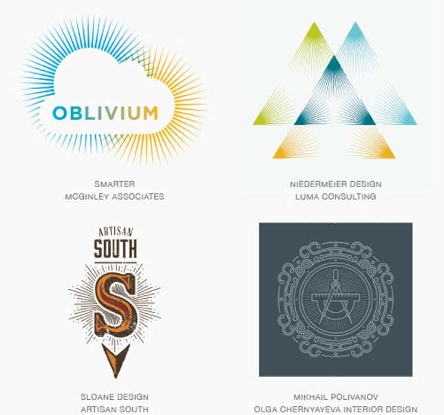
This year marked a dramatic bloom in the number of marks incorporating this technique. It may be an offshoot of a need to fill space with a single line weight decoration, but the diversity of application has been extraordinary.
Naive
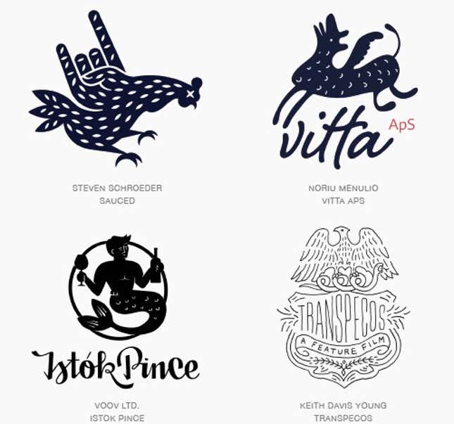
There is a renaissance of creating figural logos that have the spontaneity and whimsy of a child’s drawing with the insight and subtle design nuances of a mature rendering. The innocent nature of these solutions brings a smile to the mind. It assures us the product or the owners of the mark are not too full of themselves and likely have a sense of humor.
Coded
These marks are for the theorists that have forever believed identity designers are craftily inserting conspiratorial or hidden messages in their work. Assembled from Morse code like morsels, these logos will have pseudo cryptographers chomping at the bit to decipher.
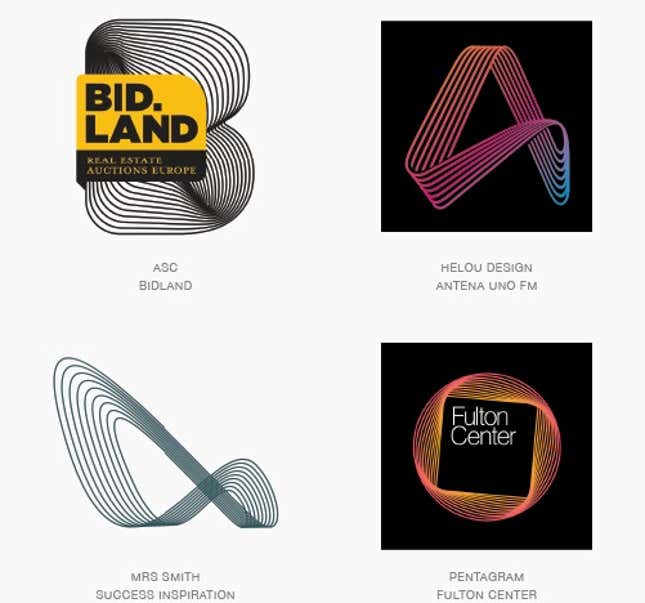
Chroma Coaster
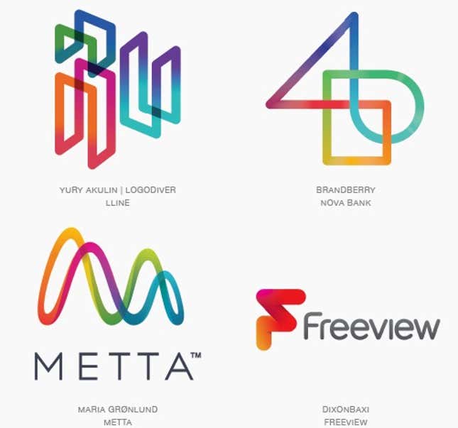
Using a single continuous line to swerve, tip and twist its way into a logo is a time-tested tool for designers. Quick and to the point these marks often rely on a line break or shadow at intersections to read well.
Detail
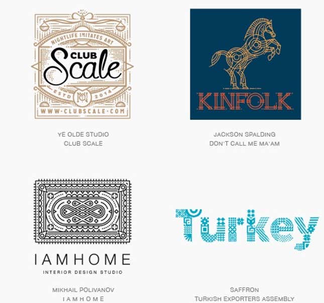
Patterns may not be practical for viewing at smaller scales but still hold their own weight like the lines of an etching. Expand the scale of the mark and the line work blooms into a riot of decoration.
Shaded
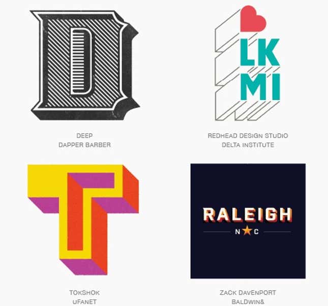
Shadows and dimensional letterforms from a typographic perspective give us a chance to demonstrate substance, illicit drama or provide a bit of campy nostalgia to suggest just a few.
In the course of his career, Gardner has seen trends, tropes, and clichés rise, fall, and resurrect themselves, sometimes several times over. Why bother with logo trends if everything is cyclical anyway? Gardner offers this insight to Quartz: “You have to know what’s been done in order to have relevance. It’s more important to know how you got there, rather than to know where you are.”