A Dropbox Illustrator On Unleashing Creative Energy
Fanny Luor is an illustrator, graphic designer and friend to creative communities around the world. As a part of the team that helped realise Dropbox’s ambitious rebrand late last year, we thought it only fitting we ask her a few questions about life, process and how to repeatedly unleash one’s creative energy. Here we go (◕‿◕✿)!
Hi Fanny! Firstly, how about you tell us your design background and how you landed at Dropbox?
I studied graphic design at The University of Washington in Seattle. I didn't really picture myself becoming an illustrator, but that's been a fun journey to embark on. Once I left school I did a graphic design internship at Airbnb, which is where I was first exposed to the tech industry and the fact that illustration is something tech companies were into. I've always liked drawing but I never studied it formally. There were some small projects that required illustration and I was like ‘well, okay, let me try my hand with that’ which was a great opportunity.
After that, I was freelancing for less than a year and then I came to Dropbox, which was my first full-time gig and also my first dedicated illustrated job.
Has it changed your process to be dedicated to one project completely?
It's so interesting to have an in-house illustration team and it's becoming slightly more common in other companies, but at the same time still quite rare and unique. You definitely have to apply some freelance sensibilities, but we respond to briefs from other departments so it’s also like an agency working inside a bigger company. That’s an exciting landscape to navigate.
How then do you make sure you’re always trying new things within the company?
We always take an opportunity to expand upon projects we're given so that it doesn't become just an illustration factory: Get the brief, turn it out, repeat.
Because that’s the risk, right?
Exactly, but it's always incremental. So you take one project, you throw in something a little weird and then see how that goes and keep testing the waters. But I think we're really lucky because the recent Dropbox rebrand gave us a very solid toolkit to experiment with.
I'd love to talk about that a little bit more. What was your experience like contributing to the new brand platform and identity system?
In the beginning we worked with an agency (Collins) to establish some foundational, higher-level thinking—’out of the box’ if you will. It was really nice to have that outsider perspective and just a different point of view. Collins helped us define these really high-level brand values and attributes, and we worked together to figure out how that manifests itself in our illustration style. It was nice because we at Dropbox have a very storied past of using illustration since day one. It wasn't too hard to evolve that ideology, we always had a very fun, playful pencil style, but we thought ‘how do we keep that ‘mark of the maker’ with hand-drawn qualities?’
So we had this idea of a graphite line, and the platform of using ‘creative energy’, so how do we represent that visually? We were thinking ‘we have this really robust colour palette, let’s introduce some patterns we can play with’. Then it was about figuring out how the graphite and the colours and shapes play together. There was a lot of workshopping in that process. We were playing with torn paper a lot to go back to one's creative roots. We were definitely pushing it visually and conceptually which was also really important. And I think that is one aspect that really elevates it and keeps it from just being like, ‘oh, this looks nice’ because that's usually the hardest part.
There had been a lot of articles about how our illustration style evolved, so the question we had to answer was ‘what’s the natural next step?’ How can it still feel like Dropbox but a little left-field? I think we achieved that — most people I speak to believe it still feels like us, even if it’s kind of crazy. It’s so lucky we even had the opportunity to push it more, and it’s really important for companies to evolve and move forward.
How would you describe your personal work?
It’s still a work in progress as I think it always will be. But I feel like having to work in a certain style for Dropbox has helped push my own individual style too. I have to be conscious not to completely adopt Dropbox’s style as my own, because that’s for them and I do a lot of personal work, so often I will think ‘how do I take what I’ve learned, that we’ve experimented with, and try to adapt it to my personal work?’ So while it’s still a work in progress, my style is definitely inspired by the hand-drawn quality of things. I’ve been trying to incorporate that ‘mark of the maker’ so I have my pencils and crayons and ink, but what I do with those things is always changing.
And what do you do outside of Dropbox? Do you do much analogue work?
Definitely. I think it's so important, especially because this is my full-time job. Some people might think, 'oh, so you just draw all the time?' and it could sound tedious, but drawing outside of work really helps me come back with new ideas. So instead of sounding like I'm being depleted of my creative energy, it’s actually a form of self-replenishment.
That's a really good point because it’s so easy to finish up for the day and say ‘that’s it, I’m done’. But if you push yourself to experiment, you can learn so much more.
This is something a lot of people talk about and do and now that I’m putting it into practice, I’ve realised how helpful it is.
It’s just about literally trying something different. I've been drawing on my iPad recently and at first, it was very uncomfortable and didn't feel natural. I don't know why I really forced myself to try and do it — maybe because it was expensive (laughs). But after a while something changed. It’s about finding something that is peaceful and special, and then just keep doing that while at the same time trying new things. It really helps you through the back and forth of a nine-to-five.
Do you have a process that doesn’t change no matter the project?
You always get some brief or objective that you need to meet. If it's on behalf of a client or employer, that's usually straightforward. If it's a personal thing, that's self-defined and it's harder because there are no constraints. So my personal favourites are side projects that involve me working with other creatives or not-for-profits. Those are nice because there is usually already some kind of agreed-upon constraint. So you start there, you look at the brief and you do some brainstorming.
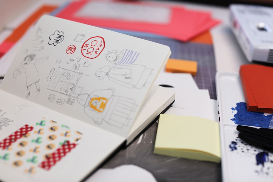
I personally like to start with written words and not sketches. There's that horrible perfectionist quality over creatives that prevents you from getting started and I find that using words are just the most non-committal, ‘I'm not judging you’ vibe. Even a sketch, when it’s rough, will still tell you ‘this could look better.’ So I like to start with word associations and questions like ‘how do I draw this subject in this way?’ ‘What are some metaphors and what are some idioms?’ I go to thesaurus.com a lot to find similar keywords, but then how do I stream them together in a way that's interesting?
Then I’ll do rough thumbnails and from there you got to higher fidelity sketches depending on who you need to get feedback from. After that, it's moving forward and the work takes off quite quickly.
That word-based approach is really interesting. Can you maybe give an example of what those synonyms are?
I was doing a personal project that was about drawing femininity. So I first thought about ‘well what are the stereotypical words here?’ I'm thinking like ‘nurturing’ and ‘more emotional’ or whatever. And then I was like, how do I break out of that? So I started thinking about being vulnerable — what does that look like? I feel like it's kind of a strength that comes with your emotions. It's sort of free flow, like poetry: ‘What does strength look like?’ So I’d think like ‘strong man’ — but that's so stereotypically masculine.
So how do I show strength in a non-stereotypical manner? You start going down these different paths referencing other things like Rosie the Riveter. I mean, that's a nice compromise between a strong pose but by a woman. I also want to show the emotional moment — what does that look like? What does nurturing look like in a way that's strong. And then I was landing on references like the sculpture of Atlas holding the world, but with a child — now that's a super strong woman, juggling all these things.

It’s interesting you mentioned earlier that you didn’t see yourself working in tech, but a lot of illustrators in San Francisco are finding themselves in the same position. Is that just a San Francisco thing, or do you think illustrators will have increasingly important roles in business?
I was just having this conversation with some fellow illustrators and designers in the industry. Everyone I find comes here through a different path. The uniting factor is connections. You happen to know people, and they bring you in. It's pretty cool. I think that’s what makes tech so compelling as a place to work because it's a very monolithic theme when you look at the key players. But we all come from different backgrounds and you meet a lot of really interesting people with the ability to do cool, creative work.
On the other side of that, why do you think it’s so valuable for businesses to have in-house illustrators?
There is a trend of companies following the success of others who use that style, but at the end of the day it’s just another element to have in your brand toolkit. You will always have typography, colour, photography and icons — illustration is another way you can express and differentiate yourself. Everyone just likes drawing. It makes people happy, so there is a really nice one-to-one connection with people which is nice to have both as an artist and as a brand.
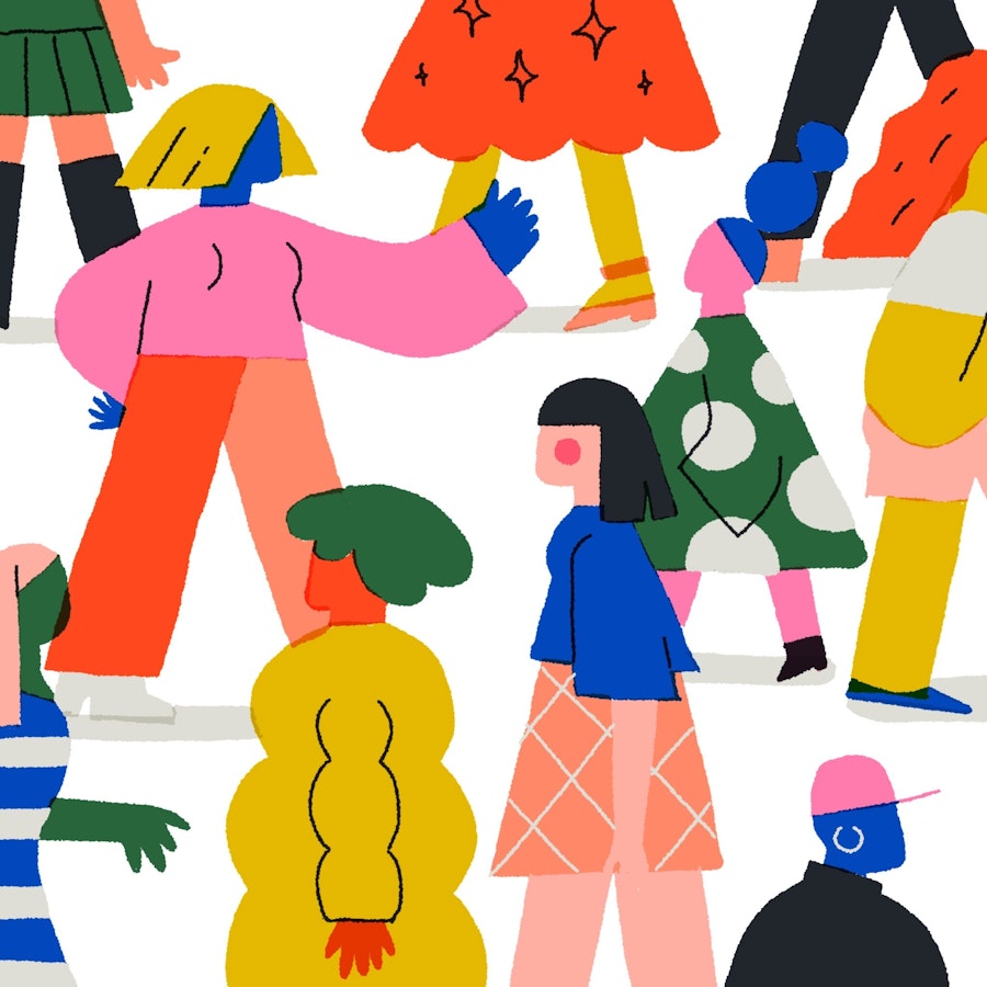
All images supplied by Fanny Luor.
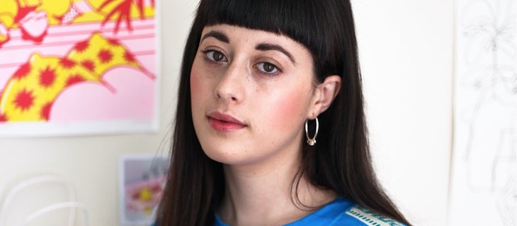
Image credit for header image Julia Wang Photography.