Have you ever wanted to create a typographic logo for you or your team? It’s not as difficult as it seems! Many people say they can't paint or draw, but typography is part of our daily lives. We are always writing names, email addresses, telephone numbers and the like. So we all have a good start; we are all familiar with the shapes of the letters.
I will now guide you through all the steps necessary to create a logo for "Team Awesome".
What You Will Need
In order to complete this project, you'll need the following:
Paper
Pencil
Adobe Illustrator
1. Plan Your Logo
Step 1
Write down the word or phrase you want to create, before you start sketching. This may sound silly but believe me, it’s important! As you write the words, you will begin to see how the letters "dance" and play with each other.
For this project, I'm creating a logotype for "Team Awesome". This is the name of the instructor team and community members within the Design & Illustration section here on Tuts+. Since you're reading this tutorial, welcome to the team!
For my "Team Awesome" logo, I was wondering what I could use to visually represent “Awesomeness". The first thing that came to my mind was superheroes. What’s more awesome than a superhero? So I want my logo to resemble a superhero logo.
Step 2
Take some time to think about and plan how the name you're using for your logo can be translated visually. In this case our logo will be all type, so I will use elements integrated with the lettering. For this logo I chose to use a lightning bolt.
Step 3
Doodle! Start exploring different visual possibilities. Play with type and elements. No need to refine anything at this stage, just doodle!
2. Choosing a Typographic Style
Step 1
As you begin sketching, think about the style you want and what message you want to convey with your logo or lettering. How do you want your logo to look and feel? What do you want the person looking at your logo to feel? Scott Biersack offers a great set of tutorials that will help you better understand typography. Head on over to Scott’s training on Hand Lettering Fundamentals. This will help you as you are working through your thoughts.
Step 2
Now that you have thought about the message you want to convey, you’ll need to choose a specific typographic style. I want my logo to be funky and have a nice flow. To do that, I chose to make it in a casual script style similar to handwriting. To have a better understanding of typography and to choose a style that best suits what you want to convey, check out this tutorial by Scott Biersack: Hand Lettering: Understanding Types of Type.
3. Create Thumbnails
Now you will begin exploring several possibilities and trying to tie all the elements together.
Step 1
First, create refined thumbnails. I like to sketch the thumbnails like mini versions of the logo. This way I can more clearly see in this initial stage how the logo will behave and whether it will work or not. At this point I will sketch a lot. Don’t be afraid to make many different versions. Also I start to define where I will place my bezier points at this stage.
Step 2
Draw the letters as simple lines and then add depth to the letterforms; kind of an analog version of the Offset Path command. It’s a good technique that you can adapt to your own handwriting or shapes, so take the time to practice. We´ll wait.
4. Selecting and Refining the Sketch
Step 1
Select the rough pencil sketch you want to work with, scan it and resize it to a larger size. This will be the template for you to build the vectors upon.
Step 2
Once the image is scanned, print it again and trace the stroke on top of it to make adjustments and to correct eventual problems. Then re-scan this sketch one more time to use the image for actual tracing in Illustrator. I usually make any last-minute tweaks on this sketch.
5. Defining the Placement of Bezier Handles
Step 1
You might be wondering: "Defining the placement of my bezier handles... now? On paper?"Yes! Do this now, before we even start with the vector part. This will help create a fast workflow in Illustrator later and also is a good exercise on general vectoring.
Step 2
Take your selected rough sketch and define key points that will help you build your vector shapes. This is not a rule; sometimes you will need to add or remove points here and there later on. Don't be a bezier nazi! It’s all about making the curves look right. Carefully examine the shapes of the letters and try to identify the outermost points. Trace lines around the letters to identify the outermost points. Mark them on the paper with a pen or a marker.
Keep this paper handy for further reference; we will call it our Bezier Reference Sheet.
6. Preparing the Sketch
With the sketch selected and the placement of the bezier points defined, it’s time to prepare the sketch to be traced in Illustrator. We do that by opening the sketch in Photoshop, converting it to a bitmap image (Image > Mode > Bitmap), and saving as a TIFF file.
7. Setting Up the Framework in Adobe Illustrator
Step 1
Now it’s time to set up the Illustrator document to start building the shapes of our "Team Awesome" logo. First click on File > New to create a new document. Mine is A4 (210 x 297 mm) horizontal, Color Mode: RGB. I’m using CS5 version, but there should not be much difference in newer or previous versions.
Step 2
Place your image by clicking on File > Place and selecting the TIFF file you saved previously. Way to go!
Step 3
This sketch will be your template. I paint it with a light blue color, to help me see through the lines.
It’s a good practice to add lines that will work as guides to help you place the shapes. I use a light grey for the guides. This is not a rule—you can play with colors to see what works best for you. Light grey works for me. The important thing to keep in mind is to have your sketch visible.
Name this layer "TEMPLATE", or some other name that you think will help you. Once it's all set, create a new layer and name it "TRACE". I recommend choosing the Dark Blue color for the "TRACE" layer.
8. Start Building the Vector Shapes
Step 1
Using our Bezier Reference Sheet created earlier, click on the Pen Tool (P) and start adding points on the defined places, always holding the Shift key to constrain the position. This will keep the points angled at 0º, 45º and 90º, allowing your shape to have better curves with fewer points and making it easy to build and control later.
Keep toggling the TEMPLATE layer on and off to see how the curves look, and adjust them if needed. For the shapes I use a pink color (#ff00ff). This will help you to see the lines on top of the blue sketch.
Step 2
Start with the uppercase A, and build each letter separately as a different object until the composition is complete. Keep repeating this for all the letters, toggling the TEMPLATE layer on and off and paying attention to how your points are placed and how your curves look. Once you get used to this technique, you will see how simple it is.
9. Placement of the Points
For most people, working with bezier curves is the most difficult, and sometimes terrifying, part. It might seem tricky the first time, but it’s not. Look at the screenshots below, and notice how all the points are placed.
10. Completed Vector Shapes
Step 1
With our basic vector shapes completed, now it’s time to review our progress. At this point I will usually print it again and make more adjustments with a pencil.
Step 2
This is my printed sketch. However, I will not re-scan this. I will just refer to it to make modifications in Illustrator.
11. Adjustments
Step 1
Duplicate the TRACE layer and name it REVISION. On this layer make corrections using the printed sketch if needed, preserving the other layers and leaving them intact.
Step 2
You have completed and refined the vector shapes. Duplicate this layer and name it FINAL as a backup, in case you need to modify it later.
12. Styling
Now it’s time to make the logo pop! Let’s give it some life to make it even more awesome.
Step 1
Cut some letters to make them look more interlaced. You can add shapes on some parts and, with the Minus Back command from the Pathfinder panel, subtract them from the original shape.
You can do this by placing the cut shapes on the bottom and clicking on Object > Arrange > Send to Back or hitting Shift-Control-[.
Step 2
Open the Pathfinder panel by clicking on Window > Pathfinder or clicking Shift-Control-F9.
Step 3
With the two shapes selected, click on the Minus Back button. Voilà!
Step 4
Add a contour to your object by selecting and clicking on Object > Path > Offset Path. Enter 1 mm and click OK.
Paint the contour with a dark blue or black color, so we can distinguish both. Don't worry about colors for now—we'll change that later.
Step 5
Now let's add some depth. Duplicate the contour layer by clicking on Edit > Copy(Control-C), and paste it in the back by clicking on Edit > Paste in Back (Control-B).
Select the two black contours and click on Object > Blend > Make or click Control-Alt-B.
After applying the effect, you will notice that the blend looks weird. Let’s correct this by double clicking on the Blend Tool button on the Tool panel.
On the dialog that appears, select Spacing: Specified Steps and enter 60. After applying the effect, select Object > Blend > Expand and it will be converted to objects.
With the objects selected, open the Pathfinder panel and locate the Unite button. Click on it. This will merge all objects into a single object.
And it’s ready! Congrats on your... What? No, no, not yet! Zoom in and will you see that some lines are full of points, making the contour look jagged in some areas. We need to get rid of that!
Enter Outline Mode by clicking Control-Y and click the Lasso Tool button (Q) on the Tool panel. Select the extra points with the Lasso Tool and go to Object > Path > Remove Anchor Points. Repeat this on all the parts needed until you have nice smooth shapes.
13. Color and Details
Step 1
Once everything is corrected, let’s change the colors. In my case I’m making this logo for an awesome group of people and their colors are the two below, so I will stick with them. In this step you are free to play with whatever colors you want.
I still think something is missing. It’s still not the superhero logo I envisioned, so I added an ellipse on the background and painted it with the lighter color.
Step 2
Now to add some details. First I add a white contour around the extrusion. Click on Object > Offset Path and enter 1 mm.
Duplicate the white contour by selecting it and clicking on Edit > Copy (Control-C) and paste it in the back by clicking on Edit > Paste in Back (Control-B) I will paint my "shadow" with a color darker than the ellipse color.
Step 3
Now I will add some highlights. Click on the Rectangle Tool button on the Tool panelor hit M, and draw some rectangles and paint them blue to be more visible. I will position mine along with the extrusion angle. Create a Compound Path from all the rectangles, making them a single path. With all the blue rectangles selected, click Shift-8 or go to Object > Compound Path > Make.
Select the extrusion and click on Object > Path > Offset Path and enter -1 mm in the dialog box.
Select the generated path and the rectangles, and in the Pathfinder panel locate the Intersect button and click on it. Copy the generated path by clicking on Edit > Copy (Control-C), and then select the extrusion and click on Edit > Paste in Front (Control-F).
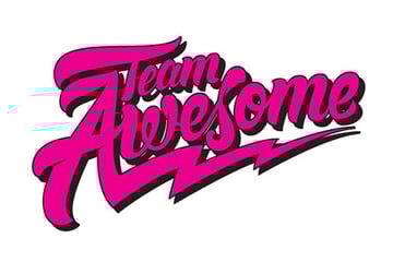
Awesome Work, Team!
Yay! Our Team Awesome logo is ready and shiny! Awesome!
This tutorial is intended to help you have a better understanding of hand lettering and vector. It sounds complex at first, but the more you practice, the easier it will become. I hope all the information I've given is useful for you, and that you can adapt the techniques and tips shown here for your own projects. Thanks for watching, and stay awesome!
Subscribe below and we’ll send you a weekly email summary of all new Design & Illustration tutorials. Never miss out on learning about the next big thing.
Brazilian digital illustrator, hand letterer and graphic designer with a penchant for all things vintage. Pop Art, cinema, funk music, pop culture and advertising are all part of my world.