
ADA Signs
This article needs additional citations for verification. (January 2013) |
The term "ADA Signs" has come into common use in the architectural, construction and signage industries with the advent of the Americans With Disabilities Act, or ADA. The Americans with Disabilities Act regulates accessibility; and includes requirements for signage that is conveniently located and easy to read both visually and through tactile touch.
In common parlance, "ADA Sign" is often synonymous with "braille sign". Signs with braille and raised characters are the most visible manifestation of the law requiring access to the built environment, but the sign standards in the ADA Accessibility Guidelines (or ADAAG) require more than just braille and raised characters on some signs.
In fact, the ADA dictates 3 broad categories of requirements.
1) Whether or a not a sign is required
2) Sign design requirements including font, letter height, spacing, color contrast and similar details
3) Precisely where a sign must be installed, and broad requirements dictating where signs may not be installed
In general, almost every sign that would be considered an "architectural" sign must comply with one or more of the ADA Guidelines.[1] If a sign identifies a permanent room or space of a facility (including exits), directs or informs about functional spaces of the facility, or identifies, directs to, or informs about accessible features of the facility, it must comply. Signs for advertising and marketing purposes, temporary signs, menus, company logos and names are examples of signs or sections of signs that do not have to comply.[2]
History[edit]
Initially it was believed that ADA signs could change the modern environment to accommodate wheel chair users. As Guffey notes, "The modern wheelchair promised far more mobility than anything offered earlier generations of disabled people. But for it to be integrated into modern life, the modern environment had to be changed to accommodate it".[3]
Benefits[edit]
Because of the rules requiring Braille on some signs, the signage section is most often considered as benefiting persons who are blind and visually impaired. Some of the sign guidelines are also designed to benefit persons with mobility or hearing impairments. Thorough wayfinding and room sign systems are also of benefit to deaf people, people who have problems speaking, and people with cognitive disabilities or psychiatric conditions that cause them to avoid speaking to strangers.
In addition, it is generally considered that easy to read and well designed signage systems are of benefit to all stakeholders using a facility, regardless of disability status.
Rules[edit]
There are a number of general rules for signage:[4]
- All signs (except for reflective parking and other traffic signs) must have non-glare backgrounds and characters. Glare and reflection are a major problem for persons with vision impairments, and particularly for the elderly.
- All signs that contain visual characters must have a high dark to light (or vice versa) contrast between characters and their background. The important issue is not color, but lightness and darkness: a sign with very light gray letters on a charcoal gray background would be acceptable, but a sign with red letters on a black background would not.
- All signs must have "easy to read" typefaces. There are different rules for signs that identify rooms and spaces, versus signs that direct and inform. This is because persons who are "functionally blind" (have no usable vision) are able to locate doors, and therefore can locate signs adjacent to doors that identify them; but have no consistent way to find directional and information signs that could be located anywhere along corridors.
- Directional and informational signs can use upper and lower case letters (recommended by many experts for visual readability) and "simple" serif typefaces of a non-decorative nature. Condensed or extended typefaces are not allowed. Strokes are of medium weight, not too bold or too thin. The size of the letters is dictated by the distance of the sign from the expected position of the sign reader. Character size on these signs is to be determined by a chart in the 2010 ADA Standards for Accessible Design that uses a combination of the height of the text above the floor and the distance the reader has to stand from the sign.
- ADA signs that identify rooms and spaces are to be located adjacent to the door they identify so they can be located by persons who are functionally blind. For the most part, one sign is used by both tactile and visual readers, so there are compromises to assist tactile readers. However, it is possible to use two separate signs with the same information. Tactile signs require uppercase characters in sans-serif typefaces with specific requirements related to the stroke and height ratios of the chosen fonts "O" and "I". The characters must be between 5/8 inch and 2 inches high based on the fonts "I". Braille must be directly below the raised characters and must be Contracted Braille (formerly called Grade 2 Braille).[5]
- Tactile signs must be installed 48 inches minimum from the baseline of the lowest raised character and 60 [5] inches maximum from the baseline of the highest raised character. (Although the definition of "character" doesn't include Braille cells, the Access Board has stated that the 48 inch rule applies to the base of the lowest line of Braille cells.)
- If pictograms are used to identify the space (for example, restroom signs with gender pictograms), they must be in a six-inch vertical field clear of all other content and accompanied by tactile characters corresponding to the pictogram.[5]
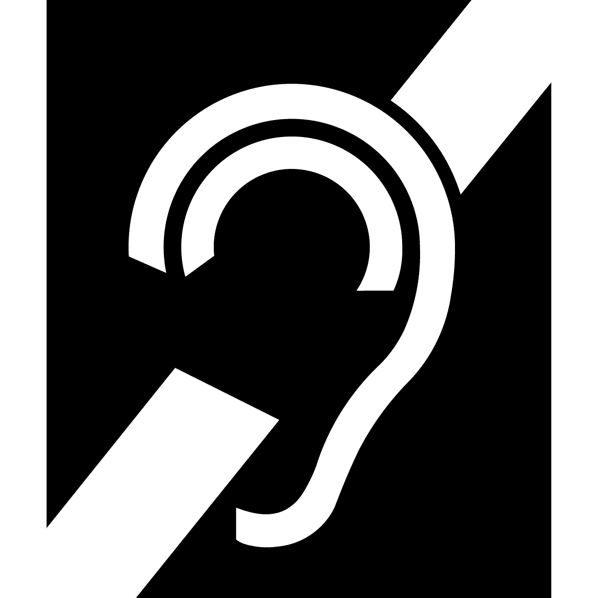
- There are four universal symbols of accessibility. One is the familiar International Symbol of Access (ISA), or "wheelchair symbol." This is used to identify accessible features such as entrances, restrooms, or pathways. Three are specifically for persons with hearing impairments: the "ear" symbol is the International Symbol of Access for Hearing Loss, and is used to show the availability of an assistive listening system. The "keyboard" symbol stands for a TTY or text telephone. The "phone" symbol with sound waves stands for the availability of a volume controlled phone.
Standards[edit]
The standards for ADA signs (and most other standards used in ADA regulations and state building codes) are the product of the ANSI (American National Standards Institute) A117.1 Committee. This large committee is made up of a balanced group of representatives from industry, the government, disability organizations, designers, code officials, and experts. The committee meets in five year cycles to revise the last published standard. The standard is then used by the International Code Council for its model building code, and has formed the basis of the new version of the ADA Guidelines, now called the 2004 ADA/ABA.[6] (However, with the final publication of the standards by the Department of Justice, we now generally refer to the Guidelines as the 2010 ADA Standards for Accessible Design.)
The standards had been already adopted by several federal agencies, and had been approved by the Department of Justice and were awaiting final review by the OMB when the Obama administration came in. Although they are actually a product of the Clinton administration and had taken eight years to make it through the Bush administration, the Obama administration considered them Bush administration regulations, and held them up for review. [citation needed] They were approved by the Department of Justice for publication on September 15, 2010, and made legally enforceable on March 15, 2012.
Bibliography[edit]
- 2010 ADA Standards for Accessible Design (2010 ed.). 2010
- "ADA Signage". www.engraversjournal.com. Retrieved 2023-10-13.
- Guffey, E. (2017). Designing disability. In Bloomsbury Publishing Plc eBooks. doi:10.5040/9781350004245
- Rhoads, Marcela (2010). The ADA Companion Guide: Understanding the Americans with Disabilities Act Accessibility Guidelines (ADAAG) and the Architectural Barriers Act (ABA). John Wiley & Sons, Inc.
- Shapiro, Joseph (2020-07-17). "Disability Pride: The High Expectations of a New Generation". The New York Times. ISSN 0362-4331. Retrieved 2023-10-13.
See also[edit]
- International Symbol of Access (Wheelchair Symbol)
References[edit]
- ^ Further Info from Martin ADA Signs Informational Center. https://martinadasigns.com/category/informational//
- ^ Further Info from Image360 Signmaker's Resource Center. http://www.image360.com/Resource-Center/ADA-Requirements/
- ^ Guffey, Elizabeth (2017). Designing Disability: Symbols, Space, and Society. London: Bloomsbury. p. 47.
- ^ United States Access Board : http://www.access-board.gov/
- ^ a b c "ADA Sign Requirements Guide". www.greendotsign.com. Archived from the original on 2020-08-07. Retrieved 2021-04-05.
- ^ available on the website of the Access Board at http://www.access-board.gov/