The new archive.org site
The new version of the archive.org site has been evolving over the past 6 months in response to the feedback we’ve received from thousands of our awesome users.
If you haven’t been following along, you can review a little bit of the journey through these blog posts:
- Building Libraries Together: New Tools for a New Direction (10/28/14)
- Redesigning Archive.org (11/5/2014)
- What’s New with V2 (2/12/2015)
Why change the site at all? The posts above help answer that, but in brief:
- 35% of our ~3 million daily users are on mobile/tablet devices, and the classic site is not easy to use on small formats.
- The new tools we want to offer our users would be difficult to implement in the old site architecture.
- The classic site was built a long time ago, using methods that are outdated. Finding programmers who have the skills to work in that environment is becoming increasingly difficult, and the ramp up time for new employees is painful. The redesign has given us an opportunity to start pulling the front end (what you see) apart from the back end, so they can evolve separately.
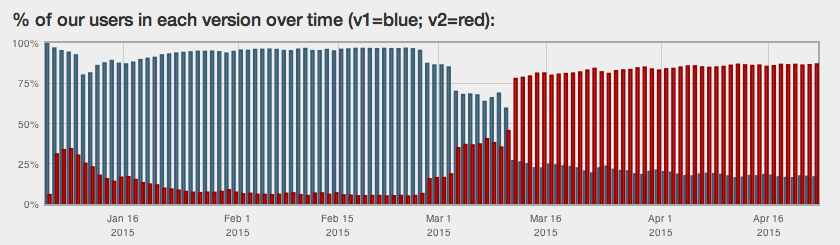
Blue represents people in classic archive.org (v1), red represents people in the new version (v2)
Currently about 85% of archive.org users are in the new version. Over the next few weeks we will be asking the remaining 15% to try it out. For the time being, users will be able to exit ![]() the new archive.org and return to the “classic” version — but the classic will not always be available or supported, so please give the new version a try and give us feedback if there are things on the site that you don’t like, can’t find, or that seem like bugs. (When you click “exit” you will have an opportunity to give us feedback.)
the new archive.org and return to the “classic” version — but the classic will not always be available or supported, so please give the new version a try and give us feedback if there are things on the site that you don’t like, can’t find, or that seem like bugs. (When you click “exit” you will have an opportunity to give us feedback.)
We have made several video tours that introduce you to the new site. I recommend starting with the site tour, below.

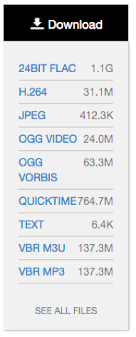
The original download button
In the past few months we have received more than 16,000 feedback emails from people using the new version. The redesign team reads every single one of them. Some just say, “I love it!” and some immediately say, “I hate it!” But a great many of you have also taken the time to share a little more – something you missed from the old site, a question about the new tools, concern about accessibility, suggestions for how to adjust things, etc.
Download menu open by default
We took that input — along with information from user tests, interviews with some of our power users, chats with partners — and tried to identify areas of the interface that seemed to be working well, and other areas that were not.
The evolution of downloading files from items is a great example of the process we’ve been following. The original design for item pages de-emphasized download as a feature. Our conversations with users told us that most people wanted to hit a play button, not download a file.
You could still download in the original design, of course, but you had to click a button to get options and then click again if you wanted specific files.
But when we opened the new site up to more users, we got many comments from people who either disliked the extra clicking, didn’t like leaving the page to get individual files, didn’t understand what the options represented, or couldn’t find the download options at all.
The first thing we tried was just opening up the download menu by default. Instead of just seeing the black download button on the page, you now also saw a menu of options. More people saw the download, but feedback made it clear that users still had issues.
What if we make it blue? (Nope!)
We thought perhaps if we increased the visibility of the download options by turning the Download header blue that people would see it faster. We did an A/B test with 50% of users seeing each option — neither option really won. And the feedback about this feature continued to be negative.
It became clear that we needed to rethink the design of the download options all together, trying to keep it clean-looking and easy to use while also satisfying the concerns of our most advanced users.
We set some goals for the download changes based on the feedback we had received:
- must be able to download an individual file without leaving the item page
- if there is only one file in a particular format, you should only need one click to download it
- improve the ability to download groups of files (e.g. “just give me all the FLAC files”)
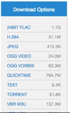
The current version of downloads allows you to consume individual media files without leaving the page and gives you a lot more options for downloading groups of files from an item. Since we released the new Download Options feature, the negative feedback about this feature has dropped off almost entirely. So we think we’re on the right track! We have created a short video tour for the downloads feature if you want to learn more.
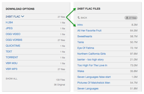
New Download Options feature, illustrating how to display individual files
The download changes are just one example of how much your feedback has helped us identify areas of confusion on the site and understand how to improve things. Here are a few more examples:
- A-Z filters available when sorting by title or creator
- better experience for people with javascript disabled
- fixes to improve software emulation
- default search results to List view (instead of image-based Thumbnail view)
- pull user page images from gravatar if available (if user has not uploaded one)
We have a lot more in store for the new site – better accessibility for sight disabled people, tools for creating your own collections, improved playback for multimedia items, etc. As these features trickle into the site, we hope you will continue to share your questions and ideas with us – you are truly helping us to make the archive a better place for everyone.
This project receives support from the John S. and James L. Knight Foundation’s Knight News Challenge.
Good work! The new site looks very nice! More intuitive and practical.
Thanks, Daniel!
I just use the live music archive mostly.
Check it most mornings for most recently added.
Came in here today and I cant even find shows I found yesterday.
I don’t hate it but it sure is frustrating for me.
Hi Jeff,
I’m sorry you aren’t finding things more easily. To find recently added shows, you sort by Date Archived (that’s the date they were added to archive.org).
We have a short video you can watch that explains the searching and sorting tools on the new site – I think you will find it helpful: https://archive.org/details/searchtools20150421
The Wayback Machine has been a big help to me in fixing broken links in advance of re-launching my website. BUT, you guys with all your skills should have a Facebook page. At least, your blog should have a Facebook button.
Just saying.
I’m looking forward to exploring the new site even more than I have, but the one thing you could do to improve the site to the greatest degree is to take every one of those terrible, shameful, outrageously bad google scans and re-do them with the skill they deserve.
Ha! You know where to find the donate page, right? http://archive.org/donate/
Thanks for trying the new site. 🙂
I’m just about to give up on the live music archive. Its impossible to find what I am looking for without scrolling through thousands of records. The sort options make no sense for live recorded music. You can’t sort by date of show and a title sort appears to alphabetize by venue? The old site was easy and simple.Not impressed with the new site. On my phone especially. The icons for different functions and pages are unidentifiable. Disappointed in the new format. Super hard to use compared to the old style.
Alexis,
Thank you for the update. I’ve been working on a project for the past 6 months to link Wikipedia articles to Internet Archive. Focusing on authors. See for example the Wikipedia author page for A. A. Milne at the bottom of the page is a link that says “Works by A. A. Milne at Internet Archive”. I have added almost 10,000 authors, thus far.
The trouble is in building the URLs to link to IA. With the old site, the search terms are highlighted making it easy to visually gauge when a search has a lot of false positives. The new sight there is no highlighting and thus it’s more difficult to determine. Most searches bring up false positives and it’s often difficult to determine which are good results and which to ignore. Without the highlighting it’s extremely difficult if not impossible when there are 100s or 1000s of results. Could search highlighting be an option enabled? Thanks for the consideration.
Green Cardamom
Hi Green Cardamom,
First, thank you for making sure Wikipedia readers can get to relevant source materials – that’s so important!
Also, thank you for the feedback on the site – we will take this into consideration as we look at further changes.
Thanks,
Alexis
“The evolution of downloading files from items is a great example of the process we’ve been following.”
Would that I had the money.
Has anyone ever asked google why they have such a neglectful attitude to the scanning of visual images?
There are many articles about the Google book scanning program published in the late 2000s, and some of them definitely deal with the issue of scan quality.
I have been using Internet Archive as long as is has existed. I look at the reasons for the “new version” and see that one of the reasons is “35% of our ~3 million daily users are on mobile/tablet devices, and the classic site is not easy to use on small formats.” My math tells mt that 65 % of your uses or not quite 6 million users are NOT using mobile/tablet devices. I am one of those nearly 6 million users. The search facilities on the new site are far more difficult to use for scholars, perhaps more difficult for the older scholars like myself. I hope you keep the older version in the wayback machine, so I don’t have to grit my teeth every time I try to use this version.
I’ve tried the new interface twice, and I’m afraid I won’t ever prefer it to the classic site. First, let me say that I’m a blind person using a screen reader, so my recommendations will be heavily slanted to this part of your audience.
The first thing I notice in the new interface is it seems to be more cluttered than the classic version. There are more photos and related items on each details page. All these extras increase the load time on a slow connection.
In version 2, there appear to be two links for each mediatype. Web has two links, Audio has two links, and so on. The classic site has one link for each, which is nice.
When I click “all files HTTPS” in the classic site, it comes up with a simple directory listing of all the files in an item. When I click the similar link in the new interface, there is a listing of the files, true enough, but there is also a list of other items to choose from, cluttering up the page and taking longer to load.
I would plead that in the future, when the classic interface is unsupported, that there would be a program to instal or javascript to run that would preserve the elements of the classic interface, for those of us who are blind or have slow connections.
Thank you.
And for those of us who are not blind but have low vision, trying to read pale blue or pale gray fonts on a white or gray background is a very frustrating experience to say the least. I’ve noticed a recent general trend towards lower and lower contrast in web design, and the younger generation seems to love it, but for Internet Archive, if no one else, usability and accessibility should weigh much more than the latest web design fads…
yes true but dont maybe bro
Thank you for your feedback, Andrew. We do want to make sure that people using screen readers have a better experience on the site, and this is very helpful information. We will be working on different aspects of the site over time to try to improve accessibility – would you be willing to help us test things?
Alexis
The new design is really helpful. Specially the menu. I found the blog this first time.
Why did you make the site harder to use? I like to use the LMA to browse for new bands and tunes. It was easy to look down the listings of bands then jump to the list of shows. I could sort for ratings, dates, venues.
Now you have to know what you are searching for, then weed through a bunch of thumbnails over multiple pages. Not intuitive at all! Also, video tutorials are for millennials who can’t follow written directions. You have dumbed down your service and made it less user friendly.
The classic site has one link for each, which is nice.
When I click “all files HTTPS” in the classic site, it comes up with a simple directory listing of all the files in an item.
Real evolution 🙂 Nice job and thanks for effort!
Sure, I’d be happy to. I am running Windows XP, Firefox 3.6 and JAWS version 9.0.
1) PLEASE add option to see List View of found items WITH thumbnails. It is ridiculous I can’t see, for example, an easy-to-scan-through list of titles AND a thumbnail on the right. It doesn’t need to turn pages as it did before – but it does need to be there
2) No matter what settings I use in Safari 5.1, I can’t see any of the icons on the home page, or anywhere else for that matter. They are all little gray diamonds with question marks in them
And while we’re at it, for heavens sake USE YOUR WORDS. New visitors to archive.org aren’t intuitively going to know what the little icons mean.
I fail to understand why this has become so common, but even though I’ve worked in IT as a hardware and software support specialist for 35 years, I am constantly frustrated at encountering yet more icons I don’t recognize, when a simple word such as “texts” or “images” is easily recognizable.
Those here who use the word “intuitive” to refer to the new design need to look that word up and learn what it means. The site is not “intuitive”. It has to be learned. What looks like a floppy drive (? seriously ?) to one person is a meaningless square-ish thingy to another, and so users have to hover over every icon to find out what it signifies.
Arbitrary icons are not the universal language. Icons are not universal, or intuitive, or even recognizable to many people.
LANGUAGE is the universal language. Again: Use Your Words
Please don’t take away the BASICS, folks:
Lists AND thumbnails, not either/or.
Words under links, visible immediately, not requiring mouseover.
Design is all well and good, but when design is increasingly considered superior to function and immediate ease of use and understanding, something is very, very wrong.
I couldn’t agree more. Cool is trumping Access on too many platforms. It makes me sad to see.
E
It is really a great effort but making more mobile friendly would make it more easier to use and access.
Unlike v1, v2 is practically broken when using it with a stripped down browser. I don’t care for fancy features that requires enormous amounts of code to be executed on the client side. Those sorts of things should have an option to be disable somewhere. Before people respond with pro change reasoning, please take the time to read through this a few more times, and understand that, I know it needs an update for people that just go with the flow.
What is good for me in “user experience” probably isn’t good for a lot of people and that is perfectly okay; however, a good user experience doesn’t have to mean one size fits all. Site developers, while constantly trying to keep up with trends in how content is delivered are still stuck in an old mode of thinking that one design is the best. As such, sites become geared towards the most popular means used to connect to it by the users and the minority is left out either having to conform to the new standard or having to go somewhere else.
The claim of uniformity can not be used in sites that attempt to do responsive design since they are using code in an effort to reach as many platforms as possible; however again, when using the most basic platform to connect the site is unable to adjust accordingly and a minority however small is left out.
Cost in site development could be a factor; but, again, a basic framework that delivers the site in it’s most simplest form, is usually part of the development process; and, the basic framework can be adapted as an option in part to the final design.
Responsive design is about reaching everyone and making it so the information of a site is presented as intended for everyone. This includes people that may not have javascript turned on, or use fonts as buttons. People that might still be stuck in the “90s” or early “2000s”. It’s not much asking to be included and to have options available. The age ‘old’ argument “get with the times” no longer applies with a world built on APIs, UIs, and RD. It’s one dimensional thinking in a multi-dimensional world.
As long as the classic/original design of the site cannot be activated by accident, I do think that an effort should be made to keep both designs active indefinitely. If it becomes expensive, create a fundraising or crowdfunding page and we will be there to help. Too many sites completely remove the original design functionality when upgrading, of all the websites, it would be most disappointing for archive.org to become like that. The new site is acceptable but something about it just makes me feel uncomfortable, like something is intentionally being taken away from users who appreciate the original design. There is enough in the world being destroyed for archive.org to become part of that in an unnecessary way.
Where is the link to the old site, while it still works?? I cannot find it on the new home (??) page. I also don’t understand the icons (cf the librarian above), and I have been online since the mid-1990’s. Finally, the searches for books do NOT turn up all the results. There are books I cannot find that I know are here. (Also, what is all this with accounts and logging in? I expect that from google, not Archive.)
Please do not tell me that since I mistakenly clicked through to check out the new site that a user can never again access the one that works. At least give us time to get whatever we can from the old Archive before we walk away.
Under all the mediatypes, there should be a link called something like Services/exit_beta or something similar.