

After years of flat, material and completely minimal styles, the gradient has made a comeback. Everywhere you look, designers are using color fades to add visual interest, create user engagement and just design something that’s worth looking at.
If you aren’t a fan of gradients, maybe it’s time to rethink your stance on the issue. To help convince you, we’ve got 10 reasons to love and use gradients in your website design projects this year.
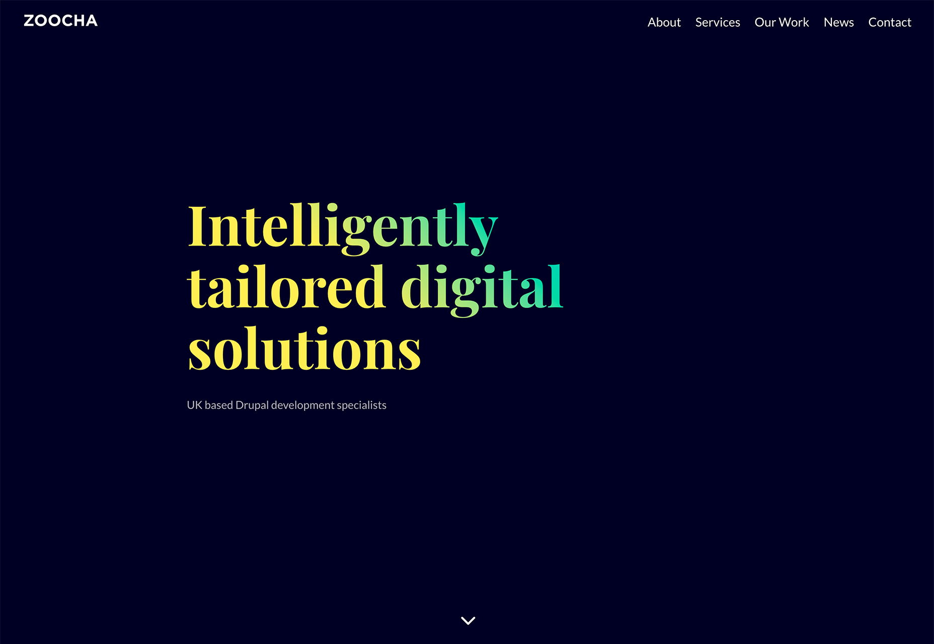
1. Backgrounds Create Interest
A gradient creates visual interest and helps move users through a design. The eye will land on one area of color and the change between hues and light and dark areas helps shift focus across the screen.
Gradients can be a highly useful and engaging design tool and add spark and intrigue to a multitude of projects. While there are plenty of ways to use gradients, one of the most popular options is as a background element with images, text and other elements layered on top of it.
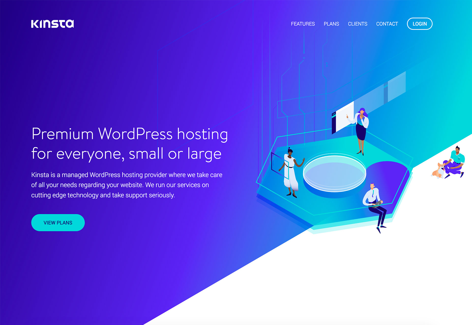
The example below uses this exact technique. The gradient provides a resting place for the eye with soft colors that help more focus from the top of the screen to the bottom corner, where a “Discover More” direction is located.
The gradient carries through the rest of the page, below the scroll, so that the user always remembers where they are. It also provides a halo type area that highlights the main navigation.
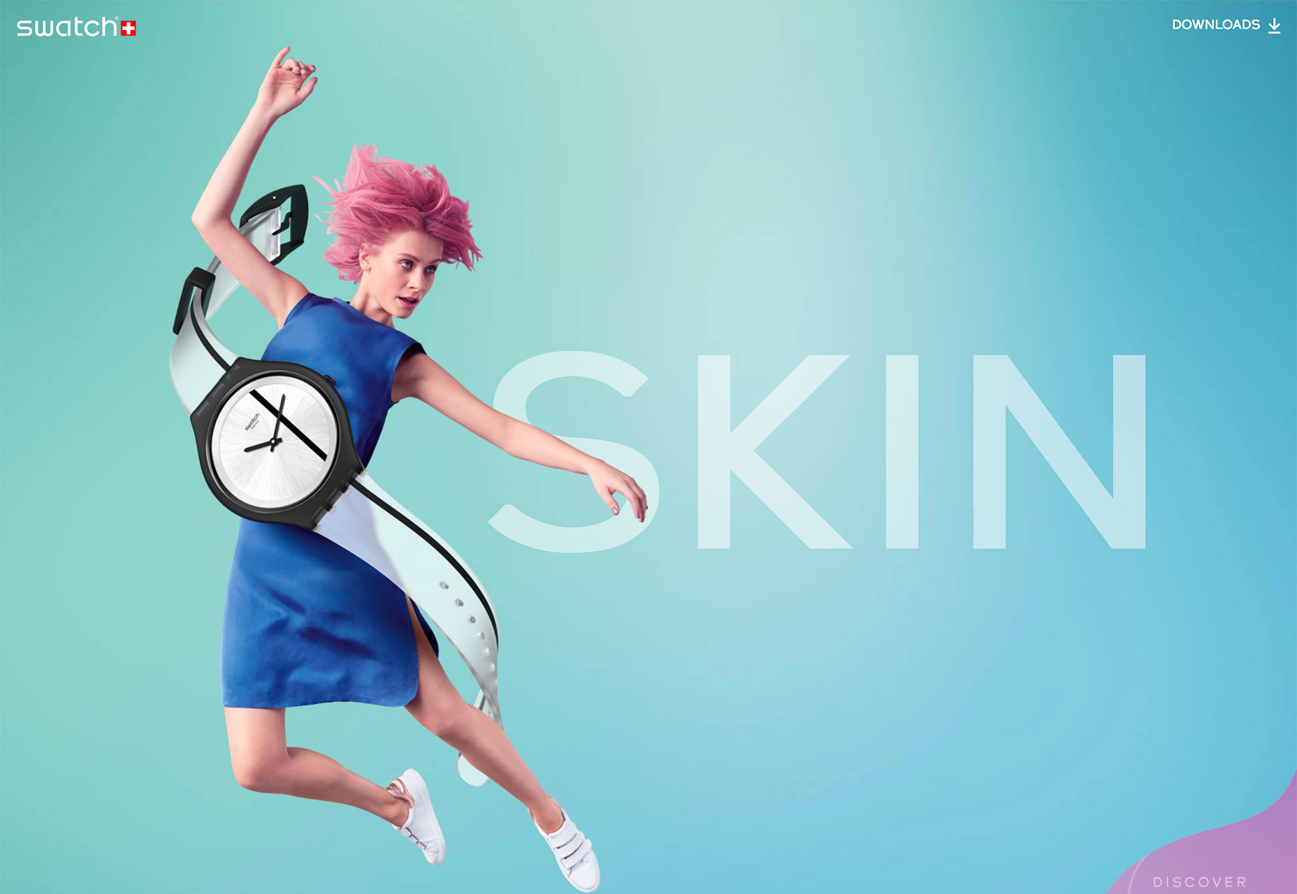
2. Lettering Can Provide a Focal Point
Just as a gradient can be used in the background, it can be a foreground element as well. Color gradients are a rather versatile technique, which might contribute to their overall popularity.
Flip the usage and a foreground gradient can be used as the fill for lettering on a more plain background to highlight and bring attention to the words.
Color choice has to be intentional so that there’s always plenty of contrast and readability is maintained.
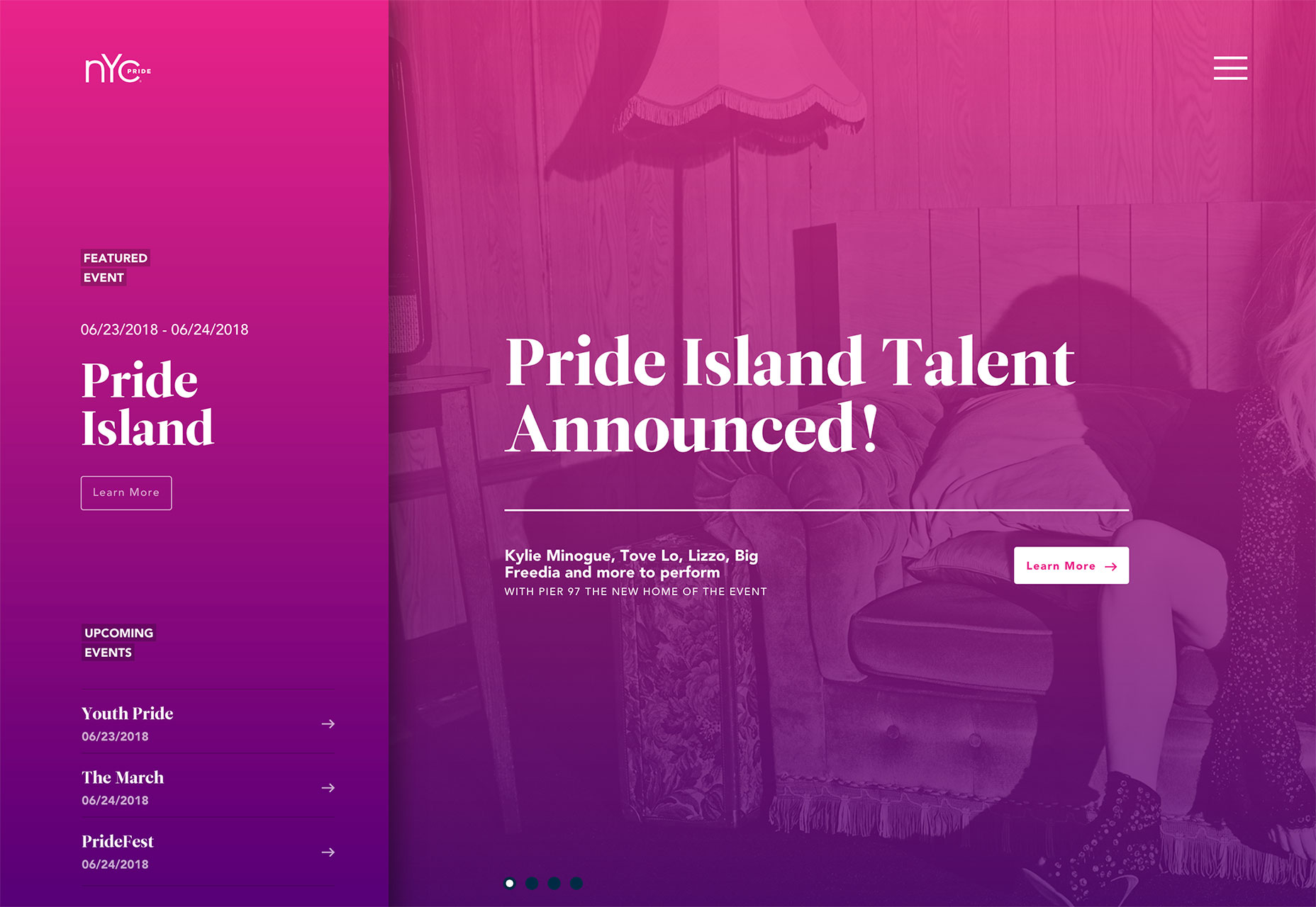
3. Overlays Can Spice Up a Bland Image
A color overlay can add extra interest to an image that is a little bland. A gradient overlay is not a fix for a low resolution or poorly composed image, but it can give a simple scene more pop.
Gradient overlays can help establish brand, as well as the voice, tone and personality of the website. Bright colors say something quite different from more muted options.
While this technique can look pretty neat, such as the portfolio example below, it is starting to get a little overused. Make sure to do something a little different with a full image, gradient overlay to set your design apart. The example below does this by completely fading the image away so that the bottom of the gradient creates a solid color bar across the bottom of the screen.

4. Help Move the Eye
A great gradient can help move the eye through a design in a way that helps create intent for users. Most users read in somewhat of an F-shaped pattern, starting at the top left and moving down and across the screen.
Use lighter and darker areas of a gradient color scheme to move the eye from a starting point, such as a logo or primary messaging, to the main call to action. The eye will go to the lightest areas of color first then move to darker spaces. Design and place the gradient color to reinforce this eye movement.

5. Create Something Memorable
While gradients are becoming more popular, the fact that every color combination is somewhat different makes them memorable to users. A killer color combination can stick out—and stick with—a user to help them remember your brand or messaging.
Design gradients with the purpose of helping create that connection. What’s cool about a good gradient is that it almost becomes a color onto itself. If you have a great gradient to work with, use it like you would any other color in your brand palette to establish a visual connection. (Or use multiple gradients as the color palette.)
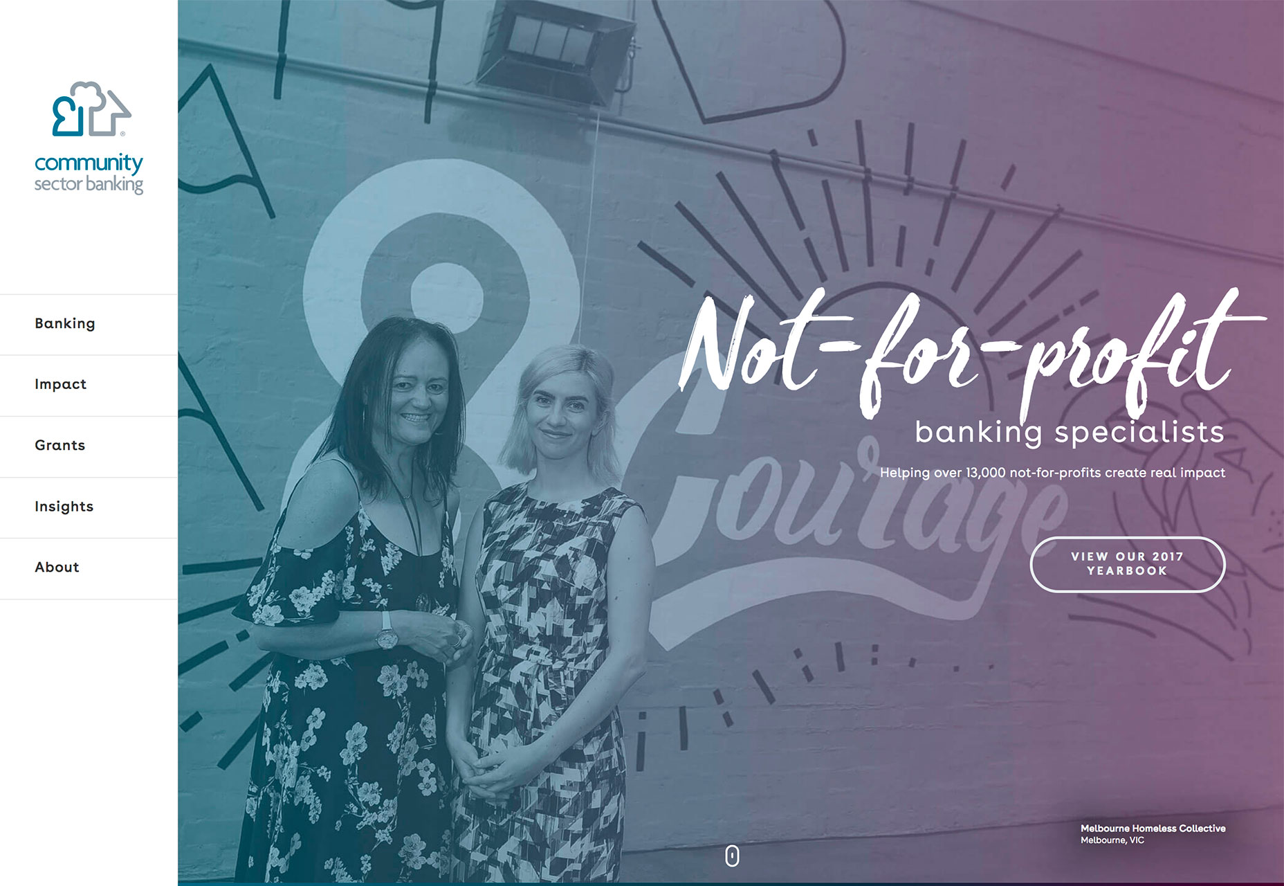
6. Emphasize Brand Colors
Use a gradient if you have brand colors that lend themselves to being paired. For new brands or websites trying to establish themselves, this can be a solid way to build branding and connection with users.
Think about how to incorporate the same style of gradient into multiple uses – on the website, for social media messaging in print or ad campaigns. Seeing the same use of the same colors in the same gradient will start to stick with users, who will in turn associate those colors with you.
The example below, Community Sector Banking, does exactly this. The color choices are interesting and the gradient – on the photo and in the bottom navigation bar – reinforce the color palette and its relationship to the brand.
7. They Are Easy to Create (Or Generate)
Adding a gradient to an image or creating one from scratch can be as simple as picking two or three colors and then selecting a shape for the gradient and where colors should start, stop and overlap.
Gradients, in terms of shape are directional, from left to right or up or down; or radial, where color variations emanate from a single point in a circular fashion. A design can contain one or multiple styles of gradients.
Picking colors for the gradient might be the most difficult step. Using colors that are nearby on the color wheel will result in the most complementary and natural gradients. But that’s not always what you have to work with. In that case, you’ll want to play with colors so that you don’t end up with a nasty hue in the space where your primary color choices meet.
Need to make a gradient and don’t trust your skills? Try one of these tools:
- WebGradients: Free collection of 180+ premade gradient swatches in CSS, PNG, Sketch and Photoshop.
- Gradient Buttons: CSS for gradient buttons with animated hover states
- Gradient Wave Generator: Pen to make a cool gradient wave using your own colors and starts and stops.
8. Color Fades Feel Natural
Even though it might not be your first thought, gradients often have colors and combinations that feel natural. Think about it, not everything in nature is a solid, single shade of green.
Gradients are a natural choice for this reason, particularly when you combine colors that would actually fade into each other in the natural world.
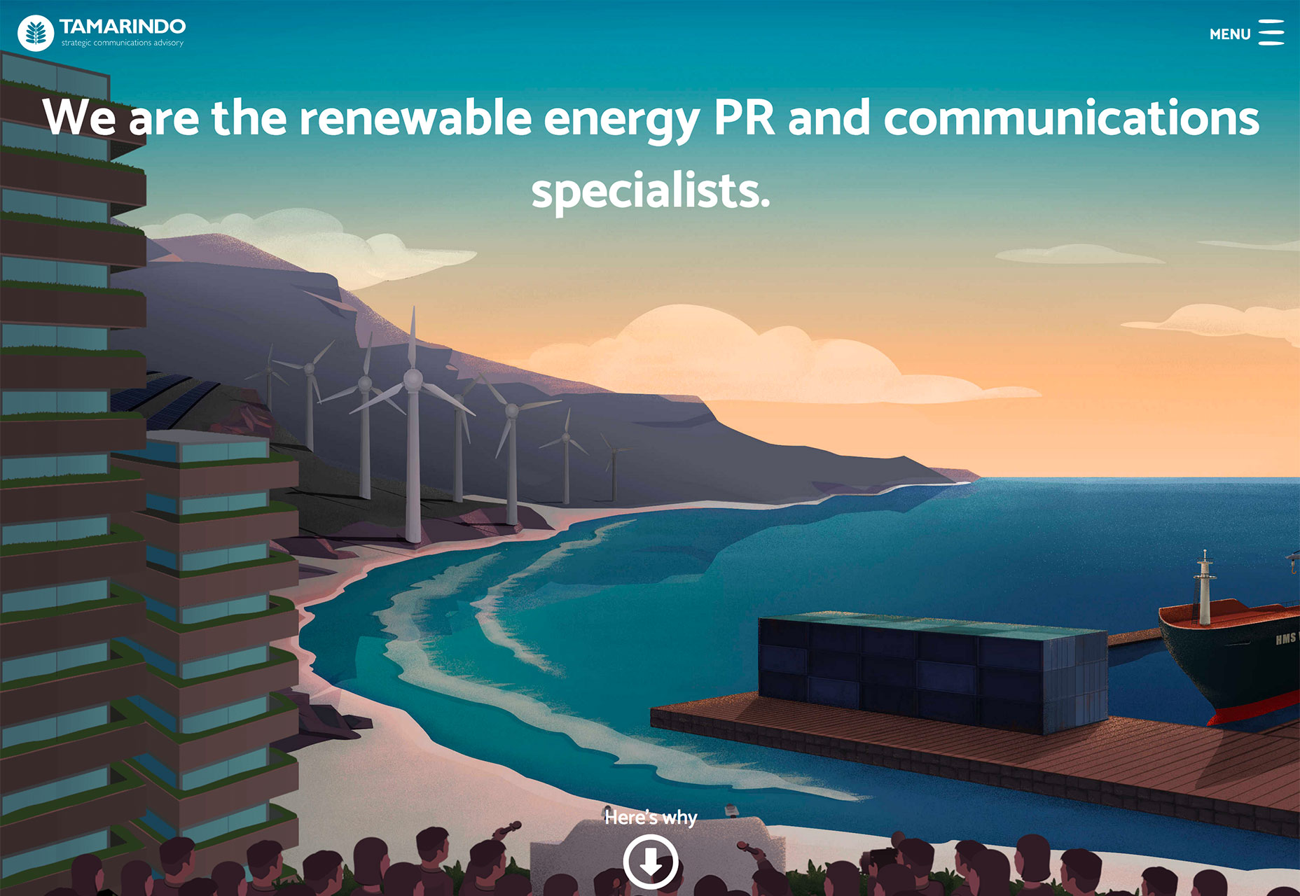
The illustration below is an overly obvious example with a sky that fades from day (orange) to night (blue).
9. Create Art When You Don’t Have a Dominant Visual
A good gradient can create visual interest and a visual display when you don’t have a whole lot to work with. Using a bright color, such as the example below, or brand colors can help establish your website’s presence.
Color changes are interesting enough that they can often stand alone as a design element. Think about how you use, and select colors so that they create the right emotional pull for users and help them find the right feelings to associate with the content.
Even a subtle gradient can go a long way to setting the tone for a design.
10. Gradients Are On-Trend
Gradients are an easy—and highly usable—element to add for a touch of something trendy without feeling overwhelming. With so many ways to use a gradient, it makes a lot of sense that this could be your go-to solution.
And while gradients have fallen out of favor from time to time, they tend to come back rather quickly because of an almost universal appeal.

Carrie Cousins


Read Next

20 Best New Websites, April 2024

Exciting New Tools for Designers, April 2024

14 Top UX Tools for Designers in 2024

What Negative Effects Does a Bad Website Design Have On My Business?

10+ Best Resources & Tools for Web Designers (2024 update)

3 Essential Design Trends, April 2024

How to Plan Your First Successful Website

15 Best New Fonts, March 2024

LimeWire Developer APIs Herald a New Era of AI Integration

20 Best New Websites, March 2024

Exciting New Tools for Designers, March 2024
