The numbers that matter - a peek into UX Analytics
So... lets talk numbers. Most times when we talk UX, we rarely talk numbers. We talk about about the “look” and the “feel”, the users, and a whole host of other things, but we rarely talk numbers. Most folks consider defining ROI on UX to be a challenge, I respectfully beg to differ. Given the right investment, like any other aspect of a project, one can present value accrued by UX. Page views, Drop offs, Popular Search terms, Task time, Error rates are all numbers, to name a few that can indicate success or failure of your interface.
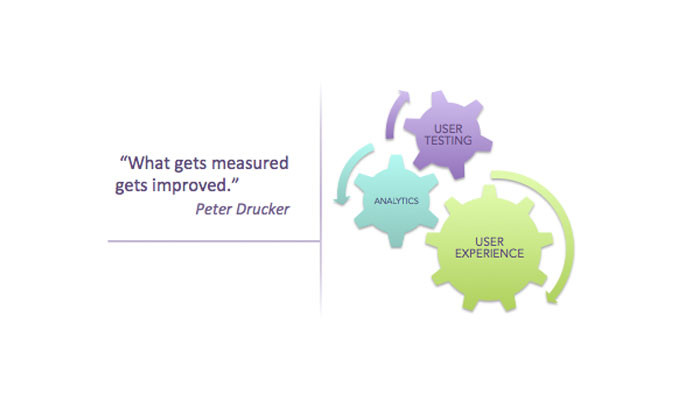
These metrics can be gleaned both passively and actively. Typically passive numbers can be gleaned via analytics over a period of time and allow UX-ers to diagnose an area of investigation. Active metrics can be derived via quantitative testing and act as the next step. In this article lets evaluate how analytics can point you in the right direction and in a following post we can talk about how to use user testing to fix the root cause.
Analytics as a tool serves more masters than just UX, so I would hope that most well conceived products would boast of the basics. There are several fantastic products out there to fit your platform and scale. Google in its bid to consume all data known to mankind, provides a suite of services that is relatively painless to get up and running. A more “household" name is Adobe's - Site Catalyst. Here is a nice article that rounds up some tools and what they can do for you.
Though a large trove of information can be gathered, reading the signs in the right context is critical. Take, E-Commerce where customer acquisition and conversion as God, or the social aspect of a product - essentially how the Facebook & Twitter community perceive you. In a vendor or employee context, the numbers read differently. Honestly though, the principle is the same, regardless of your users. Lets examine, shall we?
Page Summary; this is where I generally start, especially if I have a question about a specific piece of functionality. It presents a neat summary of all data, entry and exit volume, previous and next pages, total views etc. What's awesome about these reports is that you can tell immediately if the feature is working for you. I've used this report in conjunction with all other metrics to figure things out. Paths - Site wide, path reports talk about how users operate. The reports contain data such as Next and Previous Pages. These tell you if a design works or if folks have found a work around to your perceived thought process.
Two other numbers worth mentioning are Click to Pages and Time spent. Click to Pages tell you how many clicks into an interaction a user encounters your desired page. This is especially helpful if your objective was to reduce task time or make info “self-apparent”. Time Spent/page indicates the traction or performance of a page. If a major piece of functionality is distributed across multiple pages and the user spends an inordinate amount of time over one page and not the other, as intended, there appears to be a breakdown in the design somewhere.
As I mentioned earlier this is just a peek into the world of analytics, a reactionary rendition, if I may. Theres a lot more that can be done with analytics; to not just analyze the present but also predict the future. From a UX standpoint, its the picture these numbers paint together that tells us where to look.
Here's a good example; on a past project, I evaluated behavior on a Search interface.
Users avoided the current “advanced” search interface. From a business standpoint intended time on task for Search should have been in the vicinity of X mins but users appeared to be spending over 5X mins with the next page primarily being PDP and an inordinate volume of drop off from there. This was a vendor tool, so drop-off could not be attributed to dis-interest or competition. Subsequent paths to cart were of a very low volume.
Some of the hypotheses of interest were:
- Search was not working as efficiently as expected, since users spent a lot of time “trying to find the right product”.
- They however were not persuaded to go to “Advanced” Search despite simple search being a challenge. This meant that advanced search was either not apparent or had a history of being ineffective.
- Some piece of information was resulting in a high drop off rate. Regardless of whether they were finding what they were looking for; they were frustrated and deciding to quit.
We performed user testing and were able to identify the problem and solve it but what was the problem and how was it solved? More on that in my next post.
What experiences have you had with analytics and UX. How has it helped you understand your users and their behavior? Do share.

Lead Product Designer
9yThanks for the post…I believe numbers are the ‘Straight Flush’ for engaging Omni Channel Experience. Determining the point of entry, native content (keywords) & exit path will help in devising an UX strategy and scale up consumer engagement. On a contrary note numbers can sometimes be deceptive, especially when you are running analytics against legacy applications. High volume hits may not always signify good experience. Though from a UX standpoint it may seem complex but for the user it’s icing on a cake…it may be his bread and butter and may not like the sound of any enhancement.
User Experience Engineering Manager
9yLovely...like it... definitely number speaks