As I mentioned in my previous article, mobile email design is not only a content choreography issue, but involves many design elements.
We should never consider the design for mobile devices a simple matter of catering to “screen size”. Instead we need to have a comprehensive approach that takes into account the very different ways that people use the web — and email in particular — on small devices.
We’re going to identify some of the key considerations in mobile email composition. These rules are not meant to necessarily answer all the requirements of email design for mobile devices, but they are certainly a very good starting point.
1. Keep email simple
Complexity kills — especially in email. Always avoid complicated structures that will inevitably fail when rendered on small screens. Remember that many devices simply don’t support media queries (Gmail App for example), so you can’t count on sophisticated content rearrangement techniques.
A linear and simple layout will deliver the best result in most cases.
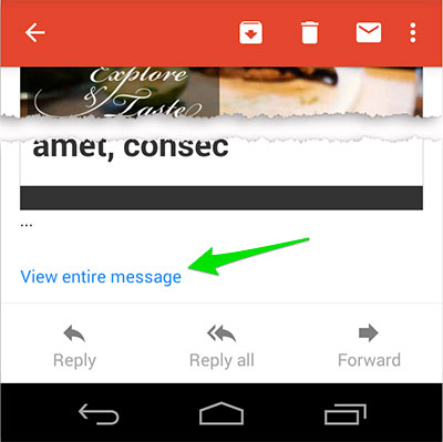
The overall size of the email is also important: your email can be not fully loaded if it over a preset size (around 100Kb). I haven’t tested this issue in all clients but both Gmail App and IOS devices exhibit this behaviour (and Gmail web app too).
In the screenshot below, you can see how the user has to click a link to view the entire message: this can discourage people from reading your email in full.
2. Focus on email goals and mind the fold
Although I am not a fan of the “above the fold” issue (take a look at this old and very interesting article), the way emails are read on mobile devices means we should always consider their upper part as critically important.
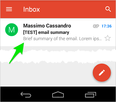
A quick glance at this content is, in many cases, the best chance you’ll have to draw your readers into reading more, so giving your them an easy to digest summary can make the difference.
A small paragraph at the top of the email can often do the trick.

This can also work very conveniently for some important clients that display these lines in their inbox list view (i.e. Gmail App, or Apple Mail on IOS and OSX).
3. Resize fonts and images
This topic only applies to devices that support media queries. Unfortunately, we can’t do anything for the others: sometimes they resize text and images themselves, but we can’t really control this behaviour.
Media queries are currently supported by all IOS devices, the Android native email App (with some issues and remembering that Lollipop dropped it in favor of Gmail App), the newest Blackberry phones and a handful of others (for a more complete list, take a look at Campaign Monitor Guide to CSS or FreshInbox Email Client Media Query and Embedded Styles Support 2014).
Together they correspond to a significant and continuously growing percentage of email clients, so it’s really mandatory to take care of them.
IOS devices have two main issues with font and image size:
- Small font sizes are enlarged by default
- Email width is based on the largest element
Font-size enlargement is usually not a critical problem, but in some cases it may cause some lines of text to be spliced potentially breaking your layout.
This can be easily fixed adding this line to your CSS:
* { -webkit-text-size-adjust: none; }In the screenshot below you can see how the text size in the red area can change adding the -webkit-text-size-adjust rule (on the left) or removing it (on the right).
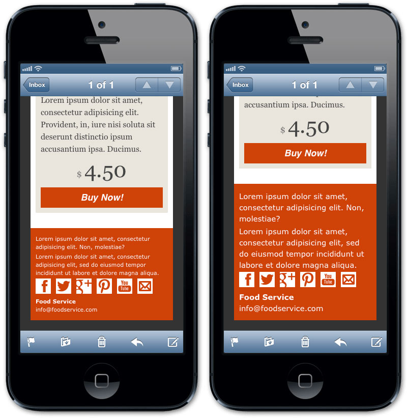
Font-size management also affects the user experience on mobile. Small text that might be easily readable on desktop devices can have a different effect on small screen.
In the example below, the summary text on the right version has been enlarged to make it easily readable and to attract users eyes:

In general, increasing the font size on mobile devices is a good practice, and especially for emails, where reading time is extremely condensed and you need to capture users attention quickly.
About images
I’ve just written about images in my previous article: optimizing images for mobile devices is an easy task based on classic max-width responsive images technique.
You can also load targetted images for devices which support media queries (take a look at A Slick, New Image Swapping Technique for Responsive Emails on Email On Acid blog, or Optimizing images for mobile on Campaign Monitor).
4. Customize links and buttons
Email mobile design requires some tricks for links.
First, consider that the links will be clicked using… fingers, so keep them well spaced and strictly limit their number (Mobile device ergonomics and links in email newsletters article on Campaign Monitor blog addresses some interesting topics about this argument).
Size and spacing are a mandatory for buttons (typically they are Call to Actions links): make sure they are easily clickable and visible. Furthermore, always remember to add rules for anchors in your inlined CSS: Gmail App styles links as blue and underlines them by default.
One small potential problem is the links that Gmail and IOS add by default to telephone numbers (both), and to URL and email strings (in Gmail App only).
To avoid automatically auto-generated telephone links on IOS, you have to simply add this meta tag to your code:
<meta name="format-detection" content="telephone=no">The Gmail fix is a little trickier (and hackier): it consists of adding some invisible characters to ensure that a string is not recognized as a potential link (while obviously preserving it’s presentation).
I’ve performed a set of tests using both HTML entities and “neutral” span tags. Only by breaking each part of the link with a span tag (the latest portion of the sample code) did I obtain the expected behaviour.
This is the result:
<p>800-234-5678</p>
<p>(800) 234-5678</p>
<p>http://mydomain.com</p>
<p>myemal@mydomain.com</p>
<p><span>800-234-5678</span></p>
<p><span>(800) 234-5678</span></p>
<p><span>http://mydomain.com</span></p>
<p><span>myemal@mydomain.com</span></p>
<p>800–234–5678</p>
<p>(800) 234–5678</p>
<p>http://mydomain.com</p>
<p>myemal@mydomain.com</p>
<p><span>800</span>-<span>234-5678</span></p>
<p><span>(800)</span> <span>234-5678</span></p>
<p>http<span>://</span>mydomain<span>.</span>com</p>
<p>myemal<span>@</span>mydomain<span>.</span>com</p>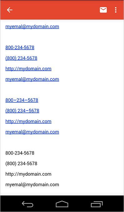
5. Add spacing
My latest small tip for mobile email design is to consider increasing padding around main text content: this will significantly increase the readability of your email.
Resources
- Campaign Monitor Guides: Responsive Email Design
- Email On Acid: 7 Tips on Designing and Developing Emails for the iPhone
- Litmus: Ditch the “Mobile Version” of Your Email
- Litmus: The How-To Guide to Responsive Email Design
- Litmus: https://litmus.com/blog/anatomy-mobile-email
-
Email On Acid:
12 Things you MUST Know when Developing Emails for Gmail and Gmail Mobile Apps - Email On Acid: Viewport Metatag Rendered Unusable
- Email On Acid: How Android is Strangling Responsive Design
-
Email On Acid:
5 Easy Ways to Improve Your Mobile Design - Litmus: Mobile Email is Here to Stay. What Comes Next?
- Litmus: Three Step Media Queries Imitate Fluid Resizing for Expedia Emails
Frequently Asked Questions on Mobile Email Design
What are the key elements to consider when designing mobile-friendly emails?
When designing mobile-friendly emails, it’s crucial to consider the user experience. This includes ensuring that the email is responsive, meaning it adapts to different screen sizes. The text should be legible without zooming in, and the call-to-action buttons should be large enough to tap easily. Also, consider the loading time of your email. Heavy images can slow it down, leading to a poor user experience. Lastly, keep your email design simple and clean, avoiding clutter that can distract the reader.
How can I ensure my email design is responsive?
To ensure your email design is responsive, you can use media queries in your CSS. Media queries allow you to apply different styles depending on the device’s screen size. You can also use fluid layouts that use percentages instead of fixed widths, allowing the layout to adjust to the screen size. Additionally, consider using responsive email design tools or templates that automatically adjust to different screen sizes.
What is the ideal font size for mobile email design?
The ideal font size for mobile email design is between 14px and 16px for body text and 22px for headlines. This ensures that your text is legible on small screens. However, the ideal font size can vary depending on the font type and the audience’s preferences. It’s always a good idea to test different font sizes to see what works best for your audience.
How can I optimize images for mobile email design?
To optimize images for mobile email design, you should ensure that they are the right size. Large images can slow down the loading time of your email, leading to a poor user experience. You can use tools to compress your images without losing quality. Also, consider using CSS to control the size of your images on different screen sizes. Lastly, always include alt text for your images in case they don’t load properly.
What is the best layout for mobile email design?
The best layout for mobile email design is a single column layout. This layout is easy to navigate on small screens and ensures that your content is legible. It also allows you to control the order in which your content is presented. However, the best layout can vary depending on your content and audience. Always test different layouts to see what works best for your audience.
How can I make my call-to-action buttons mobile-friendly?
To make your call-to-action buttons mobile-friendly, ensure that they are large enough to tap easily. The recommended minimum size is 44px by 44px. Also, make sure there is enough space around your buttons to prevent accidental taps. Lastly, use contrasting colors to make your buttons stand out and clear, concise text to tell the user what action they should take.
How can I test my mobile email design?
You can test your mobile email design by sending it to different devices and checking how it looks and functions. You can also use email testing tools that allow you to see how your email will look on different devices and email clients. Additionally, consider doing user testing to get feedback on your design.
What are some common mistakes to avoid in mobile email design?
Some common mistakes to avoid in mobile email design include using small text that is hard to read, not making your design responsive, using large images that slow down loading time, and not testing your design on different devices. Also, avoid cluttering your design with too much content or too many different elements.
How can I improve the loading time of my mobile emails?
To improve the loading time of your mobile emails, you can compress your images, use simple layouts, and avoid using too many different elements. Also, consider using a content delivery network (CDN) to deliver your images faster. Lastly, always test your emails to ensure they load quickly on different devices.
How can typography impact the effectiveness of my mobile email design?
Typography can greatly impact the effectiveness of your mobile email design. Good typography can improve readability, comprehension, and the overall user experience. It can also help convey your brand’s personality and tone. On the other hand, poor typography can make your content hard to read and understand, leading to a poor user experience. Therefore, it’s crucial to choose the right font type, size, and color for your mobile emails.
 Massimo Cassandro
Massimo is a web and graphic designer and front-end developer based in Roma, Italy.


