As 2015 approaches, Creativeworld has seen an increasingly high demand for responsive websites, a technology which enables your website to accommodate a vast range of mobile devices and users, with recent studies showing that this year the number of active mobile devices worldwide has surpassed the 7.2 billion mark.
With this in mind, it’s vital going into 2015 that your website is future proof; allowing your target audiences to seamlessly access your information on multiple platforms.
SEO (Search Engine Optimisation) is, as ever, key in ensuring potential customers can locate your business online with ease. The same is true of Social Media – most of which is accessed via mobile devices. Imagine the frustration when someone discovers your website via their mobile device, only to find themselves having to zoom in on miniscule text along with having to scroll and navigate through information, all of which was designed with a desktop in mind. This is a common problem that clients approach us with; where the layout doesn’t resize and leads to tedious scrolling and zooming.
The responsive mobile sites our in house digital team develop are also faster to load, which allows for a more user friendly and streamlined experience.
Furthermore, with the integration of new cloud technology, internet browsing history can be synced through a users home or mobile network, allowing them to stop and resume surfing on alternate devices. Imagine this, a customer searches for and identifies your nearest store location on their tablet at home, they then carry product specifications on their mobile phone to the store for reference, followed by the product purchase. Mobile devices should be considered as some of the best sales assistants for your brand!
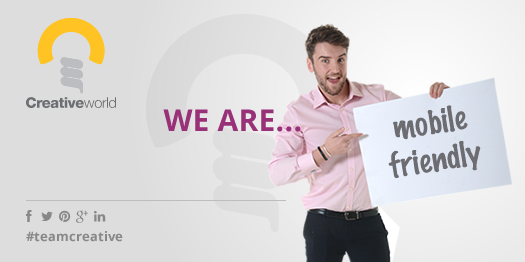
To see if your website is mobile friendly head over to this link and run the test.
For further information and help on how to make your business mobile friendly, get in touch with our expert team here at Creativeworld. You’d be surprised what we can do…
