“We have to display educational projects on the homepage; they’re far too important to hide in the menu,” says a member of the Van Gogh Museum team. Just before one of our designers can intervene, another member of the team responds: “Educational projects do not make a top task – and the concept is very clear about the structure of the site: top tasks on the homepage; all other information via navigation and search.”
It’s February 2014 and the first meeting with the Van Gogh Museum has begun after we at Fabrique and Q42 won the bid to design the new website. A few months earlier, we received the brief: “Develop a website that supports the mission of the museum – to make the work of Vincent van Gogh and the art of his time accessible for as many people as possible, with the goal to enrich and inspire them.”
We opted for a design approach that proved itself in our award-winning website for Amsterdam’s Rijksmuseum. Essentially, determine what’s most important (the “top tasks”) and make it big and good. In this case, those “important” things were twofold: on one hand, we had to ensure it was easy for visitors to plan their visit, but also tempt them with inspiring stories about the artist.
Don’t wait until you reach the museum to meet Vincent, was the opinion – start online.
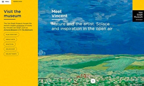
With this “meet Vincent” concept, the team had to make not only the collection (and thus the museum) accessible, but also the artist. So on the homepage, we offer a distinct choice between facilitation and inspiration. There’s the facilitating part – “visit the museum” – and an inspiring part: “meet Vincent.”
The “visit” section quickly and clearly provides practical information on the museum’s opening times, directions and accessibility, group visits, what’s on and tickets. The “meet” section tempts visitors with exceptional stories about the work and life of van Gogh. Each story has been specially written and designed for the website and offers new approaches to the work of the artist and his contemporaries. A site visitor can browse through the interactive stories, before wandering almost endlessly through shorter side stories, facts and related works of art.
At the heart of the site had to be a well-thought-out navigation structure and crystal clear visual design. The team therefore invested a lot of time devising and testing. One of the hot topics was the About the museum page, which includes information on research, organisation, press and education. With this particular section, there seemed to be a thin line between serving the majority (someone who might know nothing about the museum) and facilitating the minority (someone who knows the museum but wants to find out something specific).
We realised that a clear and concise information architecture would give us the opportunity to stick to the concept and please everyone. A museum website is a place where all should be able to find the right inspiration and information.
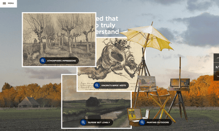
In terms of challenges, the team did slightly underestimate the effort it took to make the site structure accessible for each visitor type. There was the expectation that most of the time would go to writing, designing and programming the stories about van Gogh’s life and work. Instead of completely custom-designed and built stories, the team had to opt for a more modular design that focused on article types. This resulted in restrictions in compiling the stories, but also provided a useful framework; it gave the structure that turned out to be very useful, streamlining the process of bringing together content, design and code.
We’ve had some really positive responses since launch, most of which focus on the stuff that took the most effort: the information architecture and the interactive stories. It’s these stories that take you into the world of van Gogh: his time, his search for the highest standards, and his victories and disappointments. We like to think the new website not only informs but inspires and enriches.
David van Zeggeren is project lead at Fabrique, which you can follow on Twitter @fabrique
More like this
How mobile tech is changing the way we make and enjoy art
How we made the Show and Tell circus app for children with autism
How we made the Dozens & Trails library app
Join our community of arts, culture and creative professionals by signing up free to the Guardian Culture Pros Network.

Comments (…)
Sign in or create your Guardian account to join the discussion