Denver- Museum of Contemporary Art – Oct. to Jan 2017
Instead of using his easel to prop up a window on the world, Kandinsky used it to support a windshield moving through the universe.
–from Working Space by Frank Stella.
I went to the MCA to take a second look at a show of 20 artists who are tech-assisted in their artmaking, with Working Space in my bag – it was due back at the library.
Working Space is a series of essays written in 1968 that Stella delivered as lectures at Harvard University. Stella’s premise is that ‘abstract’ painting was at a crisis. Before the late sixties, he sees Kandinsky and many painters after him looking to outer space as they paint. He argues that this open-windshield-to-space painting is not at a dead end as many people who turned to pop and conceptual art suggested.
How has abstraction (read ‘open windshield’ if you want) fared since 1968?
To start to answer this, Stella went back to Caravaggio. He saw Caravaggio as a painter facing a similar problem: the crisis of Renaissance perfect perspective and realistic representation. I read in Stella that abstraction faced the perfect as the sublime – Rothko called his work a religious experience. Painters after Rothko had to come up with a Caravaggio-like answer. Which, as Stella explains it, was to make paintings that erase the ends of the world and shine a spotlight on the emotion of the scene in all space and time.
In this show, what’s the proposed response? Several video or animated ‘paintings’ – flat, housed in a rectangle, with images defined by color and shape. Filled with the human figure. The paintings of Kytten Janae and others are skillful uses of adobe creative cloud or other computer software, but feel less emotive, more Peter Max than Mick Caravaggio.
 Parker Ito’s Cheeto’s
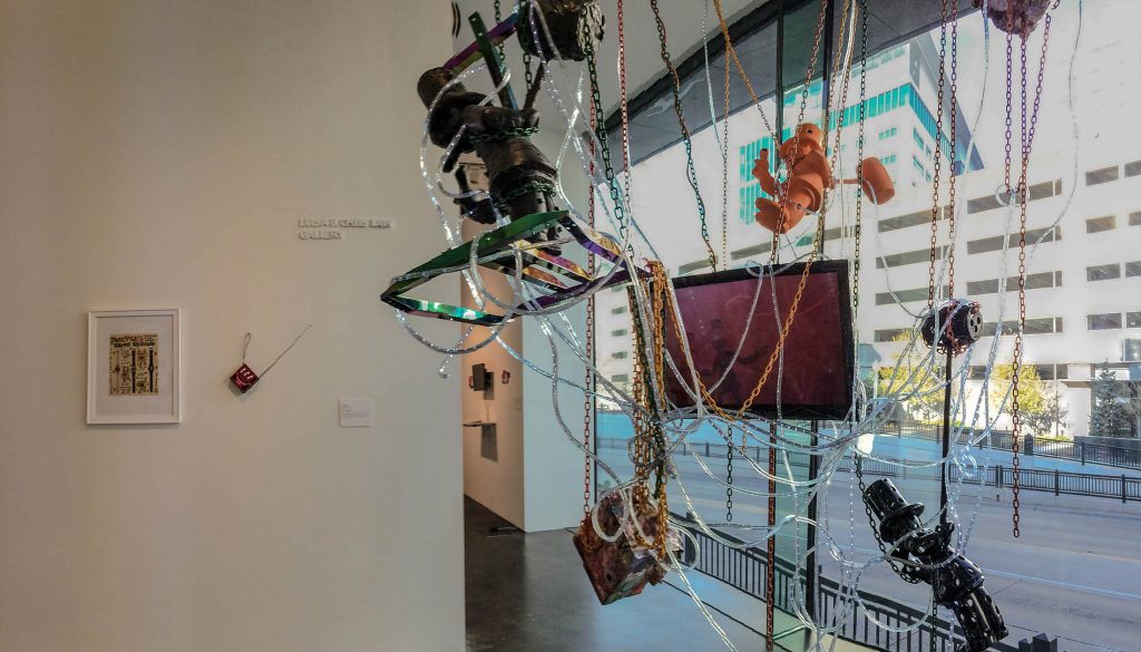
Sculpture and video called “A Lil’ Taste of Cheeto in the Night” by Parker Ito is more of recreation of a snapshot, and not the focused vision that Kandinsky would have made from his dashboard camera. It’s a mess, but some beautifully textured painting on the top-hatted figure from the Monopoly game (Richy Rich from the Rich Uncle game, remember that? Maybe,RR. Or something I’m to rural and old to know. ) Maybe Ito’s rich uncle helped him cast them in bronze. Something in this tangle is bronze – it says so on the identification card. A lot of visuals, not much meaning.
I walked into the museum wanting open minded reviewing: open to Frank Stella, who someone at an opening a few nights earlier had called a self-important bore. I’d been in these gallery spaces before and thought ‘messy.’ And yet again today, I had the feeling that the whole show, and unfortunately the museum, is bathed with that everyday bump-pa-bum music that Bill Maher so aptly criticizes by saying – “you Millennials who think they’re both awful. Of course, you can see the difference between Hillary Clinton and Donald Trump. You can tell the difference between hard-core, emo punk, post-alt punk, etc.”
A friend said that art of today is non-sentimental – and that’s why it seemed so meaningless to me. I disagreed. It is sentimental to the point of being nostalgic. Wishing it were made in the 60s when it would have been new. There is no working sentiment that speaks to the emotional, or interior life of humans today. My friend thought it felt sad and pessimistic. Such a blanket-like emotion doesn’t encourage me to keep looking.
How sad it is to see that 23-year-old Frank Stella is right where Mondrian was 25 years ago.
– Robert Coates quoted in Working Space by Frank Stella
Is there a relationship with the past – art to art gone by?
Sixties and Now
Standing around in the galleries re-reading the Stella book, I took the time to figure out that there was work from the 60-70s next to work made in 2015 or 16. The first gallery is devoted to two works: one by Aoife Dunne, 2016, called Limitless, and another by Dara Birnbaum called Technology Transformations: Wonder Woman.
 In the past there was Wonder Woman – oddly costumed in a gray flannel suit kind that was miraculously transformed by ‘spinning’ into a bra and panties workout outfit had amazing stick-to-it powers like the Woman herself. The video repeats and WonderWoman spins from business suit to super suit all the while reminding us that this is TV not real life, and how lame were our late 20thC desires manifest in this Uber(wo)Mensch. “We’ve got to stop meeting like this,” she says after breaking through a wall with her magic fingernails, cutting glass like it was as easy as scraping your fingrnails on a chalk board. Yerreeeek.
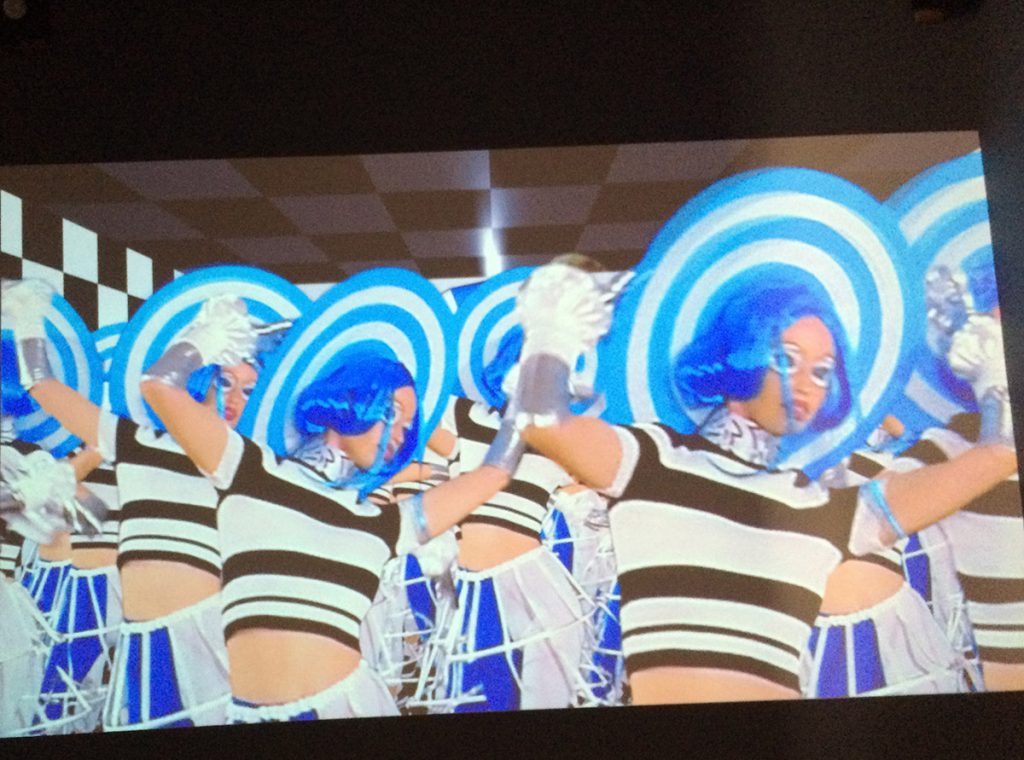
Limitless is a video satirizing a video game crowded with set decor by Anime, with characters you can choose who are called clients, who curtsy to the camera, acting to be different but are all the same. I ask myself why it is important that this is a moving image, and this same/different dichotomy may be the answer. Makeup makes them uniform, if not repeating. Techno music covers the entire video like an unescapable arcade. Undertones of language via onscreen titles,and verbal alerts imply beauty pageants or stewardesses giving the safety message or any other performance requiring a woman to look a certain way. These echoed faintly, but so frequently, what seems to be the message of the piece.
I lost interest in the Wonder Woman video when the theme song came on, and with this one when the ‘moral’ was made text – blazing like a powerpoint important point – The Ideal Self – in English and Asian characters.
Expansive enough to include the viewing and making of itself.
– Working Space by Frank Stella
Stella made that a distinction of good painting, and so let’s see if it works for sixties DYI and contemporary painting.
OWVBICS (who?) paintings & DYI
Messy is a way to include the making. I’ve been told more than once by painters who smear, stroke or drip onto a canvas that is generally representational in order to show that someone made it.
A series of 12 paintings are put together as a grid with no space in between and each is obviously made by hand. They are very rough – 6 are red, 5 include dates, many include a figure. At first glance they seem to have been made by 2 people – an abstract painter and the figure/cartoon painter. The colors are minimal: red, black white. Green for earth; blue for sky. Yellow for moments of heat: hair, fig leaves, sun, an orangey yellow flower. The figures are blurry, childlike with suggestions of substance like a ‘crown of thorns’ or ‘wolf hair’. The non-figurative seem like accidents of color and imply a depth that is not present in the realistic squares. I google the letters that are named as the artist behind the work: OWVBIC and come up blank. I have no way of knowing more about the painter(s) and why these where painted and put together.
On first writing of this story, I was not sure I felt or got anything, but in going to go back through my notes and trying, again, to be open, I wrote the previous paragraph. I thing there was something interesting in my description. I know, Iwas trying very hard to give these paintings, the video game, the keychain piece some serious attention. Is it okay to just write what comes to mind while sitting in a gallery? Does that start a conversation?
The Mis-match Room – Anon & Famous
The size of what one dips the brush into counts for more than the size of what one paints on; that is, the load of pigment carried determines the scale of gesture more than the dimensions of the area to be covered.
– Frank Stella, Working Space
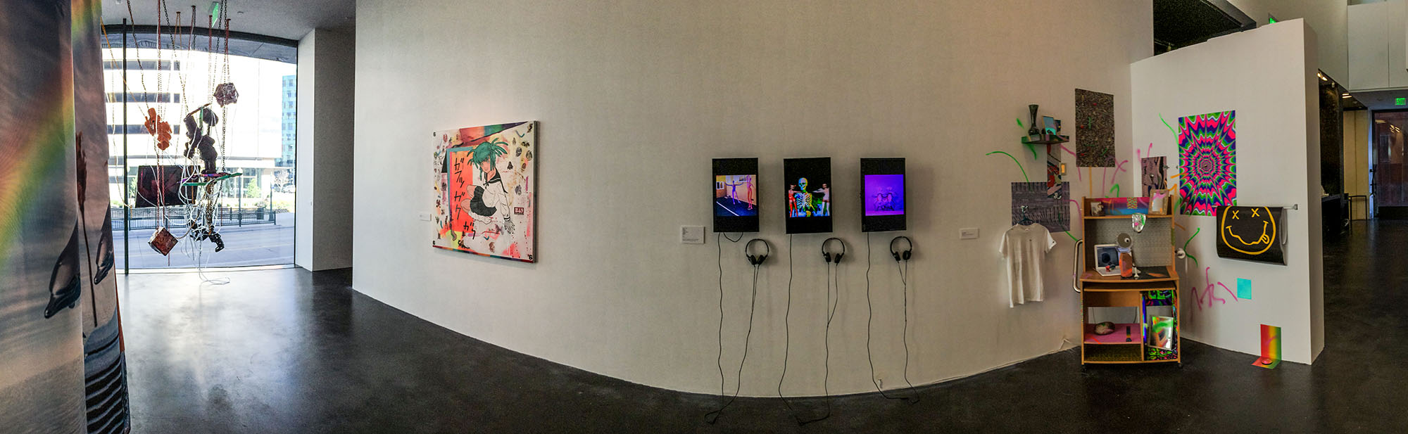
 Busy installations are mixed with very subtle marks on a surface in the largest of the MCA galleries used for this show. If I use the quote from Stella, will it help me think about what these gestures are saying? What is still obvious is my panorama photo of this show is how much the assemblages and the against-the-wall installation stick out because of their color. I guess that is a stoke, each plank of wood, each item placed in the assembled installation. But the work that I remember most from this room were bold gestures – even if they were small they were bold compared to their totality. A couple of works were by someone who is a singer in a band, and they were given disproportional more space. Space separating these subtle works felt needed. I noted the work by Alexander Page, who I know nothing about, just for their titles: “The Truth Lies Within the Vessel” -a digital print and “Truths Hidden by More Than One Person” – a drawing in enamel, marker and lacquer. These were small, intimate and almost a slap in the face of all the other stuff working so hard for attention.
There are nice little Keith Harring drawings included that are tight and to the point – commercialism kills – or something equally pithy. The artist isn’t around to contradict me. And I return to Kytten video. If I didn’t had animation so much I would probably have enjoyed these. Drawing with computer programs is so tedious and our knowledge of how to do it is so primitive. The output is shallow compared to the effort.
Our breakthrough is when more comes out than went in.