


A Casual Gray Kitchen Effortlessly Blends Looks and Functionality
Durable, family-friendly finishes and cool tones help this San Diego kitchen keep a laid-back profile

As a designer, Danielle Perkins has helped many families create their dream kitchens. So when it came to designing her own, she knew exactly what she wanted. Plenty of storage and a casual vibe topped the list, but durability was her main priority. With two young children and a busy home life, she deliberately chose practical fixtures and finishes that could stand up to day-to-day spills and food prep while still looking fresh and inviting.
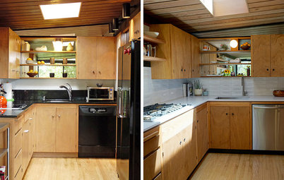
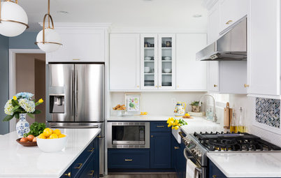
AFTER: Perkins kept most of the original layout but made a few minor changes to increase functionality. She started by moving the refrigerator to the right, making up for lost pantry space by installing a smaller but more functional — and shallower — cabinet on the end. “Everything is in a single layer, so you see everything and use it,” she says. Turning it to face away from the work area helps prevent a pinch point in the actual work space.
Perkins saved money by keeping the existing appliances. “Remodels are expensive and there was nothing wrong with them,” she says. “I also like the white appliances. They’re easy to clean.”
One thing that did go was the original range hood. The new one, with its less bulky profile and glass expanse, opens up the space, and the color of the stainless steel plays off the gray cabinetry and champagne gold hardware. “I like to mix materials,” Perkins says. “It keeps it casual.”
The mix of casual and classic continues throughout the room, starting with crown molding. “I like doing crown molding,” Perkins says. “When you’re not splurging on the highest-end cabinetry, it gives the room more of a rich feel.”
Other finishes and furnishings are geared to the realities of having a growing family. The unupholstered counter stools can be wiped down. The backs help hold kids in place and the swivel makes it easier for them to get on and off. For the floor, Perkins looked for the largest porcelain floor tiles she could find — 24 by 24 inches. “Fewer grout lines to clean,” she says.
Overhead, Perkins kept the recessed lighting but added two large solar tubes, one on each side of the hood. “They add so much light,” she says. “I recommend them to everyone, provided they’re correctly installed.” She also added undercabinet lighting. “It makes such a difference when you’re chopping vegetables,” she says.
Stools: Crate & Barrel; hardware: Atlas Homewares; floor tiles: Regis Tortora, Arizona Tile
AFTER: New cabinetry in a soft gray color blends with the appliances rather than clashing. “It’s hard to match whites,” Perkins says.
And though the location of the cabinetry stayed pretty much the same, the new units provide more functional storage. “Newer cabinets have so many amenities,” she says. A pullout trash drawer sits next to the refrigerator, close enough for the cook to reach but out of the work area. Next to it is a pullout spice cabinet.
Maximizing space inside the cabinets was also important. The two bottom drawers of the center base cabinet hold heavier items like mixing bowls. The top drawer has a doublet-tier utensil divider. “It’s great for holding extras, like baby spoons and steak knives, and you can add them to any existing cabinet,” Perkins says. A corner cabinet was fitted with a lazy Susan.
Perkins paired the cabinets with a Taj Mahal quartzite countertop. In keeping with her desire for a more natural and softer feel, she chose a finish that wasn’t highly polished.
Cabinets in Cloud, Diamond at Lowes; utensil organizer: Rev-A-Shelf
A cabinet on the island features specialty pullout drawers to organize pots, pans and lids.
Organizer: Rev-A-Shelf
Organizer: Rev-A-Shelf
Perkins replaced the original single sink with a slightly smaller granite single sink, which allowed her to shift the dishwasher to the right. This in turn left enough space for a narrow cabinet for cookie sheets and cutting boards next to the ovens.
The sink’s rounded edge lent itself to placing the faucet on one side rather than centering it, a placement Perkins likes. On the left side of the sink, Perkins had her contractor put in a longer tube under the soap dispenser, leading to a gallon container below. “I wash my hands all the time,” Perkins says, “and this way I don’t have to refill the soap dispenser every week.”
She also knew she wanted the backsplash to tie seamlessly into the cabinets and the molding with no need for end pieces. “It presents a clean, clear and constant appearance,” she says. She chose mother-of-pearl tiles set on mosaic mesh that blends with the countertops.
She added piping to the pendant light fixture over the sink so she could hang it from the ceiling and bring in another small metal detail to the space. “I wrapped the cords around the pipe,” she says. “I can change the height of the lights or move them to one side.” Finishing touches include a natural wooden window shade for warmth and an area rug for a touch of color.
Sink: Blanco; faucet: Trinsic pull-down kitchen faucet, Delta; pendant light: Europa 1910 Edison bulb brushed nickel multi- light pendant, Lamps Plus; backsplash: Mermaid Scales shell mosaic wall tile, Jeffery Court; window shade; Horizon Window Fashions
More
Trending Now: 25 Kitchen Photos Houzzers Can’t Get Enough Of
From the Pros: 8 Reasons Kitchen Renovations Go Over Budget
Kitchen at a Glance
Who lives here: Interior designer Danielle Perkins, her husband and their two small children
Location: Lake Murray area of San Diego, California
Size: 150 square feet (14 square meters)
Year built: 1963; remodeled in 2015
Designer: Danielle Perkins of Danielle Interior Design & Decor
BEFORE: Although designer-homeowner Danielle Perkins liked the layout of the original kitchen, she felt the large, deep pantry to the right of the refrigerator took up too much room and ate into what could be more counter space. Plus, the pantry was so deep, she says, the family would often lose things in its recesses.