
 Infographics are powerful tools that marry design with compelling data. They’re intended to present information quickly and clearly in a more digestible way. In short, they are data + design, information + graphics = infographics.
To help celebrate how the world is continuing to grasp visual content, here are a few delightful examples of infographic design in 2014 across a few categories. Some are funny, some more serious, but one thing is for sure: Each of these examples is equally inspiring. From static to animated, interactive to responsive, let’s take a look into some fascinating works of art.
Static Infographics
A common form of infographics today are static infographics. While these pieces aren’t clickable and moveable, they still present a set of data in an easy-to-digest format. Here are a couple of great examples:
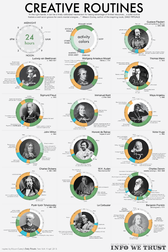
1) Creative Routines
Using data gathered by Mason Currey that compares routines and daily rituals of hundreds of creatives, Info We Trust designed a selection of the creative routines that Currey researched. The differences in routines from creative greats like Beethoven and Dickens are both amazing to know and see visualized.
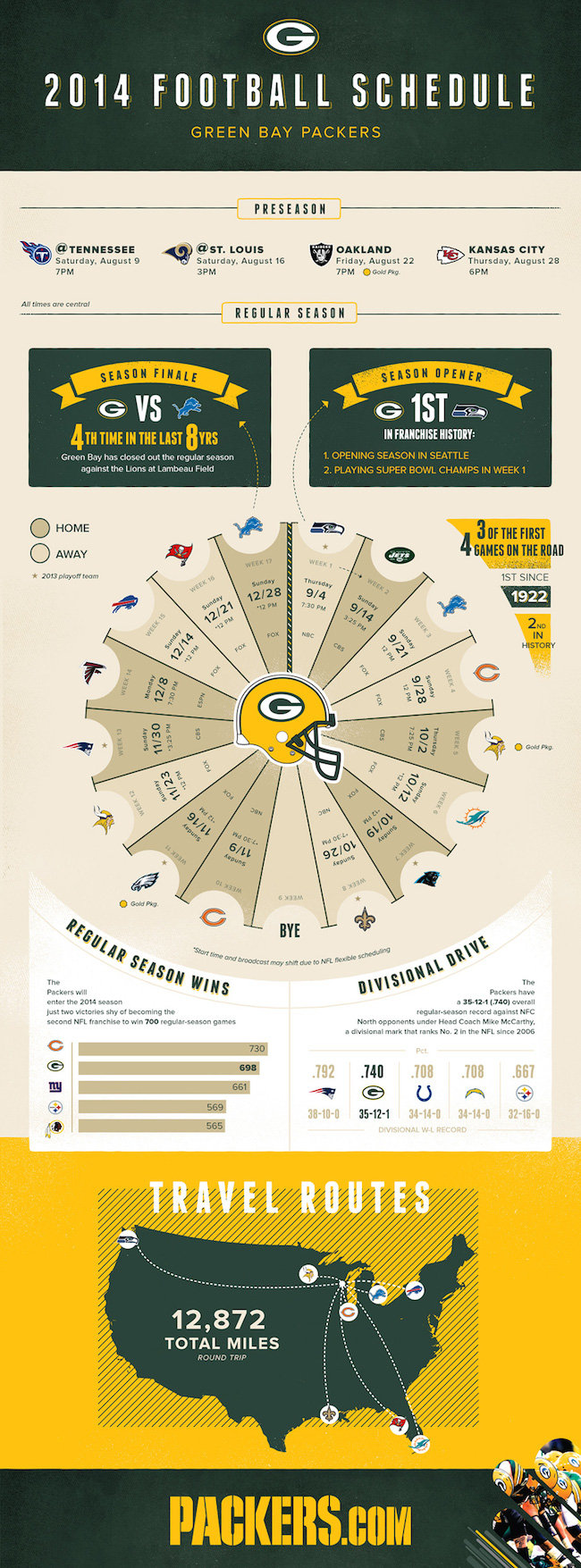
2) 2014 Green Bay Packers Football Schedule
It’s not a secret that sports and data go hand-in-hand, which is why many sports teams are starting to visualize their data with infographics. Here was a fun infographic take on the Green Bay Packers’ 2014 schedule by Statographics.
Animated Infographics
From adding subtle animation to an otherwise static piece to creating videos with moving parts, using animation can be a key part in helping illustrate different ideas and data sets.
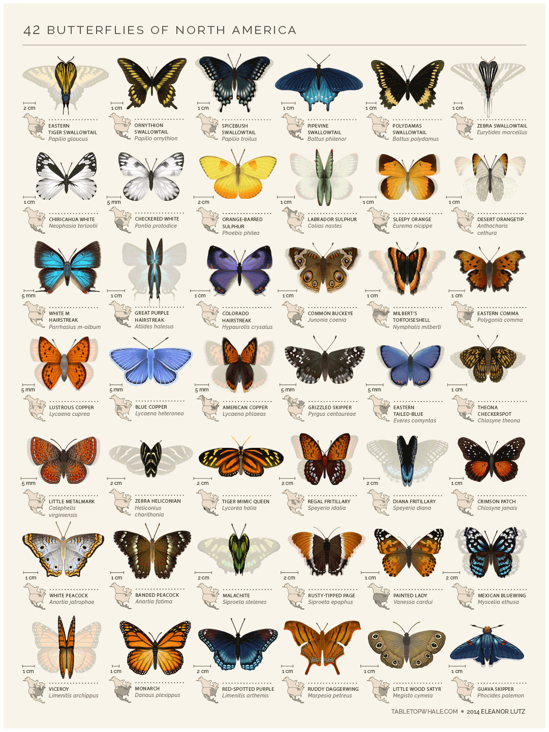
3) 42 Butterflies of North America
Sometimes simplicity can be key when dealing with visualizing data, as we can see here in this animated chart of butterfly species of North America created by Eleanor Lutz. The moving butterfly animations help add the perfect amount of “life” into this simple and beautiful piece.
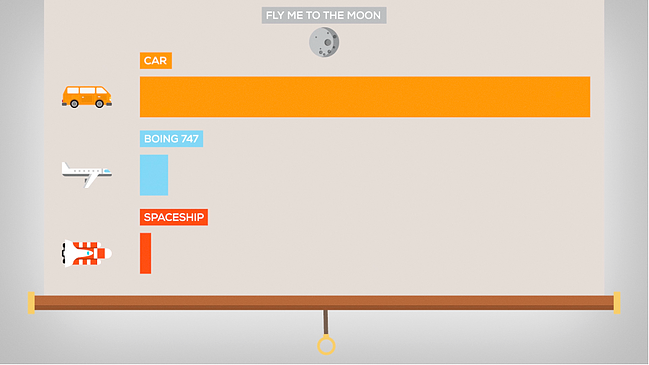
4) How Big is the Moon Really?
This animated video by Kurzgesagt helps put the size of our moon into perspective with animations, music, and voiceover. This is a much more exciting way to learn about size instead of reading it in a textbook!
Interactive Infographics
To quote interactive infographic design firm Lemonly’s latest eBook, Why Interactive Infographics?, “concise text, precise design and logical graphics assemble to make better sense of raw data. Simple as that. With the internet, we can add now add interactivity to what once were unchanging representations of information.” Here are a few exciting and enticing examples of interactive infographics.
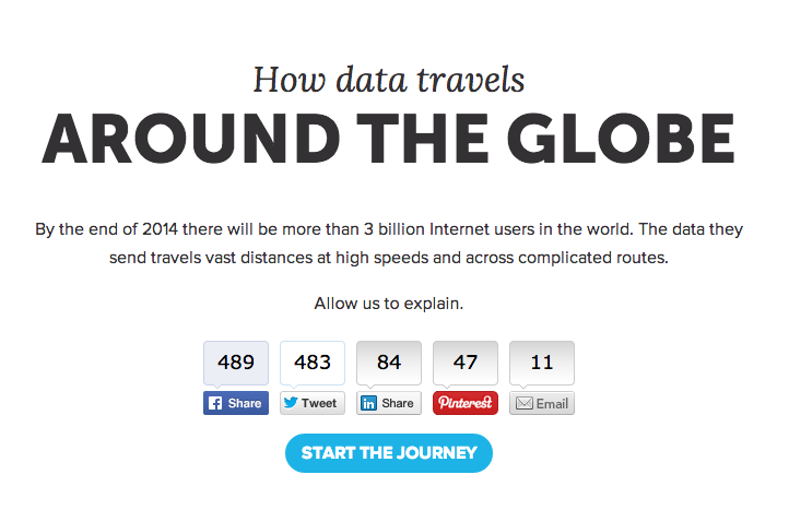
5) How Data Travels Around the Globe
This interactive infographic by Akita explains how data travels around the globe between more than 3 billion internet users. With fun scrolling features and clickable subpoints, it help make the complicated routes more digestible to grasp for readers.
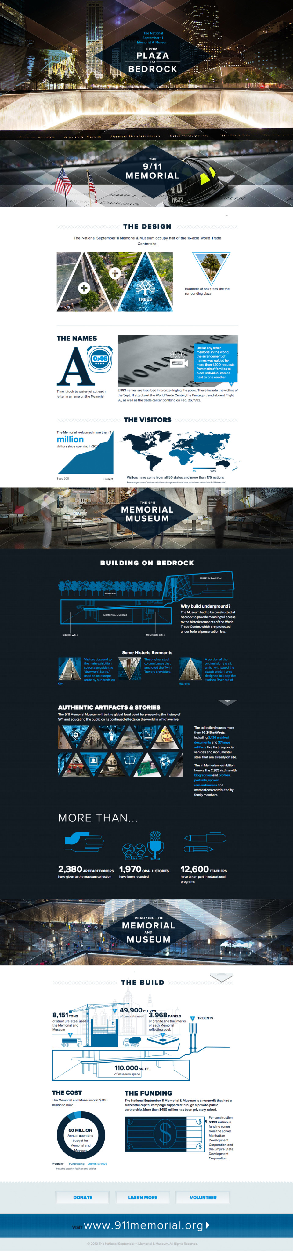
6) From Plaza to Bedrock
In 2013, this interactive piece by The National September 11 Memorial & Museum was made to show the backstory behind the construction of the memorial and museum. A new 2014 update to the piece added both audio and video pieces for viewers to interact with as they learn all about the build and design of the memorial.
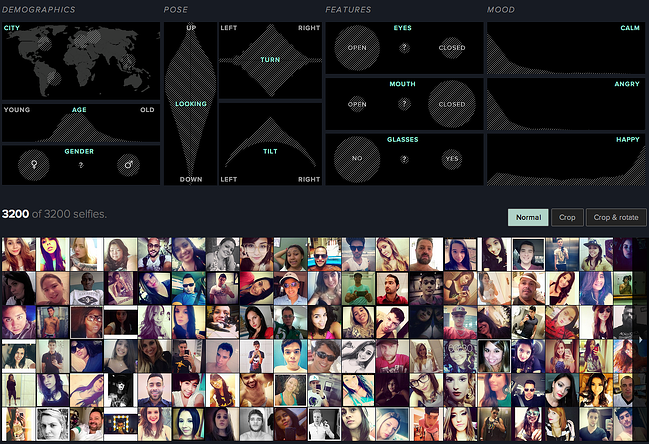
7) Selfiexploratory
This interesting data project dives deep into the selfie phenomenon and analyzes them by “theoretic, artistic, and quantitative methods.” Viewers can also play with the dataset in the dashboard and see how results change.
Responsive Infographics
Responsive infographics both have interactive components as well as the ability to look great on all devices, from a large desktop computer to a phone. Marrying functionality for all with interactive elements? Yes, please! Learn even more about the power of responsive infographics here.
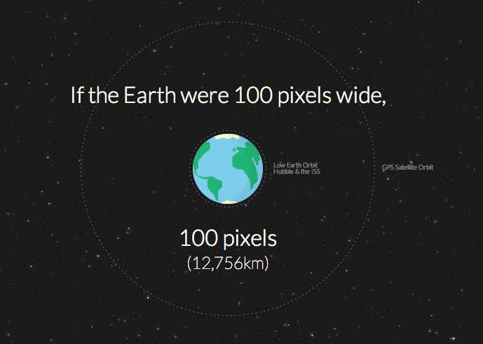
8) How Far is it to Mars?
Showing the distance between Earth and Mars as a long, scrolling webpage, this responsive and interactive infographic by David Paliwoda and Jesse Williams examines the “mind-numbing” numbers involved in traveling to our nearest planet
9) World Cup Match Balls
World Cup fans, this one is for you! This bright and responsive infographic by 150UP showcases illustrations of the official World Cup footballs used every four years since 1930 as well as bonus facts about each year.

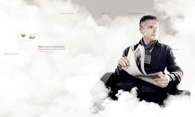
10) The World of SWISS
Rather than having a standard FAQ section or press kit for customers wanting more information on the background of SWISS airlines, they created an interactive brand experience featuring a 3D scrolling experience, films, the SWISS fleet and much more.
As you can see, 2014 has been a stellar year in infographic content. While this is a sample of the extraordinary pieces of work created this year, it’s a robust look into the forms of showing content in a beautiful and visual way.
Want to learn more about interactive infographics?
View or download the free ebook, Why Interactive Infographics?

Originally published Oct 24, 2014 12:00:00 PM, updated January 18 2023
Topics:
Infographics