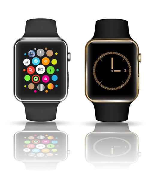
Apple's mobile screens have been steadily increasing in size before our eyes. While plenty of attention has been given to the camera quality, sharp resolution, and bendability of the iPhone 6 and 6 Plus, perhaps it's time we shift our focus on what is to come. In 2015, the world will meet Apple's smallest interface: the yet-to-be-named, custom typeface for the Apple Watch.
Our addiction to staying connected is about to spread to our wrists, bringing with it an entirely new set of design challenges that must adapt to the on-the-go, small screen.
The unveiling of it's first smartwatch marks Apple's first new product category in over four years. The technology is being billed as an intimate device that will interact with the user beyond the visual. Cue "Taptic Engine", which slightly vibrates on your wrist so that you don't need to look at the screen when receiving a notification. You can even share your heartbeat with your 'significant Apple-Watch-other' using Taptic Engine's haptic feedback technology to send a mechanical pulse to their Apple Watch wearing wrist. There are also new sound notifications and a touch-sensitive zooming tool called "Digital Crown"
While some features aren't entirely as innovative as they're cracked up to be, the visual aspect is revolutionary. The Apple Watch marks the company's first return to in-house typography design since Espy Sans and Espy Serif in 1993. "Apple Sans" (or whatever it shall be named) will be the first ever typeface designed in-house specifically for a smartwatch.
What makes it innovative? It's in the details: the precision required for designing each individual letter, as well as the space in between and surrounding them, within a parameter of a 38 to 42mm screen height.
Let's Rewind the Time
Apple's Human Interface Group designed their last in-house typeface, the bitmapped font Espy Sans, back in 1993 for its System 7.5. It was designed specifically to look good on a screen, at the time an innovation in its own right. Later, the company opted for off-the-shelf fonts, such as Adobe-designed Myriad, which has slowly been introduced to the web since 2002. The infamous Helvetica Neue and Lucida Grande have been used since the first generation iPhone surfaced in 2007. With iOS7, Helvetica Neue Ultra Light became the default system font.
Although there was some controversy surrounding Helvetica Neue Ultra Light's legibility, this didn't stop Apple from replacing their OSX system font Lucida Grande with Helvetica Neue Ultra Light in June 2014. However, considering Helvetica Neue is "basically unreadable at small sizes" it is little wonder that Apple has now decided to take typographic control by designing "Apple Sans" for a smaller screen.
Typography 101
So how do you design a typeface that's readable at a glance? You start with a clear objective. In the case of the Apple Watch, the goal is to maximize typographic clarity for both legibility and readability.
Wait, what's the difference? Legibility is an informal measure of how much effort it takes to distinguish one letter from another in a specific typeface. Readability, on the other hand, depends on the context in which the typeface is used. So in other words, in order to maximize typographic clarity, as much importance needs to be placed on the space between the letters as it is the actual design of the letters themselves.
"Apple Sans" is more spacious than Helvetica Neue and is certainly thicker and rounder than Helvetica Neue Ultra Light. It is designed to aid pattern recognition, important for comprehending information quickly. Pattern recognition starts with identifying individual letters, followed by word patterns and finally groups of words. Allowing the letters to "breathe" lets us distinguish what we're reading as clear symbols rather than text: letters, words and then phrases.
When rounded letters are used together with high-contrast colors, we're able to skim information that we need as fast as possible. The color palette of positively neon green and pink icons against Apple's black background and stark white typography lets our eyes navigate and recognize information. This is particularly evident in Apple Watch Sport, where user interface design and typography is slightly brighter and bolder to help quantify our fitness at a glance.
Apple may no longer need to convince us that the Post-PC era is imminent, as proclaimed by Steve Jobs in 2010, but the company does still need to get the details right to serve our hunger for receiving notifications, information, viewing photos and even quantifying our every movement. This all needs to be done on a surface about the size of a matchbook.
So while your wrist becomes more intimate, letting you feel those fluttering heartbeats, think of the new Apple typeface as an embodiment of Apple: your friend who is always improving according to your behavior, with the added bonus of blinging up your wrist as a customizable fashion accessory.
