Five Maps That Reveal New Truths About America's Megaregions
This post originally appeared on the Hyperloop One blog.
It’s a fact of modern geography that traditional political maps fail to capture the real outlines of American communities. Cities and states have for some time been slowly subsumed into economic megaregions created by people choosing to live and work at greater distances. For most people commutes are dictated by Marchetti’s constant, a sturdy observation that humans since the Paleolithic Era have always lived roughly 30 minutes from their work even as transport tech evolved from bare feet to carriage to train to automobile. Commuting rings just kept expanding outward. But Marchetti's Constant has broken down in most big cities. New data collected from the public transit app Moovit shows average round-trip commute times are now 93 minutes in Philadelphia, 77 minutes in San Francisco, and 86 minutes in Boston and Chicago. A third of the people in Los Angeles, New York and Philadelphia say they commute more than two hours each day.
These outlines of U.S. megaregions are by now familiar: the Boston-to-Washington megalopolis, Dallas-Fort Worth metroplex, Chicagoland. But familiar ideas often take reality for granted. Do we understand the intricacies of commuter patterns within these regions?
We need new transportation solutions that take into account the distances we travel and the ways we live and move today.
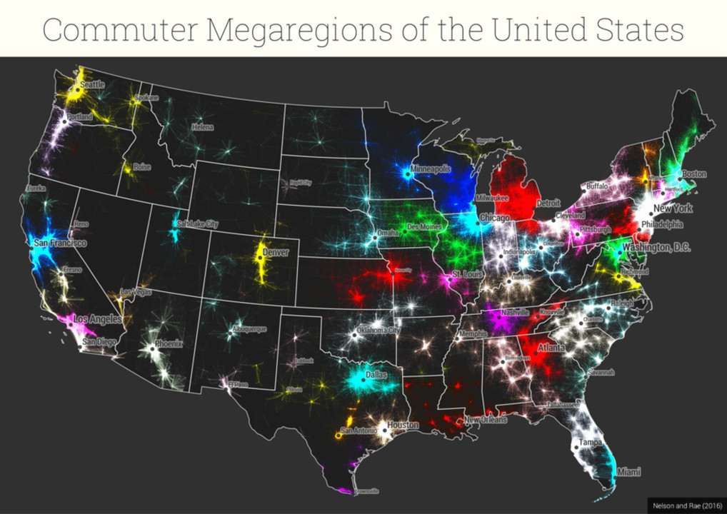
In a visually startling work of economic analysis published in PLoS ONE, Garrett Dash Nelson, a geographer at Dartmouth University, and Alasdair Rae, an urban planner at the University of Sheffield, recently published a series of maps computed from four million U.S. commutes from 2006 to 2010 as reported to the American Consumer Survey. It’s the first time anyone’s ever tried mapping this much data, and the results provide a crucial new tool for regional transportation planners looking ahead to an incoming administration that has vowed to invest hundreds of billions of dollars on new infrastructure. This analysis can start a conversation about which regional economic links matter for the greatest number of people and where we should focus investment for greatest impact, regardless of political boundaries and state lines. Just as the Interstate Highway System catalyzed the growth of metro areas after 1950, emerging megaregions will need new transportation modes such as the Hyperloop that serve population areas 200 to 500 miles across. Hyperloop can effectively turn regions into metro areas and provide seamless connections between all other existing modes such as commuter rail, highway systems, airports and sea ports.
Nelson and Rae’s first step was to transfer 40 million commutes into standard GIS software. That’s what you’re seeing in the map below, and it reflects some obvious megaregions clustered around major cities: Greater Chicago (light blue), Washington D.C-Baltimore (forest green), Greater Miami (sky blue), and Seattle (goldenrod). State borders blur often. Eastern Iowa is conjoined with western Illinois, Southwestern Connecticut is part of New York metro area, and Florida’s western panhandle is all but annexed by Alabama.

Using the same technique, Nelson and Rae produced the starburst map below of the Twin Cities region in Minnesota. High volume, shorter commutes make up the bright yellow core while longer and less frequent routes show in red. It’s pretty much what you’d expect, but it fails to show which trips are the most important for the economy of the Twin Cities region. “For real-world applications such as regional transit planning, where statistical accuracy is required,” writes the paper’s authors, it is “not sufficient” to rely on a visual representation alone.

Here’s a Northern California commuter map from Monterey in the south to Sacramento to the northeast, with the San Francisco Bay area as the epicenter. You can see Sacramento, Stockton and Modesto have their own centers of gravity yet are gradually merging into the Bay Area. It's hard to tell from this view the extent to which these links are statistically significant and whether this nexus of economic activity constitutes a single functional zone in and of itself.

To gain deeper insight, the researchers processed the same data through an algorithm from MIT’s SENSEable City Lab that ignores city locations and state lines and looks only at a trip’s relative strength within a natural community grouping. The software isolates the connections between each of the country’s 74,000-odd census tracts and considers those that connect more frequently as being more an economically significant link. Here’s what the same Twin Cities map looks redrawn on that basis. Suddenly the big starburst becomes a set of smaller pops, and previously assumed economic connections between southeastern Minnesota and western Wisconsin are not so strong after all.

For example, the mapping project found that, while southwestern Connecticut is, as one would expect, tightly linked to New York City, there is a clean break at the state border, creating a discrete Connecticut region that runs up the Connecticut River Valley into western Massachusetts, incorporating the region from Springfield, Mass., to the Vermont border. There are still plenty of commutes between Connecticut and New York, but there is a stronger “matrix of connections” on either side. They found a similar pattern along the Delaware River between New Jersey and Pennsylvania, where the New York City region breaks almost perfectly into the Philadelphia region.
One main point of this work was to show that an algorithm blind to physical geography can identify megaregions just as well as a professional mapmaker can use a GIS-based approach. All it needs is enough commuter patterns and--voila!--functional economic regions reveal themselves per the clustering of labor markets.
Nelson and Rae’s work may not be accurate enough for regional transit planning and, as Laura Bliss of The Atlantic’s CityLab points out, the researchers’ work has some limitations. For one, the data stopped at 2010 (new ACS numbers came out on December 8), coinciding with the peak of the recession. Commute patterns may have been redrawn somewhat since, and there’s a risk of missing some local community wrinkles for planning purposes when viewing the country purely as a set of megaregions.
But the maps are great conversation-starters for transportation planners and policymakers pondering how and where to deploy the potential billions the incoming Trump administration wants to spend on new and repaired infrastructure. Investment decisions should consider the way people live and work across boundaries of culture, politics and electoral districts. Transport should support and connect these dynamic economic zones to foster business formation, job mobility and personal economic freedom. “We hoped to start a conversation about how the country functions from an economic, spatial point of view,” says Rae. We need transportation solutions in the image of how we move.
Read more about transportation innovation on the Hyperloop One blog:
Supply Chain Lean Concepts, Project Director
5yReading the above map correctly showws Chicago, New York City, Atllanta, GA, and a city on the west side of MO. which isn't St Louis. Isn't St Louis on the east side of MO where the purple dot is displayed?
Regional Cooperation & Pacific Policy Analyst, Georgetown University; Education & Development; Stakeholder Engagement; Pacific Islands & Oceania
6yThese findings are also relevant to political geography, such as defining logical, representative, non-gerrymandered election districts.
Creative Lead + Art Director
6yEngaging info-graph! Makes one think of the trend how jobs get done by employees in the future
General Manager - Owner
7yplease
Fascinating!