
")
A Call To Action (CTA) is an element in your content that encourages the reader to do something, such as subscribe to a newsletter or click a link to a product page. If presented properly, it can be the gateway to increased user engagement, sales conversions, and more.
This article will explain why you need a CTA, and why it’s important you get it right. We’ll then reveal the three steps you can take to create a compelling CTA that gets clicked. What’s more, we’ll then show you how to style an amazing CTA using the Divi Call To Action module.
Let’s get started!
What a Call to Action is (and Why It’s Important)
A CTA is, in the most literal terms, a request for someone to do something. Whether it’s a button on a sales page, a link in an email, or a prompt on a printed flyer, it is an instance where you encourage the reader to take action:
In the current climate, where a huge percentage of marketing efforts are conducted via online channels, CTAs are everywhere. They can also cover a vast range of actions, including making a purchase, subscribing to a newsletter, or simply clicking through to a page with more information.
With so many sites persuading people to take so many different actions, it’s important your CTA stands out and convinces people to click. The consequences of a bland and uninteresting CTA isn’t simply felt once. The accumulative effect of a poor example can be disastrous for your bottom line.
How to Define Your Target Audience
Before you begin persuading your audience, it’s important to be clear on who you’re talking to. Making sure you’ve nailed down your target audience is a key step before tacking any marketing element, particularly your CTA. Ideally, you’ll want to create a fairly comprehensive description of your target, including demographics and psychographics. By doing this, you’ll have someone specific in mind that you’re speaking to when creating your CTA.
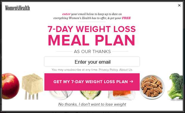
The example below is clearly targeting women who want to lose weight, and offers a weight loss plan in exchange for an email address. Even the second clickable button at the bottom plays directly to the target audience by offering “No thanks, I don’t want to lose weight” as the only alternative:
How you define your target audience will depend heavily on what your website is for, and what your CTA is persuading people to do. However, here’s some general advice to get started with:
- Your existing customers. Take a look at the demographics and psychographics of your existing visitors, and find out why they are using your product or service.
- Your competitors’ customers. If possible, investigate who your competitors are targeting and how they are doing it.
- The benefits of your product or service. Analyze the benefits that you can provide through your product or service, and identify who it might be useful to.
This is an important topic for any aspect of business, and thankfully, there are many great resources available to help you identify the target audience you’re trying to persuade.
How to Create a Compelling Call to Action That Gets Clicked (in 3 Steps)
Now we’re clear on why you need a compelling CTA – and who you’re targeting – let’s look at the three steps that will take you from marketing also-ran to CTA gold medallist.
Step #1: Write Compelling Copy
In an ideal world, anyone who views your CTA will be instantly compelled to click it. In order to get as high a click-through rate as possible, it’s imperative your preceding text and button copy do their utmost to persuade the reader.
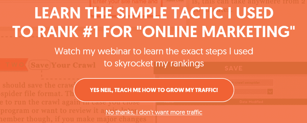
The example below appears as a blog exit pop-up. It is targeted specifically to the ideal reader of the post and speaks directly to them. It uses lots of actionable language such as the words “learn” and “watch”. The simple addition of an exclamation mark at the end of the CTA also adds a sense of urgency to the button copy. Finally, the alternative action at the bottom takes a joking, sarcastic approach. After all, who doesn’t want more traffic?
Here are some pointers for helping to give the reader the nudge they need:
- Speak to your target audience. Make sure you offer information your target audience cares about, and you use language that resonates with them.
- Use actionable language. This can help to kick people into gear and compel them to click.
- Be specific and keep it simple. A complicated CTA could leave the reader confused and less likely to click. Keep it simple, and be specific and explicit so the reader knows exactly why they are clicking.
- Create a sense of urgency. Using words like “today” and “now” can help to urge an undecided reader to click immediately.
- Consider a playful approach. You don’t have to stick to the standard “Click below to subscribe” text or “Buy” button copy. You can make it quirky, playful, or funny, depending on your target audience.
Ultimately, your text and button copy should give the reader enough information to know if they want to click, as well as a little nudge to compel them to do so.
Step #2: Make Your CTA Stand Out
Of course, no matter how persuasive your copy is, it’s all for naught if nobody reads it. To create a clickable CTA, you have to make sure the reader firstly sees it, then identifies it as something that requires action on their part.
The CTA below is another example of an exit pop-up requesting the visitor to sign up to a webinar. The bright orange color of the clickable button contrasts with the rest of the pop-up. This causes the button to stand out, making it very clear where the reader is supposed to click. The inclusion of a profile picture in this CTA also helps to grab attention, and adds a personal touch:

Here are some tips for making sure your CTA gets noticed:
- Make sure it’s in the right location: Your CTA must be placed so that the reader is guided towards it and doesn’t miss it.
- Use contrasting colors: Using a contrasting or bright color for your clickable button or text is a simple way to make sure it grabs the viewer’s attention.
- Stick to one CTA only: Having multiple CTAs on one page can be confusing. However, don’t be afraid to repeat the same one more than once.
- Make it look like a real button: Making the clickable section look like a real button can ensure the reader knows exactly where to click.
Now you’ve written the perfect copy and created a CTA that stands out, it’s time to see how it stands up to testing.
Step #3: Test and Refine Your CTA
You’ve created an incredible CTA, but the work isn’t over just yet. Testing various design components can ensure you get the most bang for your buck. Even if you think you have crafted the perfect design and copy, there’s probably still room for improvement. To determine if you should make changes (and which changes you should make), you should test different versions of your CTA.
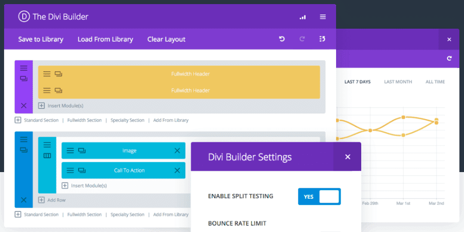
A/B split testing is ideal for this type of scenario. If you’re a Divi user, you can use our own Divi Leads – an A/B testing and conversion optimization tool built into the Divi Builder:
This tool enables you to set any module (including the Call To Action module), row, or section as the individual goal for your test. We also have a full tutorial to help you determine the statistical significance of your tests.
If you’re not using Divi, there are other services you can utilize to conduct your A/B split testing. However, regardless of the solution you choose, make sure you’re not harming your Search Engine Optimization (SEO).
How to Create a Call to Action in Divi
The Divi Call To Action module has everything you need to create a compelling and highly clickable CTA. It offers a vast range of customization options, so you can tailor the background, copy, and button to make sure your design is both unique and persuasive:

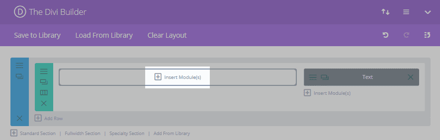
When you’ve decided on the placement for your Call To Action module, click on Insert Module(s) in your desired location:
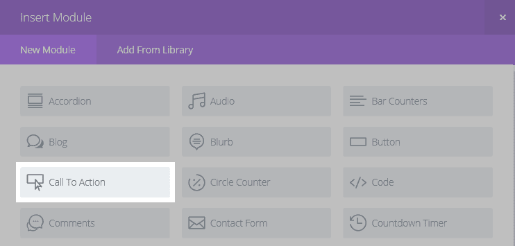
In the resulting pop-up, select Call To Action:
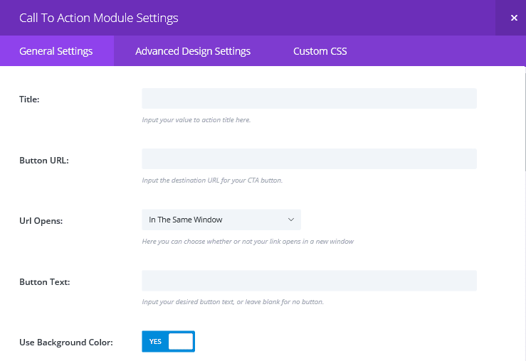
You’ll be taken to the General Settings tab, where you can add your text and make some basic appearance adjustments:
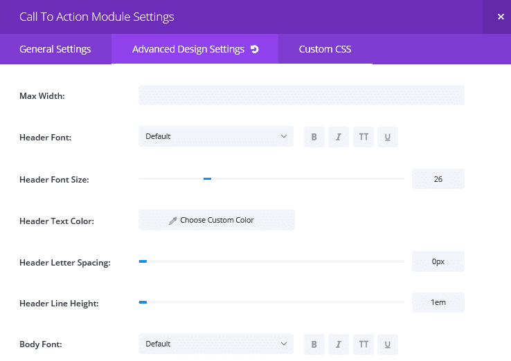
In the Advanced Design Settings tab, you’ll find lots more options for adjusting the text, button, and background:
Divi offers you almost everything you’ll need to begin creating captivating, magnetic, and compelling CTA’s. Now all that’s left is to start generating conversions!
Conclusion
A well crafted CTA will grab your viewers’ attention and compel them click for more. However, designing one that engages and persuades is not as simple as it might sound.
That being said, it is possible for you to create a high-performing CTA, particularly with Divi’s Call To Action module and built-in Divi Leads tool. In this article, we’ve outlined the three key steps you need to take to optimize your CTA. Let’s recap them quickly:
- Write compelling copy.
- Make your CTA stand out.
- Test and refine your CTA.
Do you have any questions about creating a highly clickable CTA? Let us know in the comments section below, and don’t forget to subscribe so you can follow the conversation!
Article thumbnail image by Oleksandr Yuhlchek / shutterstock.com.


Awesome tips John! A creative CTA will surely capture more attention. Thanks for sharing these cool examples.
Thanks for reading and commenting, Emmerey!
I haven’t tried it yet, but I’m really looking forward to trying out the built in split testing. This is a really awesome feature that eliminates the need of tools like Optimizely, etc.
Make sure you let us know how you get on, James. Drop us an email with your feedback!
Hi,
Do you know if there is any plugin that helps create fancy CTA buttons? I’ve seen beautiful buttons in other websites and I don’t know how to create them.
Some researches say that buttons have higher CTA than just text-links.
Thanks.
Andre, you may want to start at the WordPress.org Plugin Directory (https://wordpress.org/plugins/tags/cta-button).
Good luck. 🙂
I meant CTR, not CTA, in my last sentence.
For those who want to use Bloom as a CTA but does not want to capture email addresses. Visit this link that was referenced by an ET blog post last year.
https://agirlandhermac.design/using-bloom-image-text-pop/
Thanks for the link!
Is there a tut where it shows how to to one with a submission field in Divi?
Like the two first samples above?
Great article John! It would probably be useful for readers if you could include how Bloom or another email capture plugin would help, since Divi’s CTA module doesn’t have that. A lot of your examples did have an email capture location.
Thanks for another great article! As a marketer, I definitely approve it.
No problem, Jacob. Bloom wasn’t a focus for this piece, but we’ll bear it in mind for future articles!