
Tooltip Design: Useful Microinteractions for a Learning Effect

Microinteractions are your website's most important UI elements. Tooltips are a part of that, but they require even more diligence in terms of conception and realization.
In the end, the microinteractions are what makes the difference between a good and a bad website. In times where basic design becomes increasingly more similar, a distinction is mainly achieved via details. If your website is hard to use, this could be the deciding factor why your potential customer goes to your competition, as it provides the same offer, but makes it more comfortably accessible.
My in-depth article on microinteractions can be found here.
Clippy, One of the Originators of Modern Tooltips
Tooltips are a part of the group of microinteractions, though their application area is very limited in comparison. Wikipedia defines a "tooltip as a common graphical user interface element. It is used in conjunction with a cursor, usually a pointer."
The first version of today's tooltips is "Balloon Help", developed in 1991 by Apple, and it is still being used today. This user support, also known as "mouse over", shows short text in a speech bubble look when hovering over accordingly equipped elements with the mouse. Another common term for this kind of information popup is "quick info".
[caption id="attachment_104336" align="aligncenter" width="330"]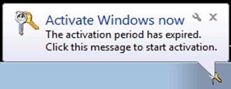 Windows: Dreaded Balloon Help a Few Years Ago. (Screenshot: Microsoft)[/caption]
In the mid-nineties, Microsoft invented a not very popular helper called Clippy, who was supposed to take care of the tooltips for Microsoft Office programs. However, turning off Clippy in the settings was among the first actions of every Office user I know. Don't let that guy inspire you.
The failure of Clippy was not entirely due to its personality. It was simply made poorly. Fully animated, it jumped onto the screen, offering its services verbosely. This kind of work delay is annoying to every user. Clippy was not intelligent enough to figure out if a user doesn't need help (anymore), either. He was the omnipresent co-worker you know from lunch break, who can't stop talking, ignoring more or less subtle hints.
Tooltips in Webdesign
In web design, there hasn't been an application case for this kind of microinteraction in years. Only the rise of web apps over the past ten years brought tooltips back.
Today, it is widely agreed upon that tooltips are very important during the onboarding process for new users and the introduction of new features, while they should be used sparingly in all following processes.
Where Are Tooltips the Most Useful?
Generally, the small info elements are exclusively meant to improve UX, the user experience. They shouldn't be placed whenever possible just to be safe. Therefore, when conceiving tooltips, you should take the most restrictive approach possible, and think carefully if functionality can actually be gained by using the tooltip.
If you're able to create self-explanatory elements, you should do that, instead of taking the easy way of adding a tooltip.
On the other hand, there may be elements that are self-explanatory, but could still use a tooltip; like this one:
[caption id="attachment_104338" align="aligncenter" width="620"] (Concept: Kerem Suer on Dribbble)[/caption]
Nonetheless, modern app interfaces with little screen space always make it a requirement to choose the shortest possible feature label. In some cases, this may confuse a user. In this case, displaying a small speech bubble on the element which explains the function behind it is completely valid. This also applies if you build an interface exclusively from icons, making you go back to not immediately understandable pictograms.
[caption id="attachment_104341" align="aligncenter" width="401"] Explaining icons via tooltip. (Concept: Oykun Yilmaz on Dribbble)[/caption]
However, the tooltips' main value is provided in two pretty common situations. For one, newcomers to your web app definitely need help. Carefully used quick info can shorten the learning process, which should strengthen the loyalty of your clients.
Secondly, tooltips are especially helpful in spots where you have expanded or in other ways altered your web app. Even experienced users could use some help, as they may miss out on all the great new features. Organizational blindness is not to be underestimated, and it exists on both sides.
[caption id="attachment_104339" align="aligncenter" width="620"]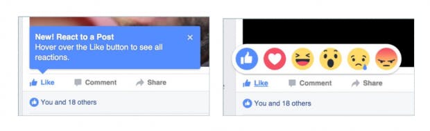 Facebook shows the like button's additional options. (Screenshot: D. Petereit)[/caption]
Specific Applications
In some cases, you may want to create a virtual walkthrough for a specific application situation. Here's where the tooltips are not only helpers but the feature itself. In that case, you'd want to go for a far more obstructive design and make sure that the user can only close a tooltip once he's done with the task defined in it.
With this kind of tooltips, I recommend showing the tour stop the user is at right now within the small infoboxes.
[caption id="attachment_104340" align="aligncenter" width="620"] Common tooltips are shown in tool bars. (Screenshot: D. Petereit)[/caption]
On the other hand, there are situations where on-hover works best. For instance, this is the case where the tooltip is only meant to explain a function that is already sufficiently explained by an icon. The formatting tools of the TinyMCE are a good example.
A marketer may lay claim to the integration of a tooltip as well. This would make it possible to highlight a special discount or a special promotion with the help of a tooltip.
What Tooltips Shouldn't be Used For
As mentioned before, tooltips are not suitable for self-purpose, or to improve a poor design. It is incorrect to place tooltips everywhere just to be safe.
In addition to that, I don't recommend adding interaction options to the tooltips themselves, turning them into another kind of control element. With very complex problems, it could make sense to get a link along the lines of "find more information here" into the tooltip. However, this shouldn't be the standard. If your user interface really takes that much information, you have not thought it through properly.
The above-mentioned product tours or virtual walkthroughs are an exception where it even makes sense to add an option to each tooltip, letting users get to the next tour stop in one click.
[caption id="attachment_104337" align="aligncenter" width="620"]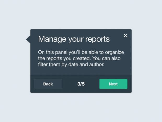 Tooltips in a product tour. (Jason Li, Dribbble)[/caption]
Tooltips should always be used for support. As soon as a tooltip becomes a necessity because your user won't make any progress without it, you've done something wrong. Your interface has to work without tooltips.
On top of that, you need to design your helpers in a way that makes them redundant after the first or second usage. They should not be a permanently required support.
What to Consider When Designing Your Tooltips?
Let's take a look at the design in a narrower sense. Tooltips are no end in itself, so we won't design them as if that were the case. There are script solutions that even let us implement media into the tooltip. In 99,9 percent of all cases, this is a bad idea.
[caption id="attachment_104342" align="aligncenter" width="620"]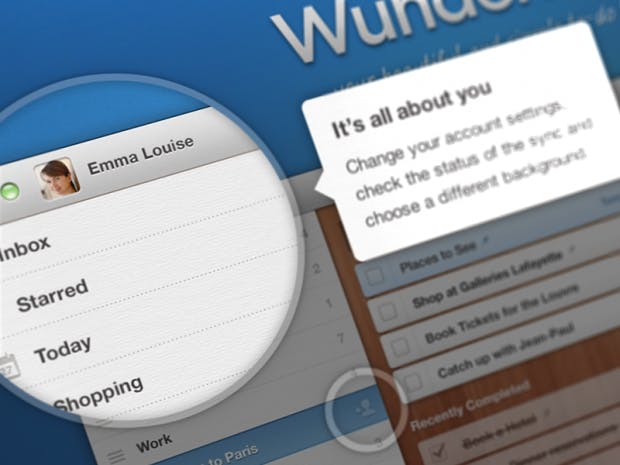 How Wunderlist welcomes new users and helps them with onboarding. (Composition: Wunderkinder on Dribbble)[/caption]
Tooltips have to be kept minimalistic. They shouldn't be a distraction, and they should point the user towards something. At the same time, they mustn't be hidden so well that they're impossible to find. In order to accomplish this, don't only show your tooltips when hovering or clicking, but whenever it makes sense to do so for your web app in general. The easiest example should be entering the landing page.
In terms of text, tooltips should be kept as brief as possible. This is not the right place for humor either. Write a maximum of two lines on what there's to know about the function that the tooltip is meant for. Feel free to go for the Twitter style. Concise wording can't hurt.
Make sure that your tooltips don't superimpose other important elements on the screen. In the best case, the infoboxes are placed so that they cover screen areas that are free otherwise. If it is necessary to place them a bit further away from the element they are meant to explain, make it clear that the tooltip X belongs to the element Y, using an arrow or a small animation, for instance. It's better if that's not necessary.
Conclusion: A Good Tooltip Takes Complex Preliminary Considerations
You noticed that there's a whole lot to consider when it comes to the construction of the perfect tooltip. It's like everywhere in web development: the easier the result looks, the more complex the task behind that look is.
If you want to touch on the creation of tooltips for the first time, I recommend the jQuery plugin Tooltipster. Later, you can work with pure CSS and HTML.
Read on:
- How Facebook, Twitter, and Linkedin Use Tooltips for Feature Discovery | Ty Magnin, Appcues
- How to Use Tooltips As Microinteractions | Marc Schenker, Webdesigner Depot
- HINT.css – Tooltipps Without JavaScript, With Pure CSS3 and HTML5 Only | Dieter Petereit, Noupe
- Why Microinteractions Decide the Success of Your Web App | Dieter Petereit, Noupe
- Tooltips: How to Design the Small But Powerful UI Pattern | Julia Chen, Appcues
Featured Image by Gerd Altmann from Pixabay