More Than Scaling: How to Make the Leap From Mobile to Desktop
In the last decade, much discussion time has been given to how both interfaces and user experiences translate from desktops to smaller mobile devices. Recently however, the conversation has switched and we’re now seeing trends begin in the mobile environment and make the leap back to the desktop.
This leap is deceptively simple and merits significant inspection as to the fundamental differences between mobile and desktop platforms and how that can and should affect how interfaces and experiences are crafted.
2 Million+ Digital Assets, With Unlimited Downloads
Get unlimited downloads of 2 million+ design resources, themes, templates, photos, graphics and more. Envato Elements starts at $16 per month, and is the best creative subscription we've ever seen.


The Rise of the Smartphone
As the smartphone made its rise to power and glory, designers realized that they had a lot to learn about the new form factor. On particularly impressive platforms like the iPhone, the potential was there to meet and exceed the richness of interfaces of desktop apps.
Countless studies, discussions and evolutions have led designers to a point where it is indeed the case that desktop users find themselves enamored with mobile interfaces, wishing that desktop UIs would undergo a similar revolution.
Mobile devices have a lot going for them. The direct interaction model provided by multitouch is so completely intuitive that everyone knows how it works immediately. Further, there’s just something about small screen that really makes designers focus on what’s most important while stripping out all the non-essential elements. The result is thousands of beautifully streamlined applications that users simply can’t put down.
A New Problem
Traditionally, given this timeline, the progression of interfaces in recent history has been from large to small. How do we take the desktop experience and successfully transplant it to a smaller screen and new interaction model?
As we now look to mobile development as a smashing success, the designer’s problem has been completely turned on its head! Many developers, including the Apple team themselves, are seeking to translate the newfound joys of mobile interfaces to the desktop (not to mention a similar leap from the iPhone to the larger iPad).
More than Interface Scaling
Conceptually, it seems like a far easier task. You’re going from a small amount of space to a large one, so you have more room to implement the features you need. However, in practice, the shift is much more difficult. In fact, many developers and designers are still struggling to get it right.
I’ve found that the problem goes much further than merely how interfaces scale to a new screen size, there’s actually a fundamental difference in the way we interact with desktop interfaces versus those on a mobile device. Let’s explore this idea further.
Back to the Mac
Leading this procession of technology and design from mobile to desktop is of course, Apple Inc. Their most recent operating system, OS X Lion, was labeled a “Back to the Mac” project meant to bring key features that first made an appearance in iOS back to OS X.
If anyone was going to get this transition right, it was Apple. After all, they were behind the smartphone that set the standard for all smartphones: the iPhone.
Interestingly enough, even Apple’s designers and developers have had a less than perfect run with making the transition from mobile to desktop. Let’s discuss some of their attempts.
Natural Scrolling
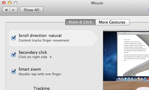
When you look at a document on an iPhone, there aren’t any visible physical controls on the phone itself, so your first reaction is to reach out and touch the document when you want to scroll. This reaction proves to be correct and you instantly realize that the interaction model mimics the real world, it’s as if you were really reaching out and touching a piece of paper. If you flick your finger in an upward motion, this grabs the piece of paper and moves it upward, effectively scrolling downward. The key takeaway here is that the learning curve is about as close to zero as it can get, almost no one takes more than a few seconds to figure out how scrolling works and will then remember it forever.
Since scrolling feels so natural like this on the iPhone, Apple decided to implement the same system in Lion. “Natural Scrolling” is now the default scrolling mode in OS X, all it really does is invert the scrolling method: swiping down used to scroll down, now it scrolls up and vice versa.
Not What I Expected
The first time I personally used an iPhone, I immediately appreciated the intuitive nature of the scrolling and remarked that the Mac should adopt this model. However, when I first tried Natural Scrolling in Lion, I realized that it didn’t translate quite as well as I thought it would.
Curious about what others thought of this, I polled over 1,800 OS X users. Almost 26%, a decent number to be sure, responded that natural scrolling seems more intuitive than the previous model. However, 34% admitted that it took some getting used to, 14% said they tried it for a while but gave up and the remaining 26% said they turned the feature off immediately.
Direct vs. Indirect Interaction
Fully 74% of respondents had at least some trouble adopting the new, supposedly more intuitive, scrolling system. Now, most of this is because we’ve been doing it the other way for years, our brains were hardwired for one model switching so suddenly wasn’t the easiest task.
Far more important though is the realization that direct interaction is a very different beast than indirect interaction. Both trackpads and computer mice provide an indirect means for input. We’re not reaching out and touching the icons or the page, we’re looking at these items while our hands are off somewhere else controlling the movement on the screen. Even though both trackpads and the Magic Mouse are multitouch, using them is still a very different experience than interacting with a touchscreen device.
Drawing tablet users have known this for years. Drawing on a tablet without a screen is a pretty interesting experience. Your hand is one place and the output is another, very different from the natural drawing model. The process becomes much more intuitive when you use a Wacom Cintiq, which has a built-in touchscreen for direct input.
Fullscreen Apps
This one should be easy to transfer, right? Bringing an app to fullscreen on a large display helps you stay focused on the task at hand and can surely only increase productivity.
However, in many ways, fullscreen apps actually represent a reduction in functionality and efficiency. One such problem that I encounter daily is with Mail, OS X’s default email client. When I’m not in fullscreen mode, I can easily start a new message in a new window, then switch back to the main window to copy an email address or some other important snippet of information. I can also move that active message window over a little bit, click on a file on my desktop, and drag it to the message window.
In fullscreen mode, neither of these actions are possible. The interface isn’t merely stretched in size, there’s a fundamental shift in the way it works that locks things in place and makes for a more rigid workflow. This seems natural on my iPad, but on my desktop where I’m used to being able to move between windows freely, I find it frustrating and usually revert to manually sizing the Mail window rather than using fullscreen mode.
Versions & The New Saving Model

Autosave is another feature that seems like it should easily survive the transition from iOS to Mac OS. After all, who wouldn’t want their document to save itself so that work is never lost?
Apple decided to go a step further with this though and rethink the core functionality of how saving documents works. Since saving the way we used to know it is now automatic, each time you hit “Command-S” you now save a new version. You can then sort through previous versions of the file and see the changes progressively. Again, a great feature!
The part where it becomes strange though is the removal of the “Save As” functionality. As a full-time writer, I have several templates for various types of content that I typically produce. My workflow used to be such that I would open my template, make some changes and hit “Command-Shift-S” to save those changes as a completely new document, thereby preserving the original template. Now however, the system is far less efficient. I’m forced to open my template in TextEdit, manually navigate to File>Duplicate in the menu before I make any changes, then make my changes and save the document.
In making the desktop saving model mimic that of iOS, Apple has stripped out core document functionality that has literally been around for decades. Before this, the lack of a “Save As” feature in any text editor would’ve been a cause for mass complaints, now it’s billed as a feature.
What’s the Point?
All right, so we agree that there are significant differences between both mobile and desktop interfaces and the interaction models for the same, how does any of this relate to design?
The primary takeaway from this article is to thoroughly consider every aspect of moving a design from a mobile space to a desktop space. Here are a few points to keep in mind as you make this transition.
Don’t Just Scale the Interface, Rethink It
Many developers have been criticized for creating simple ports of iOS apps for the Mac. Remember that, just as with natural scrolling, what seems perfectly intuitive on a touchscreen may seem awkward on the desktop.
Begin to question why your buttons are placed where they are, how each item’s proportions works with the rest of the interface, whether desktop users will expect greater control and how you can tailor the visual experience to a fundamentally different interaction model.
Think About the Experience
Notice that, more than making Lion look more like iOS, Apple sought to make it work like iOS. As we showed above, this can be both good and bad depending on the implementation.
Remember that there’s a fundamental difference between UI and UX. When crossing platforms, we uproot both the UI and UX and plop them into a new system. This causes obvious troubles with the UI, which are fairly easy to address because we can clearly see them. However, far more subtle and tricky are the UX differences between the two platforms.
Never assume that the experience and interaction will translate perfectly. Instead think about the strengths and weaknesses of both systems and fuse the strengths in light of user expectations. If you’re constantly bucking against how the user will intuitively want to use your product given that it’s in a desktop environment, you could be fighting a losing battle.
Always Ask “Why?”
When moving a product from a mobile to a desktop environment, “Why?” can be your greatest asset. If you leave something exactly the same during the transition, ask yourself why it wasn’t changed. Are both platforms similar enough in this area that it will translate well? Was the standard way of achieving this in a mobile environment better than an alternative route that’s usually taken in a desktop environment?
Similarly, if you do change something, also start asking questions about why it was changed. What were your motives for the change? Did you improve the experience or make it less efficient/effective?
Ultimately, you should always ask yourself if you’re mimicking mobile UI and/or UX just for the sake of doing it or because it actually represents an improvement. As we saw with Apple’s attempts, the answer won’t always be black and white. I am personally now more comfortable with natural scrolling than the old way, but has my experience actually improved or was it a superficial change?
Conclusion
The purpose of this article was to get you thinking about the fundamental differences between mobile and desktop environments and how that affects design and interaction decisions.
Too many people hastily port a product, feature or model from one platform to the other without thinking through the implications of that leap. The result is a poorly developed end result that disappoints users.
Always remember that a multitouch trackpad and/or mouse is very different than a multitouch screen and that moving a design from a small screen to a large one involves much more than scaling your graphics.
Image credits: superstrikertwo and kumazo